Welcome to HTML Utopia – the two part series on creating Web page designs without tables.
Part 1 introduces the concept of using CSS to create a design without tables, and explains the reasons why this philosophy has become so popular.
Part 2 explores a few standards-compliant commercial applications of this type of design, and exposes a few nifty tips and tricks to improve your CSS layout…
Enjoy!
This series sparked the idea that was eventually developed into SitePoint’s second print title, HTML Utopia: Desigining Without Tables Using CSS. Read four chapters from the book here.
HTML Utopia – Designing Without Tables: Part 1
Love at First ‘Site’!
A few weeks ago I stumbled upon a site that really inspired me. It was beautifully designed and presented. It was not until I looked at the code behind it that my heart truly skipped a beat.
The site was A List Apart, the brain child of Jeffrey Zeldman. Zeldman is also involved in WaSP – The WEB STANDARDS PROJECT that launched the browser upgrade campaign. The campaign encourages Users to upgrade to browsers that meet WC3 recommendations and lobbies the browser developers to build browsers that comply more thoroughly.
I decided to have a crack at rebuilding a SitePoint page without using any tables (currently there are 18 tables being used, 17 of which are unnecessary).
Editors Note: These examples are based on a previous SitePoint design and do not refer to the current site.
Click here to check it out. Have a look at the code if you don’t believe me (here’s the source). If you’re keen here’s the style sheet.
If all you saw was a not so pretty black and white page then I’m sure you’ll have some things to say about this article! You see, according to WaSP, your browser is not standards compliant. If it all looked fine to you then fire up your old copy of Netscape 4 and take a look at the same page…or click here for a simulated look!
When I’m talking about HTML Utopia, I’m talking about the separation of content from formatting. With databases we’ve achieved that separation to some degree but only on the production side. We’re still outputting our content into salami-like HTML code where we mix it with the cholesterol of <table> and <font> tags. Besides, not all websites are database driven and the ones that are rarely database 100% of their content.
Before I talk about the glories of such coding, let’s first address the backward compatibility issues with the older browsers.
Version 4 Bites!
As web designers and web developers, we’ve been busting our butts to get our creations to work across all browsers and over all platforms. By now, most of us have gladly committed the Version 3 browsers to the retirement home. However, we’re still suffering the shortcomings of the Version 4 browsers.
We’ve found our hacks and tricks that defy logic. We’ve developed our scripts to detect our user clients. We hold our breath as we Alt-Tab Control-R. Still, rarely do we manage to cover all bases and let’s face it – creating different code for different browsers which can’t even agree on the length of a text field is growing tiresome.
What’s the answer? Say “No!” to browsers who don’t comply with web standards. By web standards I mean CSS-1, HTML 4.01, and ECMAScript (the “official” version of JavaScript) – basically, any Version 4 or older browser? At this point the alarm bells start ringing.
With the release of Netscape 6 and Opera 5, we now have serious alternatives to Microsoft Internet Explorer who historically has provided the best support for CSS. If you’re looking for a Unix/Linux browser then Konqueror is available.
From my research, current stats indicate 77-80% of web surfers today are using browsers that do meet web standards. Maybe the remaining 20% need some encouragement.
When No means Yes
When I say No I’m not talking about serving a page to non-compliant browsers that resembles a 10 car pile up (due to its misuse of styles). And when I say No I’m not talking about a rude message and a closed door. What we can deliver is a nice message and your content! (If you haven’t loaded up your old browser yet here’s what it would look like.)
WaSP suggests that you use your message to encourage users with non-compliant browsers to upgrade and provide a link to an upgrade page.
One of the fantastic benefits of this approach is that you still present your content to a browser that doesn’t understand CSS. That includes any device capable of displaying files retrieved on the Internet eg. Hand-held devices, WAP Phones, Braille readers and Internet Fridges.
We don’t test for N4 and then serve the specially designed N4 content. We don’t test at all! By using an new alternative way of linking to our external stylesheet…
<style type="text/css" media="all">@import "styles.css";</style>… non-compliant browsers (that don’t understand this method) will simply load the page without any styles. As long as you apply your styles with <p> tags and <h1>,<h2>…<h6> etc then your content will still make perfect sense in any browsing device. It will just look a little old school.
Need some more convincing? Lets look at the many other benefits.
CSS Happiness!
OK, we’ve talked about catering for all non-CSS devices including N4, even devices that haven’t been invented yet! There are some other great benefits of separating your content from your formatting.
Reduction in File Size:
I reduced the file size of the SitePoint page from 34,353 bytes to 18,585 bytes. It would be smaller again if it wasn’t for all those rounded corners!
One file controls the whole site design:
OK you’ve heard this before – it is part of the beauty of CSS in general. Should you decide to add Geneva to your font family because you’re becoming Mac friendly then modify your style sheet and the changes will be reflected across your whole site.
Alternative Style Sheets:
You can have a separate style sheet that is used when your page is printed. That means no more separate ‘print version’ pages.
Old Dogs and New Tricks
Those of you that code by hand should have no trouble making the transitions to this style of HTML and if you’re anything like me, you’ll get a kick out of doing something new. There’s bad news for those of you that rely on WYSIWYG software – at least in the short term – because there isn’t any programs with this level of CSS support. Macromedia is usually pretty quick, so you probably won’t have to wait too long. You might even find that once you get the hang of it coding like this is easier than fiddling with 100’s of table cells!
Good luck and May The Source Be With You.
Resources:
A List Apart:
The List Apart article that inspired this article:
http://www.alistapart.com/stories/tohell/
WaSP – The Web Standards Project:
WaSP Tips for including an upgrade message:
http://www.webstandards.org/upgrade/tips.html
Some more great css tips and tricks:
http://www.bluerobot.com/web/layouts/
A very comprehensive collection of this subject matter:
Browser Stats
http://www.upsdell.com/BrowserNews/stat.htm
http://www.w3schools.com/browsers/browsers_stats.asp
Back in Part I of HTML Utopia — Designing Without Tables, we introduced the idea of using CSS Positioning rather than tables for laying out Websites. In Part 1 we took a fairly discriminatory view of old browsers such as Netscape 4.
Part 2, below, is about solving the old browser problem in a less hostile way. We’ll also take a peek at a few techniques.
HTML Utopia – Desigining Without Tables: Part 2
I’m Back
It’s been over a year since I wrote my first (and only) article for SitePoint and I thought I should share the experiences I’ve since had designing without tables.
The response to Part 1 was very positive. Thanks! There were, however, a significant number of readers that did comment that they weren’t prepared to give Netscape the bum steer like I suggested.
A simple comment that significantly impacted my future approach to Web design came from Kevin Yank, who asked the question: “What about all the CSS that Netscape 4 can do?”
WaSP — The Web Standards Project
Back in Part 1, it was the WaSP campaign (via A List Apart) that got me started on this whole utopian trip. Since then I’ve learnt to strike a balance between the WaSP ideology, and the requirements of my commercially oriented clients.
I guess you could say it’s selling out, but let’s face it — our job is to satisfy our clients to the full extent of our abilities. I decided to look for ways to exercise my new passion for CSS Positioning while still giving Netscape a look-in.
Methods in the Madness
I think I can best illustrate some of the options I explored with some real life case studies. Before I begin, I should let you know that I work as a designer for SitePoint’s commercial Web design division, and the case studies I’m about to present are real live sites that I’ve worked on in my capacity as Web Development Manager for SitePoint.
If that offends you, then don’t read on. Otherwise, let’s get cracking!
Eyes on Diabetes — Pure CSS for New Browsers
This design is from the WaSP school of thought — Pure CSS, and the vanilla treatment for Netscape 4. Check it out in Netscape 4 — it’s surprising how neat and tidy you can make your non-CSS layout look.
Admittedly, a brief like this one is something of a luxury. Accessibility was priority number 1 for www.eyesondiabetes.org.au, and the use of Pure CSS was attractive because of the abstraction of presentation from content.
Here’s how the stylesheet is called:
<link type="text/css" media="all" rel="stylesheet"

href="/includes/persistent.css" />
As I mentioned in Part 1, Netscape doesn’t understand either the @import method, or the media="all" attribute. By using either of these in your call to the stylesheet, you can ensure that Netscape won’t load it.
SitePoint.com.au — Pure CSS for All Browsers (even N4)
Editor’s Note: A year on from writing this article, we’ve redesigned www.sitepoint.com.au The site is now very stripped back for Netscape4.
For one of our own sites, SitePoint.com.au, I decided to take Kev’s idea to heart and let Netscape 4 have as much CSS as it could handle. Initially I expected that it might manage the fonts and colours, but not much else. What I actually found was that I could get the whole site to work in Netscape using CSS and no tables! The only hitch was that Netscape’s interpretation of percentages is pretty bizarre — this was the main point of contention.
In my first build I simply called two stylesheets — one of which Netscape skipped:
<link type="text/css" rel="stylesheet"

href="/includes/basic.css" />


<link type="text/css" media="all" rel="stylesheet"

href="/includes/advanced.css" />
The basic stylesheet had pixel-based widths and margins locked in to fit an 800×600 resolution. The advanced stylesheet re-declared all those widths as percentages, so the layout spread to 100% of all screen resolutions.
I revisited the site a few months later and opted for a browser detection script instead. This enabled me to split my CSS into three stylesheets:
Editize.com — Two Distinct Layout Templates
One of the features of the EditizeTM product is that it works in all browsers. Therefore it was important that the site looked as good as it could in Netscape 4.
All the pages would use the one template, as most were databased and edited via a Content Management System.
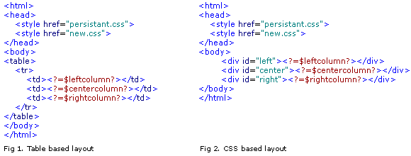
For template-based Websites, all content is displayed in a container. That container is typically a <div> or a <td>. For www.editize.com, I made two containing structures (layout files) into which our content could be inserted.
Then I simply used a browser detection script to choose the right template.
Browser Detection Scripts
A fair bit of thought has gone into how the browser detection scripts should work.
It’s important to detect the old browsers like Netscape 4, in order to serve them their specially limited layout, while presenting every other browser with the new CSS layout. We do it this way, rather than pick out the new browsers, because:
This is my PHP script (updated 5-20-03):
// Grab Netscape 4 on all platforms

// (This isn't fullproof but it's pretty close)


$tmp = explode(" ", $HTTP_USER_AGENT);

$brvers = explode("/", $tmp[0]);

$brvers = (float)$brvers[1];


if ($brvers > 4.01 and $brvers < 4.99)

  $version = "old";

else

  $version = "new";


// Here's a 'find' function to

// specifically grab some other browsers


function find($component)

{

 global $HTTP_USER_AGENT;

 $result = stristr($HTTP_USER_AGENT,$component);

 return $result !== FALSE;

}


// Use this to get IE5 on Windows (optional)


if ((find ('MSIE 5.0')) and (find('Win')))

  $version = "old";


// At this stage WebTV seems to cope much

// better with a Netscape style page so

// lets grab it


if (find ('WebTV'))

  $version = "old";
You can I see I used the decimal increments to weed out Netscape 4. These increments are platform independent and in my experience not used by any other browsers.
In the above script I chose to class IE5 as an old browser because it gets a lot of CSS wrong, and fewer people use it these days. Note that I specifically look for IE5 on Windows because the Mac version is a CSS-friendly browser.
CSS Layout Techniques
The following is an overview of the techniques you can use to lay out your pages with CSS. For an excellent article on CSS Positioning that goes into more detail check out BrainJar.com: CSS Positioning.
Float
Although this is not really the intended use for the CSS property “Float”, this technique is a good, simple way to lay out 2 columns.
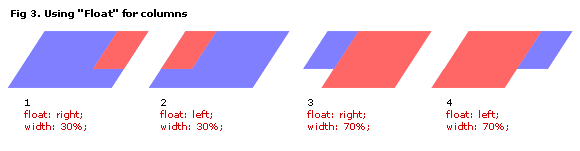
I prefer examples 3 and 4 of the above because:
Absolute Positioning
The absolute positioning technique is another good option — especially for three column layouts.
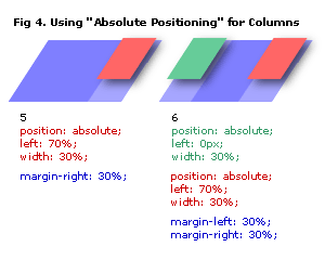
Notice how our main layer spreads to a width of 100% and our columns sit on top. We use margins to stop the main column’s content from being overlapped.
In theory, all layers could be absolutely positioned, but you’ll soon see why it’s a good idea to keep at least one of them (the longest column) relative.
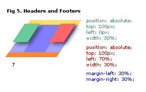
Headers and Footers can easily be slotted in. Because our main layer is also relative, it simply stacks up right after the header. Our absolutely positioned layers need to have their distance from the top set, so that they line up with the bottom of the header.
As long as we have a relatively positioned main layer, a Footer (which is also relatively positioned) will simply stack up after it. Therein lies a problem!
The Footer Issue
Our relatively-positioned layer (usually the main layer) must be longer than any other layers. If it’s not, we’ll get problems such as those illustrated in Figure 6.
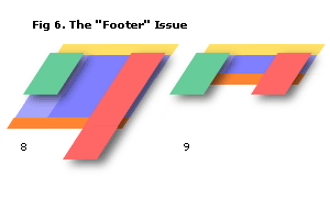
This can be a real problem for database-driven sites, because you often have automatically generated content that you don’t always plan for.
For example, say you had your databased article displayed in the main column, and the names of other articles listed in the right column. After some time, your client (a prolific writer) has more articles listed in the right hand column than you ever anticipated, and a couple of very short articles. This will cause a problem such as that depicted in illustration 8.
Another example is with short confirmation pages — such as a thank you message — as depicted in illustration 9.
The answer? Be prepared. Put limits on your queries for dynamic columns and pad out any short pages with a few <p> </p>.
Print StyleSheet
While you’re at it, clean up your site for the printer. IE6, Netscape7 and Mozilla have good print previews that enable you to fine tune your Print Mode stylesheet without destroying forests.
Call your Print Mode Stylesheet with:
<link type="text/css" media="print"  rel="stylesheet"

href="/includes/print.css" />
It’s pretty easy too. You can simply turn things off by setting the display property to none. I like to:
Show’s Over
This is probably just enough to whet your appetite. Remember, there are more and more browsers out there that support the standards for CSS. The ones I usually test on are:
Unfortunately there are still some minor idiosyncrasies amongst them, but on the whole it’s not too hard to get your site working across all of them.
I hope you’ve enjoyed HTML Utopia! Don’t forget to check out the SitePoint book HTML Utopia: Desigining Without Tables Using CSS, which builds on the concepts presented here. Read these four chapters from the book, and you’ll be well on the way to design utopia! Good luck!
Frequently Asked Questions about Website Tables
What are the benefits of using tables in web design?
Tables are a powerful tool in web design. They allow for the organization of data in a clear and concise manner, making it easier for users to understand and interpret. Tables can be used to display complex data sets, compare different pieces of information, or guide users through step-by-step processes. They also provide a structured layout that can enhance the overall aesthetic of a website.
How can I make my tables responsive for mobile devices?
Responsive design is crucial in today’s mobile-first world. To make your tables responsive, you can use CSS media queries to adjust the layout based on the screen size. You can also use JavaScript libraries like DataTables that automatically adjust the table layout for different screen sizes.
What are some best practices for designing tables for websites?
Some best practices for designing tables include keeping the design simple and clean, using clear and concise labels for rows and columns, aligning numerical data to the right for easy comparison, and using zebra striping to differentiate between rows. It’s also important to ensure that your tables are accessible for all users, including those with disabilities.
How can I add interactivity to my tables?
There are several ways to add interactivity to your tables. You can use JavaScript to add features like sorting, filtering, and pagination. You can also use CSS to add hover effects or highlight rows or columns when a user interacts with them.
Can I use tables for layout purposes in web design?
While tables were once commonly used for layout purposes in web design, this practice is now generally discouraged. CSS is a more flexible and powerful tool for layout and should be used instead. Tables should be reserved for presenting tabular data.
How can I ensure my tables are accessible for all users?
To ensure your tables are accessible, you should use proper HTML markup, including the use of the
tag for headers and the tag for data cells. You should also provide alternative text for any images used in your tables and ensure that your tables are navigable using a keyboard.What are some common mistakes to avoid when designing tables?
Some common mistakes to avoid when designing tables include using too many rows or columns, which can make the table difficult to read; not providing clear labels for rows and columns; and not testing the table on different screen sizes to ensure it is responsive.
How can I style my tables to match my website’s design?
You can style your tables using CSS. This allows you to change the color, font, border, and other visual elements of your tables to match your website’s design.
Can I use tables to display images or other media?
Yes, you can use tables to display images or other media. However, it’s important to ensure that your tables are still accessible and functional when images or other media are included.
How can I optimize my tables for SEO?
To optimize your tables for SEO, you should use clear and concise labels for your rows and columns, include relevant keywords in your table content, and use proper HTML markup. You should also ensure that your tables are accessible and functional, as this can impact your website’s overall SEO.
 Julian Carroll
Julian is one of the SitePoint Team and has been a Web Designer since 1996.