How To Quantify The User Experience

Many look to the user experience as an overall indicator of Website success. Analyzing how effectively a Website provides for a net positive user experience can often turn into a subjective affair, rife with opinion and short on objectivity.
This article outlines a quick-and-dirty methodology for quantifying the user experience, which I’ve found to be very useful in providing clients with a quick, objective, visual representation of where their site stands vis-Ã -vis the competition or past development efforts.
Key Takeaways
- The user experience is made up of four main factors: branding, usability, functionality, and content. These factors need to be analyzed together to form a comprehensive understanding of a website’s success.
- An objective tool for analysis can help remove personal bias from the evaluation of a website’s user experience. This tool should be able to provide a common understanding of the site for people with different backgrounds and create a basis for comparison with competitor sites or past versions of the same site.
- The user experience can be quantified by creating a series of statements or parameters for each of the four main factors and scoring each statement on a scale. This provides a numerical representation of the user experience that can be easily compared and analyzed.
- The results of the analysis should be displayed in a clear, communicative format, such as a Spider chart, to provide a visual representation of the site’s strengths and weaknesses. This can be used to provide fact-based recommendations to clients and show improvement over time.
What is the User Experience?
The term “user experience” refers to a concept that places the end-user at the focal point of design and development efforts, as opposed to the system, its applications or its aesthetic value alone. It’s based on the general concept of user-centered design.
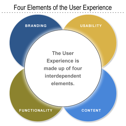
The user experience is primarily made up of a four factors:
- branding
- usability
- functionality
- content
Independently, none of these factors makes for a positive user experience; however, taken together, these factors constitute the main ingredients for a website’s success.
Take, for example, a brilliantly designed site that routinely gives server errors, or times-out. Or imagine a fantastic, database-driven application that, for some reason or other, is never used because it’s buried deep within the bowels of the site’s information architecture. In both cases, we see that the independent elements of branding, usability, functionality and content structure aren’t necessarily indicative of a site’s success. Yet, when taken together, these core elements provide the basis for the user experience.
The Need for an Objective Analysis Tool
Say you’ve got a new lead — they’re unhappy with their Website in its current form and want you to help steer the site in the right direction. If you’re like me, the first thing you’ll do is take a look at the site and make some cursory mental notes. How then do you convey these ideas and notes back to the client without simply ripping the current site apart?
The problem is that each of our perceptions of how ‘good’ or ‘bad’ a Website is, is skewed by our personal backgrounds and specialties within the industry. Asked to evaluate a Website’s benefits and constraints, a developer, usability professional, designer or information architect may come up with an entirely different critique.
An objective tool for measurement and analysis helps you provide your clients with fact-based recommendations, as opposed to mere conjecture and opinion. The methodology we’ll explore in this article will help you to:
- Remove your personal preferences (subjectivity) from the equation as much as possible.
- Enable persons with different backgrounds (designers, developers, clients) to share a common understanding of the site.
- Create ground rules for comparisons of the site to those of competitors, or past development efforts.
- Provide your clients with a fact-based, visual representation of their site’s benefits and limitations.
Measuring the User Experience
As mentioned above, the user experience is made up of four interdependent elements:
- branding
- usability
- functionality
- content
But, how can we quantify and measure these seemingly intangible elements?
The methodology is quite simple. We separate our analysis into four sections — one for each of the four elements of the user experience. For each of these elements, we create a series of statements or parameters against which the Website in question will be measured. A scale of 1 to X is created for each of the statements; we give each statement a score within this range.
Once you’ve completed this first part of the analysis, you should have a score for each of the statements in each of the four sections.
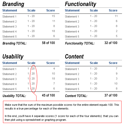
In the sample analysis attached to this article, we only used five statements or parameters for each element. Consequently, we work with a 20-point scale, so that the maximum total score of the site is 100. So, if we added an extra five statements or parameters to each element, we’d rate each on a 10-point scale.
Below, find a brief explanation of each of the elements and the statements or parameters used in the sample analysis.
Branding
Branding includes all the aesthetic and design-related items within a Website. It entails the site’s creative projection of the desired organizational image and message. Statements used to measure branding can include:
- The site provides visitors with an engaging and memorable experience.
- The visual impact of the site is consistent with the brand identity.
- Graphics, collaterals and multimedia add value to the experience.
- The site delivers on the perceived promise of the brand.
- The site leverages the capabilities of the medium to enhance or extend the brand.
Functionality
Functionality includes all the technical and ‘behind the scenes’ processes and applications. It entails the site’s delivery of interactive services to all end users, and it’s important to note that this sometimes means both the public as well as administrators. Statements used to measure a site’s functionality can include:
- Users receive timely responses to their queries or submissions.
- Task progress is clearly communicated (e.g., success pages or email updates).
- The Website and applications adhere to common security and privacy standards.
- Online functions are integrated with offline business processes.
- The site contains administration tools that enhance administrator efficiency.
Usability
Usability entails the general ease of use of all site components and features. Sub-topics beneath the usability banner can include navigation and accessibility. Statements used to measure usability might include:
- The site prevents errors and helps the user recover from them.
- Overall page weight is optimized for the main target audience.
- The site helps its visitors accomplish common goals and tasks.
- The site adheres to its own consistency and standards.
- The site provides content for users with disabilities.
Content
Content refers to the actual content of the site (text, multimedia, images) as well as its structure, or information architecture. We look to see how the information and content are structured in terms of defined user needs and client business requirements. Statements used to measure content can include:
- Link density provides clarity and easy navigation.
- Content is structured in a way that facilitates the achievement of user goals.
- Content is up-to-date and accurate.
- Content is appropriate to customer needs and business goals.
- Content across multiple languages is comprehensive.
In most instances, I use from 10-20 separate statements for each of these four elements. I suggest you use the statements above as a basis for creating your own analysis. Remember that if you add more statements, you must also refine the 20-point scale so that each element’s total score is 100. For example, if you used 10 statements for each element, then your rating scale would be 1-10. If you used 20 statements for each element, your scale would be 1-5.
For a example of this style of analysis download this sample Excel file.
Displaying Your Results
Once you’ve completed your analysis and have values for each of the statements or parameters, it’s time to put this data into a clear, communicative format.
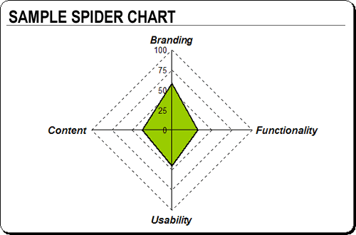
The first thing we want to do is add up all the values for each element. Because we’ve set the point scale to provide with a maximum score of 100 for each element, what we really have is a percentage score. Once we have these percentage values, what I’ve found works best is to create a Spider chart to visually represent them. Microsoft’s Excel or Open Office Calc both work well here, although any spreadsheet program with graphing capabilities will do.
Using your spreadsheet program, you can generate a host of visual representations of the data. See the sample file you downloaded above for more examples.
Get Creative with Your Analysis
The great thing about the analysis and methods described in this article is that they can be catered to your specific client or project needs.
There’s no reason why you couldn’t add a fifth category to the analysis to describe accessibility or business metrics. For example, say you’ve got a government client that needs to adhere to Section 508 regulations (for the U.S.). You could easily create a set of statements or parameters that deal exclusively with the accessibility element, modifying your charts to display accordingly. Likewise, it would be very easy to create a category that deals exclusively with your client’s important business metrics, for example, ROI, click-through rates, conversions, or repeat customers.
Alternatively, this platform of analysis can enable you to add greater weight to particular elements of your choice. Say you have a client who’s a luxury goods manufacturer, and is heavily focused on branding and look and feel. There’s no reason why you couldn’t create a modified measurement system that gave greater weight to the branding elements and less to, say, the usability elements.
Practical Uses
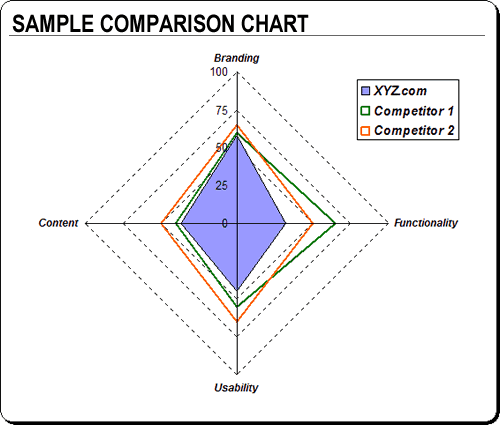
I’ve incorporated this analysis into a number of different projects on which I’ve worked. Often, I include a ‘quick and dirty’ analysis as an appendix to a new client proposal, to provide the prospective clients a snapshot view of where their site stands vis-Ã -vis the competition.
Providing this kind of review also gives you an excellent chance to display your professionalism. Chances are that other firms bidding on the RFP in question will not include such ‘free’ consulting services — and your inclusion of this report in your proposal may be a decisive factor in your favor.
In other instances, I’ve had clients pay for an in-depth analysis of their site complete with recommendations. This type of report includes, for each of the statements or parameters, several descriptive paragraphs complete with examples or screen shots. If I’m ultimately hired to follow through on my recommendations, I often schedule another evaluation six months after the launch of the site as a means of showing improvement, while at the same time reinforcing the value of my services.
This type of analysis can also serve as a gateway project that leads to further business. If you price the analysis well, it can be a great tool for getting your foot in the door and showing the new client the benefits of your services.
Frequently Asked Questions (FAQs) about Quantifying User Experience
What is the importance of quantifying user experience?
Quantifying user experience is crucial in understanding how users interact with your product or service. It provides measurable data that can be used to improve the design, functionality, and overall usability of a product. By quantifying user experience, businesses can identify areas of improvement, make informed decisions, and enhance customer satisfaction. It also helps in validating design decisions, prioritizing product development, and setting benchmarks for future improvements.
How can I measure user experience?
User experience can be measured using various methods such as usability testing, surveys, interviews, and analytics. Usability testing involves observing users while they interact with your product. Surveys and interviews provide direct feedback from users about their experiences. Analytics provide data about user behavior, such as how long they spend on a page or how often they use a feature.
What are some common metrics used in quantifying user experience?
Some common metrics include task success rate, error rate, completion time, and user satisfaction. Task success rate measures whether users can complete a task using your product. Error rate measures how often users make mistakes. Completion time measures how long it takes for users to complete a task. User satisfaction measures how satisfied users are with your product.
How can I improve user experience based on the data collected?
The data collected can be used to identify areas of improvement. For example, if users are having difficulty completing a task, you can redesign that part of your product to make it more user-friendly. If users are making a lot of errors, you can provide more guidance or simplify the process. If users are not satisfied, you can find out why and address their concerns.
What is the role of user experience in product development?
User experience plays a crucial role in product development. It helps in understanding user needs and expectations, which can guide the design and development process. A good user experience can lead to increased user engagement, customer loyalty, and business success.
How does quantifying user experience benefit businesses?
Quantifying user experience provides businesses with valuable insights into how users interact with their products. This can help businesses make informed decisions, improve product design, and enhance customer satisfaction. It can also give businesses a competitive edge by enabling them to deliver superior user experiences.
Can quantifying user experience help in user retention?
Yes, quantifying user experience can help in user retention. By understanding user behavior and preferences, businesses can tailor their products to meet user needs, thereby increasing user satisfaction and loyalty.
How can I ensure the accuracy of the data collected in quantifying user experience?
Ensuring the accuracy of the data collected involves using reliable methods of data collection, such as usability testing, surveys, and analytics. It also involves validating the data by cross-checking it with other sources and using statistical analysis to identify trends and patterns.
What are some challenges in quantifying user experience?
Some challenges include determining the right metrics to measure, collecting accurate data, interpreting the data correctly, and implementing changes based on the data. It also requires a deep understanding of user behavior and preferences, which can be complex and varied.
How can I overcome these challenges in quantifying user experience?
Overcoming these challenges involves using a combination of methods to measure user experience, ensuring the accuracy of the data collected, and using the data to make informed decisions. It also involves continuous learning and improvement, as user needs and preferences can change over time.
Rob owns and manages internet consulting firm Rubiconsult, LLC., which helps small and medium sized clients use the Internet to augment their sales, marketing, and internal business capacity. In addition, Rob runs sports gear ecommerce sites, including MiamiFanGear.com.