
Design trends come and go. But some trends are eternal. Minimalism is one such trend.
HTML5, CSS3 and all the other technology behind websites has grown dramatically over the last decade, making it possible to have more complex webpages today than ever before in history.
And yet, I think minimalist designs still rock.
Dr. Ian Malcolm – Jurassic Park (1993)“… your scientists were so preoccupied with whether or not they could that they didn’t stop to think if they should“
Early in the first Jurassic Park film, Jeff Goldblum’s mumbly, hipster scientist questions the park’s creators with the line above. Similarly in web design, just because technology enables you to add fancy bells and whistles and the kitchen sink to your website, doesn’t mean you should.
In fact, here’s what happens when you go all out embracing the latest technology and add every possible bit of it onto your home page:
 Yes. That’s the real deal – the home page over at Possible which includes sliders, animation, parallax. Go take a look. Perhaps you’ll spot your favorite there too.
It’s very difficult to find the core theme. On the other hand, it still comfortably beats getting shredded by a velociraptor. So there’s that.
Bad designs aside, here are some concrete reasons why a minimalist website may actually be good for business.
Business and Marketing Reasons
1. It forces you to polish your message.
What’s the purpose of your website? What are you trying to convey to your users? Focus on that. Don’t let it get lost in the clutter on your site.

With a minimalist design, you don’t have room to play loose. Every element on the page is deliberate. Every element serves a purpose. You can’t be wishy washy about your message. You can’t write a thousand words and hope that viewers will get the message. You can’t use generic stock photos and graphic fillers. You’re forced to consciously choose only what’s absolutely required and reinforces your message.
2. Convey your USP Better
Since there’s less clutter on the page, you have a chance to make your USP (Unique Sales Proposition) stand out and shine. Take a look at HelpScout. Their home page has a very clean, elegant design. There are a total of about 10 words above the fold (other than the menu), and a single clean background image that subtly shows people diligently working – perhaps the support team that’s going to man your helpdesk.

Check out some other great examples of good and bad USP over here. Notice a common thread among the ‘good’ USP examples? They’re mostly clean, minimal designs.
3. Less Clutter = Better Conversion
Yes, this should be obvious. But it isn’t. Just check this screenshot of the Threadless website just a few weeks ago. Can you find the subscribe button?

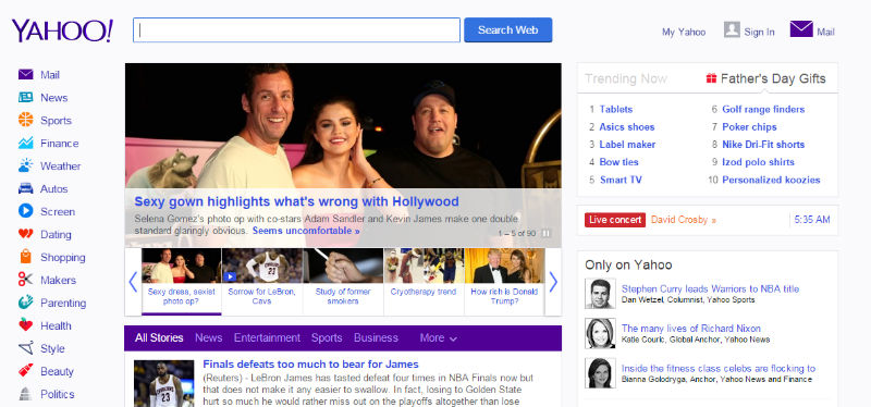
Or better, look at the contrast between Yahoo and Google. Can you guess which of these users are more likely to find and use that search button on?
or…
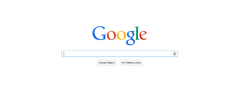
A clean minimalist design helps highlight your CTA in clear, non ambiguous manner.
4. Responsive is just waay easier
Mobile highlights the whole ‘less is more’ experience much better than any thing else. Those who’ve been designing mobile first, understand the crunch that the smaller screen enforces, and are already used to somewhat minimalist designs. You just can’t afford clutter on a 3 inch screen.
But it also works the other way around. It’s so much easier to make minimalist sites responsive, or even port them for mobile. Simply because the layout is simpler, there are fewer elements, and on the whole, lesser, more meaningful content.
User Experience
5. Space. Whitespace. Breathing space.
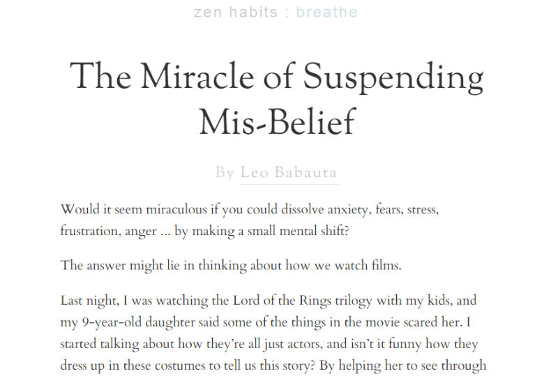
I don’t know if it’s just me, but there’s this sense of calm whitespaces bring. Like it’s ok. I don’t have to rush. A site that uses whitespace effectively conveys that sense of calm and authority. They know what they’re about. They know what matters. They’re not going to bury you with stuff. You have the space to be yourself. The ZenHabits blog captures this beautifully, radiating zen.
6. Navigation is Easier
The minimalist agenda to reduce the clutter also holds for navigation menus. Like everything else, the menu is forced to have only as much as absolutely necessary. Again HelpScout got it right. Their top menu has just four elements. They highlight the most important thing visitors would like to know – Product, Pricing, Blog.
Everything else, like the About page, the legal stuff and the help docs are tucked away under “More”. No cluttering the top header space. No 3 and 4 level deep menus. This just makes it easier for users to find the right page.
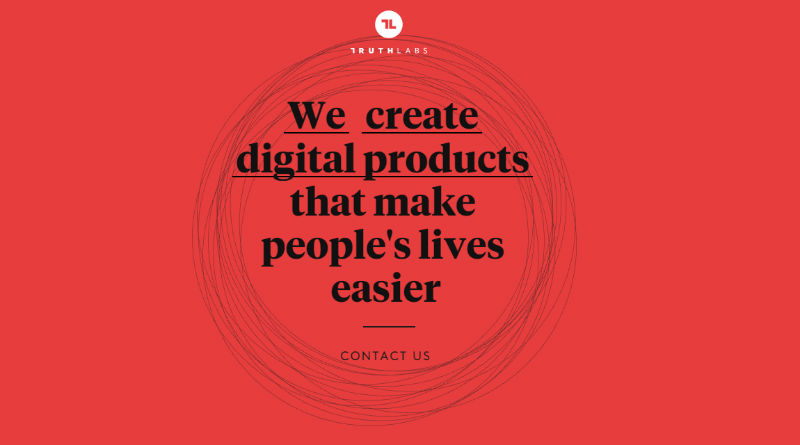
7. Elegant, sophistication
Somehow, a minimalist website exudes an elegance and sophistication. That you’re confident enough. That the business is sure of itself. That you’re not afraid to stand for what you believe in. Look back at ZenHabits. Or take a look at TruthLabs.
Unintentional Side Effects
8. Fewer resources. Less server space. Faster downloads
One of the perhaps unintentional side effects of a minimal site, is that you have less resources. That means less storage space required on your server. That means no overloading your server with large videos, flash or other jazzy content. No slowing it down with a hundred plugins, and overall faster page loads.
47% of consumers expect a page to load in 2 seconds or less.
Kissmetrics has a good infographic showing the impact of page load times on business revenues. Even Google penalizes slow websites.
9. Less Maintenance Effort
Cleaner designs not only result in fewer resources to save and download, but also fewer resources to maintain. Just updating all the plugins, libraries, frameworks that go into making your website can be a nightmare. And then you have to make sure all the updates haven’t caused any compatibility issues.
With minimal designs, chances are you’ve skipped the bells and whistles. You don’t have as many plugins etc to update.
Conclusion
Some of the points I’ve written about would fall under good design principles anyways, but often get skipped in favor of convenience, or a time/price crunch. Minimalist designing forces you to make conscious design decisions. It makes you question each element, each resource on the page – many that we would normally just take for granted. Each resource has to earn it’s place. Each element that is not absolutely required, is dropped.
Note that a minimal design may not work for all scenarios and businesses. You need to take a call about how basic or minimal you want to go with a particular design.
At the same time, do remember that just because we can do fancy designs doesn’t mean we should. Just because new features, elements, queries have been added to CSS, doesn’t mean we need to use them all.
At the end of the day, it’s important not to loose focus of the real purpose of the design. Minimalism ensures that you focus on the customer, on the message.
Staying minimal can give a huge ROI.
Frequently Asked Questions about Minimalist Website Design
What are the key elements of a minimalist website design?
Minimalist website design is characterized by simplicity and functionality. The key elements include a limited color palette, often with a lot of white or neutral space. The typography is clean and straightforward, and the layout is uncluttered, with a focus on the content rather than decorative elements. Images are used sparingly and purposefully, often in black and white or muted tones. Navigation is intuitive and easy to use, with a focus on user experience.
Why is minimalist design popular in website design?
Minimalist design is popular because it puts the focus on the content, making it easier for users to find what they’re looking for. It also loads faster and is more mobile-friendly, which is increasingly important as more people use their phones to browse the web. Additionally, minimalist design has a modern, professional look that appeals to many businesses.
How can I make my website more minimalist?
To make your website more minimalist, start by removing any unnecessary elements. This includes decorative images, excessive text, and complex navigation menus. Stick to a simple color palette and clean typography. Make sure your content is concise and easy to read. Finally, ensure that your website is easy to navigate, with clear calls to action.
Can minimalist design affect SEO?
Yes, minimalist design can positively affect SEO. By reducing clutter and focusing on content, you can improve your site’s load time, which is a factor in search engine rankings. Additionally, a clean, easy-to-navigate site can improve user engagement, which can also boost SEO.
What are some examples of successful minimalist websites?
Some examples of successful minimalist websites include Apple, Google, and Airbnb. These sites use a simple color palette, clean typography, and plenty of white space to create a user-friendly experience.
Is minimalist design suitable for all types of websites?
While minimalist design can work well for many types of websites, it may not be suitable for all. Websites that require a lot of information or functionality may not be suited to a minimalist design. However, even complex websites can benefit from incorporating minimalist principles, such as simplicity and functionality.
How can I balance minimalism with functionality in website design?
Balancing minimalism with functionality involves focusing on the user experience. Every element on your website should serve a purpose. Use white space to highlight important content, and make sure your navigation is intuitive. While you want your design to be simple, you also need to ensure that users can easily find what they’re looking for.
Can minimalist websites still be visually appealing?
Absolutely. In fact, one of the key principles of minimalist design is that form follows function. This means that a well-designed minimalist website can be very visually appealing. The use of white space, a limited color palette, and clean typography can create a sophisticated, modern look.
How does minimalist design contribute to mobile-friendly websites?
Minimalist design contributes to mobile-friendly websites by reducing clutter and improving load times. A simple, clean design is easier to navigate on a small screen, and a faster load time can improve user experience and SEO.
What are some common mistakes to avoid in minimalist website design?
Some common mistakes to avoid in minimalist website design include over-simplifying to the point of removing necessary functionality, using too little contrast, which can make the site hard to read, and not using enough white space, which can make the site feel cluttered despite its minimalist design.
 Richa Jain
Once upon a time, Richa was a savvy techie & manager, in the semiconductor software industry. After her miraculous escape and recovery, she now works from her garden, creating websites, writing about technology, business & entrepreneurship; and helping others escape the cubicle lifestyle.