Layout and Composition
For many web developers, myself included, the most intimidating part of the design process is getting started. Imagine for a moment that you're sitting at your desk with nothing other than a cup of coffee and the business card of a potential client who needs a basic corporate website. Usually, a business card speaks volumes about a company's identity, and can be used as design inspiration.
Unfortunately, that's not the case with the card for Smith's Services below. It's black and white, all text, no character. Bleurgh! Talk about a blank canvas! So, where do you go from here? You need a plan … and you need to contact Mr. Smith. With some critical input from the client about what his company actually does, and by gathering information about the content you have to work with, you'll be able to come up with a successful design.
Anyone, no matter what level of artistic talent, can come up with a design that works well and looks good. All it takes is a little experience and a working knowledge of some basic layout principles. So let's start with the basics, and before long you'll have the foundation necessary to design gallery-quality websites.
The Design Process
Designing a website can be a double-edged sword. The process falls somewhere between art, science, and problem solving. Yes, we want to create an individual site that's aesthetically pleasing, but our highest priority should be to meet the needs of our client. These needs may be lofty and elaborate, or they may just be about making information available. If we fail to listen carefully, though, the entire project will come falling down. The process of creating a design comp, however, can be boiled down to just three key tasks: discovery, exploration, and implementation.
What’s a Comp?
The word comp is an abbreviation of the phrase “comprehensive dummy”—a term that comes from the print design world. It’s a complete simulation of a printed layout that’s created before the layout goes to press. In translating this term to web design, a comp is an image of a layout that’s created before we begin to prototype the design in HTML.
Discovery
The discovery component of the design process is about meeting the clients and learning what they do. This may feel a little counterintuitive, but gathering information about who your clients are and how they run their business is vital in coming up with an appropriate and effective design.
Before you schedule your first meeting with a client, spend some time researching their business. If they've asked you to design a website, they may currently be without one, but google them anyway. If you're unable to find any information about their business specifically, try to learn as much as you can about their industry before the first meeting. Whenever possible, the first meeting with a client should be conducted in person. Sometimes, distance will dictate that the meeting has to occur over the phone, but if the client is in town, schedule a time to meet face to face.
Keep in mind that this meeting is less about impressing the client, selling yourself, or selling a website than it is about communication and establishing just what it is the client wants. Try to listen more than you speak, and bring a pad for taking notes. If you bring a laptop or tablet with you to talk about website examples, limit the time spent using it. Computers have screens, and people tend to stare at them, which isn't conducive to a good meeting or to note taking. If you must drag some technology into the meeting, use a voice recording app to record the conversation-with the client's permission, of course. In my experience, though, pen and pad are less threatening and far less distracting to the often not-so-tech-savvy client.
Client Meetings Don't Have to Take Place in an Office
Even when I worked for a company in a big office, I had some of my most productive client meetings at a café or over lunch. The feasibility of this approach depends on the client. If your contact seems to be more the formal business type, don't suggest it. In many cases, though, it's a good way to make a business meeting more personal.
Below are some of the questions I like to ask in initial client meetings, even if I've already established the answer myself via a search engine.
If the project is a new website development:
- What does the company do?
- What is your role in the company? (This question is especially important if this person is going to be your main point of contact.)
- Does the company have an existing logo or brand?
- What is your goal in developing a website?
- What information do you wish to provide online?
- Who are your competitors and do they have websites?
- Do you have examples of websites you like or dislike?
If the project is to redesign an existing website, I also like to ask:
- What are your visitors usually looking for when they come to your site?
- What are the problems with your current design?
- What do you hope to achieve with a redesign?
- Are there any elements of the current site that you want to keep?
- How do you think your visitors will react to a new site design?
If the project is a new app development:
- What is the goal of the app?
- What platforms does it need to work on (web/native)?
In all three cases I like to ask:
- Do you have examples of apps/sites you like or dislike?
- Are there competitors to the app/site in this field?
- Who comprises your target audience? Do its members share any common demographics, like age, sex, or a physical location?
- What kind of timeline do you have for the project and what is the budget?
Sometimes I start off with more questions than those listed here. Use your imagination and try to come up with some creative queries that will really give you more insight into the client's organization. If you're a programmer, avoid tech jargon. If you're a designer, avoid talking specifically about design. Sure, that may be all you're thinking about, but things like semantic markup and responsive layouts will likely mean very little to the client. Worse still, these types of conversations can bring misguided design opinions your way before you have a chance to start thinking about the design yourself.
Exploration
The next stage of the design process is to take the information you've learned from the client back to your laboratory for analysis, dissection, and experimentation. You want to develop a firm grasp on all the information, products, and services they have to offer, and play around with how these could be arranged. Put yourself in the shoes of the website visitors and ask yourself what these people are looking for. If you're thinking about buying a product, what do you need to know before you buy? If you're signing up for a service, where would you learn about the different offerings and which level of service you need? What is the clearest title possible for page X, and how many steps does it take to reach page Y?
In the world of web design, this is the beginning of a process known as information architecture, or IA for short. For expansive websites and complex web applications, information architecture is a career in itself, but the guiding principles of this field can provide a solid foundation for even the smallest websites. For the exploration stage of our process, we want to focus on organizing the content and flow of the website into a structure we can design around.
Two of the most essential tools for this task are scrap paper (or a whiteboard if you have one) and a big block of sticky notes. Make a list of all the bits and pieces of the website and start arranging them into groups and subgroups. These are likely to move around quite a bit, and that's where the sticky notes come in handy. If you make a note for every section, subsection, and page of the site, you can arrange them on a wall in the order they'll appear in your site's navigation. You'll want to avoid overwhelming the visitors with too many options, but you also don't want to bury information too deeply within the site-that is, too many clicks away from the home page. There are no hard and fast rules for this activity; just make the information as obvious and as easy to reach as possible.
Implementation
Now that we've thought through how we want to organize the information we're working with, the implementation step of our design process begins with creating a layout. Regardless of the project, try to avoid being caught up in the technology associated with building websites—at least at first. At this point, it's unimportant whether the site is going to comprise straight HTML, a template for a content management system, or a Ruby on Rails application. The bottom line is that we have an interface to design and a blank sheet of paper. "Paper?" That's right, paper. Did you really think I was going to let you go back to your precious computer already? No way. Here's why: it's easy to lose focus on the design if you start thinking about the layout in front of a computer. If you start out on paper, you can ignore the technical limitations of browsers and CSS, and focus on how you want the final product to look. You might think that all good designers carry around fancy, hard-bound sketch books in which they flourish expensive markers and paintbrushes to design Da Vinci-esque renderings of potential web page layouts. For my part, I use a 79-cent, spiral-bound notebook and any writing instrument I can find on my desk that still works.
I start out by sketching a few possible layouts. After I've produced a few, I decide on one I like, jump into Photoshop, and use the rectangle tool to block out the areas I've marked down on paper. Once I've defined my layout, I experiment with foreground and background colors until I have a solid color scheme. I continue twiddling the Photoshop knobs and pushing around pixels until, finally, magically, I have a comp to show the client.
Simple, right? Okay, perhaps I skipped a few steps in that brief description. Honestly, though, when people ask me how I do what I do, they usually receive a similar explanation. The truth is that there are reams of now—subconscious information from my past experience and those old college design and art classes that have helped me to define my own design process.
Learning how to design is like learning how to program. Some people have a bit of a knack for it, but anyone can learn. Just as there's good code and ugly code, there's good design and ugly design. Learning some of the principles and conventions associated with design will help you to understand the difference between the good, the bad, and the ugly, moving you towards establishing your own design process.
Defining Good Design
There are two main standpoints from which most people determine whether a website design is "good" or "bad". There's a strict usability angle, which focuses on functionality, the effective presentation of information, and efficiency. Then there's the purely aesthetic perspective, which is all about the artistic value and visual appeal of the design. Some people become caught up in the aesthetics and graphics, and forget about the user, while some usability gurus get lost in their user testing and forget about visual appeal. In order to reach people and retain their interest, it's essential to maximize both.
The most important point to keep in mind is that design is about communication. If you create a website that works and presents information well, but looks ugly or fails to fit with the client's brand, no one will want to use it. Similarly, if you make a beautiful website that's hard to use or inaccessible, people will leave. Indeed, the elements and functionality of a finished website design should work as a single cohesive unit. Below are listed some of the reasons for this.
Users Are Pleased by the Design but Drawn to the Content
One of the biggest concerns among usability professionals is the time it takes users to scan the page for the information they want, be it a piece of content, a link to another page, or a form field. The design should not be a hindrance; it should act as a conduit between the user and the information.
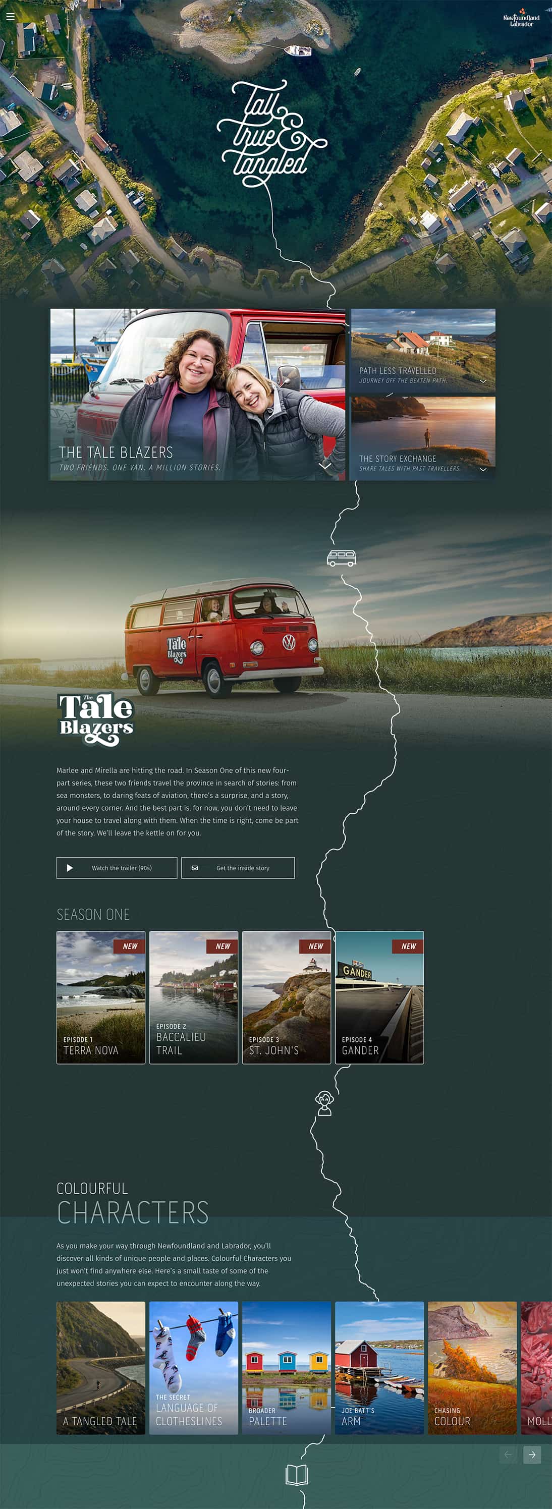
Tall, True and Tangled is a video travel journal following the journey of two friends through Newfoundland and Labrador in Canada. The "tall, true and tangled" in the title refers to the stories that Marlee and Mirella collect along the way. This idea of striking out on a grand adventure has been cleverly captured in the design, where the bird's-eye, map view of a beautiful Labrador cove perfectly frames a calligraphic logo. This logo then tails off to become a meandering road that tracks with you down the page. Topographic contour lines become tasteful decoration backing up the journey/map theme. It all works together to make navigating the page feel a little like taking a winding road trip. However, these little design flourishes don't for a moment detract from the great stories—both text and video—that you encounter as you scroll. This is rich, inventive, fun design.
Users Can Move about Easily via Intuitive Navigation
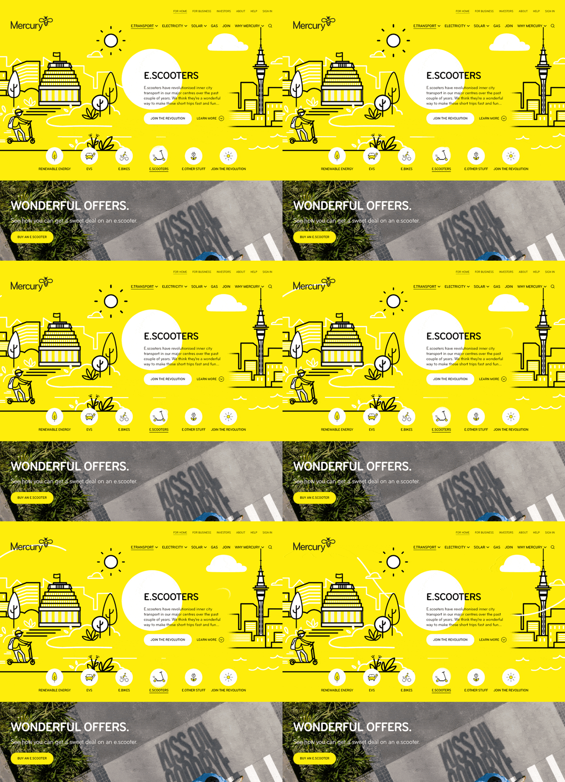
We'll talk more about the placement of navigation later, but the main navigation block itself should be clearly visible on the page, and each link should have a descriptive title. A navigation structure that not only changes appearance when hovered over with the cursor, but also indicates the active page or section, helps users to recognize where they are, and how to get where they want to go. New Zealand renewables tech company Mercury pinpoints your current location instantly in For Home, E.Transport, and E-Scooters in the example below.
Secondary navigation, search fields, and outgoing links should not be dominant features of the page. If we make these items easy to find, and separate them visually from the content, we allow users to focus on the information—while they'll still know where to look when they're ready to move on to other content.
Users Recognize Each Page as Belonging to the Site
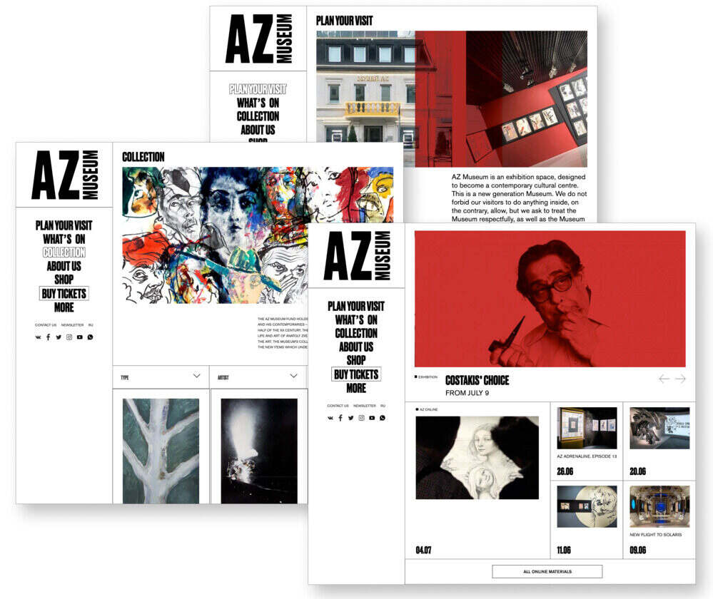
Even if there's a dramatic difference between the layout of the home page and the rest of the site, a cohesive theme or style should exist across all site pages to help hold the design together. The supporting site for Russia's AZ Museum slices and dices its layouts in lots of different ways, but there's no chance of becoming disoriented with that strong first column navigation on every page.
Web Page Anatomy
Even from a non-designer's standpoint, defining a design that satisfies all the requirements I outlined above is a simple task. It's similar to making a phrase on your refrigerator with magnetic poetry words. Although there are millions of ways to arrange the words, only a few arrangements make any sense. The magnetic words are like the components, or blocks, of the web page. Although the number of these necessary blocks depends on the size and subject of the site, most websites have the components seen below.

Let's look at each of these components in turn.
The Containing block
Every web page has a container. This could be in the form of the page's body element, or an all-containing section or div. Without some sort of container, we'd have no place to put the contents of our page. The elements would drift beyond the bounds of our browser window and off into empty space. The width of this container can be fluid, meaning that it expands to fill the width of browser window, or fixed, so that the content is the same width no matter what size the window is.
The Logo
When designers refer to an "identity", they're referring to the logo and colors that exist across a company's various forms of marketing, such as business cards, letterhead, brochures, and so on. The identity block that appears on the website should contain the company's logo or name, and sit at the top of each page of the website. The identity block increases brand recognition while informing users that the pages they're viewing are part of a single site.
Identity vs Branding
Many people use the words “identity” and “branding” interchangeably. Branding is a broad term that describes the process of developing an awareness of a company, product, or service. The branding process involves advertising, market research, customer feedback, and much more. Identity is actually a subset of branding, in that it deals only with the visual aspects of branding.
The Navigation
It's essential that the site's navigation system is easy to find and use. Users expect to see navigation right at the top of the page. Whether you plan to use vertical menus down the side of the page, or a horizontal menu across the page, the navigation should be as close to the top of the layout as possible. At the very least, all main navigation items should appear "above the fold."
Above the Fold
The fold, as many designers call it, is where the content of a page ends before users scroll down. This metaphor is derived from the fold in a newspaper. If you look at the cover of a folded newspaper, most of the headlines and biggest news appear in the top half, so that the most important news items can be seen at a glance when the newspaper is folded. The location of the fold on a web page depends on the browser dimensions and the user’s screen resolution.
The Content
Content is king. Content consists of any text, images, or videos found on a website. A typical website visitor will enter and leave a website in a matter of seconds. If visitors are unable to find what they're looking for, they'll undoubtedly close the browser or move on to another site. It's important to keep the main content block as the focal point of a design, so that visitors can scan the page for the information they need.
The Footer
Located at the bottom of the page, the footer usually contains copyright, contact, and legal information, as well as a few links to the main sections of the site. By separating the end content from the bottom of the browser window, the footer should indicate to users that they're at the bottom of the page.
Whitespace
The graphic design term whitespace (or negative space) refers to any area of a page without type or illustrations. While many novice web designers (and most clients) feel a need to fill every inch of a web page with photos, text, tables, and data, empty space on a page is every bit as important as content. Without carefully planned whitespace, a design will feel closed in, like a crowded room. Whitespace helps a design to breathe by guiding the user's eye around a page, but it also helps to create balance and unity-two important concepts that we'll discuss in more detail later in this chapter.
At this point, we've had our initial meeting with Mr. Smith, our theoretical client, and it was helpful. He explained very thoroughly what his business does and what he wants the site to achieve. Even though we've yet to see actual content, we can use the standard blocks of web page anatomy to start developing a layout. Although other site-specific blocks are worked into the designs of many website layouts, the web page anatomy works to summarize the most common blocks.
Now that we have this information, how can we use it to create a foundational layout for Smith's Services?
It's time for some grid theory.
Grid Theory
When most people think about grids, they think about engineering and architecture. However, the grid is an essential tool for graphic design as well, and the use of grids in website design has exploded in popularity over the years.
Using a grid is more than simply making elements on the page square and lined up. It's about proportion as well. That's where the theory comes into grid usage. Many art historians credit Dutch painter Piet Mondrian as the father of graphic design for his sophisticated use of grids. Yet classical grid theory has influenced successful artistic efforts for thousands of years. The concept of dividing the elements of a composition extends back to the mathematical ideas established by Pythagoras and his followers, who defined numbers as ratios rather than single units.
The Pythagoreans observed a mathematical pattern that occurred so often in nature that they believed it to be divinely inspired. They referred to this pattern as the golden ratio or divine proportion. The basic idea is illustrated below.

A line can be bisected using the golden ratio by dividing its length by 1.62. This magical 1.62 number is really 1.6180339 …, an irrational number that's usually represented as Φ (pronounced "phi"). Explaining the math used to come up with this number is a bit too involved for this discussion, and is likely to be of no real help to you becoming a better designer, so I'll spare you the details. Besides, my math is a little rusty.
So just what does this ratio have to do with graphic design? In general, compositions divided by lines that are proportionate to the golden ratio are considered to be aesthetically pleasing. The artists of the Renaissance used divine proportion to design their paintings, sculpture, and architecture, just as designers today often employ this ratio when creating page layouts, posters, and brochures. Rather than relying on artistic judgement, divine proportion gives us logical guidelines for producing appealing layouts.
The aloe cactus pictured below is an example of the golden ratio at work in nature. The scaling of each successive row of cactus spikes provides a perfect balance of spike placement and sun exposure.

Image Credit: Aloe Polyphylla: J Brew, 2005
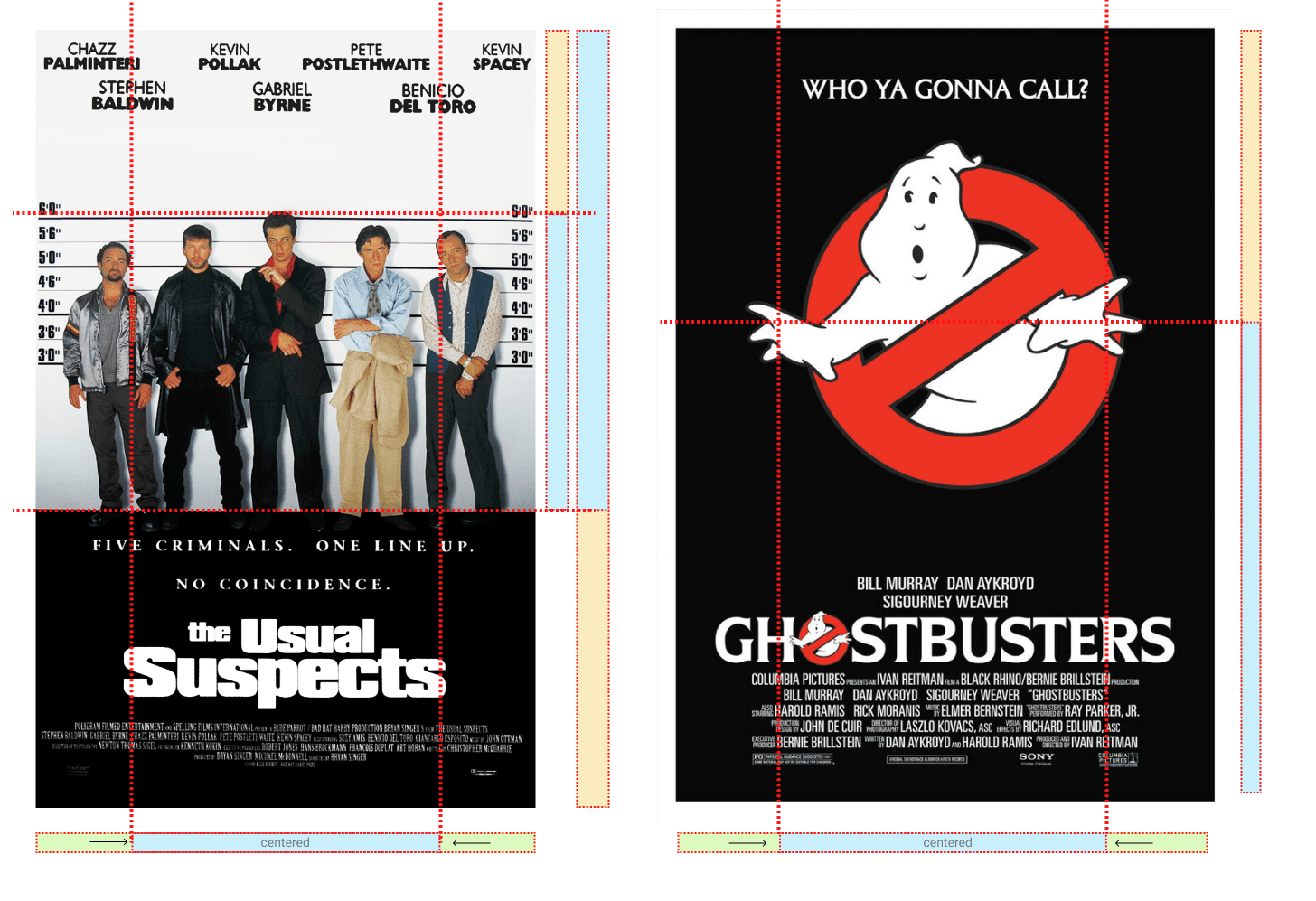
This ratio thrives in good design. Movie posters like those featured below show how the golden ratio can be used as a way to both divide the canvas and position focal points. Keep in mind that these are useful guides, not irrefutable laws. The Ghostbusters poster clearly uses the golden ratio to size and position the red circle graphic, but the designers needed to bump that whole unit to the right slightly to balance the hand poking out on the left. If they'd perfectly centered that circle, the design would feel unbalanced.
The Rule of Thirds
A simplified version of the golden ratio is the rule of thirds. A line bisected by the golden ratio is divided into two sections, one of which is approximately twice the size of the other. Dividing a composition into thirds is an easy way to apply divine proportion without your calculator.
For quick layout experimentation, I like to start off by drawing a bunch of simple rule-of-thirds grids with pencil and paper. Just draw a rectangle, divide it into thirds horizontally and vertically, then draw a line between each vertical line to create six columns to work within, as shown below.

With this simple gridwork in place, we can begin to lay out our elements. This is often referred to as a "wireframe". Wireframes are simple sketches or layouts where you design blocks of content and their positioning on the page. Wireframes are extremely useful, because you can quickly and easily move elements around. The largest, outermost rectangle represents the container that we talked about in the section called "Web Page Anatomy". When using this method of layout design, I like to place the biggest block first. Usually, that block represents the content.
In my first rule-of-thirds grid, I place the content block within the two thirds of the layout at the lower right. Next, I place my navigation block in the middle third of the left-hand column. I place the text part of the identity block over the left side of the content, and the image part of the identity over the menu. Finally, I squash the copyright block below the content, in the right-hand column of the grid. The result is the top left of the four possible layout arrangements shown below.

These initial sketches provide a quick look into what general layout approaches might work for your website. No need to stop there, though. The growth in popularity of grid-based design on the Web has inspired many great articles about-and tools for-designing websites on a grid.
CSS Frameworks
A CSS framework is a CSS system that is set up to handle the grid structure of a website. Most modern CSS frameworks are based on a 12-column grid, mostly because of the variety of column widths it offers, as twelve is divisible by 1, 2, 3, 4, and 6. Foundation, Bootstrap, Bulma and TailwindCSS are all frameworks based on a 12-column grid-athough they can be customized to any number.
I usually start designing on a 12-column sketch sheet to make it easy to transition from my sketches and mockups to an actual working prototype. As you experiment with different arrangements for your own layouts, use the columns of whatever grid you've chosen as alignment guides for the identity, navigation, content, and footer blocks. It's very tempting to arrange all your elements within the same one or two blocks, but try to avoid this, as it's not very interesting visually. Instead, consider pushing some elements into another column or off the grid entirely.
One of the most common complaints you hear from new designers is that grids make designs too boxy and constrained. That's a cop-out. While grids can always suggest good positions to place elements, there's no reason to feel boxed in by them.
Take the design for The Collective work/living spaces (below). The design uses lots of organic shapes and photo masks to create a quirky, flowing layout with very few square edges. However, roll a 14-column grid across it and the underlying structure becomes clearer. The two outer-most columns are treated mostly as text-free gutters, leaving a classic 12-column grid to divide up the remaining real estate. There's a lot of careful order and structure to this design, but it's skillfully obscured when you can't see the grid.

Notice that, even in the naturally rectangular "locations" area at the bottom, the designers have used vertical offsets and irregular background shapes to camouflage any underlying blockiness.
To quote Josef Müller-Brockmann, graphic design pioneer (and author of Grid Systems in Graphic Design):
The grid system is an aid, not a guarantee. It permits a number of possible uses and each designer can look for a solution appropriate to his personal style. But one must learn how to use the grid; it is an art that requires practice.
The longing we have for structure, grids, and ideal proportion is deeply ingrained in human nature. A layout that "doesn't look quite right" can often be fixed by moving elements and resizing them on the grid. So if a layout isn't working, keep experimenting. At some point, all the pieces will click together and the Tetris level-up sound will play in your head. You'll have achieved balance.
Balance
In a figurative sense, the concept of visual balance is similar to that of physical balance illustrated by a seesaw. Just as physical objects have weight, so do the elements of a layout. If the elements on either side of a layout are of equal weight, they balance one another. There are two main forms of visual balance: symmetrical and asymmetrical.
Symmetrical Balance

Symmetrical balance, or formal balance, occurs when the elements of a composition are the same on either side of an axis line, as shown below. The digital painting Contemplation by David Lanham, shown below, illustrates this concept well. Notice how the male and female figures are similar in position and proportion. Even the shaded background boxes are mirror images of one another.

Although it may not be practical for all designs and clients, this type of symmetry—called horizontal symmetry —can be applied to website layouts by centering content or balancing it between equal columns. Momentum Energy is an interesting example of using symmetry to balance their twin goals of sales and support. Notice on the screenshot below that they've halved the screen between a tagline/CTA (sales) on the left and major navigation (support) on the right. What's even more remarkable is the navigation list is the largest text on the screen. This is an unconventional design—perhaps even uncomfortable—but I suspect it's an earnest attempt to reduce human phone and email support costs.
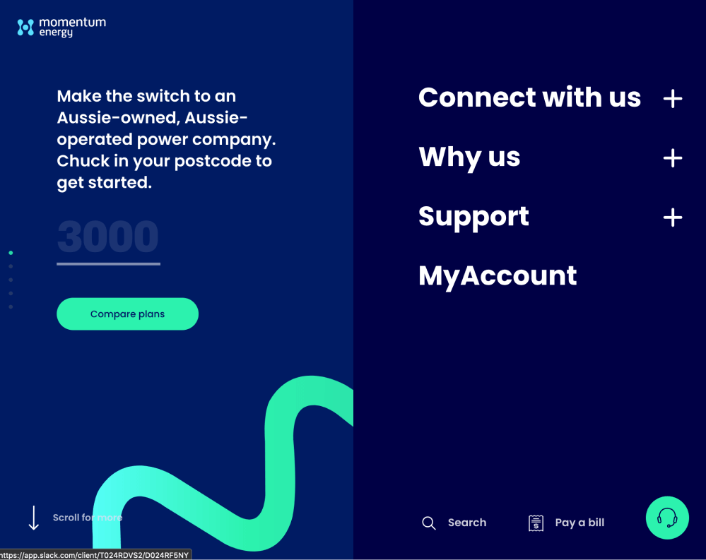
The two other forms of symmetrical balance are less common in website design, due to the nature of the medium. They are, however, commonly exhibited in logo and print design:
- bilateral symmetry, which exists when a composition is balanced on more than one axis
- radial symmetry, which occurs when elements are equally spaced around a central point
Asymmetrical Balance

Asymmetrical balance, or informal balance, is a little more abstract (and more visually interesting in general) than symmetrical balance. An example of asymmetrical balance is shown above. Rather than mirror images on either side of the layout, asymmetrical balance involves objects of differing size, shape, tone, or placement. These objects are arranged so that, despite their differences, they equalize the weight of the page. For instance, if you have a large object on one side of a page, and partner it with several smaller items on the other side, the composition can still feel balanced.
The concert poster by my friend Jeremy Darty, presented below, is a fine example of asymmetrical balance. The visual weight of the large pink flamingo on the left is balanced by the combined weight of the smaller flamingos and text blocks on the right-hand side of the layout. Notice, also, Jeremy's use of the rule of thirds. The blue cloud behind the Pop Sucks title takes up one third of the vertical space and spans two thirds of the horizontal.

Take a look at the photo of the three stones in the image below. It may not be a particularly exciting picture, but as far as balance goes, it rocks! If you were to use a piece of paper to cover any one of the three stones below, the entire photograph would feel unbalanced and unfinished. This is generally the way balance works. It's as if the entire composition is in a picture frame hanging by a single nail on the wall. It barely takes much weight on one side or the other to shift the entire picture off balance.

Unlike symmetrical balance, asymmetrical balance is versatile and, as such, is used more often on the Web. If you take a look at most two-column website layouts, you'll notice that the wider column is often lighter in color—a tactic that creates a good contrast for the text and main content. The smaller navigational column is often darker, has some sort of border, or is made to stand out in another way, in order to create balance within the layout.
The landing page for online mail service Handwrytten shows how you can rebalance a page without needing to radically change the core content. Let's break it down. There are two major content areas on the page.
- On the left, the Handwrytten logo, the tagline and the call to action are the first things they want you to notice.
- On the right, they have visual demonstration of what the product is —a handwritten letter in an envelope. This service is a new concept, so it's important to show the actual product.
Their problem was that letters and envelopes are lightweight objects (visually and physically) and struggled to compete against the heavier tagline/CTA elements on the left. They needed some visual weight.
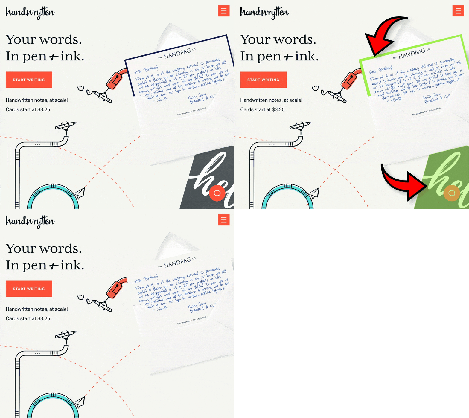
No need to panic. As the figure above shows, Handwrytten's designers added two elements to the design:
- They created a thick dark border on the letter.
- They positioned a dark "hello" card behind the envelope to give it extra visual gravity.
Neither are critical to the page content, but the design becomes visually floaty and unmoored when I take them away.
Unity
Design theory describes unity as the way in which the different elements of a composition interact with one another. A unified layout is one that works as a whole rather than being identified as separate pieces. Take the monkeys in the image below, for example. Their similarity of shape (not to mention their identical color) enables them to be recognized as a group, rather than as four disparate elements.
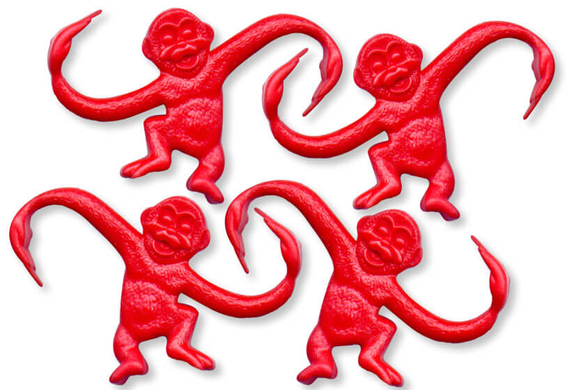
Although less of an issue these days, unity is one of the many reasons web designers have always despised HTML frames. It's important that unity exists not only within each element of a web page, but across the entire web page. The page itself must work as a unit. We can use a couple of approaches to achieve unity in a layout (aside from avoiding frames): proximity and repetition.
Proximity
Proximity is an obvious, but often overlooked, way to make a group of objects feel like a single unit. Placing objects close together within a layout creates a focal point towards which the eye will gravitate. Take a look at the digital painting below. While composed of a seemingly random assortment of strokes, the five strokes that are the closest to each other appear to form a unified object.
We practice the concept of proximity on the Web when we start setting margins and padding for elements. For instance, when I define the CSS style rules for sites, I usually change the default margin that exists between common HTML elements such as headings (h1, h2, h3 …), paragraphs, blockquotes, and even images. By altering these values, I can cause more or less space to appear between elements, thereby creating groups.
If you look at the two columns of text below, you'll notice that they look similar. The only difference is in the placement of the headings. In the column on the left, the word "Unkgnome" is equidistant from the top and bottom paragraphs. The result is that it looks more like a separator than a heading for the next paragraph. In the second column, the "Gnomenclature" heading is placed closer to the paragraph that follows it. In accordance with the rules of proximity, this heading appears to belong to that block of text.

Repetition
A gaggle of geese, a school of fish, a pride of lions. Any time you bring a set of like items together, they form a group. In the same way, repetition of colors, shapes, textures, or similar objects helps to tie a web page design together so that it feels like a cohesive unit. The example below illustrates repetition. Even though other similar strokes exist, the nine red strokes on the left-hand side appear to be a unified group because they repeat a shape, color, and texture. The strokes to the right of this group have no repeated pattern, so they appear isolated, even though there are other shapes nearby.
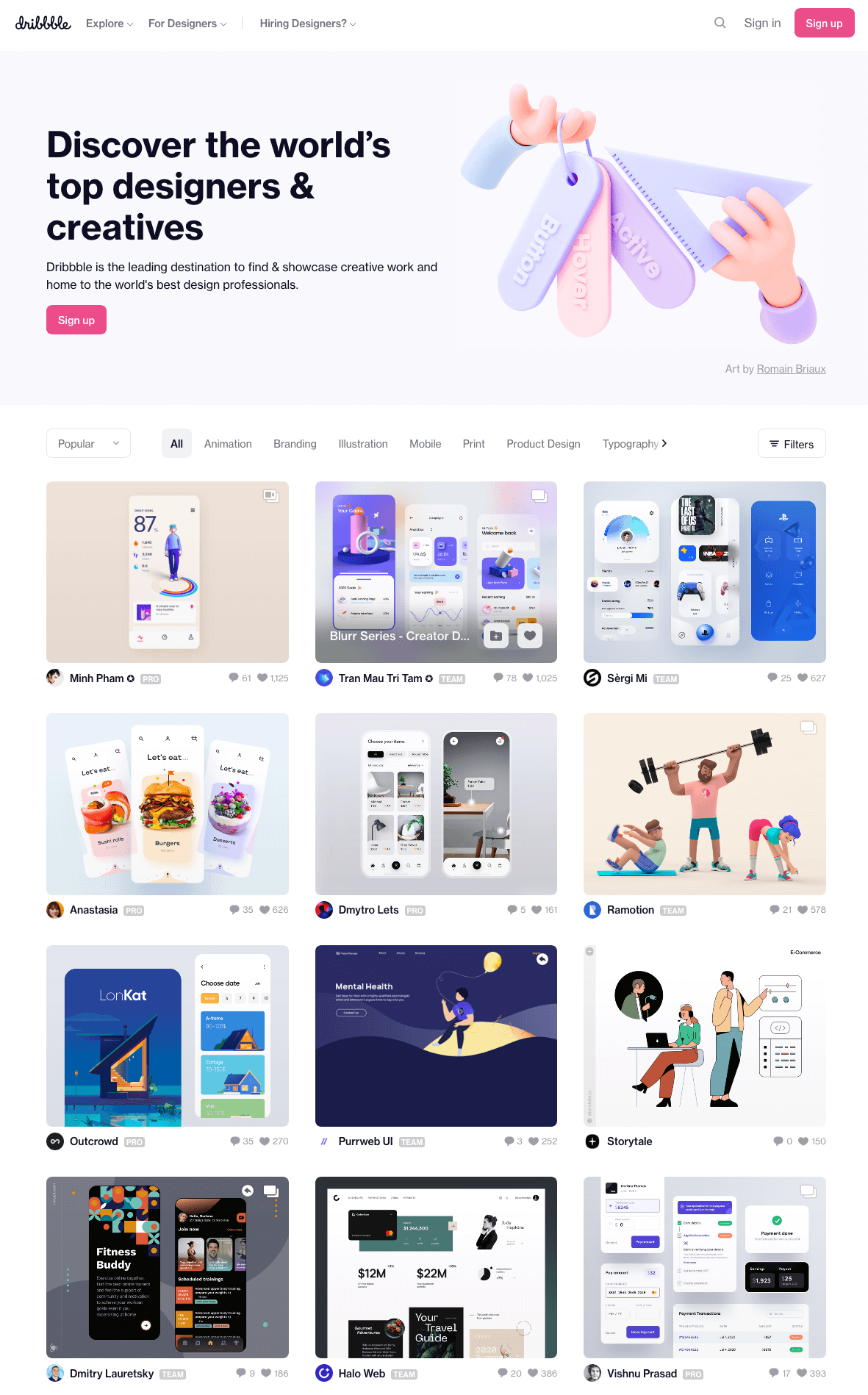
Whether you notice it or not, repetition is often used in website designs to unify elements of the layout. An example of this concept at work among unmodified HTML elements is the bulleted list. The bullet that precedes each list item is a visual indicator that the bullet items are parts of a whole. Repeated patterns and textures can also help to unify a design. Take a look at the screenshot of Dribbble, a hub for designers and developers to showcase and share their work. This layout contains many eye-catching elements, but the repeated thumbnail images with the views, comments and like icons create a sense of unity, while the navigation bar and the open content area give plenty of room to show off all of this awesome, unique design work.
Emphasis
Closely related to the idea of unity is the concept of emphasis or dominance. Rather than focusing on the various elements of a design fitting together, emphasis is about making a particular feature draw the viewer's attention. When you design a web page layout, often you'll identify an item in the content, or the layout itself, that you want to stand out. Perhaps it's a button for users to press, or an error message for them to read. One method of achieving such emphasis is by making that element into a focal point. A focal point is any element on a page that draws the viewer's eye, rather than just being part of the page as a whole or blending in with its surroundings. As with unity, there are a few tried-and-true methods of achieving a focal point.
Placement
Although the constraints of practical web design don't often allow for it, the direct center of a composition is the point at which users look first, and is typically the strongest location for producing emphasis. The further from the center an element is, the less likely it will be noticed first. On the Web, the top-left corner of the page also tends to demand a lot of attention for those of us who read from left to right (remember that many languages, like Hebrew and Arabic, are read from right to left) and scan a page from top to bottom.
Continuance
The idea behind continuance or flow is that when our eyes start moving in one direction, they tend to continue along that path until a more dominant feature comes along. The image below demonstrates this effect. Even though the bottom splotch is bigger and therefore tends to catch your eye first, your brain can't help but go "Hey, looky there, an arrow!" Soon enough, you'll find yourself staring at the smaller object.

Continuance is one of the most common methods that web designers use to unify a layout. By default, the left edge of headings, copy, and images placed on a web page form a vertical line down the left side of a page before any styling is applied. A simple way to make additional use of this concept is to align elements to the lines of your grid. This creates multiple lines of continuance for your visitors' eyes to follow down the page.
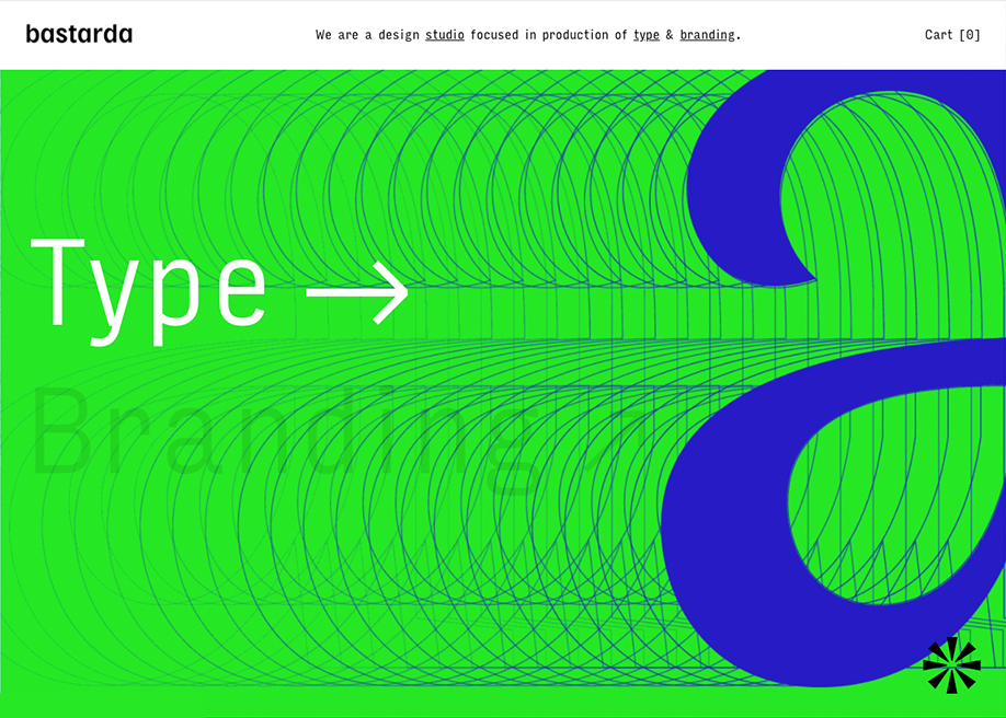
The example below-a screenshot of the site of type agency Bastarda —is a great example of continuance. Every curve, every echo drives your eye to the right, in this case for no particularly useful reason. In fact, this image is only one frame out of a blipvert of images that Bastarda hammer you with on hover. It's very punk rock. Be warned.
Isolation
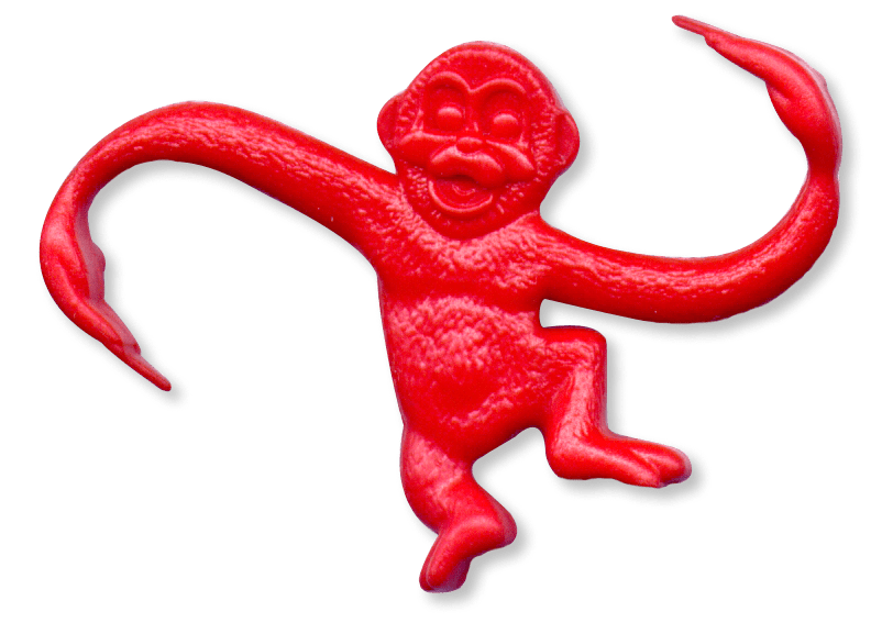
In the same way that proximity helps us create unity in a design, isolation promotes emphasis. An item that stands out from its surroundings will tend to demand attention. Even though he's sad to be apart from his buddies, the isolated monkey below stands out as a focal point on the page.
Contrast
Contrast is defined as the juxtaposition of dissimilar graphic elements, and is the most common method used to create emphasis in a layout. The concept is simple: the greater the difference between a graphic element and its surroundings, the more that element will stand out. Contrast can be created using differences in color (which I'll discuss in more detail in Chapter 2), size, and shape.
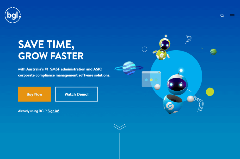
Take a look at the BGL home page above. If there's one specific link or button you want your visitors to click, it's known as a call to action (CTA). When you look at the design above, what first grabs your attention? For me, it's the Buy Now button on the left. It's the only place on the page that uses a warm color-a punchy orange against a calm sea of blues and greens. Of course, on a page of warm colors, a cool blue CTA would be high contrast.
Proportion
Another interesting way of creating emphasis in a composition is through the use of proportion. Proportion is a principle of design that has to do with differences in the scale of objects. If we place an object in an environment that's of smaller scale than the object itself, that object will appear larger than it does in real life, and vice versa. This difference in proportion draws viewers' attention to the object, as it seems out of place in that context.
In te image below, I've taken our sad, isolated monkey and superimposed him over the skyline of Manhattan to prove my point. Between the sharp contrast in color and the difference in proportion, your brain immediately says, "Hey, this isn't quite right," and you're left staring at the monkey until you force yourself to look away.

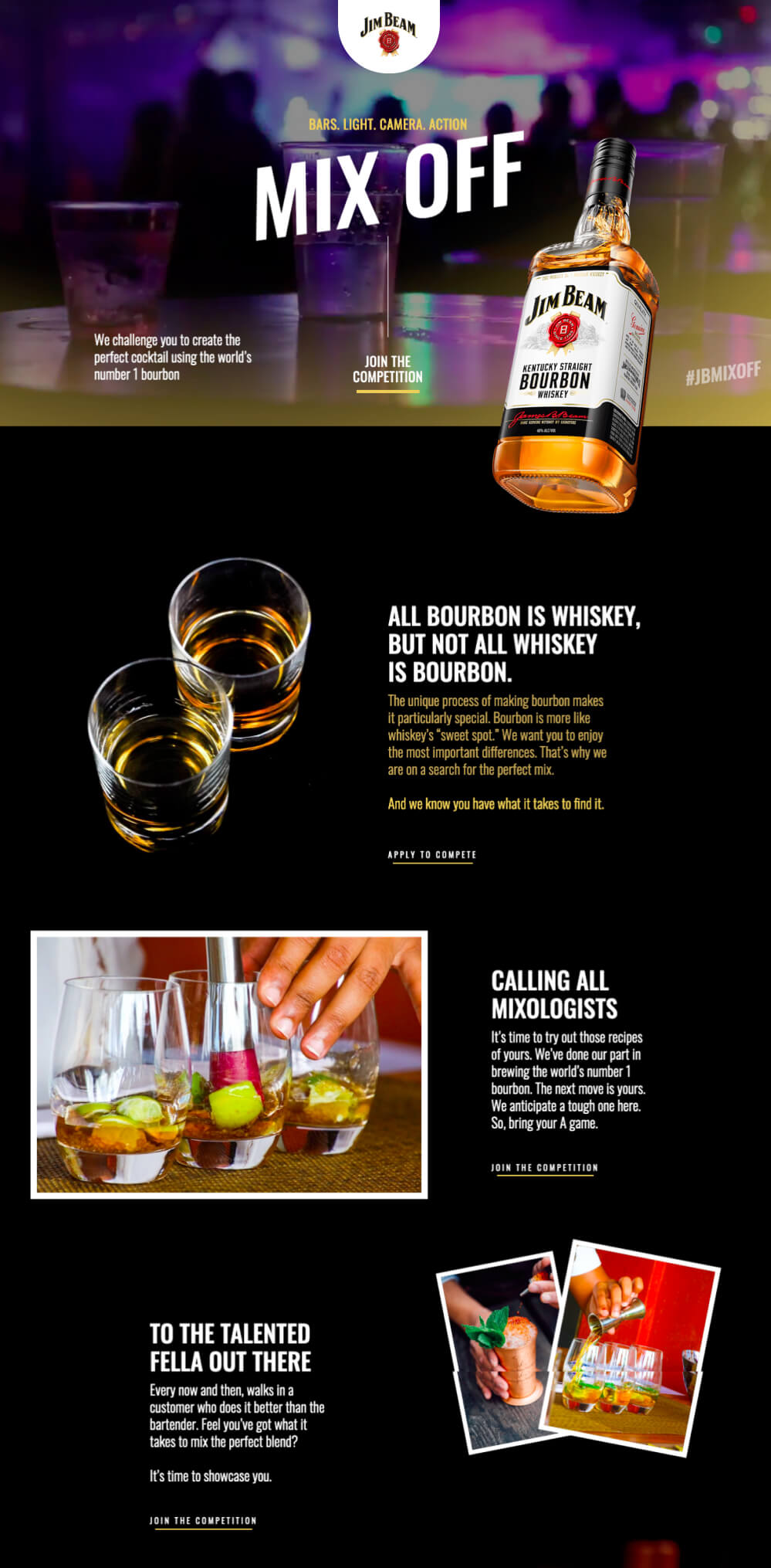
The Jim Beam Nigeria website sets up a fairly conventional bar scene, but is a little more unorthodox with its hero shot. The bottle is scaled up, teetering at a precarious angle, and breaks through the hero panel borders. Further down, two glasses are shot from a completely different perspective, all designed to add some energy and life to the page.
Creating emphasis in your design isn't just the key to making your call to action stand out. It's also how we move a viewer's eyes across the page. By giving elements a descending level of emphasis, you can suggest an order for visitors to follow. If you keep this in mind as you build your sites, you can echo the emphasis you create with semantic HTML markup and CSS. For instance, by matching h1 to h6 headline tags with a respective level of visual emphasis, you can provide a similar view of what's visually important in the page to search engines and vision-impaired visitors.
Next, we'll look at some tried and tested layout patterns you can borrow inspiration from.
Bread-and-butter Layouts
Most of what we've talked about thus far has been design theory. Theory is helpful, but it can only take us so far towards understanding why some ideas work and others don't in a website's design. In my experience, examples and practice are much more valuable. Most academic graphic design programs include a curriculum that's rich in art history and fine art. These classes provide a great foundation for understanding graphic design from an art perspective, but they do little to prepare you for the specific challenges you'll encounter when you take your designs to the Web.
Pablo Picasso once said, "I am always doing that which I cannot do, in order that I may learn how to do it." While I like to take that approach when designing a new website, it's important first to know what you can do. When you look out across the Internet, you can see that the possibilities for layout are endless. Depending on the goals of the site, though, only a few of those possibilities make good design sense. That's why we see certain configurations of identity, navigation, and content over and over again.
In this section, we'll talk about the three most common layouts, and explore some of their advantages and disadvantages.
Left-column Navigation
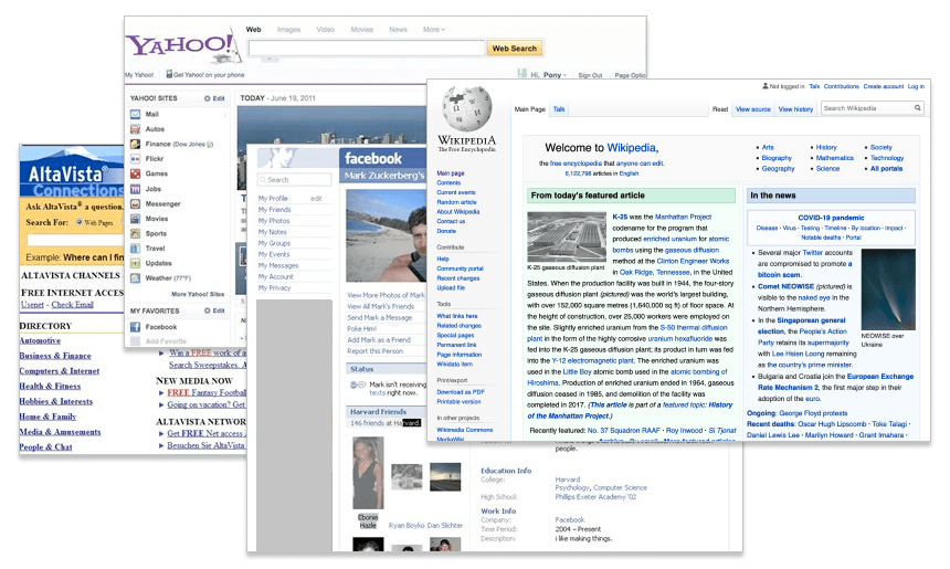
The left-column navigation pattern was arguably the design default for the first 15 years of the World Wide Web. Trawl the web archives and you'll see that all the early incarnations of Yahoo!, AltaVista and Facebook leaned heavily on their left-column navigation. Today, it tends to be reserved for huge, link-heavy enterprise sites like Wikipedia or Craigslist.
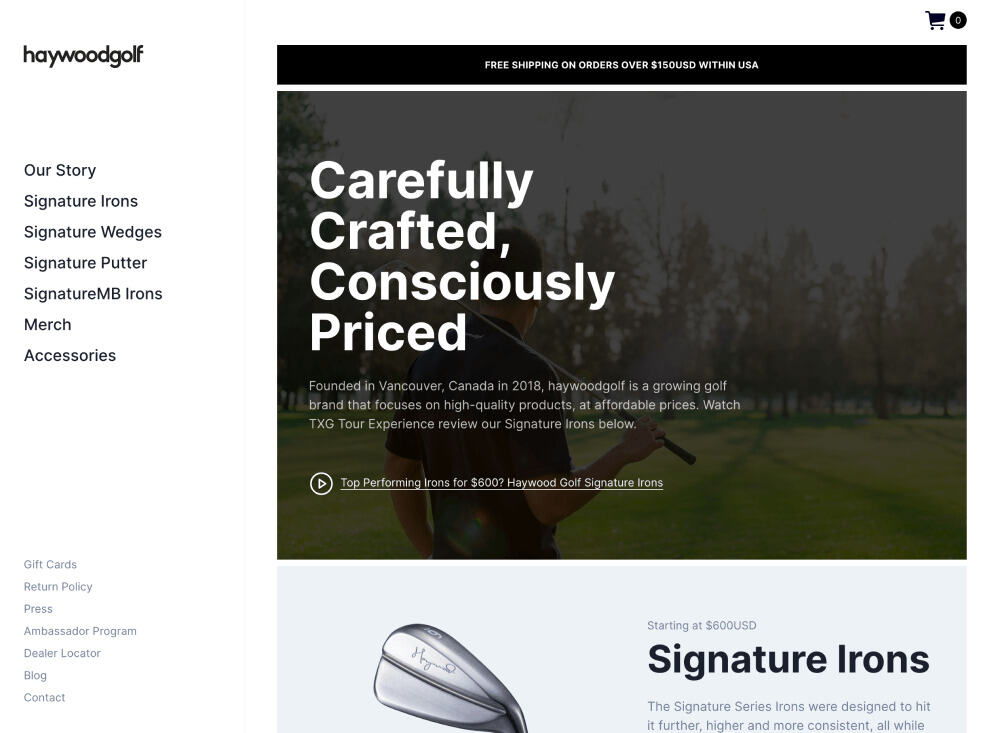
To my eye, this format still feels old-fashioned and static-even in a bright, open design like the Haywood Golf site (below)—so I tend to steer away from it. But that doesn't mean you have to. Left-column navigation is rare enough today that it might come off as cool and avant-garde if you get it right. It's always good to mix things up.
Speaking of mixing it up, how about picking that left column up and sticking it on the other side of the content? Then you'd have a right-column navigation layout.
Right-column Navigation
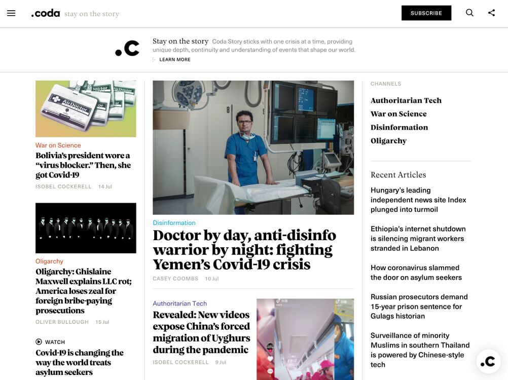
If you're going to restrict your main content to one side of the page, it's not uncommon to push it to the left, placing navigation, advertising, and subsidiary content on the right. This prioritized content over navigation is a more common configuration for news sites (such as the Coda example below), social networks such as Reddit, and websites with expansive navigation schemes that are unable to be contained within a simple top navigation.
Ultimately, the decision on whether to put a navigation column on the left, the right or anywhere else is a judgment call that's really about the amount and type of content you have to organize. If it's a simple site that doesn't require any secondary navigation, consider a narrow, columnless layout. Good design is often more about what you leave out than what you put in.
If you do need a secondary column, just remember that the content is what your visitors are there for—and they're looking for it on the left first.
Three-column Navigation
If you were paying attention to web design in the early 2000s, you may remember the obsession with "The Holy Grail Layout)"-a scaling, three-column layout with self equalizing column heights. Some of the world's greatest CSS minds spent thousands of hours trying to force buggy browsers with primitive CSS support into reproducing a layout that had been easy to do with HTML tables. It was like having all of NASA tasked with finding your house keys. Thanks, but why is this so hard!?!
The bitter irony is, today we have many elegant CSS Flexbox and Grid solutions to the Holy Grail, but far fewer opportunities to use them. Even big news sites such as CNN, The New York Times and BBC News prefer to use a broad header navigation followed by bite-sized content cards below. Today it's mostly social media sites like Twitter and Facebook carrying the classic three-column banner forward.
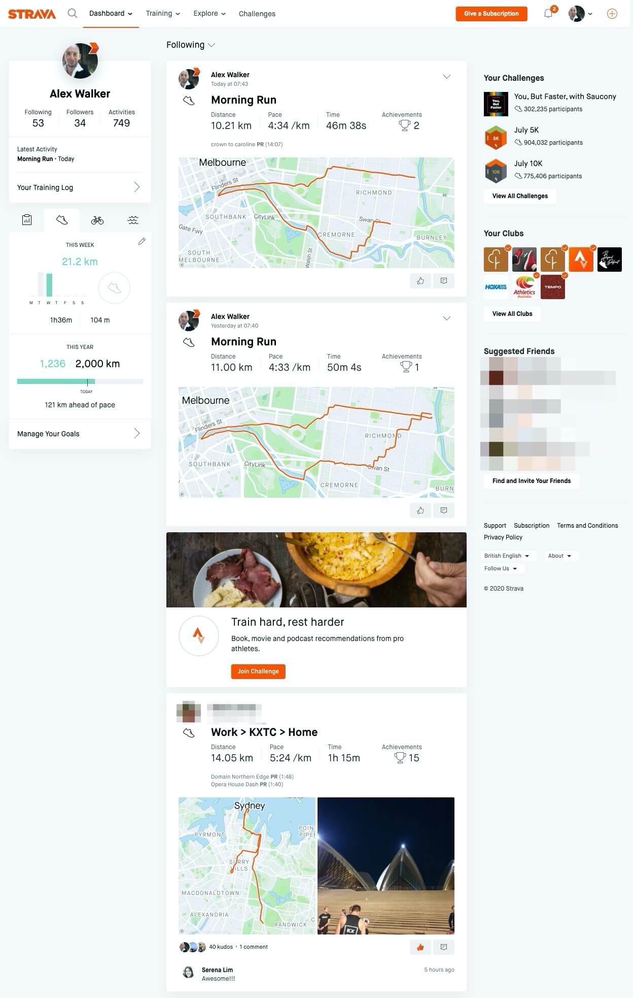
One notable exception is the dashboard for training app Strava (you may have to log in to see the view in the image below). As a regular Strava user, I believe it's one of the best examples of how to present oceans of data in a layered, digestible, attractive way. If you're working on a complex UI problem, there's a lot you can learn from these guys.
Navigationless Magazine Style
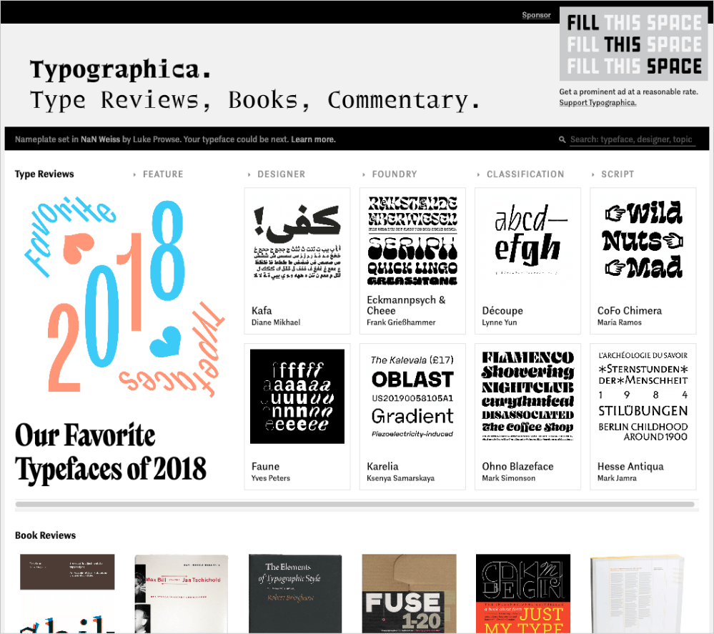
If you're reading this paragraph, I'm guessing you probably didn't arrive directly from the table of contents. On the Web, we tend to be a lot more goal-oriented and consume information in bits and pieces. Site navigation allows us to be quick, efficient … and erratic. What if you don't want your visitors skipping to another page? What if the information you need to convey is best consumed as a whole, like a book or magazine article? If that's the case, why include navigation at all? That's the approach that magazine sites like Typographica, Brand New, and Creative Review take with each of their art-directed articles. Although technically you will find a line of text-link navigation on Typographica, it's so low-key as to be practically invisible.
Bare-bones Minimalism
Sharing a philosophical approach with the navigationless magazine style, many designers are focussing on a single task and simply removing all other distractions. Minimalist design is focussed on telling a sharply directed story, rather than offering the user lots of choice. You could think of this design approach as a "vertical slide deck" or Powerpoint style. San Francisco marketing outfit Matter Made certainly takes this approach, limiting itself to tight messages in large font sizes and simple colors.

Minimalism isn't a new design trend by any stretch of the imagination-even on the Web. In the art world, the minimalist movement of the 1960s and '70s was a reaction against the overly self-expressive era of abstract expressionism. Similarly, the recent explosion in minimalism and single-page designs on the Web is a reaction against the overly interactive Web 2.0 era. It's an attempt at balancing out the hustle and bustle of social media with the equivalent of a peaceful café or quiet art gallery.
Break the Mould Layouts
I created this category to encompass original web layout ideas that can't be easily shoehorned into any the earlier classifications.
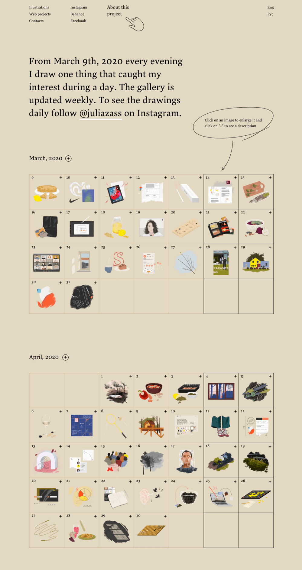
Julia Zass is a talented illustrator who just needed a way to present and archive her "drawing-a-day" project. Her stripped-back UI is dominated by a handful of big calendars peppered with drawing thumbnails. It not only makes an attractive layout but also helps to explain the project at a glance-an elegant solution to a design problem.
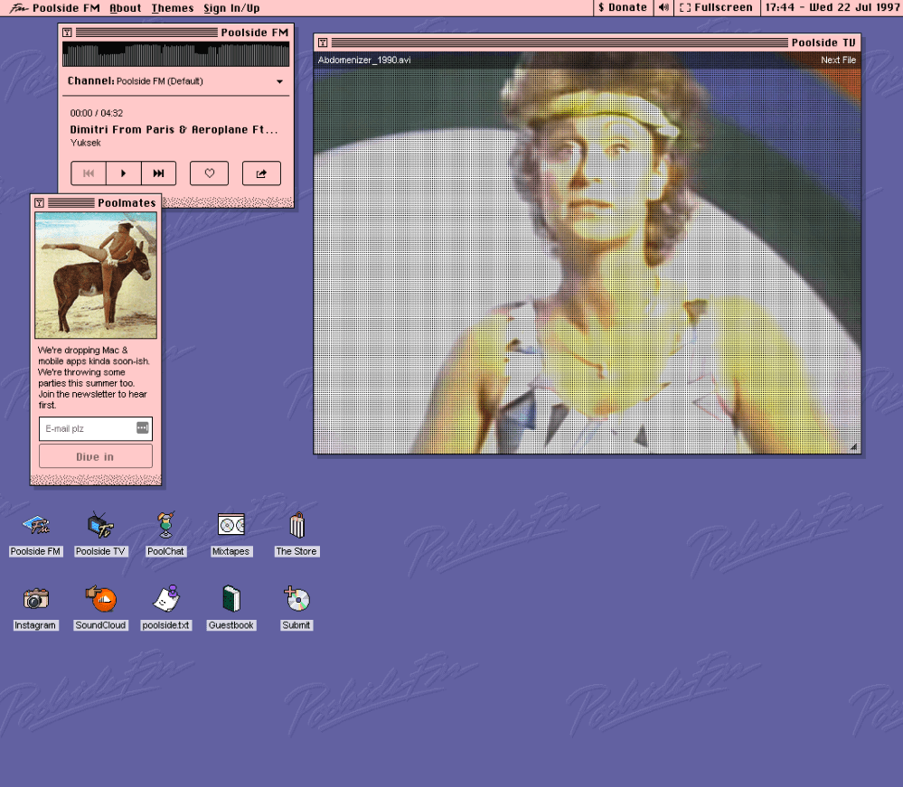
"Elegant" is definitely not the word to describe PoolsideFM, a site that combines a sunny 90s soundtrack with dorky, unwanted 90s video clips in a mock Mac OS 8 interface. The UI lets you open and close desktop apps like you're using an old Apple computer. Sure, it's tongue-in-cheek, and I laughed the first time I loaded it. But here's the thing: it's hard to look away from those video clips. I still had the app open 20 minutes later. Does that make this a successful UI? Maybe. It's undoubtedly unique, quirky and fun.
I doubt we're looking at the next big design trend, but this aggressively original UI does its job!
Web Trends
Every year, new techniques emerge. Many fade as quickly as they arrived-while a few become reliable, standardized techniques by employing new browser capabilities or new scripting breakthroughs. Let's run through a few.
Video Backgrounds
The ability to play full-screen video backgrounds that respond to the size of the browser has been available to us for some time now, and certainly gives us the ability to adapt 100 years of cinema and television technique to the Web.
There are bandwidth issues to consider. Google's WebM format provides impressive video compression, but isn't supported by all browsers, so you'll need to provide less efficient fallbacks for Safari.
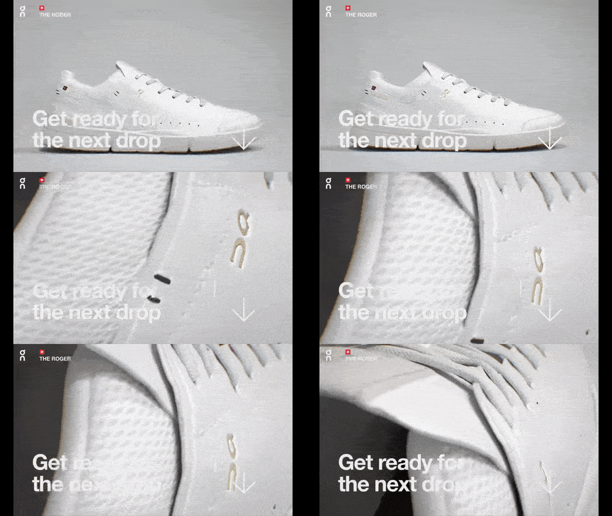
There's also a question of whether auto-playing video is what your users want. Does a peak-hour subway commuter with a slow connection expect or want an auto-playing tennis shoe video as they browse for sports shoes? That's a question for "The Roger", who uses some nicely edited video loops with his hero panel.
Masonry Layouts
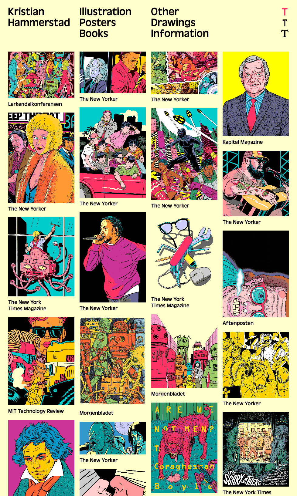
Another well-established trend is the Masonry UI pattern. Masonry layouts stack content into equal-width columns while ignoring the idea of rows. Masonry is particularly well suited to arranging a collection of randomly sized images into a neat, easy-to-browse format. While Pinterest is probably the poster child for Masonry, illustrator Kristian Hammerstad (above) shows what a great showcase it provides for artwork and photography.
Parallax Scrolling
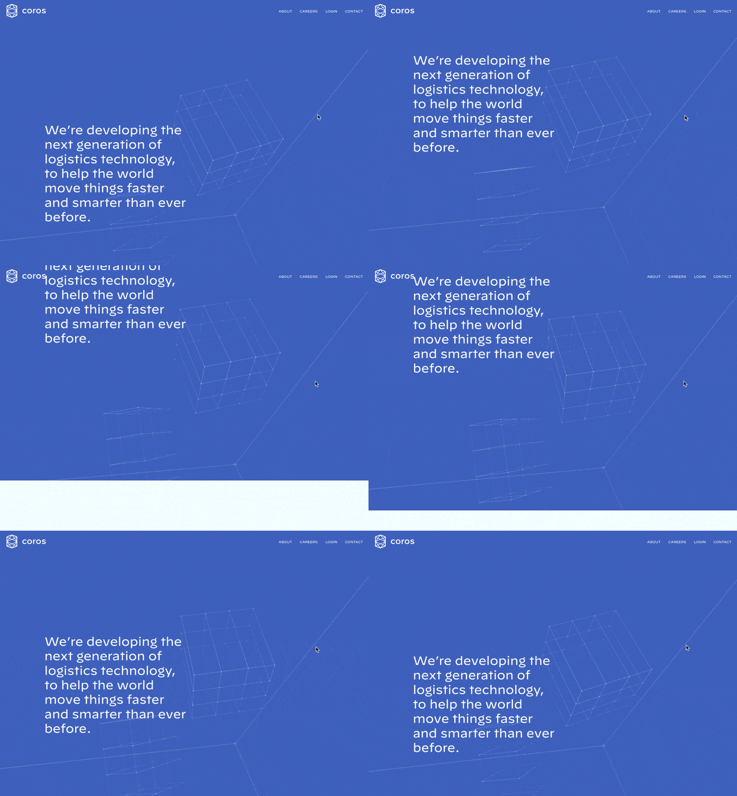
Parallax scrolling began to appear in browsers around 2011, and within a few years it was overrunning the Web. Thankfully, these days it's more thoughtfully deployed. The concept uses stacked layers that scroll at different relative speeds, creating the illusion of depth in the viewport. Coros.net, shown above, is a nice example of parallax scrolling in action.
Finding Inspiration
Just because the left-column, right-column, and three-column layout configurations are the bread and butter of most web page designs, there's no need to feel confined to these layouts. A plethora of design showcase and design pattern sites have been created to feature new and innovative ideas that might help you think outside the box, including those listed below (just to name a few).
- Awwwards is a thoughtfully curated gallery of new site and app designs supported by an active and knowledgable community. The quality of nominees is generally high-outside of the occasional dodgy casino site.
- One Page Love specializes in showcasing interesting, single-page website designs.
- Admire the Web uses an easy-to-scan layout to put the spotlight on three or four newly launched sites every week. Always worth a look.
- Designspiration continually curates galleries on a wide variety of design topics, from typography to photography, poster design, infographics and app design.
- OKMonk is a relatively new but impressive site that bills itself as "a directory of quality UI/UX design resources". You're always a good chance to find new ideas on typography, tools, templates and more.
- The Inspiration Grid, although not strictly focussed on web/app design, hunts down eye-catching examples of typography, photography and graphic design that will stimulate your own new ideas.
Using a Morgue File
I know what you're thinking: "Great, I have a bunch of galleries and pattern libraries to look at. Now what?" One of the most useful tips my first graphic design professor taught me was to create a morgue file whenever I was collecting inspiration for a large project. The concept is fairly simple: if you're doing an illustration or marketing project that involves trains, you clip out and print up anything you can find that might give you inspiration and keep it all in a folder. It helps with your current project, and should you ever need to do another project involving trains, you'll have lots of inspiration to hand.
The morgue file idea slipped my mind until a few years ago. I was looking for a site I'd seen in a favorite gallery site, but I couldn't remember the site's name or address. Doubtless it's great to have access to lots of inspirational resources, but they're useless if you can't find the specific example you're looking for. That was when I started my own digital morgue file. Having a repository of website designs that I can look at has been a handy resource on countless occasions when I've been searching for inspiration.
Capture a Screenshot for Your Own Morgue File
- Select the browser window that’s displaying the page you want to save as a screenshot.
- Copy a screenshot of the browser window to your clipboard:
- On a PC, press Alt + Print Screen or use the native Snipping Tool in Windows to grab a section of the screen. On a Mac, press Shift + Command + 4, then Space to turn the cursor into a camera. Then, hold down Ctrl, and click on the browser window.
- At this point, you should have a screenshot of the browser window in your clipboard. Open a new document in your favorite graphics program or document editor, and paste in the screenshot.
- Save your image or document.
Responsive Design
We can't really discuss layout without talking about how the design will be displayed on various screens. Responsive design allows us to craft designs that work not just on mobile phones, tablets and desktops, but TVs, fridges and AR goggles. Before the birth of responsive design, building for mobile devices meant designing standalone sites for smaller screen sizes-the short-lived era of the "m-dot" site. Ethan Marcotte's 2010 article was the first to seriously describe a process that allowed us to build a single application that looks native on all devices. With the continued growth of mobile technology, there's now every reason to believe that at least half your audience is mobile. No organization can afford to neglect half its audience.
Are Standalone Mobile Sites Still a Thing?
It’s interesting to note that both Twitter (mobile.twitter.com) and Facebook (m.facebook.com) still redirect their mobile traffic to a separate mobile site as of 2020. However, they remain the exceptions amongst the internet giants, with everyone from Amazon to Microsoft, eBay, Instagram and Spotify choosing to build a unified web application that is responsive from the ground up.
Screen Resolutions
Let's start with a look at the current state of screen resolutions. Over the last 20 years, screen resolutions and physical sizes have diversified tremendously.
Let's look at some of the interesting numbers shown in the figure above:
- Our jobs were much simpler in the early 2000s, when two screen sizes comprised 90% of the browser market.
- Growth in high-resolution screens was explosive until around 2009, when the rise of iOS and Android began to move users onto mobile in large numbers.
- Low resolution screens (below
1024px) have been in steep decline for most of the past two decades, but we've seen a recent rebound-likely due to lower-resolution phones. - W3Schools caters strongly to developers, so it's likely their traffic is more desktop-centric than the average website.
It's also worth noting that many users with larger monitors tend not to maximize browser windows, so they can see other applications they have running.
How Do @media Queries Work?
Responsive design uses CSS to control which rules are applied based on the screen size of the device displaying it. One way of doing this is with media queries. The site is instructed to determine a device's screen resolution. In the stylesheet, you create breakpoints, which are used to specify the size and structure of elements depending on the screen width of the device. These breakpoints are ranges of pixel widths for the different screen sizes you wish to target. For example, you may set breakpoints for mobile devices from 0px to 568px. The CSS to set this particular breakpoint would look something like this:
Code snippet
@media only screen and (min-device-width: 320px) and (max-device-width: 568px) { …}Then, you may set the next breakpoint to a range that fits most tablet devices, and then desktop. The advantage of using breakpoints and media queries is that you can set as many breakpoints as you want.
The truth is, the topic of responsive design is far too deep to fit within the scope of this book, so if you want to go deep on the technical aspects, here's your reading list:
- the seminal "Responsive Web Design" article by Ethan Marcotte
- Jump Start Responsive Web Design, 2nd Edition by Chris Ward
- Responsive Design by John Rhea
However, let's next look at the pure design considerations of responsive web design.
Responsive Web Design Principles
How should a designer approach designing a responsive application?
Always Design for "Mobile First"
Nearly all of the earliest responsive websites were "desktop first" designs. This meant that developers usually took their existing, fully featured desktop sites and then used CSS @media queries to add more CSS when the browser detected the screen was small. This was understandable but not a great experience. The idea of trying to simplify anything by adding more to it is rarely a good recipe for success.
Mobile first is the principle of making the default view of your layout a simple, fast-loading, mobile-friendly design, and then using @media queries to add on any richer, perhaps heavier page elements only when the browser conditions make sense. This makes sense not only from a screen-size perspective, but also from the perspective of mobile bandwidth limits.
Don't Jam Elements into the Mobile View Just Because They're in the Desktop View
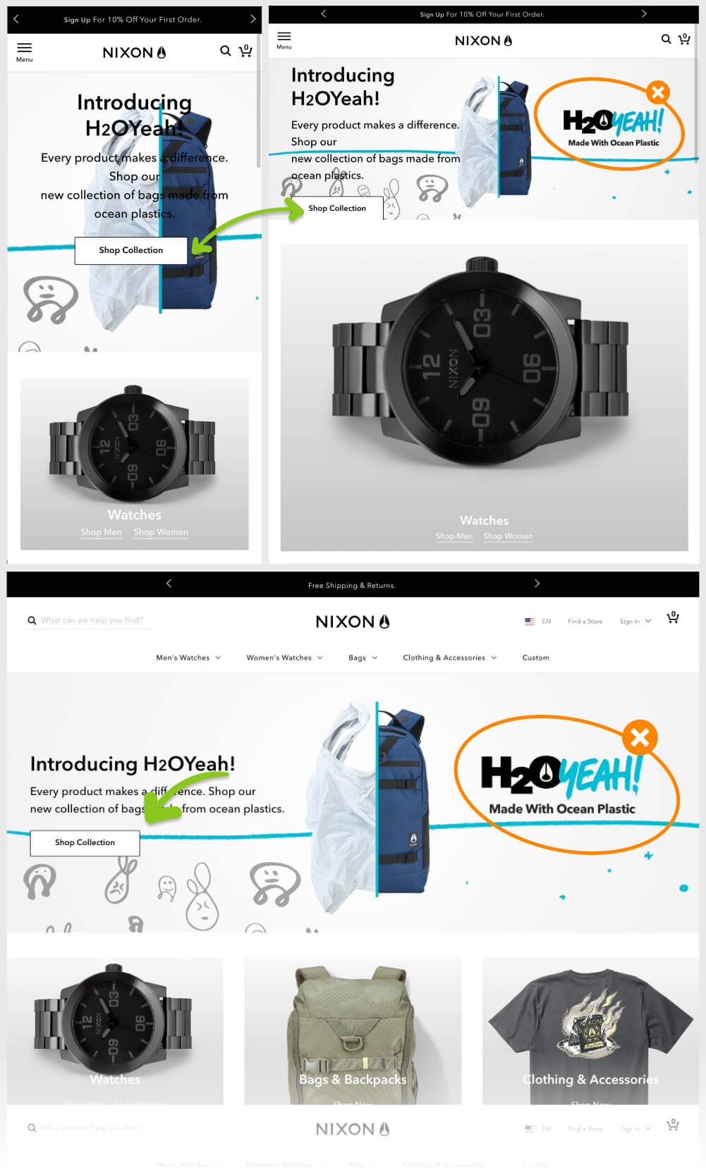
In the Nixon.com example below, you'll notice they don't render the "H 2 OYeah!" logo in the mobile view. That's not because it has no value. Bags made from recycled ocean trash is an excellent sales point. The problem is, jamming it into the mobile view compromises everything else:
- the watch gets pushed down and off screen
- the bag graphic gets more obscured
- the "Shop Collection" button has more visual competition
Nixon have been pragmatic enough to realize that shoehorning it into the mobile design isn't an overall win.
SVG Is Your BFF
While there's a lot of great information on using the pictureelement and thesrcsetproperty to serve responsive images to different screen sizes, this will still always require you to produce and manage two, three or even four versions of every image you use. That's worthwhile, but also no small undertaking.
Scalable Vector Graphics (SVGs) render in any modern browser and can scale up or down to any size with no loss of image quality, so a single graphic works in all screen sizes. Today, apps like Sketch, Figma, Illustrator, Affinity Designer and Adobe XD all produce beautiful SVGs, so there are very few reasons not to use the format in your designs whenever practical. Even if your software budget is limited, Boxy SVG has some abilities that not even Sketch or Figma can offer-for the princely sum of $9.
Are All SVG Files Small?
As the name suggests, SVG is primarily a vector format that creates imagery from mathematics and geometry rather than a grid of pixels (like JPEG and PNG, for example). This can be a very efficient way to cover large areas with imagery. However, it’s possible to import PNG and JPEG graphics into SVG. While this is sometimes useful, you’re also importing the natural file size issues and scaling limitations of the pixels of all bitmaps.
Responsive Frameworks
If you're not interested in coding your own responsive layout from scratch, your safest option is to adopt one of the established responsive frameworks-Foundation or Bootstrap.
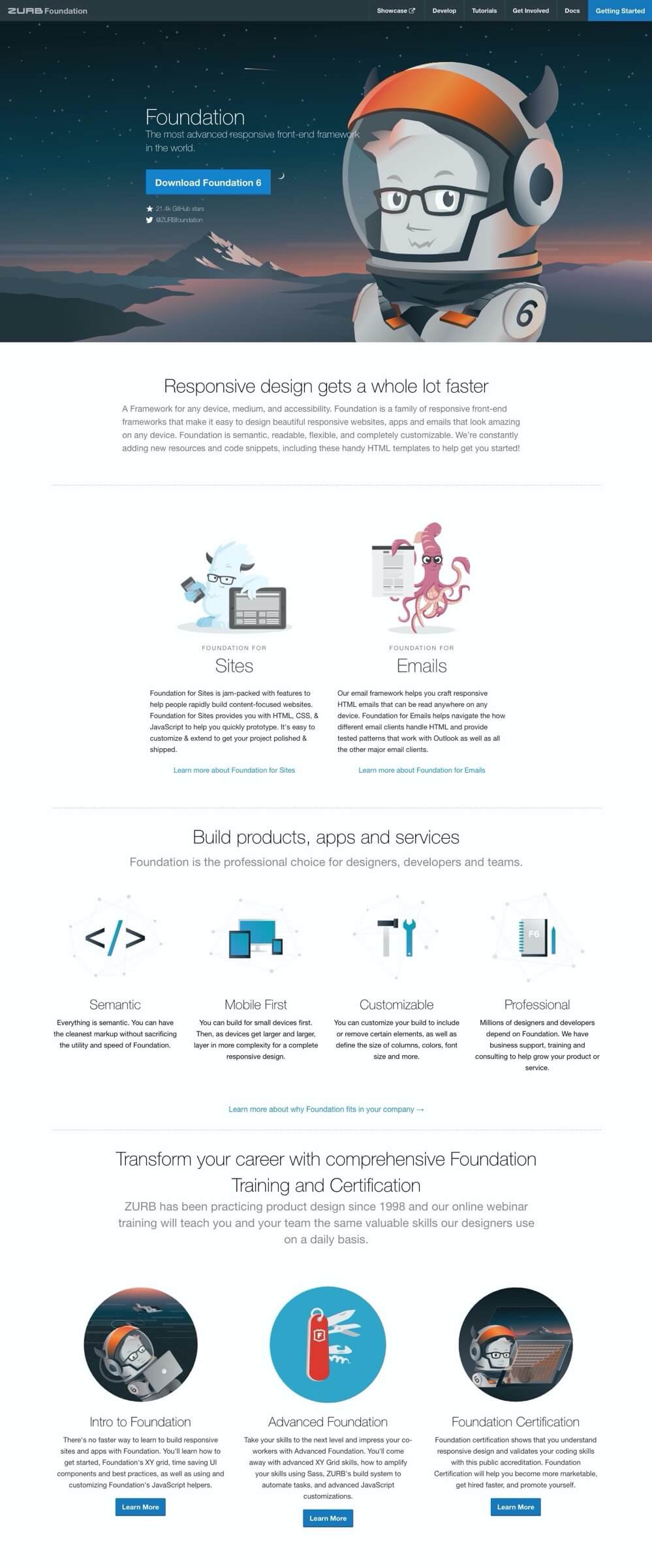
Foundation, shown below, is a mobile framework by Zurb that's packed with tons of web development features. It currently weighs in at around 60KB of CSS and 84KB of JavaScript, but this can be trimmed substantially by removing components you don't need. Later, if you need to add extra features such as responsive navigation menus, image sliders, accordion menus, validated forms, buttons, model popups, panels, tooltips, progress bars, or responsive tables, you know the components will be responsive.
There's also a nice feature that lets you generate working prototypes quickly.
Bootstrap, shown below, is the other framework battling for the number-one spot as the responsive framework of choice. Much like Foundation, Bootstrap has a number of its own built-in components that allow you to quickly create well-structured, mobile-first websites. Bootstrap has plenty of integrated features that are comparable to Foundation. With Bootstrap, you can create jumbotrons, panels, wells, navigation bars, progress bars, dropdowns, badges, alerts, tooltips, popups, tabs, carousels, and much more. Bootstrap also integrates the use of glyphicons, an embedded font library for use with the framework.
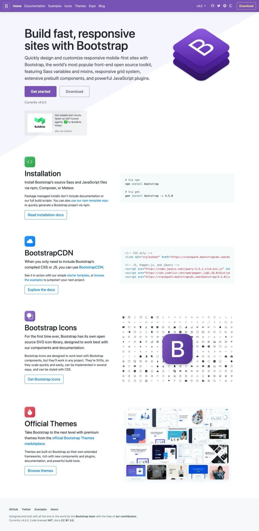
The primary reason people love Foundation and Bootstrap is that they're highly customizable. You don't have to download or even include the JavaScript files for components you aren't using. Simply click the checkboxes corresponding to the components you need, and leave the ones you don't. And once you've made your selections, Foundation and Bootstrap can compile them into custom downloads. They essentially take all the hard work out of compiling the components of your web development project.
With developers keen to create the leanest websites possible, with the least amount of JavaScript, and the smallest file sizes, it's easy to see why this approach is so popular.
One issue that's arisen with responsive web design is that traditional navigation menus don't always work the same way on a mobile device as they do on a desktop screen. When there isn't enough screen real estate, things can become jumbled. The solution that's been widely adopted is the mobile or "hamburger" menu. It's an icon of three lines stacked vertically, as shown in the top-right of the figure below, that represents an expandable menu, only available when the icon is tapped. The menu contents then appear as an overlay on top of the site's content.
![]()
The menu shown above is how the menu in Foundation looks on the desktop. On a mobile device, such as a phone or a tablet, the menu is collapsed until you interact with it, such as in the examples shown below.

The Project: Trashmonger
To walk you through the main design concepts we're talking about, it's helpful to have a real-world project to apply them to. For this book, that project will be "Trashmonger". My partner, Trish, is a photographer/digital artist and is looking to create a simple, attractive gallery site to display and market her work. Clearly there will be plenty of imagery that we don't want it to distract from, but the site needs to be attractive, memorable and professional. Her visual style is a blend of abstract modern and pop art, so we'll need to honor that in the design.
Assets
It's always good to start with a stocktake to help understand your strengths, your weak points, and what you're currently missing. At the beginning of the projects I have:
- a working logo
- 25+ art pieces
- 100+ photographs
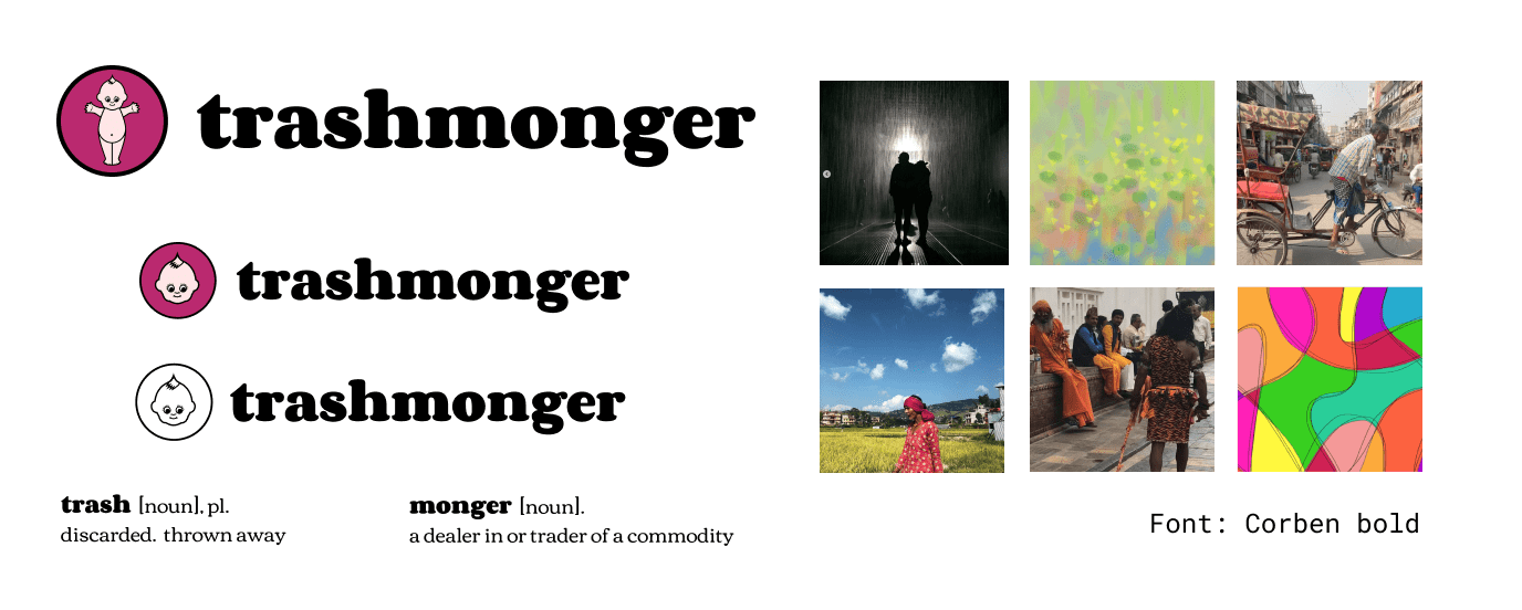
Currently, we don't have any written supporting content, so I'll need to get that moving along in parallel to the design.
Requirements
Looking at requirements, I think we have four basic page types:
- a landing/home page
- a gallery page, displaying a body of work
- product pages that show off individual pieces
- utility pages, for information such as about us, contact, and privacy
We'll also have external paths to Instagram and a shopping cart. Things may change as the project evolves, but we're going to start with this sitemap.
Sitemap
Choosing a UI Design Tool
The first edition of this book (published in 2005) focused on using Adobe Photoshop for most design tasks. While Photoshop is a magnificent photo editor, UI design has moved on to more specialised tools. I’m going to focus on three:
Each of these applications gives you the ability to create reusable symbols (or components in Figma) that let you generate child components based on a single parent component. Changes made to the parent automatically flow through to all the child components. This is perfect for creating the kind of generic interface units you need for wireframe designs.
It’s true that there are many good specialist wireframing tools such as Balsamiq, Moqups and HotGloo. Certainly check them out, but unless you’re spending most of your week wireframing, I suspect most of your wireframing needs will be covered by one of the general editors listed above.
I’m a big advocate for Figma and will be using it for the sitemap (pictured above), the wireframes, and also the finished Trashmonger designs.
Wireframes
The 12-column layout has been the default desktop configuration for more than a decade. Kicking off with 960Grid, and carried forward with Bootstrap and Foundation, 12 is a super versatile number to work with, as it breaks neatly into halves, thirds, quarters, and sixths.
Having said that, we're not going to use a 12-column layout in our example. Instead, we're going to change things up a little and design around a five-column layout. Why would we do that?
I find there's often extra energy in odd-numbered column layouts. You can get a sense of this by comparing the four-column and five-column layouts below. Even numbered columns can be so evenly balanced that they lack natural flow and movement.
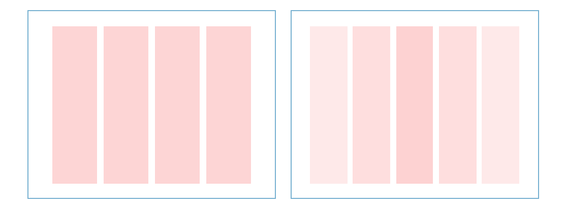
By comparison, the five-column layout seems to naturally "hang" from its center column like a trunk. That middle column is often the easiest path into the layout, and I want to use that natural flow in this design. A five-column layout can also be broken down into a handful of useful variations: 4–1, 3–2, 2–3, and 1–4.
Here are the basic wireframes for the Home page and the Product page including a mobile rendering.
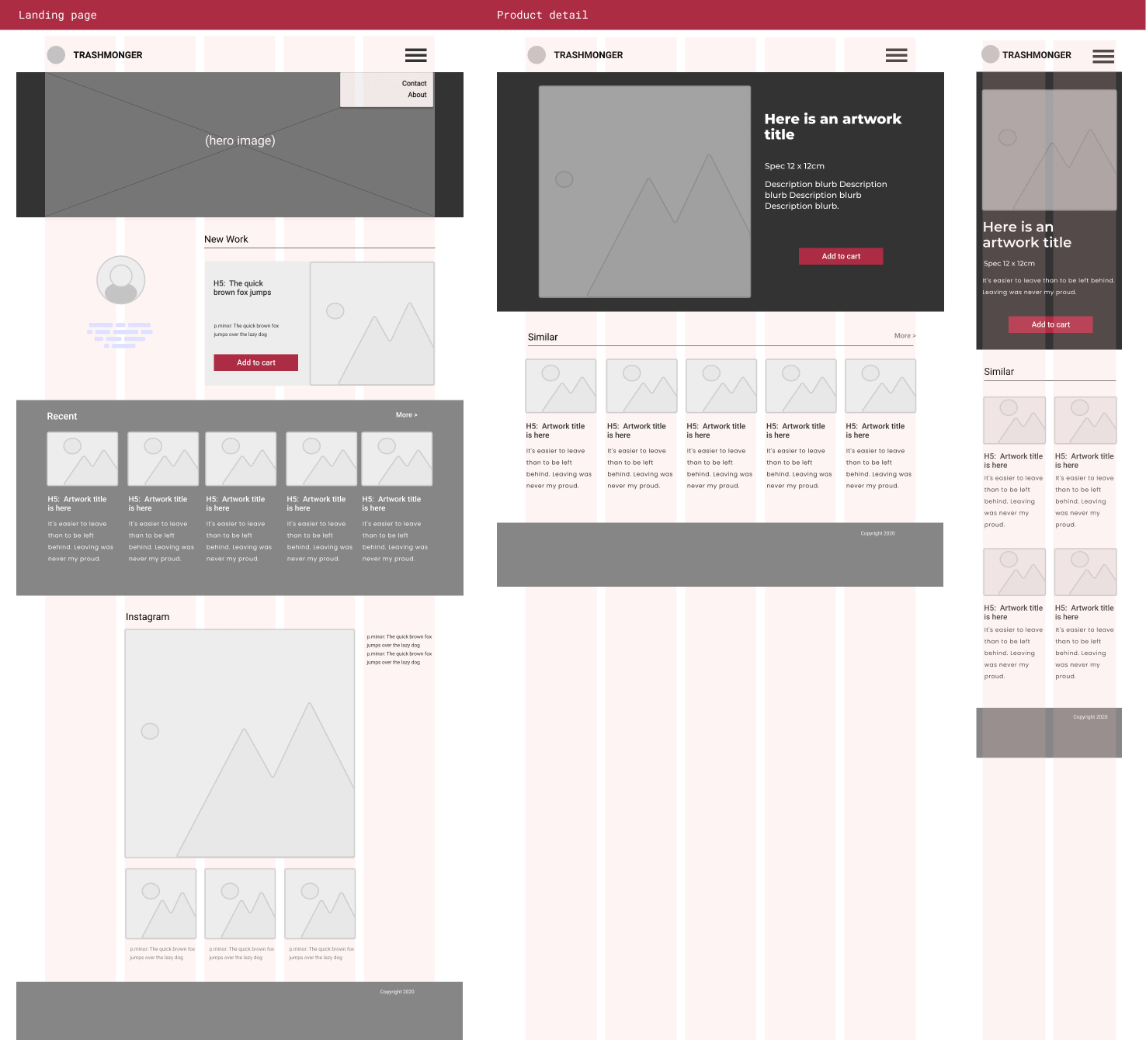
The Home page has more to accomplish, so is necessarily more complex. It needs to:
- welcome and orient users
- spotlight the latest work
- offer paths to other work
- set a visual style/tone
The Product detail page can have a narrower focus so can be simpler:
- showcasing the selected artwork
- offering paths to a handful of alternative art pieces
I tend to keep my wireframes to monotone for everything except call-to-action buttons (CTAs). I find emphasizing CTAs in wireframes helps keep them front of mind when you're making layout design decisions later.
So these are the bones that we get to flesh out. Our next consideration is the palette we're going to use. So in the next chapter, we'll talk about color.


