Low-fidelity Prototyping
Welcome to this tutorial on Figma. In this book, we’ll immerse ourselves in everything Figma has to offer as we design a simple web page. The layout of this page will be based on an older and a newer version of the iA Writer website’s splash page.
Figma is the most complete tool for designing apps, websites, and other types of user interfaces (UIs). Unsurprisingly, it’s also the most-used UI design tool according to the 2022 Design Tools Survey.
Figma can take product design teams all the way from ideation to high-fidelity prototyping—covering all the design processes in between. It can also facilitate diagramming, collaboration, and research, although these may sometimes require the use of third-party plugins or Figma’s secondary tool, FigJam. Figma’s design handoff and design system management features can help bridge the gap between design and development. It’s available for Windows, macOS, and as a browser app. (We’ll need access to Figma in one of these forms to complete this book.)
In this first tutorial, we’ll focus on acquainting ourselves with Figma. We’ll learn where everything is, while using some of Figma’s biggest and most exciting features. In the end, we’ll have created a low-fidelity but functional (simulated) prototype.
Designer, Meet Figma
With our (free) Figma account set up, let’s open the Figma dashboard and click on New design file. (There’s obviously much more to the dashboard than this, but nothing that’s especially technical. It’s simply a place to manage our files, projects, teams, organizations, and account.)
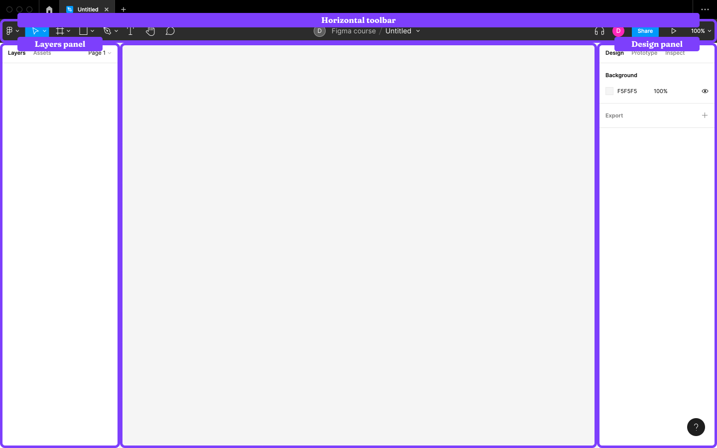
We can now take our first look at Figma, where we’ll see the horizontal toolbar near the top, the Layers panel on the left, the Design panel on the right, and in the middle, a blank canvas. Let’s change that by creating something so that we can see first-hand what all of this means.
Step 1: Creating a Frame (Artboard)
Click the “Region tools” icon (#) in the horizontal toolbar, then choose Frame (or tap F or A on the keyboard) to reveal the list of the Frame options in the right sidebar.
Finding Menu Items
You can find any menu item directly by using the command + / / Ctrl + / keyboard shortcut and then typing its name into the popup field. These are referred to as “Quick action…” shortcuts.
A Frame is a contained spaced that we can dedicate to a specific web page or app screen (or section within either of those). As we can see, there are many Frames to choose from. Normally, I would suggest taking a mobile-first (“Phone”) approach to design. However, to make this tutorial easier to digest, we’ll focus on desktop first, so choose Desktop → Desktop 1440×1024.
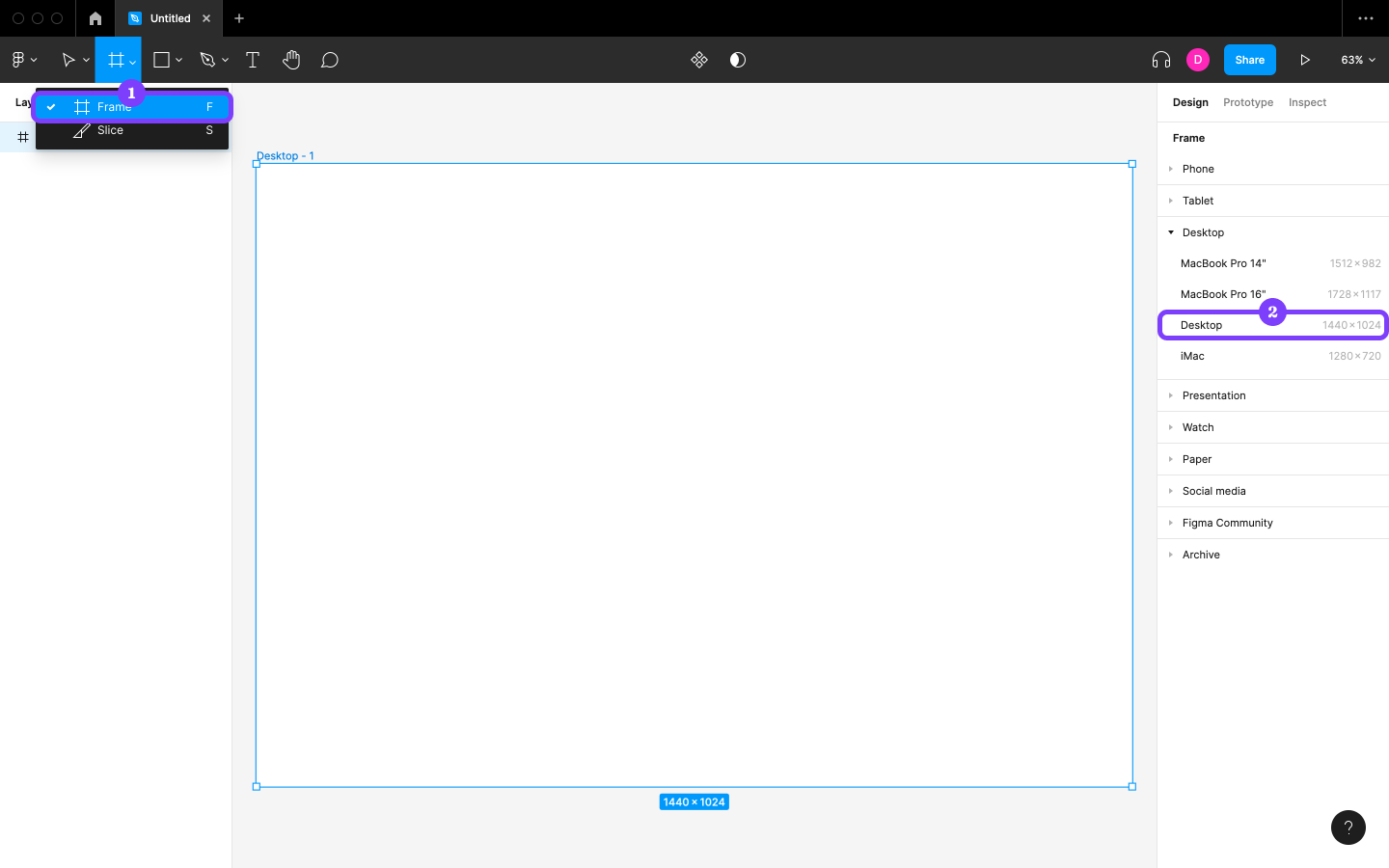
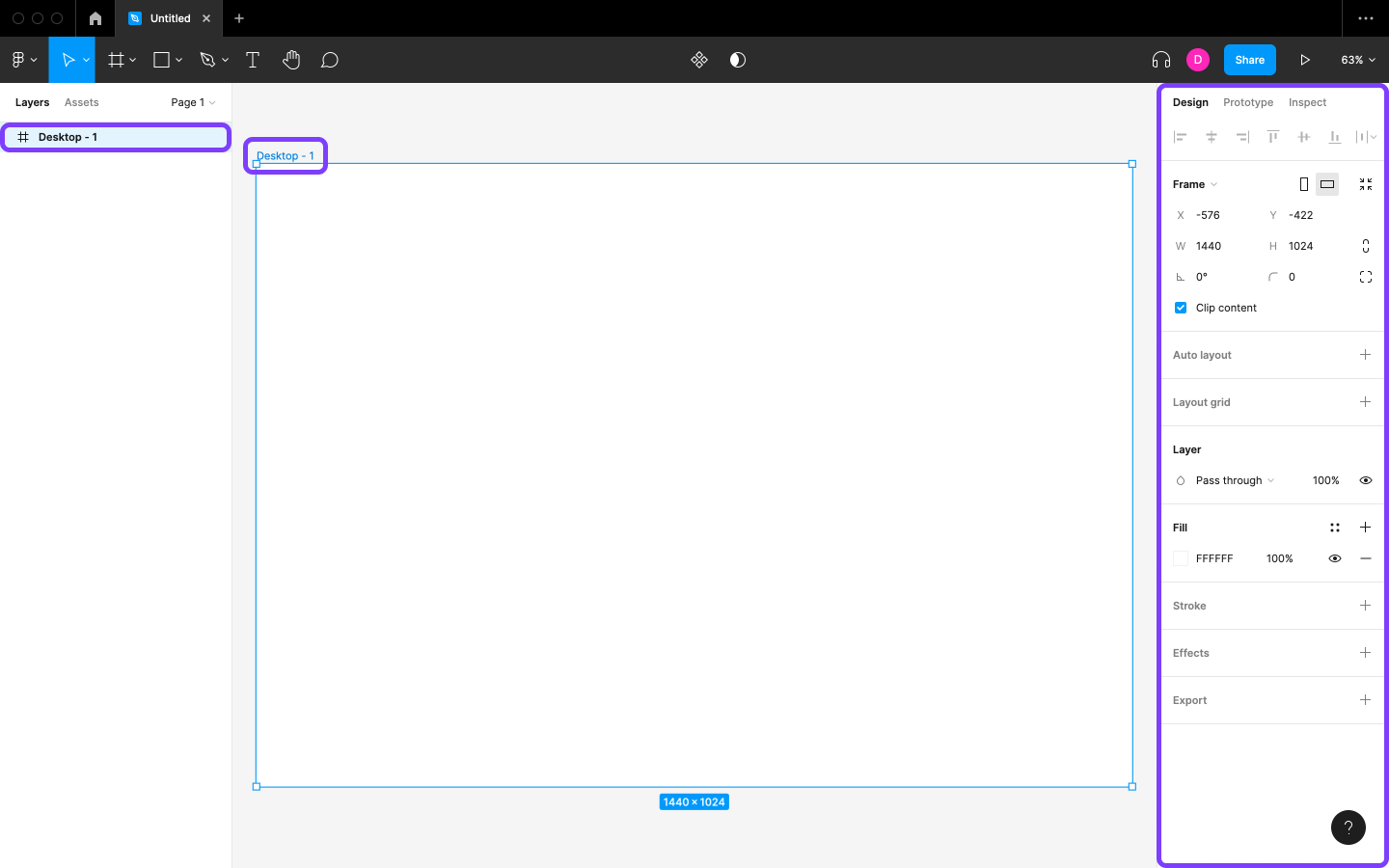
We should now be able to see a reference to “Desktop - 1” in the Layers panel. Whenever we want to do something to a Layer (such as a Frame), we can just click on it from the canvas or click on its reference from the Layers panel.
Different types of Layers are represented by different icons in the Layers panel. We should be able to see that standard Frames are represented by what looks like a hash (#) icon.
The Design panel is contextual: the options available for customizing will depend on the situation. When we were looking for a Frame, it showed the list of Frames, but now that a Frame is selected, the Design panel contains various options for customizing it.
Step 2: Setting Up Auto Layout
Next, we’re going to customize the Frame’s Auto layout options. Using Auto layout on a Frame makes its content more robust and responsive by enforcing alignment, spacing, and padding rules. In the long run, it also makes designing UIs more efficient.
Our objective in this step is to use Auto layout to ensure that any future content is padded and aligned.
- Click Auto layout (
shift+A) in the Design panel to activate it. - Change the “Horizontal padding” to
12and the “Vertical padding” to120. (Note that some options—including these ones—aren’t labeled unless we hover over them.) - Set the blue alignment bars to “Top center alignment”. (Use the image below as a guide if you’re unsure.)
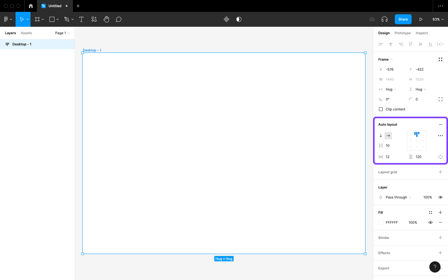
Auto layout can be overzealous. In the Frame section, it will have added Horizontal resizing and Vertical resizing. Change their settings to “Fixed width” and “Fixed height” respectively, so that the Frame won’t hug its contents (once content is added).
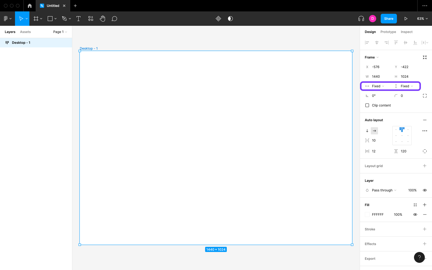
We’ll see the outcome of this step after adding content, so let’s do that by creating a navigation section.
Step 4: Creating a Text Layer
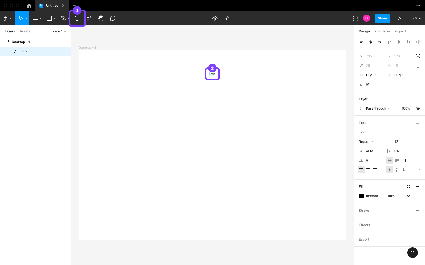
To create a Text layer, click the “Text” icon in the horizontal toolbar (or press T on the keyboard), then click on the canvas and type some text. (In this instance, let’s write “Logo”.)
We’ll see right away that the Text layer doesn’t appear exactly where we clicked, and in fact seems to be aligned to the top center of the Frame, but for a bit of space. This is because the parent Frame has those Auto layout settings that impose those rules.
Step 5: Creating a Nested Frame
Frames inserted directly onto the canvas (such as “Desktop - 1”, the Frame that we already created) are called top-level Frames. In this step, we’ll Frame our “Logo”, and this Frame will be called a Nested Frame, because it will be nested inside our top-level Frame.
With the “Logo” selected, choose Frame selection from the right-click menu (option + command + G / alt + ctrl + G). The Frame will be called “Frame 1”, and “Logo” will be the only Layer inside it. (Look at the Layers panel to understand the structure.)
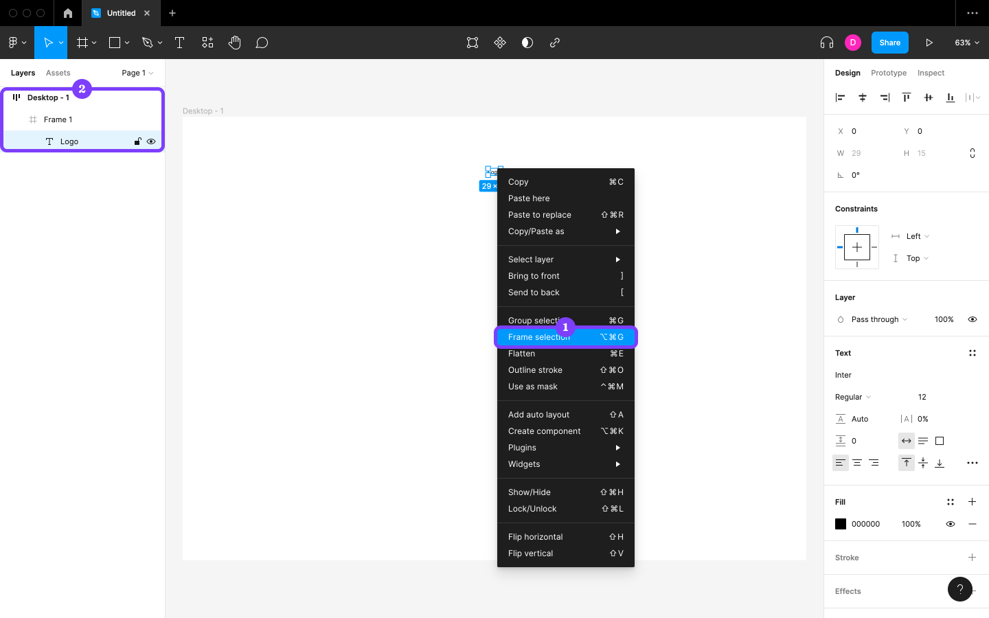
Next, activate Auto layout on “Frame 1” and then apply the following settings using the Design panel:
- Horizontal resizing: Fixed width
- Vertical resizing: Fill container
- W (width):
1000
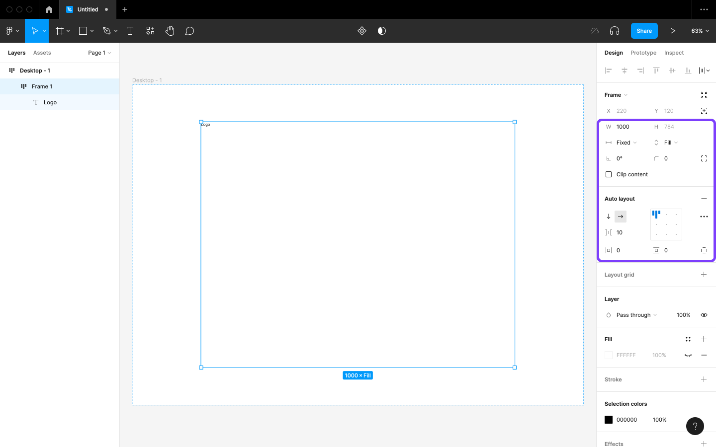
You’ll notice that the logo now snaps to the top left. This is because “Desktop - 1” is no longer its parent, so it doesn’t have to respect its Auto layout rules anymore. “Frame 1” is now the parent of “Logo”, and “Desktop - 1” is now the parent of “Frame 1”, and both must now respect the rules of their new parents.
Step 6: Renaming “Frame 1”
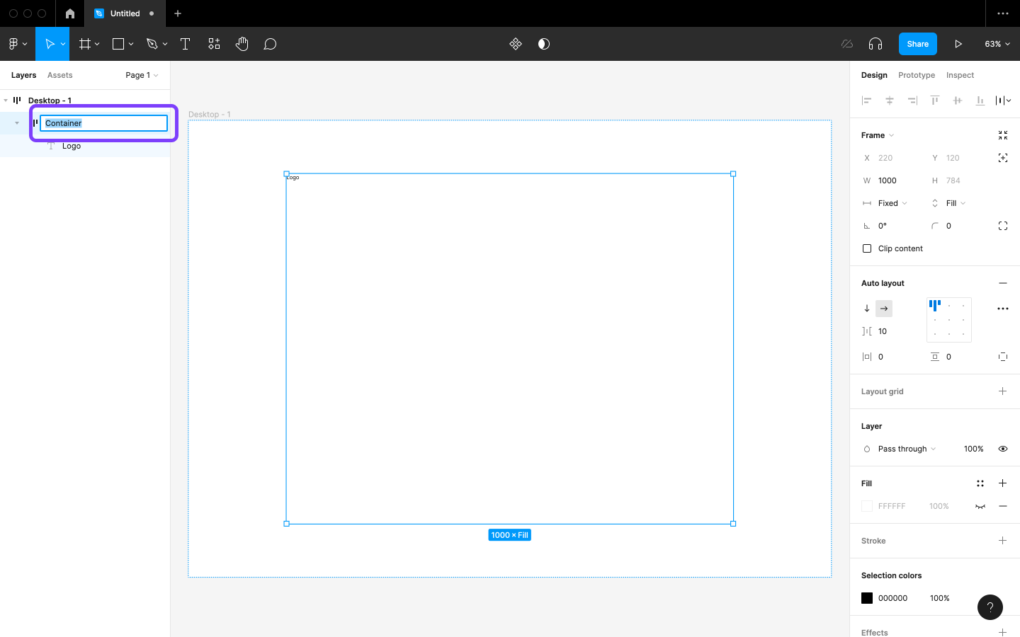
Double-click on “Frame 1” in the Layers panel (command + R / ctrl + R), type “Container”, then tap return to confirm its new name. Renaming arbitrary-sounding layers to something more specific is a healthy habit that we should adopt early on.
Step 7: Setting Up a Layout Grid
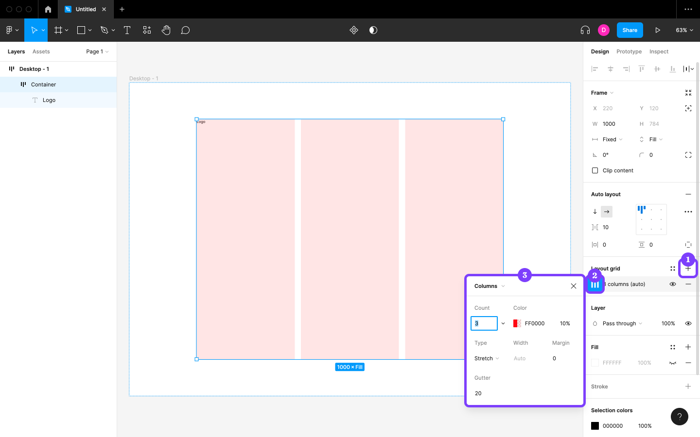
“Container” will utilize a three-column Layout grid. Let’s set this up now so that we can better visualize the container’s bounds (which, currently, are unknown unless we select the container). Alternatively, we can tap shift + O to “Show outlines”, but we need a Layout grid anyway, so let’s use this way for now.
Click on Layout grid (control + G / ctrl + shift + 4) in the Design panel, and then click on the “Layout grid settings” icon (a square of nine dots). Click on Grid and choose Columns from the drop-down and set the “Count” to 3. “Gutter” is fine at 20.
No Need for Rulers
Figma is able to apply Layout grids to any Frame, which kind of makes Rulers (shift + R) obsolete. Even if we’re accustomed to using Rulers (to visualize bounds and/or align things) in other UI design tools, it’s likely that we won’t need to do so in Figma.
In the following steps, we’ll create a navigation Component. Components can be reused and also contain Variants and conditional Properties, all of which are ideal for maintaining visual consistency and avoiding redundancy. This navigation will contain our logo, a hamburger menu, and some links that will drop down.
Step 8: Creating the Component
Select the logo to begin. We can do this by double-clicking on it, since it’s a child of the Frame that’s currently selected. When this isn’t the case, we can hold command / ctrl while clicking on Layers to “deep select” them. Or we just select “Logo” in the Layers panel.
Next, click on the “Create component” icon in the horizontal toolbar (option + command + K / ctrl + alt + K) to wrap the logo in a Component, which is like a Frame but with the features mentioned previously.
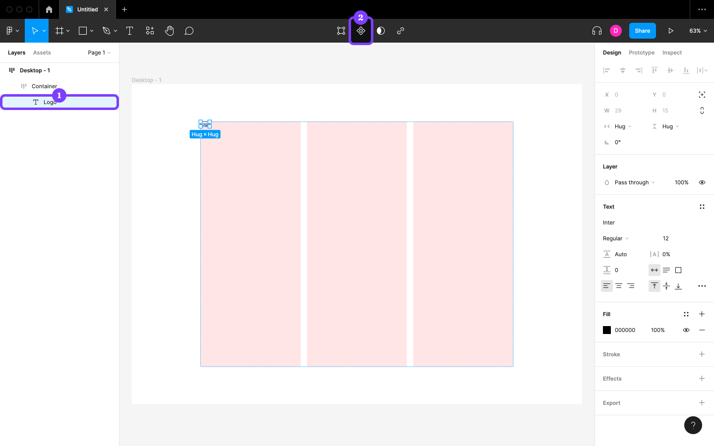
Rename this Component to “Navigation” by double clicking it in the Layers panel.
Component First
When turning Layers into a Component, Auto layout settings are removed—which is one of Figma’s annoying quirks. So when designing something reusable, ensure that you establish the Component before using Auto layout (as we did above). Component first, always.
Step 9: Creating a Rectangle Shape
We’ll design the “Hamburger icon” next, which will consist of two Rectangle shapes. (Yes, no burger!)
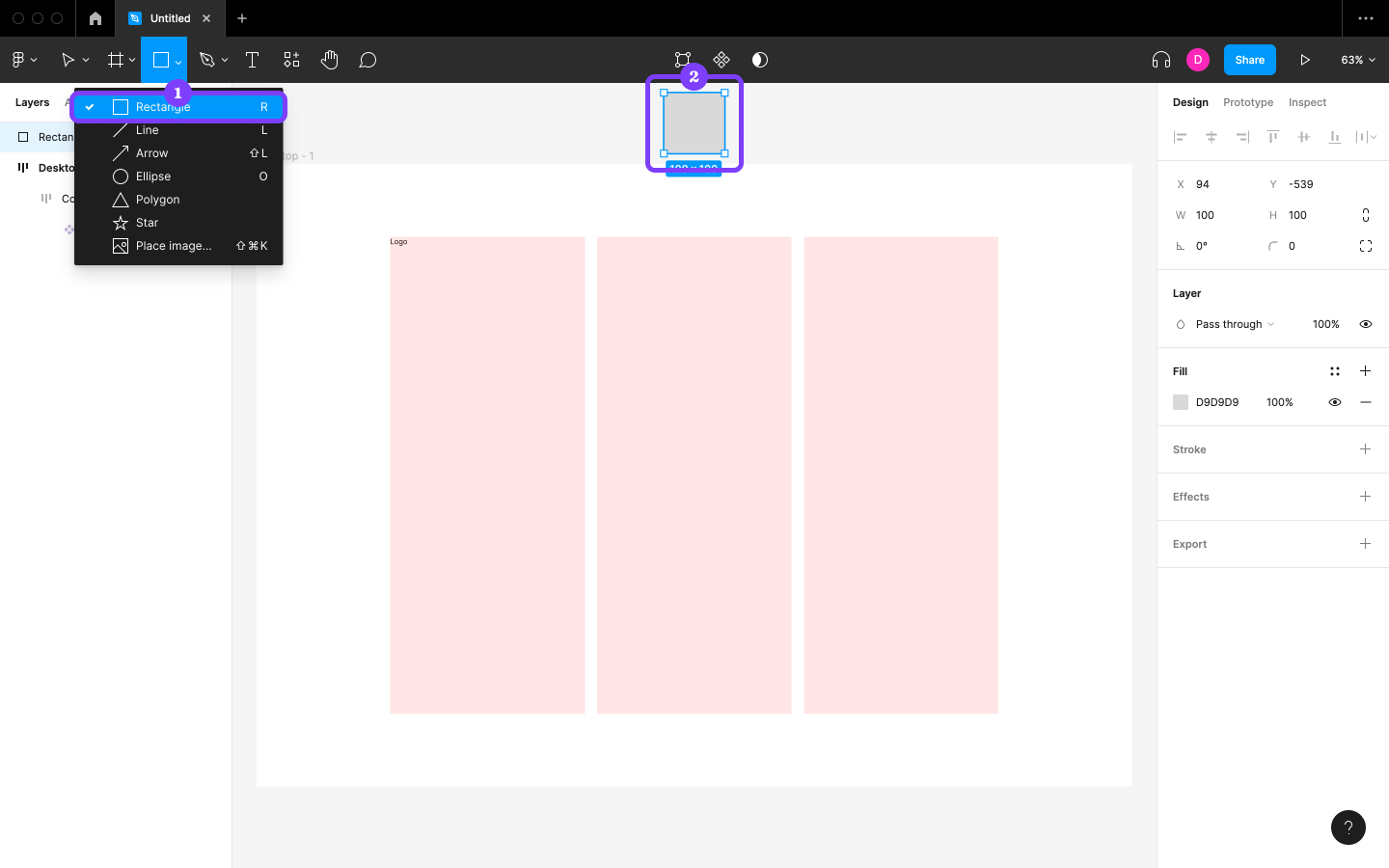
To create the first Rectangle, select the “Shape tools” icon in the horizontal toolbar, choose Rectangle (R) from the options, and click on the canvas. (Click outside the bounds of “Desktop - 1” so that we can work freely.)
Step 10: Styling the Rectangle
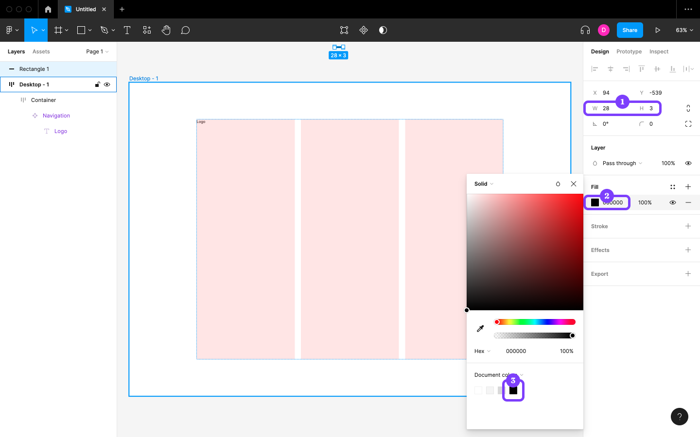
Set the width (“W”) to 28, the height (“H”) to 3, and the “Fill” to #000000. Alternatively, select the black square underneath “Document colors” inside the Fill modal, which exists because another Layer (“Logo”) also uses that color.
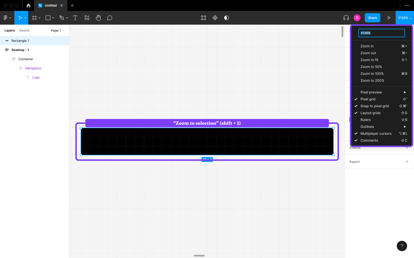
If the Rectangle is difficult to see, tap shift + 2 to “Zoom to selection” (we can tap shift + 1 to revert to “Zoom to fit” whenever we need to). See “Zoom/view options” (the right-most drop-down in the horizontal toolbar) for more options.
Step 9: Creating the Second Rectangle Shape
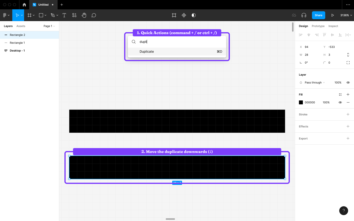
Find “Duplicate” using Quick Actions (command + / / ctrl + /) to duplicate (command + D / ctrl + D) the Rectangle. “Rectangle 2” will appear on top of its original (and will be selected), so keep tapping the ↓ key until you can see both of them. (We can use the arrow keys to move Layers by 1px, or 10px while also holding shift.)
We want there to be a spacing of 10 between the Layers, so let’s measure the distance between them using Smart Guides. Hold option / alt while hovering over the other Layer (“Rectangle 1”) to measure the spacing between them.
If the spacing isn’t correct, use the arrow keys to move the Layer while measuring with option / alt.
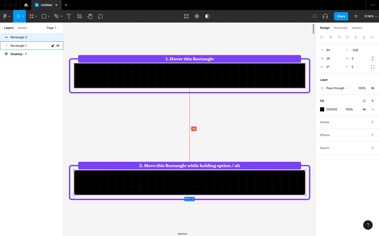
Alternatively, we can drag Layers while holding option / alt to duplicate and measure at the same time.
Step 10: Grouping the Rectangles
Hold shift while clicking on the other Rectangle to select it in addition to the Rectangle that’s already selected. After that, choose Group selection (command + G / ctrl + G) in the right-click menu, and then rename the Group to “Hamburger icon”. Grouping helps with organization and also makes related Layers easier to maneuver.
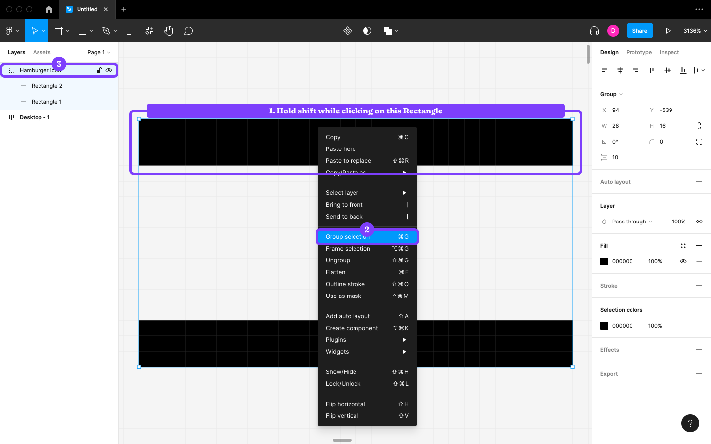
The Purpose of Groups
Groups are like Frames without functionality. That is, they can’t use Auto layout, Layout grids, Components, and so on. Although it can seem like Groups aren’t handy, different Layer types have different icons to signal what they do, so when you see a “Group” icon you know that it’s for organization.
With “Hamburger icon” still selected, tap command + X / ctrl + X to cut it. Next, select “Logo” and tap shift + command + V / shift + ctrl + V to “Paste over selection”.
“Hamburger icon” and “Logo” should now be siblings. Group them, then rename this Group to “Logo+hamburger icon”. Our document should look as pictured below.
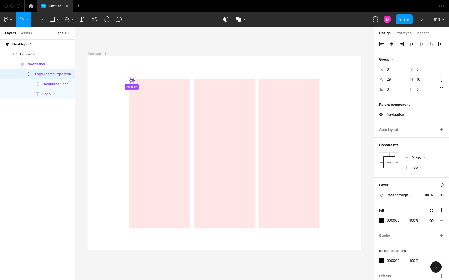
Step 11: Applying Auto Layout to the Navigation
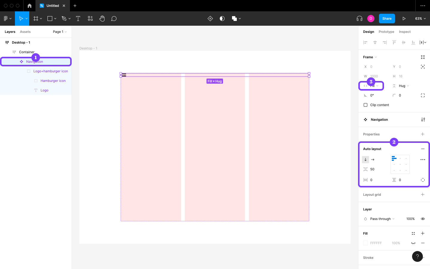
Select Navigation, activate Auto layout, and then change the “Spacing between items” to 50 (so that the drop-down menu that we’ll create shortly will have some space to breathe). Next, change the Horizontal resizing to “Fill container” (to make its width fluid).
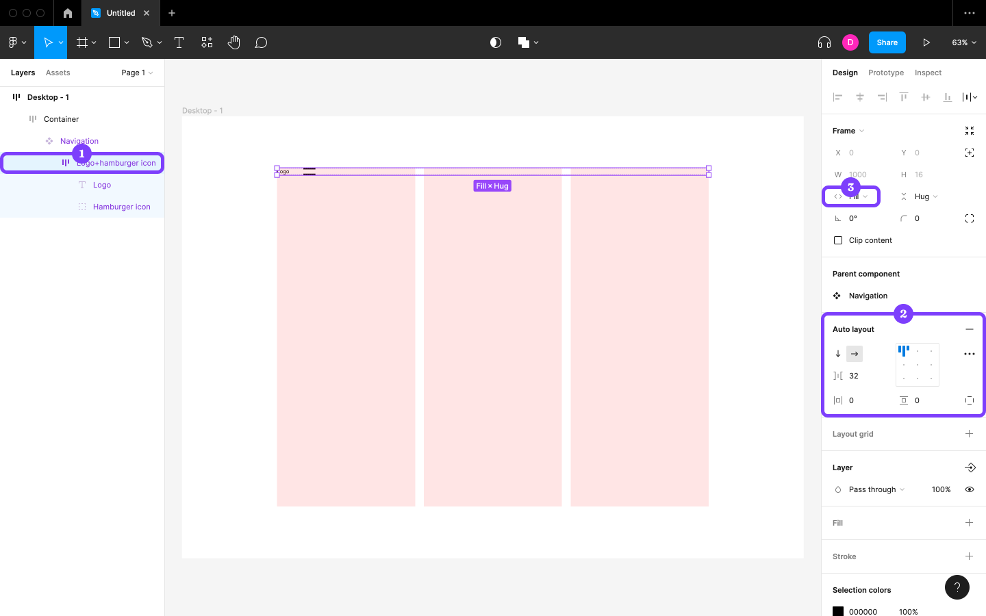
Repeat those steps with “Logo+hamburger icon”, but change the “Spacing between items” to 32 and click on the “Horizontal direction” icon to make the content flow horizontally.
Finally, select “Logo” and change the Horizontal resizing to “Fill container”, which will make it fill all horizontal space not occupied by the hamburger.
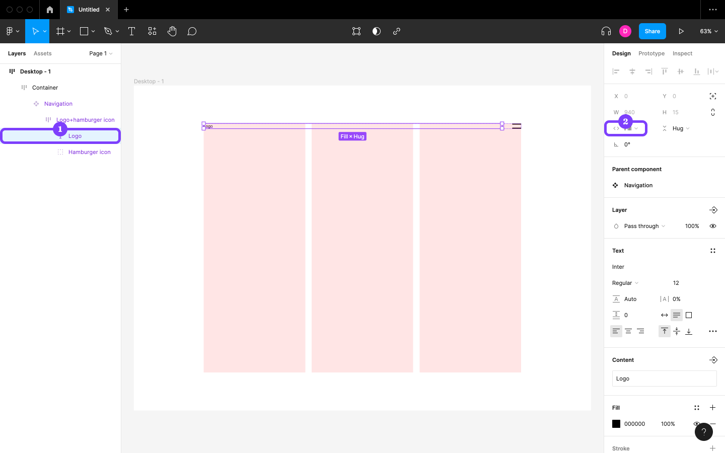
Step 12: Creating the Menu
Create a Text layer (out of bounds) like this:
Code snippet
Link 1Link 2Link 3Link 4Link 5After that, duplicate it twice, multi-select the instances, then Frame them. Cut the Frame, select Navigation, and then Paste over selection. Rename the Frame to “Dropdown menu”. After doing all of that, “Navigation” should look something like the image below.
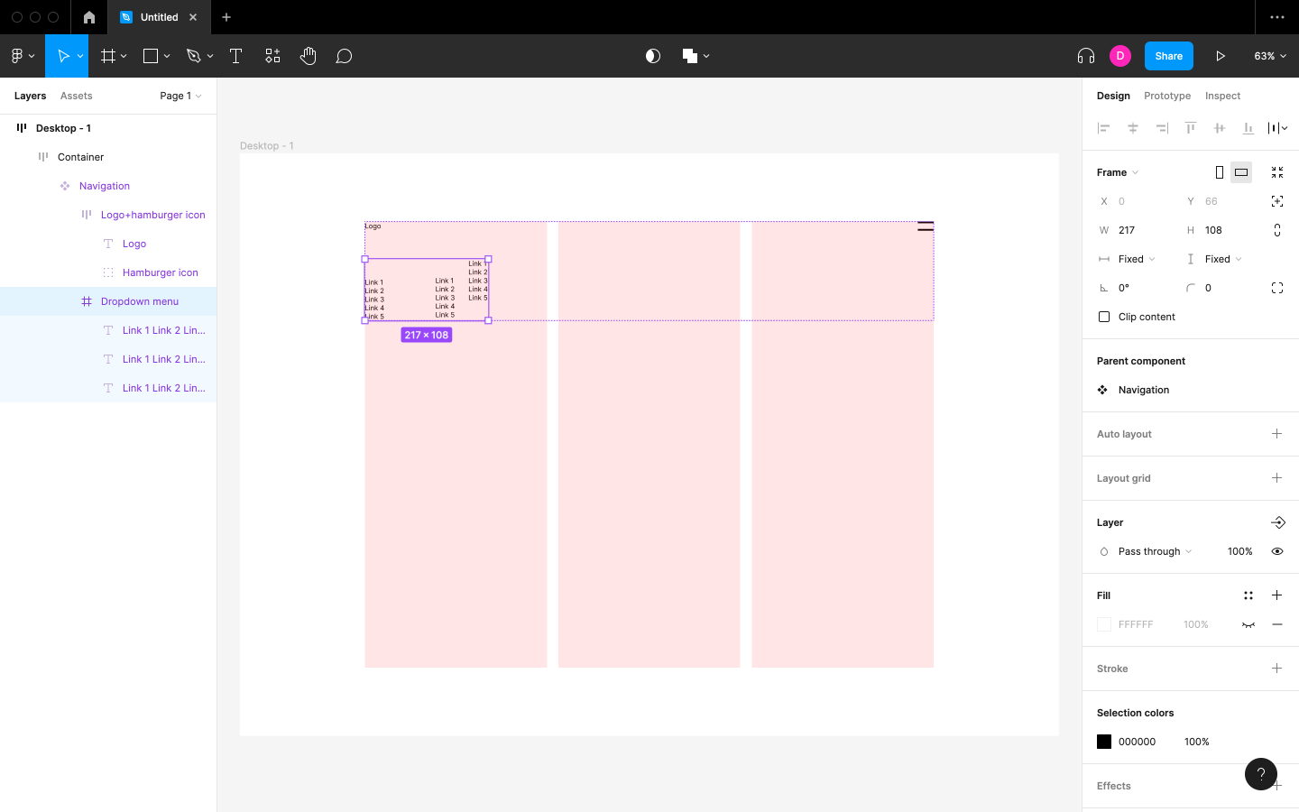
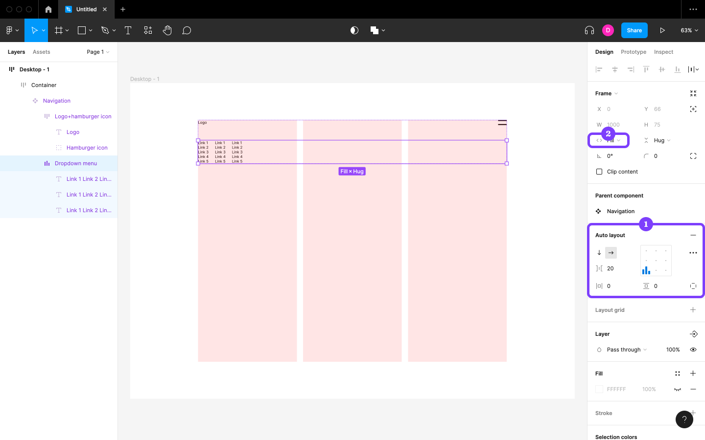
Next, activate Auto layout, click on the “Horizontal direction” icon, change the “Spacing between items” to 20 (to match the Layout grid’s Gutter), and then change the Horizontal resizing to “Fill container”.
Finally, after selecting all three lists, change the Horizontal resizing to “Fill Container” so that the width of the lists and the width of the Layout grid’s columns are the same.
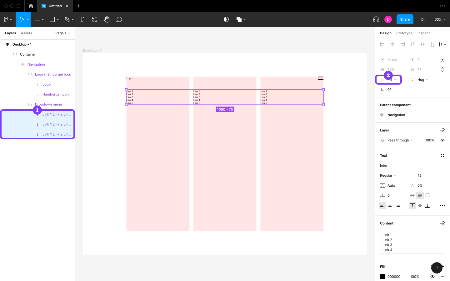
Step 13: Creating the “Closed” Variant
Next, we’ll create a Variant of our navigation Component that shows what it looks like when closed.
Select Navigation, click on the “Create component property” icon (Design panel, to the right of “Properties”), then choose Variant.
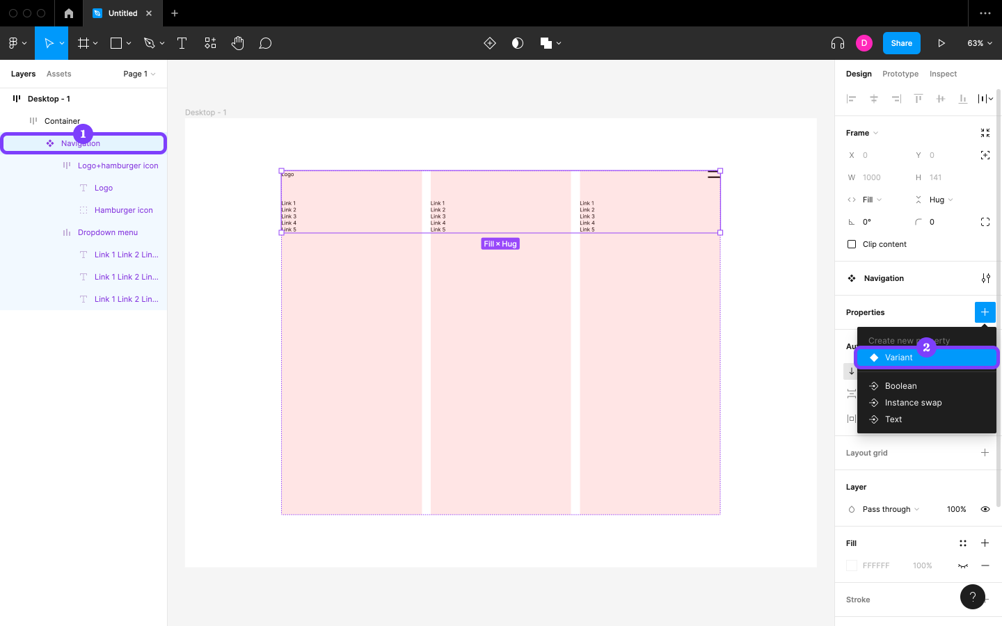
Before moving forward, turn Auto layout back on (because Figma resets Auto layout settings when creating Variants). Revert the “Spacing between items”, “Horizontal padding”, and “Vertical padding” to 0. Revert the Horizontal resizing to “Fill container”, then double-click on the Variant (which will be called “Default”) to select it and apply the same setting.
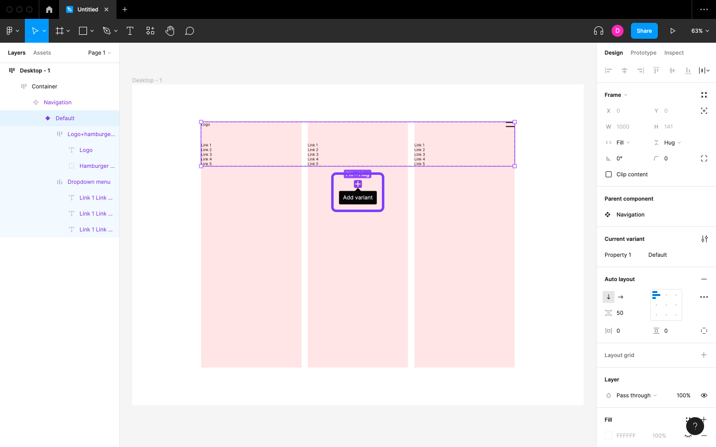
Now we can create the “closed” Variant. Do this by clicking on the + icon underneath the Component to Add variant (it will be called “Variant2” by default).
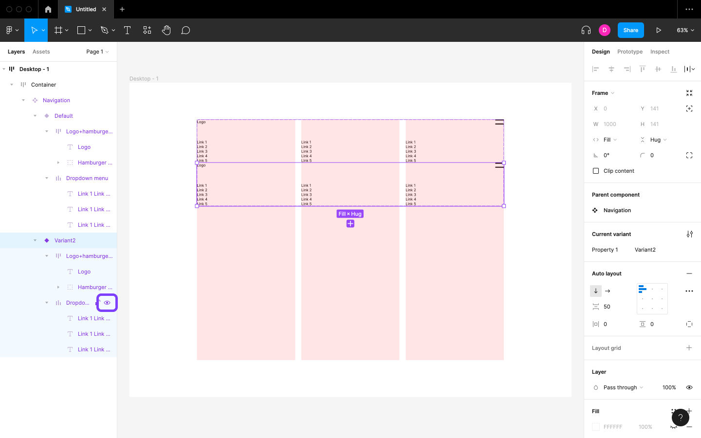
Next, let’s style this Variant. To show what the navigation should look like without the menu dropped down, we can simply hide the “Dropdown menu” Frame. Hover over “Dropdown menu” in the Layers panel and then click on the eye icon to hide it (shift + command + H / shift + ctrl + H).
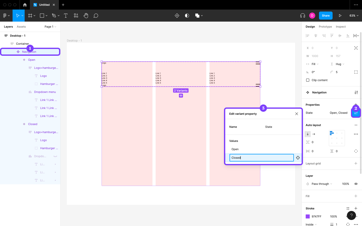
Finally, we need to name our Variants. Select Navigation and then click on the “Edit property” icon in the Design panel. Change “Name” to “State”, “Default” to “Open”, and “Variant2” to “Closed”.
In the following step, we’ll create interactions that will enable users to open and close the drop-down.
Step 14: Creating the Interactions
With both Variants now designed, let’s create some interactions that will enable users to switch between them by clicking on the hamburger icon.
Select “Hamburger icon” from within the “Open” Variant, switch to the Prototype panel, then click on Interactions. Next, click on the Click → None option and change the following settings:
- “None” to “Change to”
- “State” to “Closed”
- “Instant” to “Smart animate”
With “Smart animate”, Figma makes assumptions about how the interactions should animate, which most of the time are correct and can save us a lot of time. Since our design doesn’t need to be fancy right now, this option works for us.
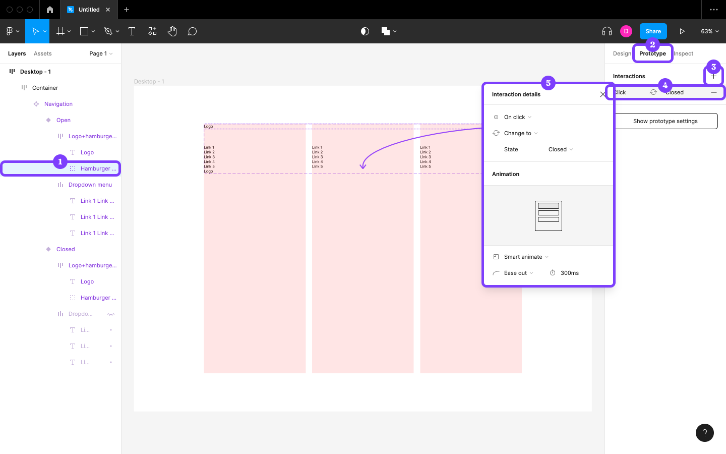
Similarly, select “Hamburger icon” from within the “Closed” Variant and repeat the steps above, but change “State” to “Open” this time around.
Step 15: Utilizing Instances
Before moving on, let’s make sure our design only shows the closed Variant, because right now it looks weird with both Variants stacked on top of one another. This is happening because this Component is the “Main Component”, whereas our mockup only needs to show one “instance” of it.
Let’s move the Main Component aside for now. Grab “Navigation” and drop it anywhere outside the bounds of “Desktop - 1”. Next, click on the “Resources” icon (shift + I) in the horizontal toolbar, and then drag “Navigation” into “Desktop - 1” (“Container”).
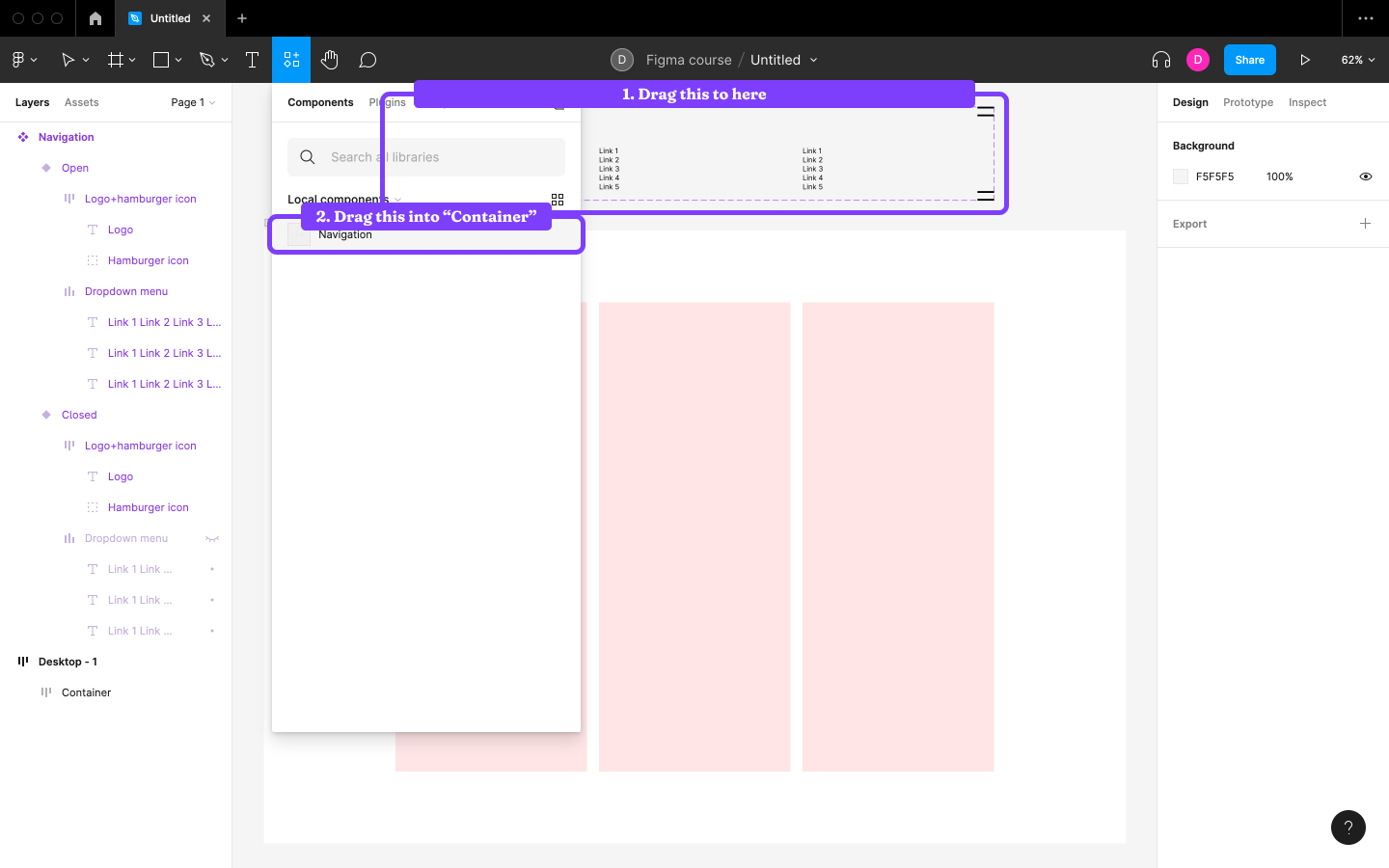
Next, change the “State” from “Open” to “Closed” in the Design panel and reapply “Fill container” (sigh).
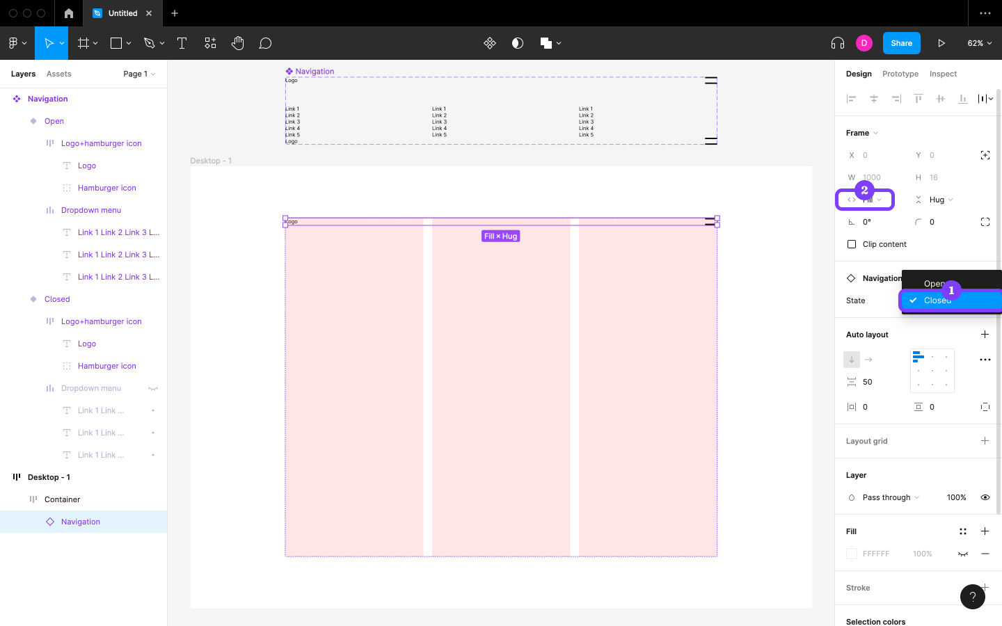
If we were to make a change to this instance of “Navigation”, this change would be called an Override and it would only apply to this instance. However, if we wanted to make a change to all instances of the Component (current and future), we would need to make the change to the Main version of the Component.
Step 16: Sourcing Content with Figma Plugins
As designers, we’ll often be designing while awaiting the content from stakeholders, using fake content until then. Other times we might need fake names, avatars, and so on, and for this purpose Figma has plugins that we can install. Figma plugins are add-ons that can add additional functionality to Figma.
Firstly, though, let’s ensure that our container is ready for more content. Select Container and apply vertical direction to ensure that all new content appears under our navigation. Also, set the “Spacing between items” to 50.
Next, create a new Text layer with “Heading” as the copy, and then set its Horizontal resizing to “Fill container”. Duplicate it so that there’s two of them.
It should look like the image below.
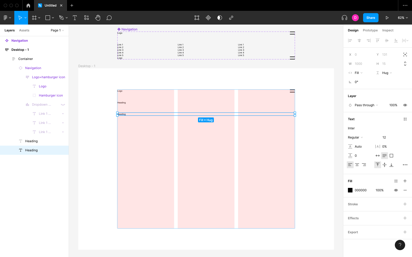
Now let’s fill the current selection with fake content. Navigate to the “Resources” icon in the horizontal toolbar, switch to the Plugins tab, search for “lorem ipsum”, then click on the Run button.
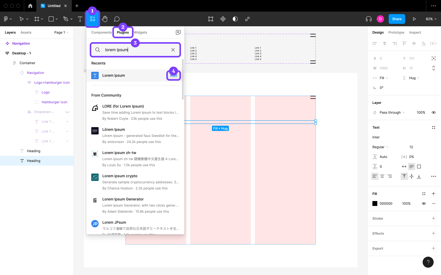
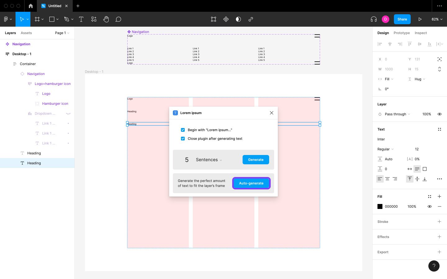
Like with any Figma plugin, follow the on-screen instructions to use it. In this case, click on the Auto-generate button.
Let’s try an image now.
We can drag images from our computer onto the canvas, or we can go to the “Shape tools” icon in the horizontal toolbar and select Place image (shift + command + K / shift + ctrl + K). Pasting images onto the canvas also works.
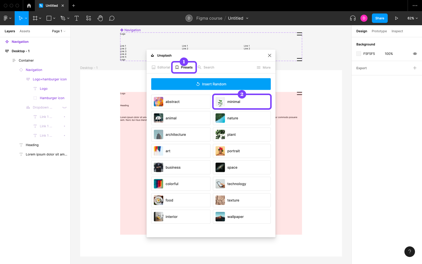
For now, though, search for and run the Unsplash plugin.
Next, select a random image from Presets → minimal. Ensure that there aren’t any Layers selected before running the plugin, as otherwise the image will be set as the background for that Layer.
Plugins for Fake Content
We can use community-built Figma plugins to insert all kinds of fake and real content, speeding up our design workflow significantly. Here are some of the best ones:
- Iconify (insert icons)
- Figmoji (insert emojis)
- Charts (insert charts with fake or real data)
- Map Maker (insert fake or real Google or Mapbox maps)
- Content Reel (insert fake names, avatars, addresses, etc.)
- Various illustration libraries (insert customized illustrations)
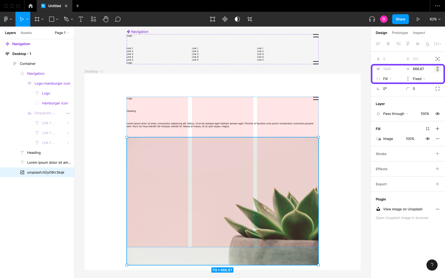
After dragging the image into “Container” using the Layers panel, apply “Constrain proportions” from the Design panel (click on the “Link” icon next to “H”) so that it will maintain its aspect ratio when we resize it. Now resize it by setting the “W” to 1000, then set the Horizontal resizing to “Fill container” to make it responsive. Proportion constraint won’t work with Resizing since it forces “Fixed height”, which is why we sized the image for “Desktop - 1” before setting the Horizontal resizing. On other screen sizes the height will be an issue, but we’ll try to circumvent that in the next tutorial.
Ultimately, we should end up with what’s pictured below.
Summary
In this tutorial, we learned how to create a functional, adaptive, low-fidelity prototype with Figma. We dove into the basics of its UI, concepts, and terminology, and even explored some plugins.
Nice work!