Introducing Data Visualization and D3
Hi there! My name is Shaumik Daityari, and I’ll be your instructor. I’m a business analyst by day and a comic book enthusiast by night. For over four years, I’ve been authoring articles, books and even a book on SitePoint. In this book, I’ll teach you how to create data visualizations using JavaScript. Fasten your seatbelts— it’s going to be a bumpy ride!
Every second, netizens generate a tremendous amount of data, such as shopping habits, location, and browsing history. The data collected is analyzed and insights are drawn, which drives new businesses.
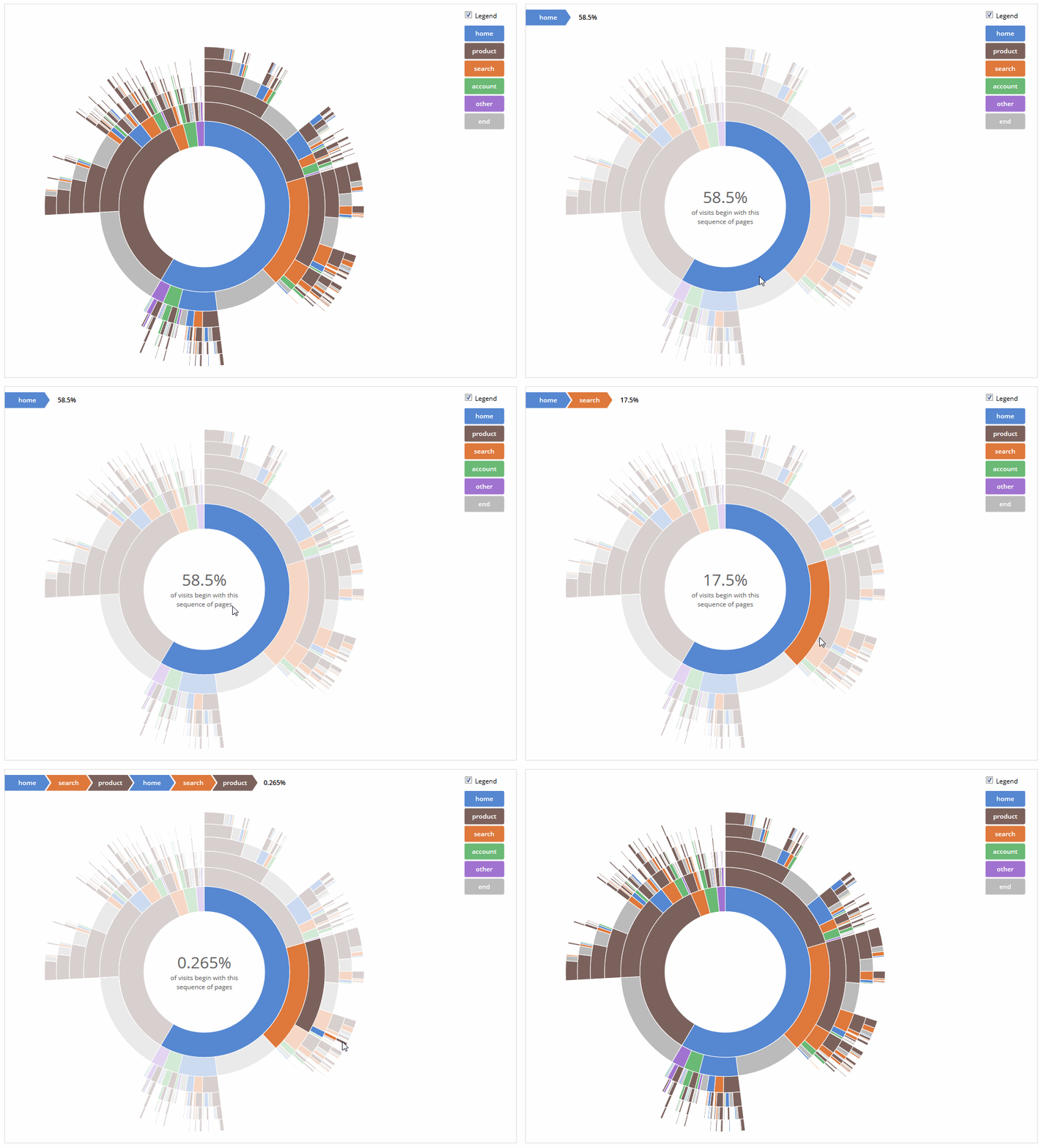
While the data analysis is fueled by machine learning and artificial intelligence, a unique requirement has quietly emerged in recent times—the ability to tell the story behind an analytical exercise. This has led to the emergence of a variety of graphing tools. Data is only as good as its presentation. Visualizations can, therefore, greatly simplify complex data and explain insights.
With the inevitable use of data analytics in web and mobile applications, there’s an increasing demand to effectively communicate results through crisp visuals. The ability to create data visualizations makes a developer stand out from the rest in the job market.

This book follows the journey of a beginner learning the most popular tool, D3.js, a JavaScript library for visualizing data. D3 enables you to bring data to life—getting data from various sources, manipulating it to suit your needs, adding interactivity and embedding it in a web page. We chose D3 because it’s over seven years old, and has a strong community that provides support. Recent versions of D3 have become easier to learn for beginners with rudimentary knowledge of JavaScript and no prior experience of charting tools.

As with most technologies, the reckless use of commonly available charting tools can lead to very confusing graphical representations of data. This book will tackle what one should keep in mind when preparing visualizations for an audience.
In the next chapter, we’ll look at possible data sources before we begin the process of data visualization. We’ll start with static data in the form of flat files, and move on to more complex sources like databases on the cloud and other real-time data.