Part 1: Foundations. Design Systems
Design System
There isn’t a standard definition of “design system” within the web community and people use the term in different ways. In this chapter, we’ll define what a design system is and what it consists of.
A design system is a set of interconnected patterns and shared practices coherently organized to serve the purpose of a digital product. Patterns are the repeating elements that we combine to create an interface: things like user flows, interactions, buttons, text fields, icons, colors, typography, microcopy. Practices are how we choose to create, capture, share and use those patterns, particularly when working in a team.
Take a look at these two screens of unrelated products. One is from Thomson Reuters Eikon, a trading and market analysis application; the other is from FutureLearn, an open education social learning site.
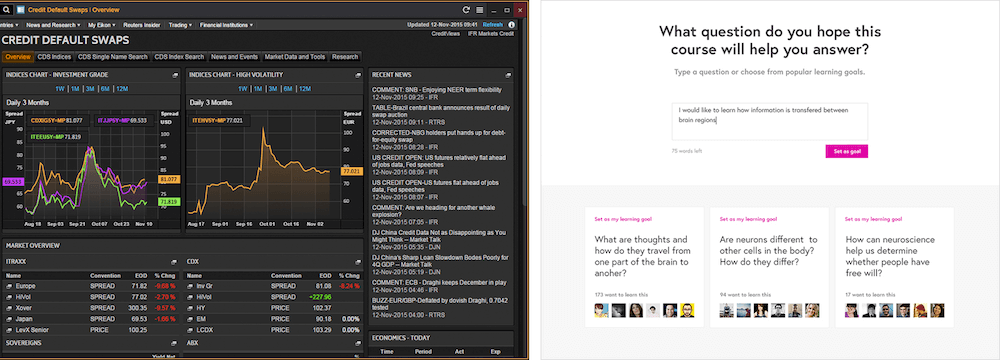
A screen from Thomson Reuters Eikon (left) and a screen from FutureLearn (right).
In each example the patterns work together to achieve different purposes. For Thomson Reuters, it’s about handling data, utility, quick scanning and multitasking; for FutureLearn, it’s about thoughtful reading, informal learning, reflection and connecting with like-minded people. The purpose of the product shapes the design patterns it adopts.
The Thomson Reuters layout is panel- and widget-based, to allow users to multitask. The design is dense, fitting large amounts of information on the screen. Density is achieved through tight spacing, compact controls, flexible layouts and typographic choices, such as a condensed typeface and relatively small headings. On the other hand, the FutureLearn layout is much more spacious. Each screen is typically focused on a single task, such as reading an article, engaging in a discussion, or completing an interactive exercise. The layout here is mostly a single column; there’s high-contrast typography with large headings, chunky controls, and generous white space. 1
The choice of design patterns is influenced by many factors. Some of them come from the domain the product belongs to, and from its core functionality: those are functional patterns. To use trading and market analysis software, for instance, you’d need to be accustomed to task bars, data fields and grids, charts and data visualization tools. For an online learning site, it could be articles, videos, discussion threads, progress indicators and interactive activities. An e-commerce site would most likely include a product display, list filters, shopping cart and a checkout.
The ethos of a product (or the brand, depending on your definition of a brand) also forms patterns which together shape how a product is perceived; throughout this book I’ll refer to them as perceptual patterns. By that I mean things like tone of voice, typography and color choices, iconography styles, spacing and layout, specific shapes, interactions, animations, and sounds. Without perceptual patterns you wouldn’t feel that much difference between products from within the same domain, which have similar functionality.

Although HipChat and Slack have similar purposes and functionality, they feel quite different, largely due to how brand is expressed throughout their interfaces.
Patterns are also shaped by platform conventions. A product can feel distinctly web-y or distinctly app-y because of a platform-specific design language. An iOS application for a product can behave and feel entirely different from its Android equivalent.
There are many kinds of patterns at play when it comes to creating a digital product. That’s why design is hard. Patterns need to interact, connect, yet still work seamlessly together. Let’s take a closer look at them.
Design Patterns
The idea of design patterns was introduced by the architect Christopher Alexander in his seminal books, The Timeless Way of Building and A Pattern Language. One question that runs through the books is why some places feel so alive and great to be in, while others feel dull and lifeless. According to Alexander, the way places and buildings make us feel is not due to subjective emotions merely. It’s a result of certain tangible and specific patterns. Even ordinary people can learn and use them to create humane architecture.
A pattern is a recurring, reusable solution that can be applied to solve a design problem.
“Each pattern describes a problem that occurs over and over again in our environment, and then describes the core of the solution to that problem.”— Christopher Alexander, A Pattern Language
A Pattern Language contains 253 architectural design patterns, starting from the larger ones, such as a layout of a city and road systems, down to the smallest ones, such as lighting and furniture in a family house.
Similarly, when creating interfaces we use design patterns to solve common problems: we use tabs to separate content into sections and indicate which option is currently selected; we use a dropdown to display a list of options at the user’s request. 2
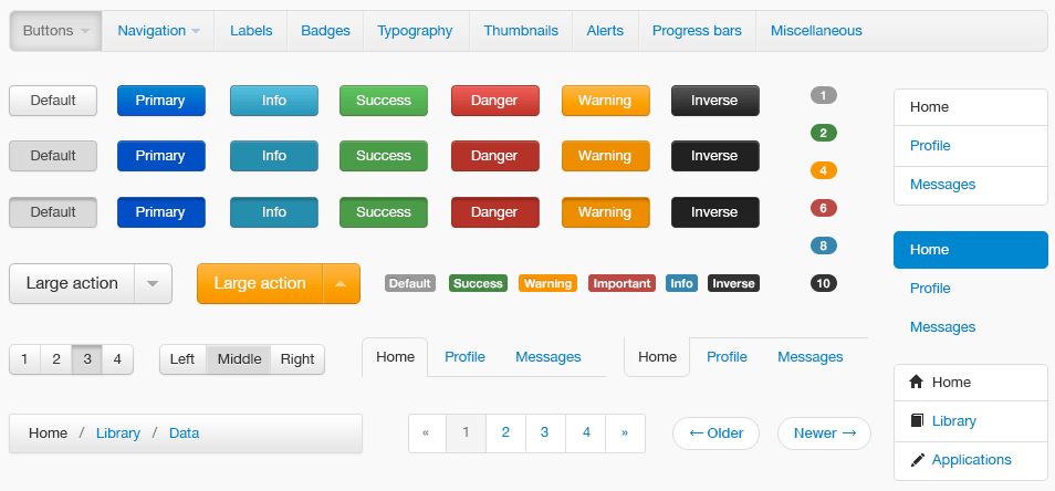
Some of the patterns from Bootstrap, a front-end framework for developing responsive websites.
We use patterns to offer feedback, to show how many steps are left in a process, to allow people interact with each other, to view and select items. Design patterns can intrigue and encourage, make tasks easier, create a sense of achievement or an illusion of control.
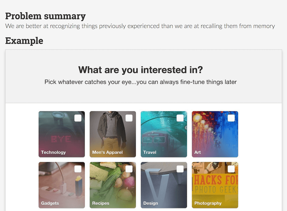
Example of persuasive pattern “recognition over recall” on UI Patterns3.
Most of the design patterns are established and familiar. They make use of people’s mental models and allow design to be understood intuitively. Entirely new patterns require users to learn and adopt them first — they are relatively rare. 4 What makes a product distinct from its competitors is not the novelty of patterns it uses, but how those patterns are executed and applied, and how they interconnect to achieve a design purpose. A set of interconnected patterns forms the design language of your product’s interface.
A design language emerges as we work on a product. We don’t always know what this language is. Sometimes, effective and interesting designs are based on intuition, and we struggle to articulate exactly how and why they work. Designers and developers might know it instinctively, but intuition is not always reliable or scalable. In his article “ Researching Design Systems,” 7 designer Dan Mall noted that one of the main goals of a design system is “extending creative direction.” If you need to get a group of people to follow a creative direction consistently, reliably and coherently, patterns need to be articulated and shared.
When you articulate your design language it becomes actionable and reproducible. You start approaching design with a system in mind. For example, instead of discussing how to tweak an item to make it stand out more, you can have a suite of promotional patterns, each one targeted to achieve a different level of visual prominence. The visual loudness guide6 by Tom Osborne is an example of how buttons and links can be approached systematically. Instead of listing them individually, they are presented as a suite, each one having a different “volume” corresponding to its intended visual prominence.
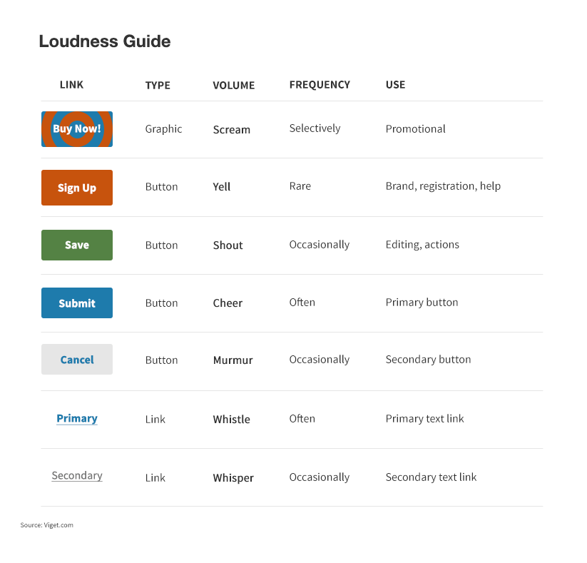
The visual loudness guide by Tom Osborne.
Articulating your language allows you to gain more control over the system. Rather than making small tweaks, you can affect it in much more profound ways. If you discover a small design change which made a positive impact on user experience, you can apply it to the pattern across the system rather than to one place. Instead of spending hours on designing a dropdown, you can spend that time with the users and domain experts, finding out if a dropdown is needed in the first place. When the design language is shared knowledge, you can stop focusing on the patterns themselves and instead focus more on the user.
Throughout the book we’ll talk a lot about articulating, sharing and documenting a pattern language for digital products. In particular, we’ll look at two types of design patterns: functional and perceptual. Functional patterns are represented as concrete modules of the interface, such as a button, a header, a form element, a menu. Perceptual patterns are descriptive styles that express and communicate the personality of the product visually, such as color and typography, iconography, shapes and animations.
To extend the analogy with language, functional patterns are a bit like nouns or verbs — they are concrete, actionable parts of the interface; whereas perceptual patterns are similar to adjectives — they are descriptive. For example, a button is a module with a clear function: allow users to submit an action. But the typographic style in the label of the button, its shape, background color, padding, interactive states and transitions are not modules. They are styles; they describe what kind of button it is. From a front-end perspective, modules always have a basis in HTML, and perceptual patterns are typically CSS properties.
A design system contains many other kinds of patterns: user flows (such as completion of forms with errors and success messages), domain-oriented design patterns (like learning patterns for EdTech systems, and e-commerce patterns), and persuasive UX patterns. The focus of this book is on the functional and perceptual patterns as the core building blocks of a design system.
But, of course, what matters is not only the patterns themselves, but how they are evolved, shared, connected and used.
Shared Language
Language is fundamental to collaboration. If you work in a team, your design language needs to be shared among the people involved in the creation of the product. Without a shared language, a group of people can’t create effectively together — each person will have a different mental model of what they’re trying to achieve. Let’s return to the button example. Even such a basic unit of the interface can have different meanings. What exactly is a button? An outlined area that you can click on? An interactive element on a page that links somewhere? A form element that allows users to submit some data?
In her book How to Make Sense of Any Mess, Abby Covert suggests that a shared language should be established before you think about interfaces, by discussing, vetting and documenting our language decisions. This idea could be applied to describing high-level concepts as well as the day-to-day language we use to talk about design decisions. Having a shared language would mean that we have the same approach to naming interface elements and defining design patterns, or that the same names are used in design files and front-end architecture.
Even that might not be enough. Sometimes, people in a group think they have reached a mutual understanding because they share the same vocabulary and use it expressively, but they still retain fundamental differences in understanding. For example, after a year of using the term “Scenario” as a key concept in a project, you might discover that different people are interpreting it in entirely different ways. It’s not only about developing a shared language — we need also to develop a shared use of language. It’s not enough to have a shared understanding of the term button. People must also know why and how to use a button, in what contexts, and the purpose a button can serve.
Suppose we use an element called “Sequence” in the interface. By presenting it as “Sequence” we aim to communicate to users that the steps should be looked at in a specific order.

Example of “Sequence” module.
Ideally, everyone involved in the creation of the product should know what this element is: its name and purpose, why it’s been designed that way, and how and when it should be used. 7 The stronger this shared knowledge is, the higher the chances that it will be used appropriately. Designers and front-end developers should have this knowledge, but it helps if people from other disciplines (content, marketing, product management) have some idea too.
It should be known to everyone as “Sequence,” not “Wizard control” or “Fancy bubbles.” If designers refer to it as “Fancy bubbles,” developers call it “Wizard control” and users interpret it as set of optional tabs, then you know your language doesn’t work. Why is the user’s interpretation important? We can remember here Don Norman’s pioneering work, The Design of Everyday Things, where he talks about the gulf between the system image (the interface) and the user’s model (the perception of the interface formed by the user through interaction with it). If the user has a mental model of the interaction that doesn’t fit with the system image provided by the design team, then the user will be continually challenged by unexpected behavior from the system. An effective design language bridges the gap between the system image and the (assumed) user model.
As your language becomes richer and more complex, you need an efficient way to capture and share it. On today’s web, a pattern library is one of the key examples of good practice in supporting a design system.
Pattern Libraries And Their Limitations
A design system consists not only of patterns, but also techniques and practices for creating, capturing, sharing and evolving those patterns. A pattern library is a tool to collect, store and share your design patterns, along with the principles and guidelines for how to use them. Even though pattern libraries have become popular on the web relatively recently, the concept of documenting and sharing design patterns in various forms has existed for a long time.
Palladio’s The Four Books of Architecture, first published in 1570 in Venice, is one of the most important and influential books on architecture. It is also one of the earliest examples of system documentation. Drawing inspiration from Greco-Roman architecture, Palladio provided rules and vocabulary for designing and constructing buildings, including principles and patterns, with detailed illustrations and explanations of how they work.
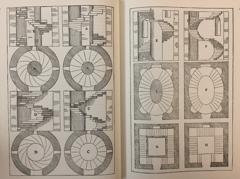
Types of staircases: spiral, oval and straight. Palladio described how and when to use each type; for example, spiral staircases are suited for “very restricted locations because they take up less space than straight stairs but are more difficult to go up.”
In modern graphic design, systems have also long been documented, from early typography and grid systems, to Bauhaus design principles. For the last few decades, companies have documented their visual identities in the form of brand manuals, with NASA’s Graphics Standards Manual from 1975 being one of the more well-known examples.
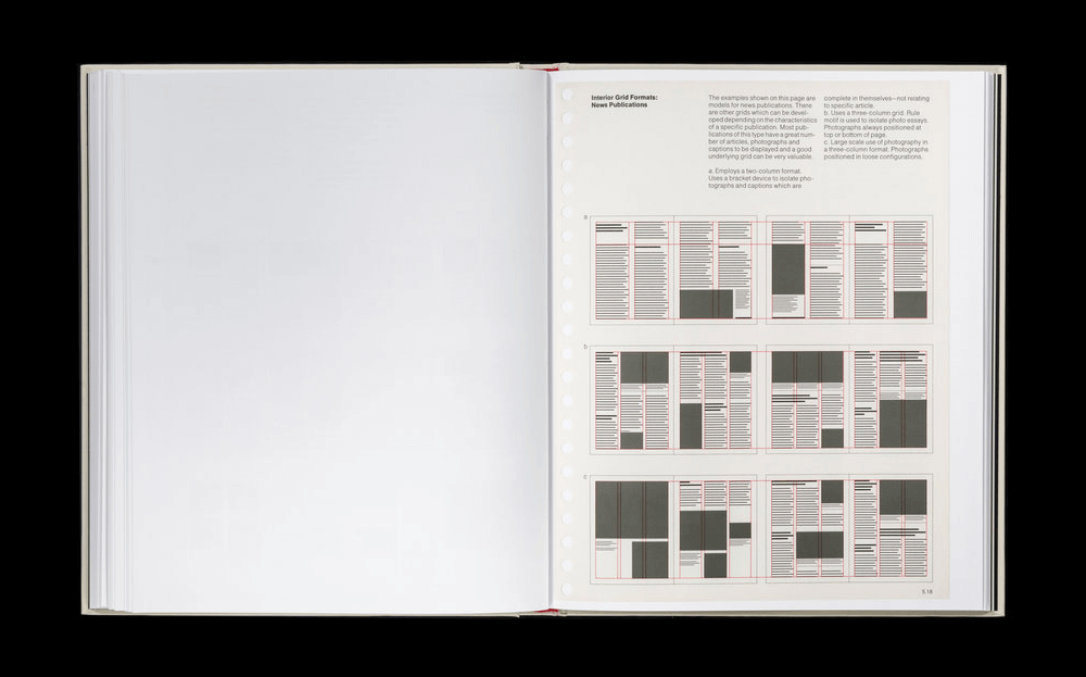
Layout guidelines in NASA’s Graphics Standards Manual.
On the web, pattern libraries started as extended brand identity documents that focused on logo treatments, corporate values and brand styles, such as typography and color palettes. 8 They then extended to include interface modules, as well as guidelines for their use. Yahoo’s pattern library was one of the first examples of documented interface patterns.
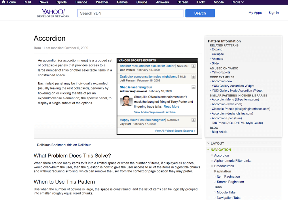
Yahoo’s pattern library was one of the first examples of documented interface patterns.
For companies less resourceful than Yahoo, a pattern library would typically live in a PDF or a wiki, which meant that it was static and difficult to keep up to date. The aspiration for many designers and developers today is a more dynamic or “living” pattern library that contains the design patterns, as well as the live code used to build them. A living style guide or pattern library is more than a reference document — it’s the actual working patterns used to create an interface for a digital product.
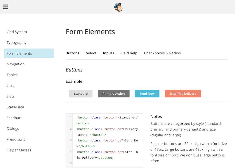
MailChimp’s pattern library9 is one of the most influential early examples of living pattern libraries on the web.
The Limitations of Pattern Libraries
Pattern libraries are sometimes thought of as interchangeable with design systems. But even the most comprehensive and living pattern library is not the system itself. It’s a tool that helps to make a design system more effective.
A pattern library doesn’t guarantee a more cohesive and consistent design. It might help to correct small inconsistencies or make a codebase more robust, but a tool alone will have very little impact on the user experience. No pattern library will fix bad design. Patterns can still be badly designed, misused or combined in ways that don’t work as a whole. As Michael McWatters, UX architect at TED, noted in an interview: “Even a SquareSpace template can be ruined by sloppy design thinking.” And conversely, a product with a coherent user experience can be created without a comprehensive pattern library (as we will see in chapter 6 in the example with TED’s design system).
A living pattern library is associated with better collaboration. Yet you might end up in a situation where only a small group of people uses it, or there might be too many disconnected patterns as a result of a lack of communication between the teams. When up-to-date, a pattern library is a glossary for the shared language. But that doesn’t mean there isn’t still room for interpretation. It’s the discussions around the interpretation which are often the key to a pattern library’s success or failure.
On the other hand, pattern libraries are sometimes blamed for stifling creativity, leading to generic looking websites. But again, a pattern library reflects the design system behind it. If your system is fundamentally rigid and restricting, the pattern library can reveal and emphasize the rigidity. If it allows plenty of creative experimentation, a good pattern library can make the experimentation easier.
With all the automated tools and style guide generators available today, setting up a library of components can be done much quicker than in the past. But without a foundation of a coherent design system that integrates the patterns and practices, its impact will be limited. When a pattern library is used to support a solid design language foundation, it becomes a powerful design and collaboration tool. Until then, it’s a collection of modules on a web page.
What Makes An Effective Design System
The effectiveness of a design system can be measured by how well its different parts work together to help achieve the purpose of the product. For example, the purpose of FutureLearn is “to inspire lifelong learning in everyone, anywhere.” We could ask, how effective is the design language of the interface to help us achieve this, and how effective are the practices of the team? If the interface is confusing and people don’t achieve their goals, then the design language is not effective. If it takes too long to build a new area of the site because patterns have to be recreated from scratch every time, then we know our practices can be improved. A design system can be considered effective when it combines cost-effectiveness in the design process, and efficiency and satisfaction of the user experience in relation to the product’s purpose.
Shared Purpose
In Thinking in Systems, Donella Meadows explains that one of the most important qualities systems have is how they’re connected and organized: subsystems are aggregated into larger systems, which in turn form part of something larger. A cell in your liver is part of an organ, which is a part of you as an organism. No system exists in isolation. Your design system might have a smaller subsystem within it: editorial rules to control the layout of the page; or it might include a method for scaling your logo responsively in a certain way. At the same time, it is also part of other larger systems: your product, your team, your company culture.
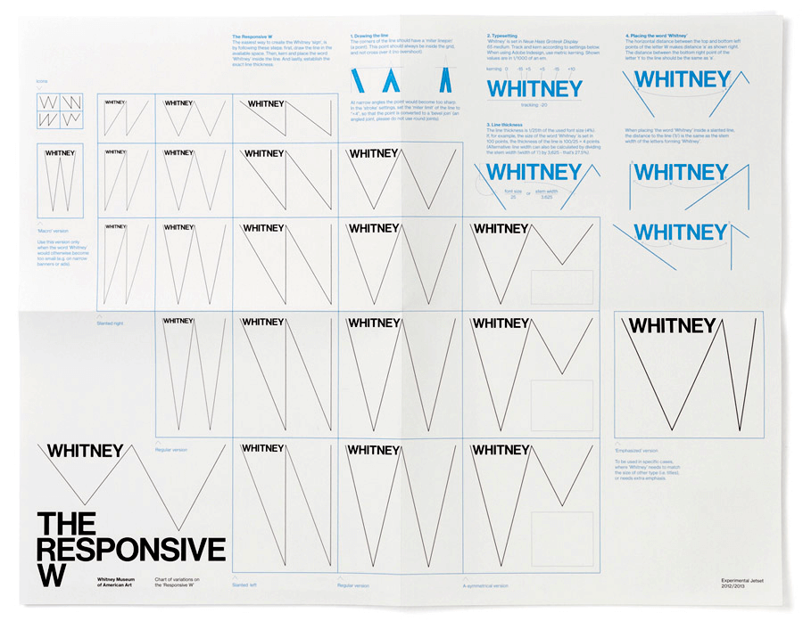
The Whitney Museum of American Art’s logo, a “ dynamic W,” 10 is a simple yet remarkably adaptable system in its own right. The W responds to the artworks and words around it, allowing a huge range of flexible layout possibilities.
In highly effective systems, we see that subsystems are connected and aligned toward a shared purpose: a design approach is mirrored in the front-end architecture; design patterns follow the guiding principles; the pattern language is applied consistently in design, code and the pattern library. We see harmony in the way those systems function: their workflow is more efficient, and the user experiences they generate feel more meaningful and coherent.
Identifying Problems
When there are gaps, it’s also easy to see them. A fragmented design system leads to a fragmented user experience, full of conflicting messages. We want the user to sign up for our newsletter, but we also want them to check out our latest products. We want them to progress through the steps, but we also need to make sure they rate each recipe. “Sequence” is used to preview the steps in one area of the site; in another, it is suddenly a tabbed navigation. The interface is full of various shades of the same color and multiple versions of the same button. The team’s productivity is also affected: making the tiniest change is time-consuming and fiddly because of the confusing, tangled up code. Designers spend their time copying pixels and reinventing solutions to the same problems, instead of understanding and solving real user needs.
How do we reduce the gaps and make our design system more effective? By understanding what it is and how it works. We’ll start by looking at how a pattern language evolves in a new product, by taking a simple fictional ten-minute recipe website as an example.
Example: A Ten-Minute Recipe Site
Imagine we are creating a website for sharing recipes with people who love healthy food but don’t want to spend a lot of time cooking. If we were to approach it with a system in mind and define design patterns early on, where would we start? Before we begin, let’s make some assumptions. We understand the domain of cooking, and enough research has already been done to inform our design decisions. So what we’re trying to do is not figure out what the experience should be, but see how we can establish design system thinking for this new website.
Purpose and Values
One of the first things we’d do is try to understand who our users are, their goals, needs and motivations. To keep it simple, let’s say that we know they are busy professionals and their goal is to get a tasty, healthy meal without hassle and hours spent cooking. There are many ways we can help them achieve this goal: connect them with chefs, deliver food to their doorstep, build a conversational app. But we want to do it through a website with ten-minute recipes.
If we were to express the purpose in a single sentence, it would be along the lines of: Motivate and empower people to cook delicious healthy meals in no more than ten minutes. This purpose is the core of the product, and it should inform design and development decisions. The team should recognize that purpose and believe in it — it shouldn’t feel forced.
Another important element is the ethos that captures the values and spirit we try to portray through the site. For us it can be simple healthy food and experimentation with common ingredients. For other cooking sites it can be haute cuisine and mastery of culinary skills.
Design Principles
To make sure the purpose of the product is expressed clearly through everything we do, we would need to establish a few grounding principles and values. They might be discussed informally or written as a manifesto — what’s important is that the people involved in the creation of the product agree on those values and commit to them.
For example, everyone on the ten-minute cooking recipe site team understands the value of time. They are motivated by having a time limit on the recipes, and as a result they all strive to make interactions on the site short, simple, fast and smooth. This principle will be expressed not only through design patterns, but the performance of the site, its tone of voice, and even how the team operates.
These principles might not necessarily be official or even written down. But having an agreement and awareness in the team on what they are is essential to keep everyone’s effort and priorities in sync. It can also help with decision-making: from which feature to build first and which approach to use, to working out UX flows, or how buttons should look and the choice of typeface. 11
Behaviors and Functional Patterns
We’d work out some of the key behaviors we want to encourage or enable in our users that will help them achieve their goals.
- We want people to always choose a healthy home-cooked meal over fast or microwaved food. This means that our meals need to look delicious and healthy, and be more enticing than microwaved food. Good imagery with irresistibly delicious yet simple-looking food can help us here.
- We want to enable people to achieve good results in under ten minutes. This means that we’ll need to present the recipes in a few simple steps. The steps should be short, clear and focused. Perhaps we could have a timer on each step, to make sure we keep to the ten-minute promise.
- We want to encourage people to be spontaneous and feel like they can prepare something whenever they like. Start with what you have already, rather than with what you need to get — no need to shop for extravagant ingredients. In terms of UI, this could be supported by easily selectable ingredient thumbnails with clear labels.
- Finally, we want to encourage people to be creative and spontaneous, and to have fun. Show which ingredients are optional and what they can be replaced with. Show unexpected combinations that could be interesting to try. 12
Naturally, the design details will change as we work on the site, but those key behaviors would remain the same. Those behaviors will inform the core functional modules and interactions of the site: ingredient thumbnails, recipe cards, step sequence, timer.
Aesthetics and Perceptual Patterns
Around the same time, we’d need to work out how we want to be perceived by someone using the ten-minute cooking recipes site. Are we simple and down-to-earth or glamorous and sophisticated? Are we serious or playful? Bold or subdued? Utilitarian or emotional? What are the aesthetics that capture the personality and ethos we want to portray through the interface? We’d start thinking about the brand.
We’re passionate about healthy food, so we want it to come through the site. Perhaps it would have an organic, warm, wholesome feel. We also believe that cooking doesn’t need to take a lot of planning and preparation; it can be spontaneous and fun, and you can experiment and be creative in the ten-minute time limit.
At this point we would probably put together some mood boards and start experimenting with visuals until the brand feels right. 13 Once we achieve this, we can define core visual brand elements such as typography, color palette, tone of voice, and any distinguishing features of the brand; for example, illustrations, image styles, specific shapes, unique interactions that capture the essence of our service and present content in the best way.
Let’s say we come up with a warm, earthy color palette, hand-drawn icons, typography with a focus on readability, quality photography of healthy food, and a few simple interface elements and controls. These styles will become our perceptual patterns.
Shared Language
Alongside this process we will be making language decisions by choosing to refer to concepts in certain ways. What is a “recipe”? What do we mean by “steps”? What makes a “delightfully simple” interaction? The words we choose will influence how the team thinks. And indirectly, they will shape the design.
At first, the patterns and language choices will be shared informally. But as our team and the product grow, so will the language. Eventually we’ll need a more structured way to capture, share, and organize our design vocabularies. 14
Now that we’ve looked at the design process in a nutshell using a fictional site, we can look at how systems evolve, using examples from real-world digital products and companies.
—
- The patterns on FutureLearn are chosen to support reflective learning. The learner needs to focus on the task at hand and not be distracted by displacement activities. The goal was to create an atmosphere that feels calm and contemplative.
- The website UI Patterns is a great source of common design patterns, grouped by purpose and the design problem it solves. For a comprehensive read on UI patterns, I also recommend Designing Interfaces: Patterns for Effective Interaction Design by Jenifer Tidwell.
- http://smashed.by/patternsrecognition
- Until the swipe gesture had emerged as a mobile pattern, no one would have known how to engage with it. Now we see whole products built on this pattern (such as Tinder). The transition to using what people know and exploring something new is very delicate; products live and die based on when and how they do this.
- http://smashed.by/researchingsystems
- http://smashed.by/visualloudness
- The challenge is also not to impose one definition or conception of “Sequence,” but to understand and work with its context of use so that, for example, the UX team can support different types of sequencing (for FutureLearn, sequencing of courses, runs, steps, user actions, etc.) within a coherent framework.
- 8.Perhaps this is how we can distinguish style guides from pattern libraries. Style guides traditionally focused on styles, such as colour and typography. Pattern libraries can include styles, as well as functional patterns and design principles, among other things.
- http://smashed.by/mailchimppatterns
- http://smashed.by/whitneyidentity
- In the next chapter we will look in more detail at the qualities of effective design principles and how they can form a foundation of your design language.
- For further reading on understanding what people want, and shaping a vision for a new product, see “ We Don’t Sell Saddles Here ” by Stewart Butterfield, CEO of Slack.
- More about the process of defining perceptual patterns in chapter 4.
- In chapter 5, we will see how effective names and a collaborative naming process can become part of the foundation of a design language system. In chapter 10 we will look at pattern libraries as a way to capture language choices and establish a shared vocabulary.