I am looking for such a needed feedback on the website that we are getting ready to launch: http://spacerim.com/ . I’d also like to mention that we are starting off as a two people team without any design, UI and UX skills, thus your opinions could really help us.
Our main goal is to motivate people to contribute to projects > in order to add their contributions to their resumes > apply to jobs (click job ads)
The roughest critique could be very helpful for us. Thank you in advance for all the ideas!
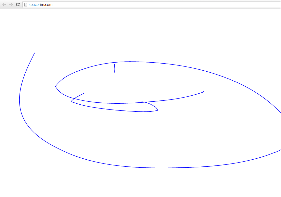
The worst thing about this site is that it is totally reliant on javascript.
If you visit with js disabled, you just get a blank screen. Not even any message to say that you need it enabled.
It may also be harming your chances with search engines, as it seems none of your content is being picked up and your pages don’t have unique meta descriptions.
JavaScript should be used for progressive enhancement of a site; adding extra (non-critical) functionality; relying on it for something central to your site - or the actual display of the site itself - is always a bad move. JavaScript can fail, or fail to load (or your visitor may have it disabled for good reason and be unwilling or unable to turn it on).
I do like the nice, clean layout of your home page and articles - and you have some great images on there.
As far as I am concerned, a “warning” or advisory about JS is as inviting as a sign that says, “You can Trust Me! I would never harbour an STD”.
Over the years, I’ve lost enough data and hardware to malware intrusions to give any leeway to my reservations about enabling JavaScript willy-nilly. (The most damaging intrusion came from what appeared to be an ad on an automobile dealer’s site.)
As much as I enjoy news about astronomy and space exploration, I would not miss what I will never see on your site.
I agree with TechnoBear that JS is best used for non-essential enhancement and absolutely not as a structural requirement where nothing is rendered with JS disabled.
Finally, it is very nice to see a cleanly laid out web site. It would be a pleasure to visit if only it were not totally JS dependent.
The site has a few validation errors. I wouldn’t be surprised if they all stem from the validator having a problem with a single < less than in the JavaScript.
Thank you all a lot! That’s a great feedback. We might not change the stack now as for the js. Thanx for the SEO tips. And as for design, looks like everybody gave it “ok” “so so” - this is our weakest part
Well, one of my pet peeves (extreme dislike, would be better) is type that is so light that it is nearly impossible to read without severe eyestrain! What is the fascination with very light type??? And my wife agree’s with me on this point too. We both spend a lot of time online, and hate, ABSOLUTELY HATE, this apparent ‘rule’ that copy must be barely visible! There is no reason to have ANY copy at all, if it can’t be read easily. And, since the emphasis on Web design today is all about “user experience” (rather than conveying information effectively), it seems ironic that the contrast between the copy and background is completely ignored.