Web layout - How to move sidebars?

I’m working on a wordpress theme with left and right sidebars and main content in middle:

But in some resolutions I need it to be like this, which is fine, I manged to do it with CSS flexbox.

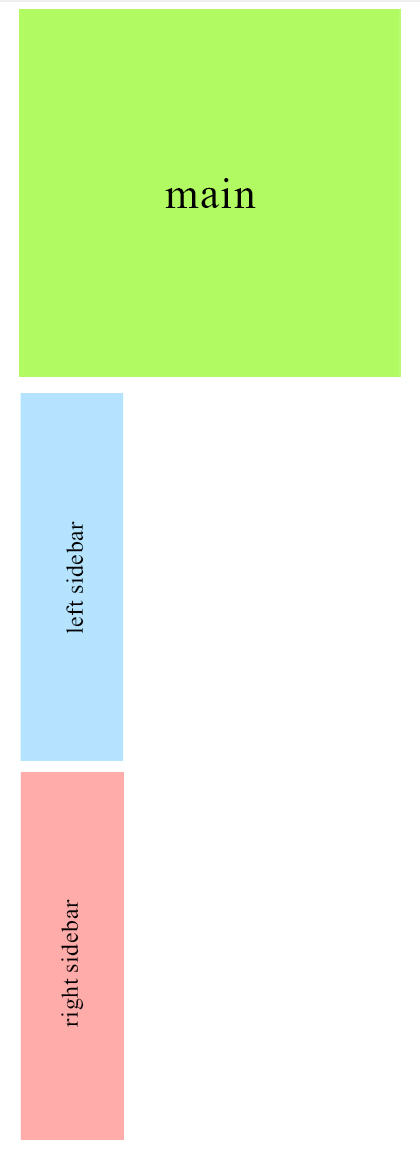
The problem is in resolutions which I need the right sidebar to move from right side of the screen (main content) to the bottom of left sidebar, like this.

I tried setting flex box to column and changing orders, but it gets me all the three divs in one column. I tried setting max-height so right sidebar goes below the left one, it kinda worked but it is not reliable. Any other way (preferably without scripts) will be appreciated.

P.S: sorry, as a new user I can’t have more than 1 image, so I provided links to other images.

1 Like

I’ve added them in for you.

You could try using the flex-grow or flex-shrink properties on the child elements to make the sides half the size of the main.

When I use flex-column the layout gets to be like this:

If I set max-height for the container it gets better but the sidebars height vary so I’m not sure if setting max-height would be a good idea.

Is there any way to make it just two rows?

Sam suggested

How did you get on with changing these?

I tried it, but it didn’t make any changes. The last photo I posted is what I get. English is not my first language, maybe I’m not using these properties in a correct way. I tried several articles, but I nedd something more specific.
I think If I can get the first column to be just two rows, main content will automatically go to the second column.

You need to enable flex-wrap: wrap

It IS enabled!!!

Just to be clear, you are using a modern browser and the flex syntax it supports for testing?

I’m working on a “Pen”. Not finished, but nearly there.

Feel free to fork and improve, anyone.

Yes (Chrome 48), and as I said in the first post I was able to make the other layout I wanted.
I think because in this one I’m using flex in column and there is no limit about height it doesn’t wrap up my flex items. Is there any way so I could make the main section to fill all the row so the two sidebars go to the next column (considering direction:rtl).

Did you look at Sam’s example which seems to do the first part of what you want. I forked the code to add the third layout.

At 800px you get the columns on the left side and at 600px you get the main column and then the two columns underneath.

2 Likes

What code is being added by CodePen that makes the page render properly (full height) when viewed on CodePen’s site but not when run from my browser (or viewed on SitePoint), please?

This is what I see

That’s interesting I didn’t notice that:) I just looked at Sam’s page and forked it into mine.

It seems that Sam’s 100% height is getting a height from the iframe’s 100% when it shouldn’t have any effect.

What the demo needs is this:

html,body{height:100%;margin:0;padding:0;}

Or use the vh unit instead of percent.

Usually I test in the browsers before posting on codepen because I have seen odd things there before but this time I just forked Sam’s pen without checking :smile:

I need to revisit that demo because we can’t use 100% height like that!!

1 Like

I did think that 100% height shouldn’t work there, but it did, so I just went with it.

Yes I should have spotted that straight away but I’ve been out all day and trying to catch up quickly :slight_smile: (That’s my excuse anyway).

If content is added to the div it just overflows out of the bottom.

Will need to look into this a bit more carefully :wink:

Harder than I thought :smile:

I had to mangle the html to get this working.

I’m sure there’s a better way to do it as I don’t like the relatively moved flex columns as it stinks a bit of magic numbers.

I’ll have another look tomorrow unless someone else cracks it first.

Thanks guys, I need to implement it on my site and see the result.
One thing though, how come when I resize the chrome window I get the result on codepen but when I use DevTools toggle mode I don’t see it’s working. Which one is reliable? What’s the best way to check my site in different resolutions?

Yes codepen can be a bit weird at times as its sandbox’s code in an iframe so just copy the code into an editor and view in a browser.

e.g.

<!DOCTYPE HTML>
<html>
<head>
<meta charset="utf-8">
<meta name="viewport" content="width=device-width,initial-scale=1">
<title>Untitled Document</title>
<style>
html, body {
	height:100%;
	margin:0;
	padding:0;
}
p {
	margin:0 0 1em
}
#wrap {
	display: flex;
	min-height:100%;
	min-height: 100vh;
	justify-content: space-around;
}
.sidebars {
	display: flex;
	width:50%
}
.left {
	background: blue;
	width:50%;
	position:relative;
	left:-100%;
}
.right {
	background: pink;
	width:50%
}
main {
	background: yellow;
	flex-grow: 2;
	position:relative;
	left:25%;
}
@media screen and (max-width: 800px) {
.sidebars {
	flex-direction: column;
	flex-wrap: wrap;
	order: 1;
}
.left, .right {
	left:0;
	width:100%;
	flex:1;
}
main {
	order: 2;
	width: 75%;
	left:0;
}
}
 @media screen and (max-width: 600px) {
#wrap {
	flex-direction:row;
	flex-wrap: wrap;
}
.left, .right {
	width: 50%;
}
.sidebars {
	width:100%;
	flex-direction:row;
}
main {
	order: 1;
	width: 100%;
}
}
</style>
</head>

<body>
<div id="wrap">
  <main>
    <p>main</p>
    <p>main</p>
    <p>main</p>
    <p>main</p>
    <p>main</p>
    <p>main</p>
    <p>main</p>
    <p>main</p>
    <p>main</p>
    <p>main</p>
    <p>main</p>
    <p>main</p>
    <p>main</p>
    <p>main</p>
  </main>
  <aside class="sidebars">
    <div class="left"> Left </div>
    <div class="right"> Right </div>
  </aside>
</div>
</body>
</html>

As I said above this will need stress testing as its just a proof of concept. There probably is a better method waiting to happen.

Your code definitely works, but I can’t change mine that much. My structure is like:

<div class="flex-container">

  <div id="sidebar-left" class="sidebar">

       <div id="content">
	  ...
       </div>

  <div id="sidebar-right" class="sidebar">

</div>

And unfortunately I couldn’t use your advice in my structure.