I have the following JSFiddle code which displays everything vertically:
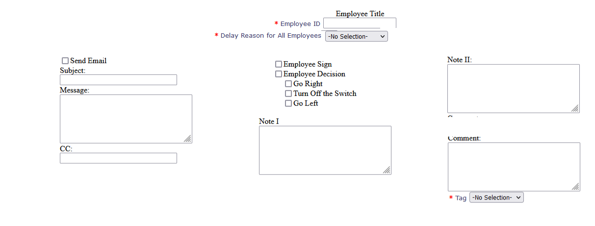
I’m looking to split it into three columns type of sections as shown in the image below:
I was thinking about using css float:left for Send Email check box, Subject text box, Message and CC so that it displays on the left and use css float:right property for Note II text area and Comment textarea and Tag dropdown ist" but not sure how ti put the checkboxes and Note I` in the middle? Am I thinking it correctly?
Does this need to be responsive so it can be displayed on a smartphone, or will it always be used on an office computer with monitor?
Consider using CSS Flexbox or CSS Grid,
Mostly it has been used on Computer with monitors but is using CSS Flexbox or CSS Grid going to make any difference in terms of responsiveness?
Nearly everyone seems to be using Flexbox or Grid for responsiveness these days.
1 Like
Here is flex example.HTML .
<!DOCTYPE HTML>
<html lang="en">
<head>

<meta charset="utf-8">
<meta name="viewport" content="width=device-width,height=device-height,initial-scale=1">

<title>Untitled document</title>

<link rel="stylesheet" href="screen.css" media="screen">

</head>
<body>

<h1>Employee Title</h1>

<form id="copysomeForm" action="/abc/employee.htm" method="POST">

<fieldset>
 <label><input id="sendEmailAlert1" name="sendEmailAlert" type="checkbox">Send Email</label>

 <label for="empSubject">Subject:</label>
 <input id="empSubject" name="empSubject" value=""  maxlength="100">

 <label for="empMessage">Message:</label>
 <textarea id="empMessage" name="empMessage" rows="5"></textarea>

 <label for="empCC">CC:</label>
 <input id="empCC" name="empCC" value="" maxlength="100">
</fieldset>

<fieldset>
 <label for="employeeId" class="requiredFieldLabel">Employee ID</label>
 <input id="employeeId" required>

<label class="requiredFieldLabel">Delay Reason for All Employees</label>

<select id="reasonSelect" name="delayReason" required>
 <option value="">-No Selection-</option>
 <option value="Late Payment">Late Payment</option>
 <option value="Options Test One">Options Test One</option>
</select>

<label><input id="topList0" name="list0" type="checkbox">Employee Sign</label>
<label><input id="topList1" name="list1" type="checkbox">Employee Decision</label>
<label><input id="list1" name="list2" type="checkbox">Go Right</label>
<label><input id="list2" name="list3" type="checkbox">Turn Off the Switch</label>
<label><input id="list3" name="list4" type="checkbox">Go Left</label>

<label for="empNote1">Note I</label>
<textarea id="empNote1" name="empNote1" rows="5"></textarea>
</fieldset>

<fieldset>
 <label for="empNote2">Note II:</label>
 <textarea id="empNote2" name="empNote2" rows="5"></textarea>

 <label for="empComment">Comment:</label>
 <textarea id="empComment" name="empComment" rows="5"></textarea>

 <label class="requiredFieldLabel">Tag</label>
 <select id="empSubject1" name="tagReason" required>
 <option value="">-No Selection-</option>
 <option value="Tag1">Tag1</option>
 <option value="Tag2">Tag2</option>
</select>
</fieldset>

</form>

</body>
</html>
screen.css
body {
   background-color: #fff;
   font: normal 1em / 1.5  sans-serif;
 }
h1 {
   font-size: 1.25em;
   font-weight: normal;
   text-align: center;
 }
#copysomeForm {
   display: flex;
   padding: 0.5em;
   gap: 0.5em;
 }
fieldset {
   display: flex;
   flex-direction: column;
   justify-content: center;
   gap: 0.5em;
   flex: 1;
   border: 0;border: 1px solid #999;
  }
 input[type="text"], select{
   width: 100%;
  }
@media ( max-width: 40em ) {
#copysomeForm {
   flex-direction: column;
   }
  }
Look at it here…https://codepen.io/Snady_Leiby/full/rNqbMaK
2 Likes
Nice job. Extra points for using <fieldset>.
Thanks. This seems to have disturbed the checkbox indentation.
Yeah, he didn’t add that in. Just wrap a .checkboxes div around them and add in the same CSS from your other thread:
.checkboxes label {
  display: block;
  margin-left: 20px;
}
.checkboxes label:first-of-type {
  margin-left: 0;
}
No need for div wrapping.
Avoid Divitis
Simply add this CSS…
#list1, #list2, #list3 {
   margin-left: 1.5em;
 }
ralphm
May 27, 2023, 8:16am
10
snadyleiby:
Avoid Divitis
And replace it with IDitis?
4 Likes
You are, of course, absolutely right.
I really should have removed all the superfluous idsPurged HTML
<h1>Employee Title</h1>

<form id="copysomeForm" action="/abc/employee.htm" method="POST">

<fieldset>
 <label><input name="sendEmailAlert" type="checkbox">Send Email</label>

 <label for="empSubject">Subject:</label>
 <input id="empSubject" name="empSubject" value="" maxlength="100">

 <label for="empMessage">Message:</label>
 <textarea id="empMessage" name="empMessage" rows="5"></textarea>

 <label for="empCC">CC:</label>
 <input id="empCC" name="empCC" value="" maxlength="100">
</fieldset>

<fieldset>
 <label for="employeeId">Employee ID</label>
 <input id="employeeId" required>

<label>Delay Reason for All Employees</label>

<select name="delayReason" required>
 <option value="">-No Selection-</option>
 <option value="Late Payment">Late Payment</option>
 <option value="Options Test One">Options Test One</option>
</select>

<label><input name="esign" type="checkbox">Employee Sign</label>
<label><input name="edeci" type="checkbox">Employee Decision</label>
<label><input name="list2" type="checkbox">Go Right</label>
<label><input name="list3" type="checkbox">Turn Off the Switch</label>
<label><input name="list4" type="checkbox">Go Left</label>

<label for="empNote1">Note I</label>
<textarea id="empNote1" name="empNote1" rows="5"></textarea>
</fieldset>

<fieldset>
 <label for="empNote2">Note II:</label>
 <textarea id="empNote2" name="empNote2" rows="5"></textarea>

 <label for="empComment">Comment:</label>
 <textarea id="empComment" name="empComment" rows="5"></textarea>

 <label>Tag</label>
 <select name="tagReason" required>
 <option value="">-No Selection-</option>
 <option value="Tag1">Tag1</option>
 <option value="Tag2">Tag2</option>
</select>
</fieldset>

</form>
CSS
body {
   background-color: #fff;
   font: normal 1em / 1.5  sans-serif;
 }
h1 {
   font-size: 1.25em;
   font-weight: normal;
   text-align: center;
 }
#copysomeForm {
   display: flex;
   padding: 0.5em;
   gap: 0.5em;
 }
fieldset {
   display: flex;
   flex-direction: column;
   justify-content: center;
   gap: 0.5em;
   flex: 1;
  }
input[type="text"], select{
   width: 100%;
  }
input[name="list2"],
input[name="list3"],
input[name="list4"] {
   margin-left: 1.5em;
 }
@media ( max-width: 40em ) {
#copysomeForm {
   flex-direction: column;
   }
  }
The codepen in post #5
2 Likes
system
August 26, 2023, 4:52pm
12
This topic was automatically closed 91 days after the last reply. New replies are no longer allowed.