I have 2 issues that I’m now trying to tackle.
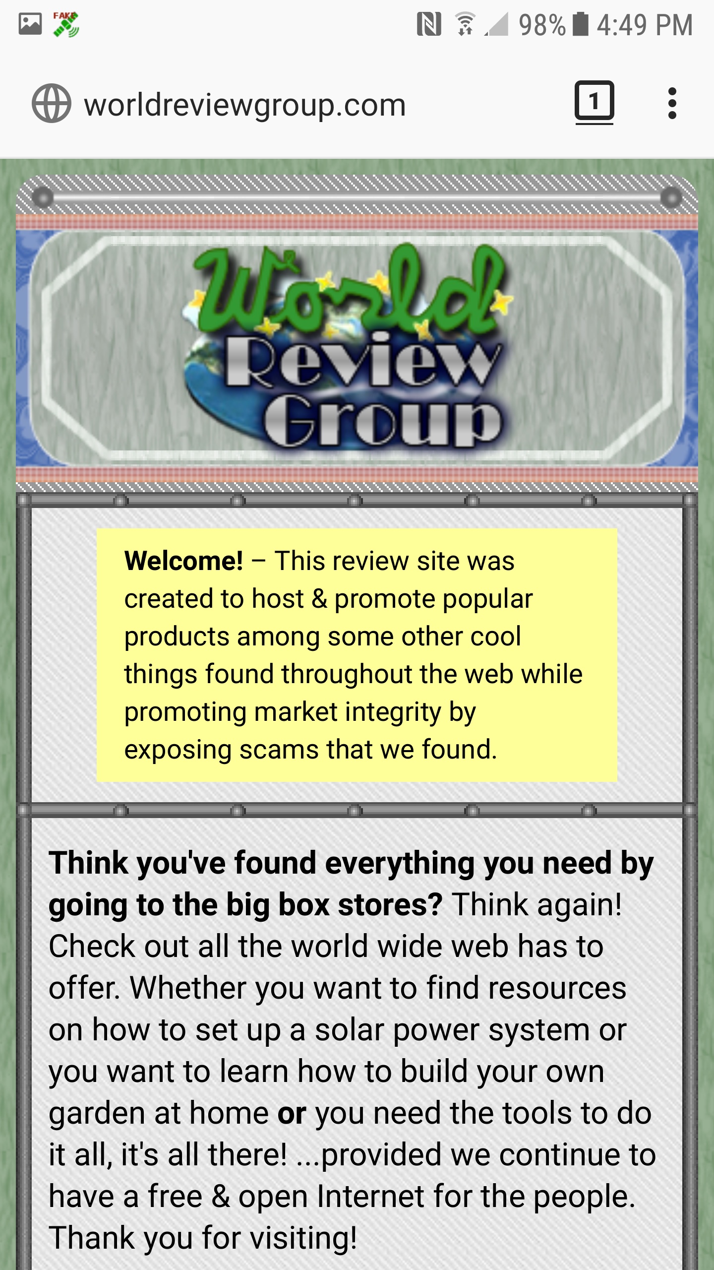
The first is the one that is more important - how to “snap” in a design to a neat width on smaller devices. On my first website, worldreviewgroup.com, some styles were implemented that make the size appear the same on mobile phones with different display sizes. I can’t quite remember how parts of that responsive design add up, but it may have something to do with this following code:
/* lines 85-93, homepage.css */
@media (max-width:600px) {
    .head .logo {background-position: 50% -156px;}
}
@media (max-width:470px) {
    .head .logo {background-position: 50% -306px;}
}
@media (max-width:390px) {
    .head .logo {background-position: 50% -466px;}
}

@media screen and (max-width:33em) {
    .table {display:block;}
    .table .tcell {
        display:block;
        width:auto !important;
        max-width:260px;
        margin:0 auto;
    }
    .table .trow {
        display:block;
        padding-top:.3125em;
    }
    .table label {
        text-align:left;
        white-space:normal;
    }
}
I am trying to come up with a strategy on how to implement something similar for my shipping agency website project @ firstratefreight.net
I’m lost, and my hands are tied… again. 
Other than somehow coming up with a design that relies on percentage size values, I don’t even know where to start to accomplish this. What I have uploaded to firstratefreight.net currently does display somewhat well on a mobile device, but it doesn’t “snap in” like the World Review Group page does. The obvious guess is to assign a width to .headercontainer for small viewports within one of the media queries. I just don’t know what to put yet.
I would really appreciate if someone can push me in the right direction. I’m sleep-deprived and overworked as this project needs to be getting close to done soon.  Oh, well, I can’t rush this.
The other issue is kind of small, but it is this: The design tends to lose its symmetry and alignment by about one pixel when I zoom in and zoom out in the browser (tested with FF, latest IE, and Chrome).
This appears nicely at plain 100% zoom.
133% zoom (Bars don’t neatly align.)
I wonder if this has to do with .png images, but .jpg images do the same thing. Weird. I don’t think it has to do with my coding.
Thanks for everything over the years, Sitepoint Community.
To success,
-ty 

 Other than that, I’m exhausted and stressed.

 Hope you had a great day.

 Yes, I do use a few creative images, but I am picking up on how you construct the layout images based upon our previous correspondence and how you implement them so as to minimize code and image count / size.
 , and here is what I have done: