svg fence xwidth: 10px;height: 10px;
To do this, all that is needed here is to create the x pattern shape made up of 16 tiny 1px squares and a bigger one 2px in the middle.
https://jsfiddle.net/9af7vk06/
Blown up in size it looks like this.
The gradient would be made of the darker shaded square spots.
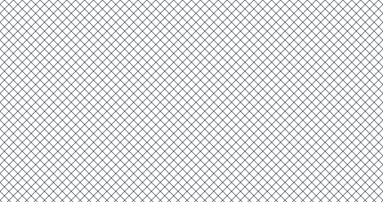
Here is the Fence pattern: I want to make using a gradient replicating the svg.
https://jsfiddle.net/ef46pxbz/1/
body {
  background-color: white;
  background-image: url('data:image/svg+xml;utf8,<svg xmlns="http://www.w3.org/2000/svg" width="10" height="10" viewBox="0 0 10 10"><path stroke="rgb(113, 121, 126)" d="m10 .15-4.85 4.85 4.85 4.85v.15h-.13l-4.86-4.86-4.86 4.86h-.15v-.14l4.87-4.86-4.87-4.87v-.13h.15l4.86 4.86 4.85-4.86h.14z"/></svg>');
}
PaulOB
December 3, 2021, 6:12pm
2
Is this close enough?
The top one is the linear gradient and the bottom one is your svg.
2 Likes
Can the color that is not white or gray be made transparent?
1 Like
PaulOB
December 3, 2021, 6:44pm
4
It is transparent. I think that’s just the way the browser anti aliases the diagonal line otherwise it wouldn’t look smooth.
The svg is exactly the same.
I think this is one of the rare occasions where you can use fractions of a pixel.
e.g.
.test1 {
  width: 100px;
  height: 100px;
  background-image: linear-gradient(
      45deg,
      transparent,
      transparent 7px,
      rgb(113, 121, 126) 7px,
      transparent 7.5px,
      transparent 10px
    ),
    linear-gradient(
      -45deg,
      transparent,
      transparent 7px,
      rgb(113, 121, 126) 7px,
      transparent 7.5px,
      transparent 10px
    );
  background-size: 10px 10px;
}
2 Likes
With the svg, I am not able to see through the gray.
Why is part, or, all of the fence transparent?
Why am I able to see through the gray?
https://jsfiddle.net/brzt230o/
PaulOB
December 3, 2021, 7:10pm
6
Try adjusting the pixel measurements.
e.g.
  background-image: linear-gradient(
      45deg,
      transparent,
      transparent 7px,
      rgb(113, 121, 126) 7px,
      rgb(113, 121, 126) 7.5px,
      transparent 7.5px,
      transparent 10px
    ),
    linear-gradient(
      -45deg,
      transparent,
      transparent 7px,
      rgb(113, 121, 126) 7px,
       rgb(113, 121, 126) 7.5px,
      transparent 7.5px,
      transparent 10px
    );
That gives me this:
I’m sure that’s close enough.
1 Like
How do I adjust the code, there’s supposed to be 4 1px squares, not 3?
I think never mind.
When there is only 1 X there are 4 1px squares, when they multiply, then only 3 are visible.
I’m right.
PaulOB
December 3, 2021, 11:29pm
8
Obviously when you repeat the pattern the pattern repeats at each edge so you get the adjacent pixels touching.
You got exactly what you asked for.
If you want a seamless join then you’d have to leave off the last right pixels and the bottom pixels. Effectively 9 x 9 instead of 10 x 10.
The repeating part of the gradient should not be wholly symmetrical otherwise you get a double pixel each time it repeats.
That should have been blatantly obvious before you started so I assumed that’s what you wanted.
1 Like
asasass
December 3, 2021, 11:37pm
9
Now I want to see what a seamless join looks like.
leave off the last right pixels and the bottom pixels.
Which are which? https://jsfiddle.net/2kjxpwr8/1/
I can create a .test3 in there.
  background-image: linear-gradient(
      45deg,
      transparent,
      transparent 7px,
      rgb(113, 121, 126) 7px,
      rgb(113, 121, 126) 7.5px,
      transparent 7.5px,
      transparent 10px
    ),
    linear-gradient(
      -45deg,
      transparent,
      transparent 7px,
      rgb(113, 121, 126) 7px,
       rgb(113, 121, 126) 7.5px,
      transparent 7.5px,
      transparent 10px
    );
PaulOB
December 4, 2021, 12:42am
10
Have a look at repeating linear gradients instead.
Here’s a start.
I’m offline now until tomorrow.
1 Like
PaulOB
December 4, 2021, 10:06am
11
I don’t think you can get perfect lines at 45 degrees. This is close but still some double pixels.
Looks perfect on a phone.
asasass
December 4, 2021, 11:17am
12
Is this one able to use a repeating gradient instead?
Would there be that same issue with this one?
.test {
  width: 100px;
  height: 100px;
  background-image: linear-gradient(
      45deg,
      transparent,
      transparent 7px,
      rgb(113, 121, 126) 7px,
      rgb(113, 121, 126) 7.5px,
      transparent 7.5px,
      transparent 10px
    ),
    linear-gradient(
      -45deg,
      transparent,
      transparent 7px,
      rgb(113, 121, 126) 7px,
      rgb(113, 121, 126) 7.5px,
      transparent 7.5px,
      transparent 10px
    );
  background-size: 10px 10px;
}
asasass
December 4, 2021, 11:52am
13
Is it more than just changing linear-gradient to repeating?
There is no difference in how the code is written?
background-image: repeating-linear-gradient(
.test3 {
  width: 100px;
  height: 100px;
  background-image: repeating-linear-gradient(
      45deg,
      transparent,
      transparent 7px,
      rgb(113, 121, 126) 7px,
      rgb(113, 121, 126) 7.5px,
      transparent 7.5px,
      transparent 10px
    ),
    repeating-linear-gradient(
      -45deg,
      transparent,
      transparent 7px,
      rgb(113, 121, 126) 7px,
      rgb(113, 121, 126) 7.5px,
      transparent 7.5px,
      transparent 10px
    );
  background-size: 10px 10px;
}
PaulOB
December 4, 2021, 12:52pm
14
Yes, the repeating gradient doesn’t use background-size as that breaks the repeating pattern. The last color/position specified is used as the repeat. If you use background-size then you get the edge pixels repeated as they butt together.
You can read the details on repeating linear gradients here:
However I believe I have already given you as close as you can get. Browsers can’y seem to handle 45 degree lines efficiently without some sort of anti aliasing.
I think number 1 here is as close as you can get so that no one in the world will notice. If you are going to magnify it a 1000 times then expect it to look odd.
https://codepen.io/paulobrien/pen/gOGagLg
1 Like
PaulOB
December 4, 2021, 1:54pm
15
To see what I mean look at the first item here that is made as square boxes so there is no pixellation but once you rotate them the pixels are anti aliased and moved around.
1 Like
asasass
December 4, 2021, 3:38pm
16
How would I change the color of the intersecting squares in the middle?
https://jsfiddle.net/vexf0pn1/
.test {
  width: 100px;
  height: 100px;
  background-image: linear-gradient(
      45deg,
      transparent,
      transparent 7px,
      rgb(113, 121, 126) 7px,
      rgb(113, 121, 126) 7.5px,
      transparent 7.5px,
      transparent 10px
    ),
    linear-gradient(
      -45deg,
      transparent,
      transparent 7px,
      rgb(113, 121, 126) 7px,
      rgb(113, 121, 126) 7.5px,
      transparent 7.5px,
      transparent 10px
    );
  background-size: 10px 10px;
}
PaulOB
December 4, 2021, 4:26pm
17
I can’t make it square in the middle but I can make it round.
asasass
December 4, 2021, 4:49pm
18
To change the color in the middle it needs to be a circle?
PaulOB
December 4, 2021, 5:02pm
19
I can’t find a way to do it yet but there probably is a method.
It’s almost impossible to tell if its a circle or a square anyway at that size.
asasass
December 4, 2021, 5:03pm
20
What about using a conic-gradient? https://jsfiddle.net/j4ntv0y2/
Would that work?
Not that exact thing, but something like it.
It creates a square.
body {
  background: conic-gradient(at 85px 85px, #3f48cc 0deg 90deg, #f00 90deg 180deg, #ff0 180deg 270deg, #99D9EA 270deg 360deg);
  background-size: 165px 165px;
}