I wanted to show the parent gradient just from child shape.
I tried adding ::after to parent with white background to hide parent background color, but then child’s background also becomes white.
Currently: https://jsfiddle.net/5kn6smj8/4/
  <div id="parent">
    <div class="child top-10"></div>
    <div class="child top-20"></div>
    <div class="child top-40"></div>
    <div class="child top-60"></div>
  </div>
#parent {
  background: linear-gradient(#e66465, #9198e5);
  width: 100px;
  height: 300px;
}
.child {
  position: relative;
  width: 50px;
  height: 50px;
  border: 1px solid blue;
  border-radius: 50%;
  color: white;
}
.top-10 {
  top: 10px;
}
.top-20 {
  top: 20px;
}
.top-40 {
  top: 40px;
}
.top-60 {
  top: 60px;
}
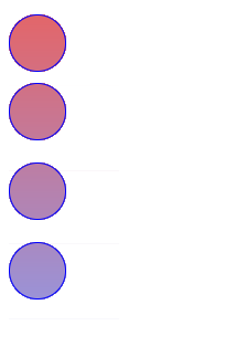
Expected:

Also the child positions are changeable.
Hello to emoniishaaq,
you might like to see if this code works a little more like you want…
HTML
<body>
 <div id="parent">
  <div></div>
  <div></div>
  <div></div>
  <div></div>
 </div>
</body>
CSS
body {
   background-color: #f9f9f9;
   font: normal 1em / 1.5em  sans-serif;
 }
#parent {
   width: 3.19em;
   padding: 1em 2em;
   margin: 1em auto;
   border: 1px solid #000;
   border-radius: 0.5em;
   background-color: #fff;
   box-shadow: 0.4em 0.4em 0.4em rgba( 0, 0, 0, 0.4 );
 }
#parent > div {
  width: 3.125em;
  height: 3.125em;
  border: 1px solid #00f;
  border-radius: 50%;
  background-image: linear-gradient(#e66465, #9198e5);
  background-size: 3.25em 18.75em;
 }
#parent >  div:nth-of-type(1) {
   margin-bottom: 0.625em;
 }
#parent >  div:nth-of-type(2) {
   margin-bottom: 1.25em;
   background-position: 0 -3.75em
 }
#parent >  div:nth-of-type(3) {
   margin-bottom: 1.875em;
   background-position: 0 -8.1255em
  }
 #parent > div:nth-of-type(4) {
   margin-bottom: 1.25em;
   background-position: 0 -13.125em
  }
No problem emoniishaaq, I am most happy to have helped.
PaulOB
5
You can also use a trick to rub out the background using box-shadow but only has limited usefulness.
It does allow for scaling and zooming but is no good if you have other content in that parent box.
Another approach could be to use an <svg> element with <mask> . . . .
1 Like
system
Closed
7
This topic was automatically closed 91 days after the last reply. New replies are no longer allowed.