Hi from pitch black freezing York UK,
On this page:
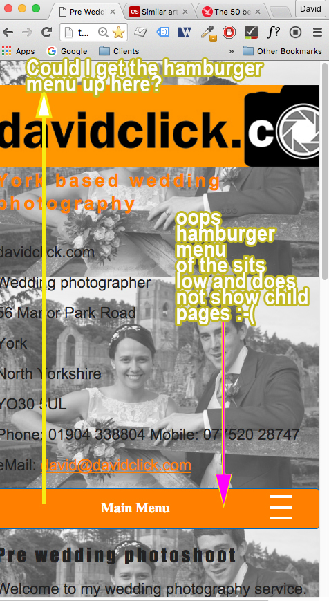
A hamburger menu kicks in when you size down your viewport or browse via ipad / mobile.
But the hamburger menu sits in an odd position, I’d like it to sit at the top of viewport when seen via a mobile / tablet. Waht woul i need to fo with the css to make this happen?
You seem to have mislaid the suckerfish menu script which would have probably given you ‘some’ support for the hover function on mobiles. (You also have two links to jquery in the head of your page so remove the latter one).
Because touch devices don’t really do hover I advise against hover dropdown menus these days and instead use a click menu which is much better for touch devices (and indeed much better for users who don’t have a steady hand on the mouse). (Here’s a demo in garish colours)
A quick fix for the hover menu would be to add the following code.
@media screen and (max-width: 793px) {
.sf-menu li:hover > ul {
	left: 0;
	opacity:1.0;
	left:30px;
	right:30px;
	margin-top:-10px;
	width:auto;
	box-shadow:0 0 20px rgba(0,0,0,0.5);
	border-bottom:1px solid #fff;
}
.sf-menu li:hover > ul li a {
	background:#333
}
.sf-menu li:hover > ul li a:hover {
	background:#999
}
}
That will work on touch devices but the only way to clear the open menu is by clicking something else or indeed closing the menu with the hamburger icon.


