what should i do if my page messed up when i zoom it in and out? thank you in advance guys
hope you can help me guys. this is urgent
what should i do if my page messed up when i zoom it in and out? thank you in advance guys
hope you can help me guys. this is urgent
Welcome to the forums.
As I’m sure you must have read in the other topic in which you posted:
(By the way, please don’t post in more than one thread for the same issue. Also, it’s pretty pointless to resurrect an old topic from two years ago; it’s much better to start a new one, as you have done here.)
Welcome to the forums, @@LaLisa07. It is the weekend and you might not get the speedy response that you would like, so re-posting 8 minutes after you have started the thread will not help. Please remember that the members here all volunteer their help and be patient.
It would also help if you could post the code for your page (html and css) because without any information, people would just be guessing at what is causing your site to be ‘messed up’ when you zoom in and out.
alright thanks. its just that my header, nav and footer messed up everytime i zoom it in and out.
By “zoom in and out”, are you referring to changing font size, or to increasing and decreasing the size of the browser window?
Either way, it’s hard to give anything but the most general of hints without seeing your code.
THIS ARE MY CODE. HTML AND CSS
----------------html-------------
<!DOCTYPE html>
<html>
<meta name="viewport" content="user-scalable=no, initial-scale=1, maximum-scale=1, minimum-scale=1" />
<link rel="icon" type="image/png" href="favicon.ico.png">
<link rel="icon" type="image/png" href="http://example.com/myicon.png">
</head>
<div class="header1">
<img src="try.jpg" alt="logo" />
</div>
<header>
<nav>
<ul>
<li>
<a href="ex3.html">Home</a>
</li>
<li>
<a href="#"> Program</a>
<ul>
<li><a href="#">Premier</a></li>
<li><a href="#">Full</a></li>
<li><a href="#">Priority</a></li>
<li><a href="#">Basic + SUC/LCU</a></li>
<li><a href="#">SUC/LCU</a></li>
<li><a href="#">Basic</a></li>
<li><a href="#">Review</a></li>
</ul>
</li>
<li>
<a href="#"> (TLC)</a>
</li>
<li><a href="#">FAQ</a></li>
</ul>
</nav>
</header>
<br>
<br>
<body>
<h2> <center> Apply Online</center> </h2>
<body style="background-color:#bdc3c7">
<div id="main-wrapper">
<center><h2>Sign In</h2></center>
<form action="index.php" method="post">
<div class="inner_container">
<label><b>Username</b></label>
<input type="text" placeholder="Enter Username" name="username" required>
<label><b>Password</b></label>
<input type="password" placeholder="Enter Password" name="password" required>
<button class="login_button" name="login" type="submit">Login</button>
<p><a href="#">Forgot password?</a></p>
</div>
</form>
</div>
<footer id="footer">
<div id="footer-inner">
<center><p>© Copyright <a href="#">Online</a> | <a href="#">Terms of Use</a> | <a href="#">Privacy Policy</a></p></center>
<div class="clr"></div>
</div>
</footer>
</body>
</html>
------------------------CSS---------------------------
<style>

body{
    margin: 0;
    padding: 0;
    font-size: 15px;
    font-family: "Lucida Grande", "Helvetica Nueue", Arial, Allerta;
	background-image:url(blue.jpg);

}
header  {
  float: left;
  width: 1370px;
  position:fixed;
  length: 500px;
bottom :470px;
}
header1 {
	position:fixed;

}

nav {
	background-image:url(blue1.jpg);
	background-no-repeat:no-repeat
    background-color: #1E90FF;
    color: #fff;
    display: block;
    margin: 0;
	padding: 2;
    overflow: hidden;
}
nav ul{
    margin: 0;
    padding: 0;
    list-style: none;
}
nav ul li {
    margin: 0;
    display: inline-block;
    list-style-type: none;
    transition: all 0.2s;
}

nav > ul > li > a {
    color: white;
    display: block;
    line-height: 2em;
    padding: 0.5em 2em;
    text-decoration: none;

}

nav li > ul{
    display : none;
    margin-top:1px;
    background-color: #1E90FF;
	background-image:url(blue1.jpg);

}

nav li > ul li{
    display: block;
}

nav  li > ul li a {
    color: white;
    display: block;
    line-height: 2em;
    padding: 0.5em 2em;
    text-decoration: none;
}

nav li:hover {
    background-color:  	#1E90FF;
}
nav li:hover > ul{
    position:absolute;
    display : block;
}
nav li > ul > li ul  {
    display: none;
    background-color: white;
}
nav li > ul > li:hover > ul  {
    position:absolute;
    display : block;
    margin-left:100%;
    margin-top:-3em;
}
#footer {
   position:absolute;
   bottom:0;
   width: 1370px;
   position:fixed;
   height:40px;   /* Height of the footer */
   background-image:url(blue1.jpg);
}

/*CSS file*/

input{
    width: 430px;
	margin: 0 auto;
    padding: 15px;
    border: 1px solid #ccc;

}

#main-wrapper{
	border-radius : 10px;
	background-color: white;
	text-align: left;	margin-left:5px;
	border: 10px solid #f1f1f1;
	width: 500px;
	margin: 0 auto;
}
.inner_container{
	width:450px;
	margin:0 auto;
}
.login_button {
    background-color: #4CAF50;
    color: white;
	margin-top:10px;
    padding:10px;
    width: 100%;
	font-size:18px;
	font-weight: bold;
}
.register_btn{
	background-color: #3498db;
    color: white;
	margin-top:10px;
	margin-bottom:15px;
	padding:10px;
    width: 100%;
	font-size:16px;
	font-weight: bold;

}
.back_btn{
	margin-top:10px;
	color: white;
	margin-bottom:15px;
    padding: 10px;
    background-color: #e67e22;
}
.logout_button{
	background-color: #c0392b;
    color: white;
	margin-top:10px;
    padding:10px;
    width: 100%;
	font-size:18px;
	font-weight: bold;
}

.sign_up_btn {
	background-color: #3498db;
    color: white;
	 padding:10px;
	margin-top:10px;
	margin-bottom:10px;
    width: 100%;
	font-size:16px;
	font-weight: bold;
}


.container {
    margin: 16px;
	width:100%;
}
.container {
  text-align: center;
}

.container a {
  color: #fff;
  text-decoration: none;
  transition: color 0.3s;
}

.container a:hover {
  color: #cab6bf;
}


</style>
You should take a class in HTML and CSS and learn how to write code.
You should also use the HTML validator to test your code as you write it and before you sumit it as if it has a mysterious problem.
https://validator.w3.org/nu/
You should NOT use positioned elements for layout without knowing how they work.
Finally, if you are actually trying to write a responsive web page (or whatever “Zoom” means) you should replace your contra-functional viewport meta tag with this:
<meta name="viewport" content="width=device-width,initial-scale=1.0">
There is nothing urgent about trying to ride a BMX bicycle before you learn to walk.
Everything will come together in its time.
Try again and post valid HTML and please include the CSS between <style> tags in the <head> of the page. That would be a “working page” which will allow us to see exactly what you see. If you cannot supply a full URL to the images, then at least include the actual size of the images within width="" and height="" attributes for each image.
As @ronpat says, your code is malformed, so it would be quite surprising if it displayed correctly at all.
You have no closing </head> tag, and two opening <body> tags, neither of which is in the correct place. You are also using obsolete <center> tags, which should be replaced with text-align: center in your CSS. Your inline styles should also be moved to your stylesheet.
You still haven’t explained what you meant by “zoom in and out”, but as Ron has explained, using a meta-tag which prevents users resizing the page is a bad idea.
I suggest you correct your HTML (and check it in the validator, as Ron explained), then post again, explain what you expect the page to look like, because the whole layout looks broken to me (with overlapping elements).
When you say this is “urgent”, is it for a school or college project with a deadline?
well thanks guys. my problem now is how to center my page. because when you zoom it in and out the position was always on the left.
<!DOCTYPE html>
<html>
<head lang="en">
<meta charset="UTF-8">
<title>Official Website</title>
<link href="style3.css" rel="stylesheet"/>
<style>
body{
margin: 0 auto;
padding: 0;
font-size: 15px;
font-family: "Lucida Grande", "Helvetica Nueue", Arial, Allerta;
background-image:url(blue.jpg);
}
header {
float: left;
width:1365px;
bottom :470px;
}
header1 {
}
nav {
background-image:url(blue1.jpg);
background-no-repeat:no-repeat
background-color: #1E90FF;
color: #fff;
display: block;
margin: 0;
padding: 2;
overflow: hidden;
}
nav ul{
margin: 0;
padding: 0;
list-style: none;
}
nav ul li {
margin: 0;
display: inline-block;
list-style-type: none;
transition: all 0.2s;
}
nav > ul > li > a {
color: white;
display: block;
line-height: 2em;
padding: 0.5em 2em;
text-decoration: none;
}
nav li > ul{
display : none;
margin-top:1px;
background-color: #1E90FF;
background-image:url(blue1.jpg);
}
nav li > ul li{
display: block;
}
nav li > ul li a {
color: white;
display: block;
line-height: 2em;
padding: 0.5em 2em;
text-decoration: none;
}
nav li:hover {
background-color: #1E90FF;
}
nav li:hover > ul{
position:absolute;
display : block;
}
nav li > ul > li ul {
display: none;
background-color: white;
}
nav li > ul > li:hover > ul {
position:absolute;
display : block;
margin-left:100%;
margin-top:-3em;
}
#footer {
position:fixed;
bottom:0;
width: 1365px;
height:40px; /* Height of the footer */
background-image:url(blue1.jpg);
margin: 0 auto;
}
/*CSS file*/
input{
width: 430px;
margin: 0 auto;
padding: 15px;
border: 1px solid #ccc;
}
#main-wrapper{
border-radius : 10px;
background-color: white;
text-align: left; margin-left:5px;
border: 10px solid #f1f1f1;
width: 500px;
margin: 0 auto;
}
.inner_container{
width:450px;
margin:0 auto;
}
.login_button {
background-color: #4CAF50;
color: white;
margin-top:10px;
padding:10px;
width: 100%;
font-size:18px;
font-weight: bold;
}
.container {
margin:0 auto;
width:100%;
}
.container {
text-align: center;
}
.container a {
color: #fff;
text-decoration: none;
transition: color 0.3s;
}
.container a:hover {
color: #cab6bf;
}
</style>
</head>
<body>
<div class="header1">
<img src="try.png" alt="logo" />
</div>
<header>
<nav>
<ul>
<li>
<a href="ex3.html">Home</a>
</li>
<li>
<a href="#"> Program</a>
<ul>
<li><a href="#">Premier</a></li>
<li><a href="#">Full</a></li>
<li><a href="#">Priority</a></li>
<li><a href="#">Basic + SUC/LCU</a></li>
<li><a href="#">SUC/LCU</a></li>
<li><a href="#">Basic</a></li>
<li><a href="#">Review</a></li>
</ul>
</li>
<li>
<a href="#">Taguig Learners Certificate (TLC)</a>
</li>
<li><a href="#">FAQ</a></li>
</ul>
</nav>
</header>
<br>
<br>
<center><h2>Apply Online </h2></center>
<div id="main-wrapper">
<center><h2>Sign In</h2></center>
<form action="index.php" method="post">
<div class="inner_container">
<label><b>Username</b></label>
<input type="text" placeholder="Enter Username" name="username" required>
<label><b>Password</b></label>
<input type="password" placeholder="Enter Password" name="password" required>
<button class="login_button" name="login" type="submit">Login</button>
<p><a href="#">Forgot password?</a></p>
</div>
</form>
</div>
<footer id="footer">
<div id="footer-inner">
<center><p>© Copyright <a href="#">Online Scholarship</a> | <a href="#">Terms of Use</a> | <a href="#">Privacy Policy</a></p></center>
<div class="clr"></div>
</div>
</footer>
</body>
</html>
OK - that’s fixed most of the HTML errors. (You still have the obsolete <center> tags.)
background-no-repeat:no-repeat is not valid CSS, and is missing the semi-colon.
Now, please answer this question: what do you mean by “zoom in and out”? Do you mean enlarging and decreasing the size of the content, or enlarging and decreasing the size of the window? (We don’t ask questions out of idle curiosity, but because we require the information to give you a useful reply.)
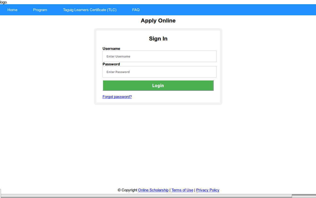
This is how the code you have just provided renders on my screen (with the incorrect CSS declaration removed):
Is that how you expect it to look? If not, what is incorrect? (Bear in mind that I don’t have access to your images.) There is a horizontal scrollbar, because your fixed-width items are 1365px in width, which is greater than the width of my monitor.
Do you have any fixed widths in your code? especially w-i-d-e widths? If so, delete them and just let blocks be blocks and let’s see what the page looks like.
The <center> tags are obsolete as @TechnoBear pointed out and as the validator should have shown. They should be replaced using CSS.
TB has just posted, so I’ll post this and disappear.  \
\
Cheers.
This topic was automatically closed 91 days after the last reply. New replies are no longer allowed.