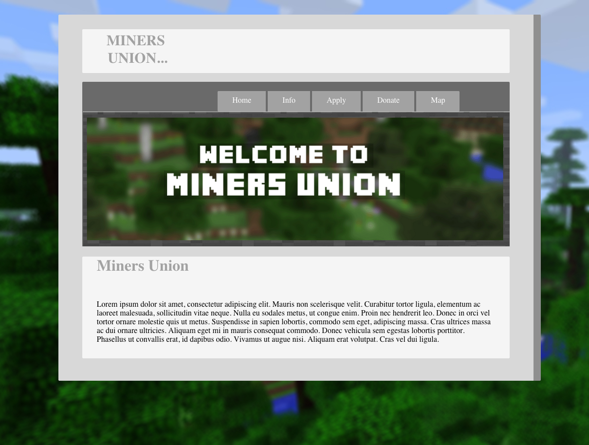
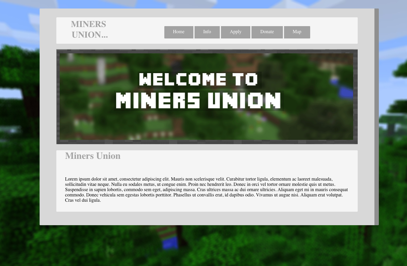
The nav bar (home, info, apply etc) is meant to sit in the white area but doesn’t seem to stay if the browser window is too thin.
When the browser window is enlarged the banner image (welcome to miners union) just gets bigger and bigger. Preferably the image would get to it’s maximum size and then the background image would act as margins.
#wrapbod {
padding-top: 30px;
border-radius: 2px;  (this seems to have 0 effect, why is it there?)
[COLOR="#A52A2A"]margin: 30px auto 0px auto; (this will center this elemnent w/out using the 10% left margin)[/COLOR]
background-color: #d8d8d8;
width: 80%;
/* margin-left: 10%; */
[COLOR="#A52A2A"]border-right-style: solid; (is this decorative. part of the design? doesn't look very nice & it is pushing the main ui to the side, looks like an error, i'review this border idea)
border-right-width: 15px;
border-right-color: #8f8f8f;[/COLOR]
padding-bottom: 30px;
}
you currently have the image set @100% so it is doing what you want it to do and is enlarging as you widen the browser.
this would work i think
but you need to set a background image for the welcome div
#welcome {
[COLOR="#A52A2A"]background: url(image.jpg or whatever); (you should put here your brick pattern)[/COLOR]
border-radius: 2px;
width: 90%;
margin: auto;
}
Before we get to the nav. Is this supposed to be a responsive theme?
if not really important put the title in a diff div from the nav. (you can use <nav> or <div class=“nav”>)
Mal_
It might be good for to take just a bit of time and decide as to the purpose and expected traffic to this site. or to consider using wp or blogger or some such pre made cms if you wish to spend more time on the content than the coding.
As for what to copy and past, the classes & id info goes into the css file. if you open it you should for example find the .welc bit and the tags such as <div> go into the html or php file.
D
well, still not clear sorry. Do you want a red border? or do you want the gray border on the right to repeat all around the wrapper?
Also right now your div wrapbod & mu are set to percentages for widths. With margins of auto. which means while centered it will adjust to browser being re sized.
No the red border was an annotation. I’d like everything inside the red border to stay at the same size, but everything outside the box (the background) to stretch depending on the size of the window.
It sounds like you just want a max-width on your main container.
#wrapbod{max-width:980px}
You really need a doctype on that page or you consign all but the latest versions of IE to render like IE5 and forget any css since about 1999. It will also cause all other browsers to go into quirks mode which is not good.
If you are making this responsive then you also need the viewport meta tag.
<head>
    <link rel="stylesheet" type="text/css" href="styles.css">
</head>

<body>
    <div id="wrapbod"> <meta name="viewport" content="width=device-width, initial-scale=1.0">
        <div class="nav">
                        <h1 class="title">MINERS <br /> UNION...</h1>
            <nav>
                <a class="navlink br" href="#">Home</a>
                <a class="navlink" href="#">Info</a>
                <a class="navlink" href="#">Apply</a>
                <a class="navlink" href="#">Donate</a>
                <a class="navlink bl" href="#">Map</a>
            </nav>
        </div>
        <br />
        <div id="welcome">
            <img src="welcome.png" class="welc"/>
        </div>
        <div id="mu">
            <h1>Miners Union</h1>
            <p>
                Lorem ipsum dolor sit amet, consectetur adipiscing elit. Mauris non scelerisque velit. Curabitur tortor ligula, elementum ac laoreet malesuada, sollicitudin vitae neque. Nulla eu sodales metus, ut congue enim. Proin nec hendrerit leo. Donec in orci vel tortor ornare molestie quis ut metus. Suspendisse in sapien lobortis, commodo sem eget, adipiscing massa. Cras ultrices massa ac dui ornare ultricies. Aliquam eget mi in mauris consequat commodo. Donec vehicula sem egestas lobortis porttitor. Phasellus ut convallis erat, id dapibus odio. Vivamus ut augue nisi. Aliquam erat volutpat. Cras vel dui ligula.
            </p>
        </div>
    </div>
</body>
The width: 80% makes that container respond to the width of the window. If you want it a fixed size, then replace that with width: 900px; (or 50em, or whatever size suits you).
If you want it centred, then change
 margin-left: 10%;
    margin-top: 30px;
to
margin: 30px auto 0px;
That sets the bottom margin to 0px, as you don’t have a margin in your current code. If you want it to be 30px like the top margin, just leave that out.
(We had a previous thread about this site which seemed to be asking the opposite, so I may have misunderstood what you want.)
Then when the browser window is stretched I’d just like the background to get bigger
#wrapbod {
padding-top: 30px;
border-radius: 2px;
background-color: #d8d8d8;
width:900px;
margin: 30px auto 0;
border-right-style: solid;
border-right-width:15px;
border-right-color: #8f8f8f;
padding-bottom: 30px;
}
This how it currently is. Doesn’t seem to have affected anything.
With the code I gave you, that’s what happens. The grey content area stays a fixed width (whatever width you choose to set it to), and the background image will expand with the viewport.
That makes your site 100px wide and no more and therefore is a thin line down the side of the browser! How can you say it made no difference
I gave you a max-width of 980px but you used 100px?
The max-width will stop the actual site from getting any larger than 980px and stay centred in the viewport. It will however let the site shrink smaller so that it will fit on smaller devices.
If you simply want a fixed width then use width:980px (or whatever width you want) but realise that fixed widths are not very helpful to smaller devices.