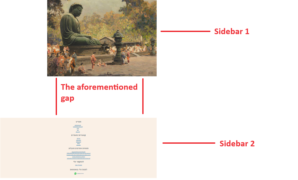
this webpage contains two sidebar blocks but there is a huge gap between them in a desktop display.
I don’t know how to explain this gap; the DOM tree looks fine to me and the CSS of the regions is quite simple and straightforward in my opinion so It may have to do with the grid layout of the website (I never worked with grid, but Drupal framework use it).
How would you explain this gap and how would you suggest to best cope with it?
1 Like
The site has told the sidebars to be in a grid, and then tried to put 2 things in the same grid column.
The grid, therefore, has put them both in the same column - stacked on top of each other.
The “main” portion, however, is also in the grid. So the row height of the grid is the maximum of the contents of that row, meaning the Main section is pushing down the boundary of the row height, as it fits in the first row of the grid.
the Grid is doing… a lot of columns to try and handle various screen widths, but in plain form:
The grid currently is a 2x2; sidebar 1 is in 0,0. main is in 0,1, sidebar 2 is in 1,0, and nothing is in 1,1.
Solutions include:
Wrapping both sidebars in another container.
Giving a grid-row to the main section, such as 1 / span 2
Rearranging the second sidebar data to actually be part of the first, rather than having two sidebars?
1 Like
Thanks a lot @m_hutley for accessing this quite advanced CSS topic to general audience.
Solution 1
<div class="two_new_sidebars_based_on_original_one">
  {{ page.sidebar_first }}
  {{ page.sidebar_second }}
</div>
Did sovle the problem in desktop display but in some mobile displays the sidebar now appears juxtaposed to the right.
An attempt to centralize it with the following code failed:
.two_new_sidebars_based_on_original_one {
    margin: 0 auto 0 !important;
}
You can check that live on the website.
Solution 2
I have tried:
main {
	grid-row: 1/2 !important;
}
It didn’t solve the problem, so I removed this code.
Solution 3
I need both sidebar regions to be separate due to Drupal considerations:
Relevant Drupal blocks containing an image are situated in sidebar_first region and the region is styled accordingly and all other relevant Drupal blocks are situated in sidebar_second region.
That’s not what i told you though, is it? 
So why didnt 1/2 work?
So grid-row when its got a slash in it is a combiner name for grid-row-start and grid-row-end.
Grid Row start is… pretty simple to understand. It’s the row where the box starts.
Why did 2 “fail” in grid row end though?
Well, the box did exactly what you told it to do. It ended at row 2.
But if you start at row 1, and finish at row 2… you’ve drawn a box 1 row high.
If you want the box to be 2 high, you’d need to finish at row 3. Because 3-1 is 2.
This is why I put my solution as “span 2”. Span in an end block says “Whatever i started at, add this amount to it.”
By “main section” did you mean the <div id="main"> html element or to the main html element that (surprisingly???) comes after that div in the DOM tree there?
Anyway, the first approach is more tempting to me because I am quite afarid to “play” with Drupal Olivero theme grid organization when I never learnt about grid before and by no means an application themer or a website graphics designer.
I mean the thing that’s beside the sidebars.
I brought the website back to previous mode with the problem intact but I can’t select that gap with the dev tools inspection tool so I can’t test its CSS.
When I try to select it I get:
.grid-full {
    display: grid !important;
    grid-template-columns: auto !important;
    grid-column-gap: unset !important;
}
1 Like

I have added this to style.css
.sidebar-grid > .site-main {
	grid-row: 1 / span 2;
}
I still get gaps, in various lengths.
I think I should buy a book about CSS grid but anyway for the moment is there anything else left for me to try or is it only to try to change a design theme?
1 Like