You shouldn’t use label elements unless they refer to form elements. Use something more semantic. The name and reason fields are almost tabular data so you could get away with using a table for them but not that monstrosity that you were using. A simple styled table would have done.
Another way to do it would be to use a DL list for the name and reason fields.
I have many existing pages where I want to this. Is there any editor which could help me converting things visually …instead of typing one by one…any time saver approach ?
Unfortunately there is no quick approach to converting an old style table layout into a CSS layout.
The issue is that if the site is old and table based then you should be doing a full redesign anyway and bring it up to scratch and not a patch and repair job. If you want patch and repair job then leave it as it is and just fix what’s wrong.
You mentioned something about converting to div because you want the page to remain the size when you resize the window but that doesn’t really make sense and indeed these days you should be designing with responsive web design in mind anyway. Notwithstanding the above you can make the table layout behave more or less as you want anyway and can fix the width if needed without problem. It all depends on what you are trying to achieve?
yes…you are right. i want to do this conversion to div because i want the page to remain the size when you resize the window…i thought table can not be fixed to remain the size when i resize the window…and so was thinking about migration to div.
Notwithstanding the above you can make the table layout behave more or less as you want anyway and can fix the width if needed without problem. It all depends on what you are trying to achieve?
yes…exactly… thats my requirement indeed ….what piece of code can help me to keep the same size when i resize the browser window whenever I am using table layout in the page ?
Forget about divs and work out what tags semantically identify your content.
Start by marking up your content with the most semantically correct tag for each section of the content. Only use divs for blocks of content where there isn’t a more semantic tag to use.
Don’t worry about appearance when writing the HTML. You can style the HTML in all sorts of different ways for different devices using CSS once the HTML is written properly.
It sounds like you are saying that you want your page/table to have a fixed width. Your table currently has a width of 100% which is fluid. Change that to a fixed number of pixels or ems and the width of the table will not change (if that’s what you really want).
.tbl {
	font-family: Verdana, Arial, Helvetica, sans-serif;
	font-size: 11px;
	width: [color=red]100%[/color];    /* CHANGE to a fixed width such as 900px or whatever width you wish */
I want … when browser window is re-sized , entire table to remain visible to the user.
You seem to be asking for a fixed pixel width table in one breath but in another you are saying you want the table resized to fit the window.
If the table is in percentage then it will stretch with the window as required but there will come a point when it can’t get any smaller due to the content it holds and then will stay fixed at that size.
If the table is a fixed pixel width (say 900px) then it will always remain at 900px no matter the window size which means that on viewport widths smaller than 900px you will get a scrollbar triggered to view the content that is outside the viewport.
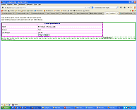
I think you may need to show some screenshots of what you want or what you don’t want as I’m a little confused now
Do you mean “remain the proportional size of the table when you resize the window”?
=======
The word “fixed” has in css the special meaning “locked size, in px or another unit”.
2. Do you mean “I thought a table can not be made in a way that the design of the table will remain when I resize the window”?
If you do mean that, it’s not right: a table is flexible and will adapt to the screen width automatically; the table cells will then adapt proportionally (unless you set the table or cells in a “fixed width” in px or em).
=======
You can see the scaling of the tables in a normal online page, if you change the browser-window (it’s difficult to see in the JSfiddle window).
I gave the table and the inner table and their cell different border-colors, so the size is easy visible.
A cellspacing: 0; cannot be used in css. In css it has to be: border-collapse: collapse;
The cells don’t have the right colspan’s: there are missing some cells in this way (visible when you omit the border-collapsing; see [U]scalable-table-ori-2.htm[/U]). As Paul O’B said, it should be better to make a more simple table-construction in the html.
If you don’t want that the table is spread very wide on larger screens, you can give the main table a maximum width. In case the screen width is under the maximimum, the 100% is working. - If you set the margin-left and -right into “auto”, the whole table will be centered on the page at large screens:
The first <div> inside the <body> has a fixed width assigned. Delete that fixed width and see what changes (or change it to [size=+1][color=blue]max-width:860px;[/color][/size]).
Did you replace BOTH of those red properties with the blue property that I suggested? BOTH of them?
I am unable to access your common.css stylesheet, so there may be other code in the common.css stylesheet that is also setting a fixed width on the page. Please include a link to the common.css stylesheet.
I tried it too, and I was able to narrow the width of the page and the table narrowed with it without triggering a scrollbar… in Firefox. Please post a link to the code that you have tested, or post new code again along with a screen shot showing how it does not work. ALSO please describe how it fails. Do not just say, “it does not work”, describe HOW it does not work.
 A simple styled table would have done.