How to color in a circle inside a gradient

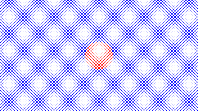
How do I add the colored circle to the middle?

I am not exactly sure how this would be done.

circle is 90px 90px.

https://jsfiddle.net/vcfu5px1/

I am trying to do this:

.panel-left,
.panel-right {
  position: absolute;
  height: 100%;
  width: 50%;
  top: 0%;
  transition: all 8s ease;
  transition-delay: 0s;
  overflow: hidden;
  pointer-events: none;

}

.panel-left {
  left: 0;
}

.panel-right {
  right: 0;
}

.panel-left::before,
.panel-right::before {
  content: "";
  position: absolute;
  top: 0;
  left: 0;
  height: 100%;
  width: 200%;
  background:
    linear-gradient(45deg,
      transparent,
      transparent 7px,
      black 7px,
      black 7.5px,
      transparent 7.5px,
      transparent 10px),
    linear-gradient(-45deg,
      transparent,
      transparent 7px,
      black 7px,
      black 7.5px,
      transparent 7.5px,
      transparent 10px);
  background-size: 10px 10px;
  /* filter: drop-shadow(0 0 5px #000);*/
}

I found this works.

But this won’t work in that code.

https://jsfiddle.net/t7cxefb3/


.fence {
  width: 640px;
  height: 340px;
  display: flex;
  justify-content: center;
  align-items: center;
  background:
    linear-gradient(45deg,
      #0000 7px,
      blue 0 7.5px,
      #0000 0 10px),
    linear-gradient(-45deg,
      #0000 7px,
      blue 0 7.5px,
      #0000 0 10px);
  background-size: 10px 10px;
}

.circle {
  border-radius: 50%;
  width: 90px;
  height: 90px;
  background:
    linear-gradient(45deg,
      #0000 7px,
      red 0 7.5px,
      #0000 0 10px),
    linear-gradient(-45deg,
      #0000 7px,
      red 0 7.5px,
      #0000 0 10px);
  background-size: 10px 10px;
}
<div class="fence">
  <div class="circle">
  </div>
</div>

You could add it to the :after pseudo element assuming you are splitting it again.

e.g.

.panel-left::after,
.panel-right::after {
  content: "";
  position: absolute;
  top: 0;
  left: 0;
  right:0;
  bottom:0;
  margin:auto -45px auto auto;
  height: 90px;
  width: 90px;
 z-index: 10;
  border-radius: 50%;
  background:
    linear-gradient(45deg,
      #0000 7px,
      red 0 7.5px,
      #0000 0 10px),
    linear-gradient(-45deg,
      #0000 7px,
      red 0 7.5px,
      #0000 0 10px);
  background-size: 10px 10px;
}
.panel-right:after{
  margin:auto  auto auto -45px;
}

How come z-index: 10 is used?

Why 10?

Also, what did I do wrong here?

https://jsfiddle.net/zhe27g43/

That was in your code for the circle. I just copied it.

Why did you use 10?

1 Like

You seem to have deleted the panel-left:before and panel-right:before css code for some reason.

1 Like

How would I use clip-path to punch through, remove the circle area completely?

https://jsfiddle.net/m4jdhewa/

You can’t really punch through something. I believe we have created transparent circles before with a solid background outside the circle but in the case of a repeating gradient then I think the options are very limited.

I’m assuming you mean something like this demo which is done using mix-blend modes?

This was used: background: radial-gradient(circle, transparent 0% 35%, #0a0a0a 35%);

Would something similar to that work on the gradient?

No I don’t think so. That puts a solid color outside the transparent circle and not a repeating hatch effect.

I think the only solution is mix-blend mode but its not an exact science. You’d need to hard code the elements rather than pseudo elements and as mix-blend mode works on the parent.

I think you’d need something like this.

.before,
.before {
  content: "";
  position: absolute;
  top: 0;
  left: 0;
  height: 100%;
  width: 200%;
  background:
    linear-gradient(45deg,
      transparent,
      transparent 7px,
      black 7px,
      black 7.5px,
      transparent 7.5px,
      transparent 10px),
    linear-gradient(-45deg,
      transparent,
      transparent 7px,
      black 7px,
      black 7.5px,
      transparent 7.5px,
      transparent 10px);
  background-size: 10px 10px;
  /* filter: drop-shadow(0 0 5px #000);*/
      mix-blend-mode: hard-light;
}

.panel-right .before {
  left: -100%;
}

.hole {
  position: absolute;
  left: 0;
  right: 0;
  top: 0;
  bottom: 0;
  margin: auto;
  width: 90px;
  height: 90px;
  border-radius: 50%;
  background-color: gray;
}
 <div class="panel-left">
        <div class="before">
          <div class="hole"></div>
        </div>
      </div>
      <div class="panel-right">
        <div class="before">
          <div class="hole"></div>
        </div>
      </div>
    </div>

However I haven’t really had time to delve further into this and I don’t know if you can get it perfect for your use case.

Back tomorrow now.

Is there anything you would adjust here? https://jsfiddle.net/qhntd7s8/2/

This one uses:

  -webkit-mask-image: radial-gradient(circle, transparent 0 44px, black 44px);
  mask-image: radial-gradient(circle, transparent 0 44px, black 44px);
.panel-left::before,
.panel-right::before {
  content: "";
  position: absolute;
  top: 0;
  left: 0;
  height: 100%;
  width: 200%;
  background:
    linear-gradient(45deg,
      transparent,
      transparent 7px,
      black 7px,
      black 7.5px,
      transparent 7.5px,
      transparent 10px),
    linear-gradient(-45deg,
      transparent,
      transparent 7px,
      black 7px,
      black 7.5px,
      transparent 7.5px,
      transparent 10px);
  background-size: 10px 10px;
  /* filter: drop-shadow(0 0 5px #000);*/
  -webkit-mask-image: radial-gradient(circle, transparent 0 44px, black 44px);
  mask-image: radial-gradient(circle, transparent 0 44px, black 44px);
}

.panel-right::before {
  left: -100%;
}

.panel-left::after,
.panel-right::after {
  content: "";
  position: absolute;
  top: 0;
  left: 0;
  right: 0;
  bottom: 0;
  margin: auto -45px auto auto;
  height: 90px;
  width: 90px;
  border-radius: 50%;
  background:
    linear-gradient(45deg,
      #0000 7px,
      red 0 7.5px,
      #0000 0 10px),
    linear-gradient(-45deg,
      #0000 7px,
      red 0 7.5px,
      #0000 0 10px);
  background-size: 10px 10px;
}

.panel-right:after {
  margin: auto auto auto -45px;
}

.slide .panel-left::after,
.slide .panel-right::after {
  display: none;
}

Ah yes, I forgot about mask-image.

That seems to work although you are only applying it after you have clicked play which doesn’t seem to make sense to me.

Unless that was the effect I was looking for.

1 Like

Applying it the other way around I would be doing this.

https://jsfiddle.net/av4ng8op/

.panel-left::before,
.panel-right::before {
  content: "";
  position: absolute;
  top: 0;
  left: 0;
  height: 100%;
  width: 200%;
  background:
    linear-gradient(45deg,
      #0000 7px,
      black 0 7.5px,
      #0000 0 10px),
    linear-gradient(-45deg,
      #0000 7px,
      black 0 7.5px,
      #0000 0 10px);
  background-size: 10px 10px;
  /* filter: drop-shadow(0 0 5px #000);*/
  -webkit-mask-image: radial-gradient(circle, transparent 0 44px, black 44px);
  mask-image: radial-gradient(circle, transparent 0 44px, black 44px);
}

.panel-right::before {
  left: -100%;
}

/*.panel-left::after,
.panel-right::after {
  content: "";
  position: absolute;
  top: 0;
  left: 0;
  right: 0;
  bottom: 0;
  margin: auto -45px auto auto;
  height: 90px;
  width: 90px;
  border-radius: 50%;
  background:
    linear-gradient(45deg,
      #0000 7px,
      red 0 7.5px,
      #0000 0 10px),
    linear-gradient(-45deg,
      #0000 7px,
      red 0 7.5px,
      #0000 0 10px);
  background-size: 10px 10px;
}

.panel-right:after {
  margin: auto auto auto -45px;
}

.slide .panel-left::after,
.slide .panel-right::after {
  display: none;
}*/

1 Like

This topic was automatically closed 91 days after the last reply. New replies are no longer allowed.