Hi!
I’ve been struggling to build the following header with navigation within bootstrap 3, I know it should be simple to do but it’s just not coming together at all, hence the reason I’m posting here in the hope that someone can give me the eureka moment!
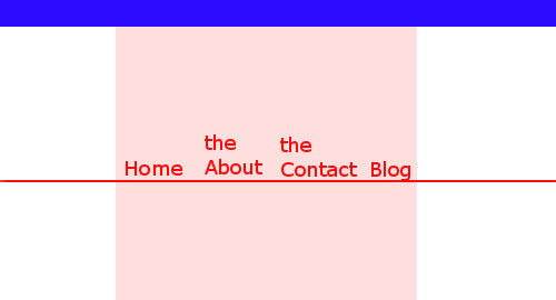
I’ll explain this very basic, simplified drawing of what I’m trying to do.
The Blue section is a top nav which will be right justified but indented inline with the pink box. Then within the pink box this is the main container of the site, so everything will fit within here but out on the left and right hand sides the top nav and main nav (home, about, contact, blog) their is a graphic border which runs the full width of the site.
I’ve managed to get the border working across the top, simply by putting a background image within the div and repeating it, the issue I have with the main nav is the image should repeat across the bottom of the nav but when the user clicks on a link, the bottom border changes a different colour, e.g. red border image changes to yellow border image just under the text on the nav. To add to the issue, the nav should be responsive and have the home button sitting on the border but have the “the about” on two lines! When I’ve tried to put the main nav background in when I go responsive the nav floats away from the background image.
Honestly, it’s been doing my head in and even if someone can help with one of the issues, that would be amazing.
I think for you to get the best help, your markup is needed. Please provide a link to either your site or a codepen with your current markup or post your markup here to see where you are and how to get you to your destination…
To be honest, I’m having a hard time making sense of, or interpreting your requirements.
But I can’t help thinking that this is one of those cases where you have quite unusual and specific requirements for the design, where Bootstrap is likely to be more of a hindrance than anything else.
It may be fine for churning out “cookie-cutter” sites, but for very specific, bespoke designs, it doesn’t cut it.
In order to have the elements “spill” out of the central content container, while keeping the actual content within it. I’m thinking one way to approach thins is to have a series of parent containers that remain at full width, which each have a child container for the actual content with a class assigned to give a common max-width and auto margins.
That is if I’m reading your requirements correctly.
Thanks everyone - sorry, I should have put some code in and given some more details.
The reason I’m needing to go down the bootstrap option is because the design is being intergrated in to a CMS which is running bootstrap and we can’t change that option.
I’ll pull together something in to codepen and post back.
The wrapping on the nav elements can be done with something like this, but you’ll need to set a max-width on the parent container, and adjust the vertical alignment as well
Do you have any suggestions on how I can make the top word be a different font size? I thought about putting span tags around the first work, would this be the best option?