This is what I did, how would I fix it?
or, does that look good to you?
https://jsfiddle.net/pebrfh6o/
.ratio-keeper2 {
position: relative;
height: 0;
padding-top: 42.85%;
margin: auto;
}
.header {
margin: auto auto 20px;
max-width: 640px;
border: 21px solid;
border-radius: 12px;
border-color: #000 #101010 #000 #101010;
position: relative;
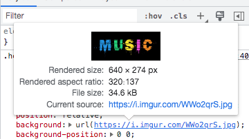
background: url("https://i.imgur.com/WWo2qrS.jpg");
background-position: 0 0;
background-size: cover;
background-repeat: no-repeat;
}
.header::after {
content: "";
position: absolute;
left: 0;
right: 0;
bottom: 0;
top: 0;
outline: 1px solid red;
}
  <div class="header">
    <div class="ratio-keeper2"></div>
  </div>
PaulOB
October 31, 2022, 8:55pm
2
If my eyes don’t deceive me then you could probably do it like this with one element.
/*
.ratio-keeper2 {
  position: relative;
  height: 0;
  padding-top: 42.85%;
  margin: auto;
}
*/
.header {
  position: relative;
  margin: auto auto 20px;
  max-width: 640px;
  border: 21px solid;
  border-radius: 12px;
  border-color: #000 #101010 #000 #101010;
  position: relative;
  background: url("https://i.imgur.com/WWo2qrS.jpg");
  background-position: 0 0;
  background-size: cover;
  background-repeat: no-repeat;
  aspect-ratio:320 / 137;
    outline: 1px solid red;
    outline-offset:-21px;
}

/*
.header::after {
  content: "";
  position: absolute;
  left: 0;
  right: 0;
  bottom: 0;
  top: 0;
  outline: 1px solid red;
}
*/
<div class="header"></div>
I think that looks the same but everything looks black with my eyes so I may have missed something
1 Like
https://jsfiddle.net/92dqj16f/ padding-top: 42.85%;
100 / 21 x 9 = 42.85%
aspect-ratio:21 / 9; was the aspect ratio I was using, and that works here also.
1 Like
PaulOB
October 31, 2022, 9:31pm
4
I just took it straight from devtools.
= 42.8125%
PaulOB
October 31, 2022, 9:47pm
6
asasass:
My math gives me 42.857%
Yes but the rendered size was 320 / 137 so I kept it the same. You won’t notice a difference and 21 / 9 is easier to remember.
Why have you left the ratio-keeper2 in place? Its not used anymore.
  <div class="header">
    <div class="ratio-keeper2"></div>
  </div>
1 Like
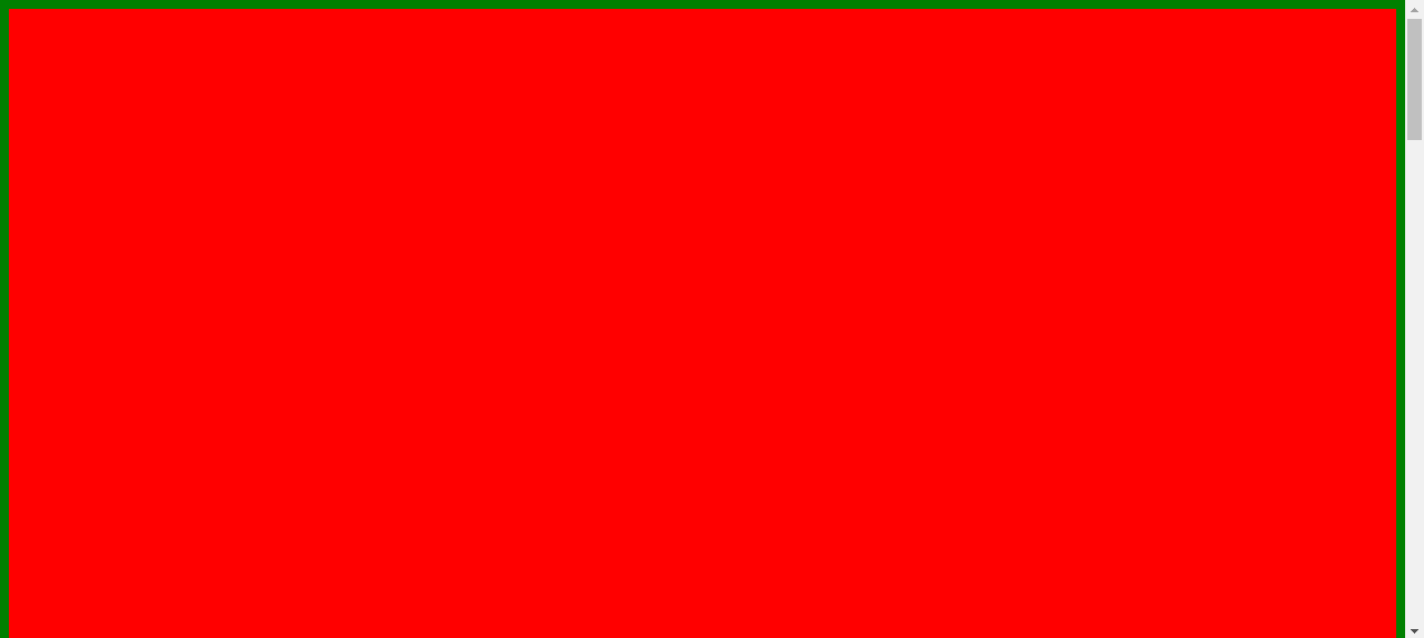
If the red is the header image, how do you fill in the green space with the red background?
How come it’s not covering the entire area?
What would get adjusted in the code for that to occur?
https://jsfiddle.net/d7zxesku/2/
.ratio-keeper2 {
  position: relative;
  height: 0;
  padding-top:  56.25%;
  margin: auto;
}

.header {
  margin: auto auto 40px;
  max-width: 1440px;
  border: 0px solid;
  border-radius: 0px;
  border-color: #000 #101010 #000 #101010;
  position: relative;
  background: red;
  /*background-position: 0 0;
  background-size: cover;
  background-repeat: no-repeat;*/
}
How would I be able to keep
padding: 8px 8px:
On only the videos?
That would make no sense I think.
I was thinking of using media queries to adjust it, but that would likely make no sense either.
How do you apply padding left right only to the videos when they hit the left and right of the browser screen?
But remove that padding from being applied to the header.
PaulOB
November 2, 2022, 12:08pm
9
You could apply a left and right margin to the videos via media query once the browser width is the same size as the video + 16px (8px either side). The media query would be a max-width of 640px + 16px.
asasass
November 2, 2022, 12:33pm
10
How would that be written in the code?
PaulOB
November 2, 2022, 1:40pm
11
I’m on a mobile at the moment so can’t offer code snippets. You had examples of media queries in your other thread anyway.
You might even get away with just adding a left and right margin to the ratio-keeper (iirc).
PaulOB
November 2, 2022, 6:26pm
12
You have the header at a max-width of 1440px so it can’t always go edge to edge on larger screens unless you remove the max-width.
Assuming you want the max-width at 1440px for the header then you could add a media query like this to make the header touch the viewport at smaller sizes.
e.g.
@media screen and (max-width:1456px){
  .header{margin-left:-8px;margin-right:-8px;}
}
That assumes that header is inside .container because its .container that provides the padding.
You could for example just move the header outside of the container and then you don;t need a media query at all.
<div class="container2 ">
		<div class="header">
			<div class="ratio-keeper2"></div>
		</div>
 <div class="container ">
		<div class="curtain">
1 Like
system
February 2, 2023, 1:26am
13
This topic was automatically closed 91 days after the last reply. New replies are no longer allowed.