Hello good afternoon everyone.
I have some problems with the construction of my portfolio CV someone who understands HTML, CSS and JavaScript could help you thank you for your help.
My doubts are as follows:
-
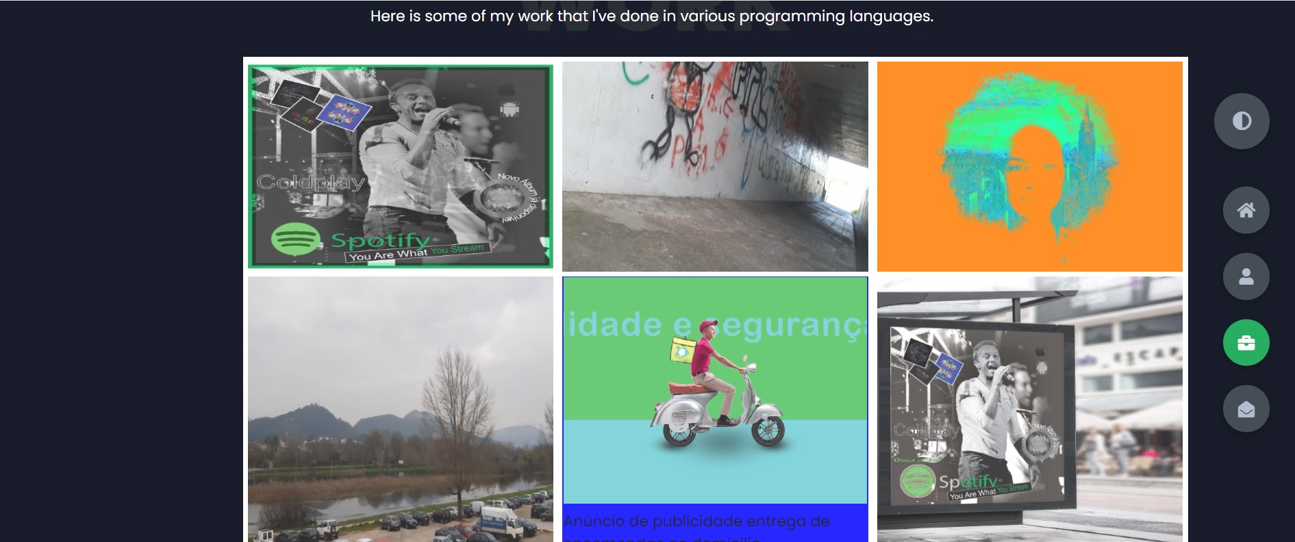
How do I create text blocks about images in the image gallery?
-
What steps do I have to do so that in image 5 (man on a motorcycle), create an image with link to Behance in the image gallery?
-
What do I have to do to centralize the image gallery with the website background?
index.html
 <!--image gallery-->
        <section class="container" id="portfolio">
            <div class="main-title">
                <h2>My <span>Portfolio</span><span class="bg-text">My Work</span></h2>
            </div>
            <p class="port-text">
                Here is some of my work that I've done in various programming languages.
            </p>


            <div class="gallery-container">
                <div class="gallery-item" data-index="1">
                    <img src="img/bandacoldplay.jpeg">
                </div>
                <div class="gallery-item" data-index="2">
                    <img src="img/Dutchplan.jpg">
                </div>
                <div class="gallery-item" data-index="3">
                    <img src="img/mascaraNY.jpg">
                </div>
                <div class="gallery-item" data-index="4">
                    <img src="img/planogeralPonteLima.jpg">

                </div>
                <div class="gallery-item" data-index="5">

                   <p><img src="img/deliveryadd.jpg">
                    <a href="https://www.behance.net/gallery/155636655/Empresa-de-Entregas-ao-Domicilio">Anúncio de publicidade entrega de encomendas ao domicilio</a></p>
                    </div>

                <div class="gallery-item" data-index="6">
                    <img src="img/mockupcoldplay.gif">
                </div>


            </div>

        </section>
          <!-- End of image gallery-->
styles.css
* {
  margin: 0;
  padding: 0;
  box-sizing: border-box;
  list-style: none;
}

:root {
  --color-primary: #191d2b;
  --color-secondary: #27AE60;
  --color-white: #FFFFFF;
  --color-black: #000;
  --color-grey0: #f8f8f8;
  --color-grey-1: #dbe1e8;
  --color-grey-2: #b2becd;
  --color-grey-3: #6c7983;
  --color-grey-4: #454e56;
  --color-grey-5: #2a2e35;
  --color-grey-6: #12181b;
  --br-sm-2: 14px;
  --box-shadow-1: 0 3px 15px rgba(0,0,0,.3);
}

.light-mode {
  --color-primary: #FFFFFF;
  --color-secondary: #F56692;
  --color-white: #454e56;
  --color-black: #000;
  --color-grey0: #f8f8f8;
  --color-grey-1: #6c7983;
  --color-grey-2: #6c7983;
  --color-grey-3: #6c7983;
  --color-grey-4: #454e56;
  --color-grey-5: #f8f8f8;
  --color-grey-6: #12181b;
}

body {
  background-color: var(--color-primary);
  font-family: "Poppins", sans-serif;
  font-size: 1.1rem;
  color: var(--color-white);
  transition: all 0.4s ease-in-out;
}

a {
  display: inline-block;
  text-decoration: none;
  color: inherit;
  font-family: inherit;
}

header {
  min-height: 100vh;
  color: var(--color-white);
  overflow: hidden;
  padding: 0 !important;
}

section {
  min-height: 100vh;
  width: 100%;
  position: absolute;
  left: 0;
  top: 0;
  padding: 3rem 18rem;
}

.container {
  display: none;
  transform: translateY(-100%) scale(0);
  transition: all 0.4s ease-in-out;
  background-color: var(--color-primary);
}

.active {
  display: block;
  animation: appear 1s ease-in-out;
  transform: translateY(0) scaleY(1);
}
@keyframes appear {
  0% {
    transform: translateY(-100%) scaleY(0);
  }
  100% {
    transform: translateY(0) scaleY(1);
  }
}

.controls {
  position: fixed;
  z-index: 10;
  top: 50%;
  right: 3%;
  display: flex;
  flex-direction: column;
  align-items: center;
  justify-content: center;
  transform: translateY(-50%);
}
.controls .control {
  padding: 1rem;
  cursor: pointer;
  background-color: var(--color-grey-4);
  width: 55px;
  height: 55px;
  border-radius: 50%;
  display: flex;
  justify-content: center;
  align-items: center;
  margin: 0.7rem 0;
  box-shadow: var(--box-shadow-1);
}
.controls .control i {
  font-size: 1.2rem;
  color: var(--color-grey-2);
  pointer-events: none;
}
.controls .active-btn {
  background-color: var(--color-secondary);
  transition: all 0.4s ease-in-out;
}
.controls .active-btn i {
  color: var(--color-white);
}

.theme-btn {
  top: 15%;
  right: 3%;
  width: 65px;
  height: 65px;
  border-radius: 50%;
  background-color: var(--color-grey-4);
  cursor: pointer;
  position: fixed;
  display: flex;
  justify-content: center;
  align-items: center;
  box-shadow: 0 3px 15px rgba(0, 0, 0, 0.3);
  transition: all 0.1s ease-in-out;
}
.theme-btn:active {
  transform: translateY(-3px);
}
.theme-btn i {
  font-size: 1.4rem;
  color: var(--color-grey-2);
  pointer-events: none;
}

/*Header-content*/
.header-content {
  display: grid;
  grid-template-columns: repeat(2, 1fr);
  min-height: 100vh;
}
.header-content .left-header {
  display: flex;
  align-items: center;
  position: relative;
}
.header-content .left-header .h-shape {
  transition: all 0.4s ease-in-out;
  width: 65%;
  height: 100%;
  background-color: var(--color-secondary);
  position: absolute;
  left: 0;
  top: 0;
  z-index: -1;
  clip-path: polygon(0 0, 46% 0, 79% 100%, 0% 100%);
}
.header-content .left-header .image {
  border-radius: var(--br-sm-2);
  height: 90%;
  width: 68%;
  margin-left: 4rem;
  background-color: var(--color-black);
  transition: all 0.4s ease-in-out;
}
.header-content .left-header .image img {
  width: 100%;
  height: 100%;
  object-fit: cover;
  transition: all 0.4s ease-in-out;
  filter: grayscale(100%);
}
.header-content .left-header .image img:hover {
  filter: grayscale(0);
}
.header-content .right-header {
  display: flex;
  flex-direction: column;
  justify-content: center;
  padding-right: 18rem;
}
.header-content .right-header .name {
  font-size: 3rem;
}
.header-content .right-header .name span {
  color: var(--color-secondary);
}
.header-content .right-header p {
  margin: 1.5rem 0;
  line-height: 2rem;
}

/*About*/
.about-container {
  display: grid;
  grid-template-columns: repeat(2, 1fr);
  padding-top: 3.5rem;
  padding-bottom: 5rem;
}
.about-container .right-about {
  display: grid;
  grid-template-columns: repeat(2, 1fr);
  grid-gap: 2rem;
}
.about-container .right-about .about-item {
  border: 1px solid var(--color-grey-5);
  border-radius: 5px;
  transition: all 0.4s ease-in-out;
  box-shadow: 1px 2px 15px rgba(0, 0, 0, 0.1);
}
.about-container .right-about .about-item:hover {
  cursor: default;
  transform: translateY(-5px);
  border: 1px solid var(--color-secondary);
  box-shadow: 1px 4px 15px rgba(0, 0, 0, 0.32);
}
.about-container .right-about .about-item .abt-text {
  padding: 1.5rem;
  display: flex;
  flex-direction: column;
}
.about-container .right-about .about-item .abt-text .large-text {
  font-size: 3rem;
  font-weight: 700;
  color: var(--color-secondary);
}
.about-container .right-about .about-item .abt-text .small-text {
  padding-left: 3rem;
  position: relative;
  text-transform: uppercase;
  font-size: 1.2rem;
  color: var(--color-grey-1);
  letter-spacing: 2px;
}
.about-container .right-about .about-item .abt-text .small-text::before {
  content: "";
  position: absolute;
  left: 0;
  top: 15px;
  width: 2rem;
  height: 2px;
  background-color: var(--color-grey-5);
}
.about-container .left-about {
  padding-right: 5rem;
}
.about-container .left-about p {
  line-height: 2rem;
  padding: 1rem;
  color: var(--color-grey-1);
}
.about-container .left-about h4 {
  font-size: 2rem;
  text-transform: uppercase;
}

.about-stats {
  padding-bottom: 4rem;
}
.about-stats .progress-bars {
  display: grid;
  grid-template-columns: repeat(2, 1fr);
  grid-gap: 2rem;
}
.about-stats .progress-bars .progress-bar {
  display: flex;
  flex-direction: column;
}
.about-stats .progress-bars .progress-bar .prog-title {
  text-transform: uppercase;
  font-weight: 500;
}
.about-stats .progress-bars .progress-bar .progress-con {
  display: flex;
  align-items: center;
}
.about-stats .progress-bars .progress-bar .progress-con .prog-text {
  color: var(--color-grey-2);
}
.about-stats .progress-bars .progress-bar .progress-con .progress {
  width: 100%;
  height: 0.45rem;
  background-color: var(--color-grey-4);
  margin-left: 1rem;
  position: relative;
}
.about-stats .progress-bars .progress-bar .progress-con .progress span {
  position: absolute;
  top: 0;
  left: 0;
  height: 100%;
  background-color: var(--color-secondary);
  transition: all 0.4s ease-in-out;
  width: 60%;
}
.about-stats .progress-bars .progress-bar .progress-con .progress .html {
  width: 80%;
}
.about-stats .progress-bars .progress-bar .progress-con .progress .css {
  width: 95%;
}
.about-stats .progress-bars .progress-bar .progress-con .progress .js {
  width: 75%;
}
.about-stats .progress-bars .progress-bar .progress-con .progress .react {
  width: 60%;
}
.about-stats .progress-bars .progress-bar .progress-con .progress .node {
  width: 87%;
}
.about-stats .progress-bars .progress-bar .progress-con .progress .python {
  width: 70%;
}

.stat-title {
  text-transform: uppercase;
  font-size: 1.4rem;
  text-align: center;
  padding: 3.5rem 0;
  position: relative;
}
.stat-title::before {
  content: "";
  position: absolute;
  left: 50%;
  top: 0;
  width: 40%;
  height: 1px;
  background-color: var(--color-grey-5);
  transform: translateX(-50%);
}

/*Timeline*/
.timeline {
  display: grid;
  grid-template-columns: repeat(2, 1fr);
  grid-gap: 2rem;
  padding-bottom: 3rem;
}
.timeline .timeline-item {
  position: relative;
  padding-left: 3rem;
  border-left: 1px solid var(--color-grey-5);
}
.timeline .timeline-item .tl-icon {
  position: absolute;
  left: -27px;
  top: 0;
  background-color: var(--color-secondary);
  width: 50px;
  height: 50px;
  border-radius: 50%;
  display: flex;
  align-items: center;
  justify-content: center;
}
.timeline .timeline-item .tl-icon i {
  font-size: 1.3rem;
}
.timeline .timeline-item .tl-duration {
  padding: 0.2rem 0.6rem;
  background-color: var(--color-grey-5);
  border-radius: 15px;
  display: inline-block;
  font-size: 0.8rem;
  text-transform: uppercase;
  font-weight: 500;
}
.timeline .timeline-item h5 {
  padding: 1rem 0;
  text-transform: uppercase;
  font-size: 1.3rem;
  font-weight: 600;
}
.timeline .timeline-item h5 span {
  color: var(--color-grey-2);
  font-weight: 500;
  font-size: 1.2rem;
}
.timeline .timeline-item p {
  color: var(--color-grey-2);
}

.port-text {
  padding: 2rem 0;
  text-align: center;
}

/*image gallery*/


.gallery-container {
  display: flex;
  flex-wrap: wrap;
  justify-content: space-between;
  background-color: #fff;
  box-shadow: 0 0 3px 0 rgba(0, 0, 0, 0.3);
  width: 115%;
  margin: 12px;
  margin-top: 2px;
  margin-left: 2px;
  margin-right: 2px;
  padding: 6px;
  box-sizing: border-box;
}
.gallery-item {
  flex-basis: 32.7%;
  margin-bottom: 6px;
  opacity: .85;
  cursor: pointer;
}
.gallery-item:hover {
  opacity: 1;
}
.gallery-item img {
  width: 100%;
  height: 100%;
  object-fit: cover;

}
.gallery-content {
  font-size: .8em;
}

.gallery-item p {
  color: #000;
  background-color: blue;
  padding-top: 1px;
  padding-bottom: 1px;
  padding-right: 1px;
  padding-left: 1px;
}

.lightbox {
  position: fixed;
  display: none;
  background-color: rgba(0, 0, 0, 0.6);
  width: 100%;
  height: 100%;
  overflow: auto;
  top: 0;
  left: 0;
}
.lightbox-content {
  position: relative;
  width: 65%;
  height: 58%;

  margin: 5% auto;
  margin-top: 100px;
}
.lightbox-content img {
  border-radius: 3px;
  border: 6px solid white;
  width: 100%;
  height: 100%;
  object-fit: cover;
}
.lightbox-prev,
.lightbox-next {
  position: absolute;
  background-color: rgba(0, 0, 0, 0.8);
  color: #fff;
  padding: 9px;
  top: 45%;
  cursor: pointer;
}
.lightbox-prev {
  left: 0;
}
.lightbox-next {
  right: 0;
}
.lightbox-prev:hover,
.lightbox-next:hover {
  opacity: .8;
}

@media (max-width: 767px) {
  .gallery-container {
      width: 100%;
  }
  .gallery-item {
      flex-basis: 49.80%;
      margin-bottom: 3px;
  }
  .lightbox-content {
      width: 80%;
      height: 60%;
      margin: 15% auto;
  }
}
@media (max-width: 480px) {
  .gallery-item {
      flex-basis: 100%;
      margin-bottom: 1px;
  }
  .lightbox-content {
      width: 90%;
      margin: 20% auto;
  }
}


/* end of image gallery*/


.contact-content-con {
  display: flex;
  padding-top: 3.5rem;
}
.contact-content-con .left-contact {
  flex: 2;
}
.contact-content-con .left-contact h4 {
  margin-top: 1rem;
  font-size: 2rem;
  text-transform: uppercase;
}
.contact-content-con .left-contact p {
  margin: 1rem 0;
  line-height: 2rem;
}
.contact-content-con .left-contact .contact-info .contact-item {
  display: flex;
  align-items: center;
  justify-content: space-between;
}
.contact-content-con .left-contact .contact-info .contact-item p {
  margin: 0.3rem 0 !important;
  padding: 0 !important;
}
.contact-content-con .left-contact .contact-info .contact-item .icon {
  display: grid;
  grid-template-columns: 40px 1fr;
}
.contact-content-con .left-contact .contact-info .contact-item .icon i {
  display: flex;
  align-items: center;
  font-size: 1.3rem;
}
.contact-content-con .left-contact .contact-icon {
  display: flex;
  margin-top: 2rem;
}
.contact-content-con .left-contact .contact-icon a {
  display: flex;
  align-items: center;
  color: var(--color-white);
  background-color: var(--color-grey-5);
  cursor: pointer;
  justify-content: center;
  width: 50px;
  height: 50px;
  border-radius: 50%;
  margin: 0 0.4rem;
  transition: all 0.4s ease-in-out;
}
.contact-content-con .left-contact .contact-icon a:hover {
  background-color: var(--color-secondary);
}
.contact-content-con .left-contact .contact-icon a:hover i {
  color: var(--color-primary);
}
.contact-content-con .left-contact .contact-icon a i {
  display: flex;
  align-items: center;
  justify-content: center;
  font-size: 1.3rem;
}
.contact-content-con .right-contact {
  flex: 3;
  margin-left: 3rem;
}
.contact-content-con .right-contact .input-control {
  margin: 1.5rem 0;
}
.contact-content-con .right-contact .input-control input, .contact-content-con .right-contact .input-control textarea {
  border-radius: 30px;
  font-weight: inherit;
  font-size: inherit;
  font-family: inherit;
  padding: 0.8rem 1.1rem;
  outline: none;
  border: none;
  background-color: var(--color-grey-5);
  width: 100%;
  color: var(--color-white);
  resize: none;
}
.contact-content-con .right-contact .i-c-2 {
  display: flex;
}
.contact-content-con .right-contact .i-c-2 :last-child {
  margin-left: 1.5rem;
}
.contact-content-con .right-contact .submit-btn {
  display: flex;
  justify-content: flex-start;
}

/*Independed components*/
.btn-con {
  display: flex;
  align-self: flex-start;
}

.main-btn {
  border-radius: 30px;
  color: inherit;
  font-weight: 600;
  position: relative;
  border: 1px solid var(--color-secondary);
  display: flex;
  align-self: flex-start;
  align-items: center;
  overflow: hidden;
}
.main-btn .btn-text {
  padding: 0 2rem;
}
.main-btn .btn-icon {
  background-color: var(--color-secondary);
  display: flex;
  align-items: center;
  justify-content: center;
  border-radius: 50%;
  padding: 1rem;
}
.main-btn::before {
  content: "";
  position: absolute;
  top: 0;
  right: 0;
  transform: translateX(100%);
  transition: all 0.4s ease-out;
  z-index: -1;
}
.main-btn:hover {
  transition: all 0.4s ease-out;
}
.main-btn:hover::before {
  width: 100%;
  height: 100%;
  background-color: var(--color-secondary);
  transform: translateX(0);
  transition: all 0.4s ease-out;
}

.main-title {
  text-align: center;
}
.main-title h2 {
  position: relative;
  text-transform: uppercase;
  font-size: 4rem;
  font-weight: 700;
}
.main-title h2 span {
  color: var(--color-secondary);
}
.main-title h2 .bg-text {
  position: absolute;
  top: 50%;
  left: 50%;
  color: var(--color-grey-5);
  transition: all 0.4s ease-in-out;
  z-index: -1;
  transform: translate(-50%, -50%);
  font-weight: 800;
  font-size: 6.3rem;
}

.about-container .left-about p {
  padding-left: 0;
}

@media screen and (max-width: 600px) {
  header {
    padding: 0 !important;
  }

  .theme-btn {
    width: 50px;
    height: 50px;
  }

  .header-content {
    grid-template-columns: repeat(1, 1fr);
    padding-bottom: 6rem;
  }

  .left-header .h-shape {
    display: none;
  }

  .right-header {
    grid-row: 1;
    padding-right: 0rem !important;
    width: 90%;
    margin: 0 auto;
  }
  .right-header .name {
    font-size: 2.5rem !important;
    text-align: center;
    padding-top: 3rem;
  }

  .header-content .left-header .image {
    margin: 0 auto;
    width: 90%;
  }

  .controls {
    top: auto;
    bottom: 0;
    flex-direction: row;
    justify-content: center;
    left: 50%;
    transform: translateX(-50%);
    width: 100%;
    background-color: var(--color-grey-5);
  }
  .controls .control {
    margin: 1rem 0.3rem;
  }

  .about-container {
    grid-template-columns: repeat(1, 1fr);
  }
  .about-container .right-about {
    grid-template-columns: repeat(1, 1fr);
    padding-top: 2.5rem;
  }
  .about-container .left-about {
    padding-right: 0;
  }
  .about-container .left-about p {
    padding-left: 0;
  }

  .timeline {
    grid-template-columns: repeat(1, 1fr);
    padding-bottom: 6rem;
  }

  .container {
    padding: 2rem 2.5rem !important;
  }

  .about-stats .progress-bars {
    grid-template-columns: repeat(1, 1fr);
  }


  .contact-content-con {
    flex-direction: column;
  }
  .contact-content-con .right-contact {
    margin-left: 0;
    margin-top: 2.5rem;
  }

  .contact-content-con .right-contact .i-c-2 {
    flex-direction: column;
  }

  .contact-content-con .right-contact .i-c-2 :last-child {
    margin-left: 0;
    margin-top: 1.5rem;
  }

  .contact-content-con .right-contact {
    margin-bottom: 6rem;
  }

  .contact-item {
    flex-direction: column;
    margin: 1rem 0;
  }
  .contact-item p {
    font-size: 15px;
    color: var(--color-grey-2);
  }
  .contact-item span {
    font-size: 15px;
  }
  .contact-item .icon {
    grid-template-columns: 25px 1fr;
  }

  .main-title h2 {
    font-size: 2rem;
  }
  .main-title h2 span {
    font-size: 2.3rem;
  }
  .main-title h2 .bg-text {
    font-size: 2.3rem;
  }
}
@media screen and (max-width: 1432px) {
  .container {
    padding: 7rem 11rem;
  }

  .contact-content-con {
    flex-direction: column;
  }
  .contact-content-con .right-contact {
    margin-left: 0;
    margin-top: 2.5rem;
  }

  .contact-content-con .right-contact .i-c-2 {
    flex-direction: column;
  }

  .contact-content-con .right-contact .i-c-2 :last-child {
    margin-left: 0;
    margin-top: 1.5rem;
  }

  .contact-content-con .right-contact {
    margin-bottom: 6rem;
  }

  .main-title h2 .bg-text {
    font-size: 5.5rem;
  }
}
@media screen and (max-width: 1250px) {

  .header-content .right-header {
    padding-right: 9rem;
  }
}

@media screen and (max-width: 1070px) {
  .about-container {
    grid-template-columns: repeat(1, 1fr);
  }
  .about-container .right-about {
    padding-top: 2.5rem;
  }

  .main-title h2 {
    font-size: 4rem;
  }
  .main-title h2 span {
    font-size: 4rem;
  }
  .main-title h2 .bg-text {
    font-size: 4.5rem;
  }
}
@media screen and (max-width: 970px) {
  .container {
    padding: 7rem 6rem;
  }

  .about-container .left-about {
    padding-right: 0rem;
  }

  .header-content {
    grid-template-columns: repeat(1, 1fr);
    padding-bottom: 6rem;
  }

  .left-header .h-shape {
    display: none;
  }
  .left-header .image {
    width: 90% !important;
    margin: 0 auto !important;
  }

  .right-header {
    grid-row: 1;
    padding-right: 0rem !important;
    width: 90%;
    margin: 0 auto;
  }
  .right-header .name {
    font-size: 2.5rem !important;
    text-align: center;
    padding-top: 3rem;
  }
}
@media screen and (max-width: 700px) {
  .container {
    padding: 7rem 3rem;
  }

  .about-stats .progress-bars {
    grid-template-columns: repeat(1, 1fr);
  }

  .about-container .right-about {
    grid-template-columns: repeat(1, 1fr);
  }

  .timeline {
    grid-template-columns: repeat(1, 1fr);
  }

  .main-title h2 {
    font-size: 3rem;
  }
  .main-title h2 span {
    font-size: 3rem;
  }
  .main-title h2 .bg-text {
    font-size: 4rem;
  }
}

/*# sourceMappingURL=styles.css.map */


/*datetime*/
.datetime {
  font-size: 16px;
  padding: 24px;
  color: #ffffff;
  background: var(--color-primary)
  box-shadow: 0 0 10px rgba(0, 0, 0, 0.25);
  border-radius: 4px;
  border-right: 10px #009578 solid;
  width: 400px;
  font-weight: 500;
  font-family:"Inter", sans-serif;
  margin-top: 12px;
  margin-bottom: 12px;
  margin-right: 12px;
  margin-left: 12px;
}

.time {
  font-size: 3em;
  color: #00ffcc;
}

.date {
  margin-top: 12px;
  font-size: 1.75em;
  color: var(--color-secondary);
}


/* end of datetime*/
I also send the source code of Codepen.:
https://codepen.io/Quencyjones79/pen/vYrxZGj thank you for your help with code