I always seem to stumble on my nose when using DIV wrappers to wrap my codes. They’re never in the same place as the element itself. As you can see here :
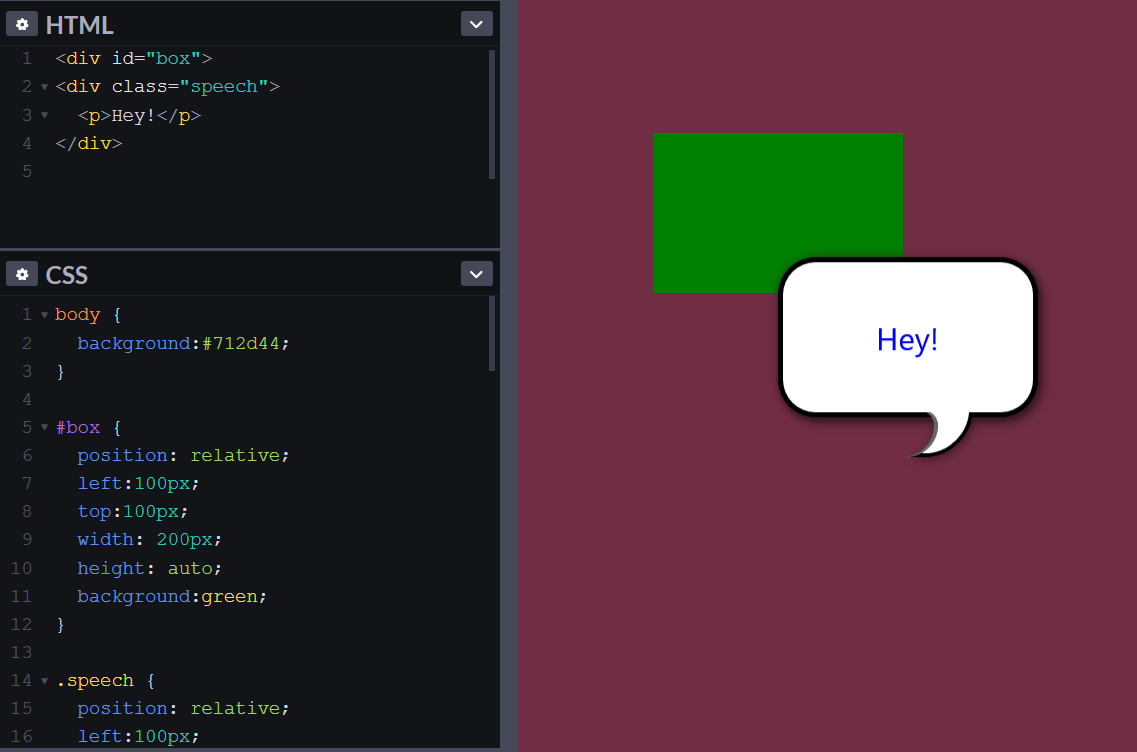
I even give it the same exact positioning. Well sometimes +/- of what it is.
I always seem to stumble on my nose when using DIV wrappers to wrap my codes. They’re never in the same place as the element itself. As you can see here :
I even give it the same exact positioning. Well sometimes +/- of what it is.
You completely misunderstand the use of position:relative and what it does :). That’s not just you making this mistake but most beginners get this wrong and indeed some so called professionals.
In 99% of cases you will never need to move things with co-ordinates using position:relative. When you apply position:relative and then say left:100px you are saying that this element should move from the left by 100px. However, and this is a big caveat, the element always maintains its position in the flow of the document in the place it would have been had you not moved it. In essence you have moved the element visually but not physically. Everything else on the page will believe the element to be where it was and leave a hole in the page that won’t get filled. The new visual position of your element may indeed now overlap anything else in the normal flow.
In your example above you did not need to relatively move #box at all but simply use margins to move it across and down and maintain the flow of the document. The speechbox inside that box does not need any positioning at all either (apart from its spikes) as it is inside of #box and will be moved with it.
If #box is to be removed from the flow then it should be position:absolute and then you could use co-ordinates to move it but of course will not take part in the flow of the document so you would have to control where you place it so that it does not interfere with other elements unless you want it to. Once again though the speechbox inside doesn’t need any positioning as it is already inside the box and moves with it.
What you have done in your code is move #box relatively and then done the same thing to its child the speechbox and moved that further on also as it had already moved with the parent.
position:relative is generally used to create a stacking context for child absolute elements. When you have an absolute element that is say left:100px then the left position refers to the nearest positioned ancestor. If there is no such ancestor then the left position is placed from the viewport (the root element).
When you apply position:relative to a div then any absolute children in that div take their starting co ordinates based on the position of that parent div. That is a child with position:absolute and left:100px will be 100px from the left edge of that parent div.
When you move an element with position:relative with say left:100px it is only moved from the position ot already occupies and then moved another 100px left. However as mentioned above it still believes it is where it was even if it appears to be somewhere else. That is why you will seldom move things relatively and indeed I tell beginners that in the last 100 sites I have coded I have not needed to move an element relatively so you can see you are barking up the wrong tree by doing so 
Sorry for the long answer but this really is a whole topic about positioning that could take a book to explain in detail
@PaulOB don’t be sorry . I really appreciate your answer, and will always refer to it. Thank you. So, in short, using margin : whatever px is the way to go instead of position : whatever… ? I just want to make sure I understand this.
It’s all about context.
Imagine if you had several paragraphs of text on your page and you want more space between paragraphs. You wouldn’t want to absolutely or relatively position any of them to make the space between them greater. Instead you would use a margin to push each paragraph apart without allowing anything to overlap. This is called controlling the flow of the page.
Now imagine you had absolutely placed each of those paragraphs and that would mean you would have to precisely position each one in order for them not to overlap. However once you resized the browser window or added more or less text then they will all break and no longer be of any use.
So effectively you use margins (and or padding) to maintain space between items and also maintain the flow of the document.
In relation to the div around your speechbox then context is important. If you are placing this #box next to an existing image and on top of other content without disrupting the flow then #box would need to be absolutely placed so that it overlaps and sits on top of whatever you wanted it to sit on. In order to maintain a relationship between the absolutely placed #box and the element you want it to overlap you would need a stacking context using position:relative on a common parent of the image and the #box. This means that the absolute element will keep track with the image that you want it overlap. Without a common positioned parent (relative or absolute) then an absolute element is placed from the viewport and that means you are guessing that your image is always in the same place.
Here is a Pen that shows how different positioning affects content.
In the first one with the margins, note the 10px margin is before the container.
The second, relative one, the div leaves a gap where it would normally be, but has shifted to overlap the following text content.
Note it has pushed the container wider though.
The third, absolute example, its container and following text, doesn’t even know it’s there. It just sits on top, doing its own thing.
I read through this earlier today which was helpful
Finding a downside to this : I can’t resize both the wrapper and the speech box at the same time. 
You didn’t need a width on the speechbox. It would have been as wide as its parent automatically.
Ok took that out. So how to resize it now, if I want it smaller or larger?
Sorry I’m not quite sure what you mean? Just change the width to what you want.
Or have you some specific context in mind? I can’t quite see where you are heading with this question?
I’m sorry. What I’m wanting is how to resize both the wrapper and the speech box at the same time. To either a smaller one or larger one.
You didn’t show any code for a wrapper and a page wrapper doesn’t really have a bearing on the question for the speechbox as such.
Do you mean you want the bubble to grow and shrink with the page width? If so then you need a percentage width unit (such as % or vw) for #box instead (again it depends on context as to which you will need).
Without seeing the context you are talking about I can only guess
Look at the 4th bubble in my demo I have just made it wider by changing the px width. Then look at the 5th bubble where I have used vw to base its width on the viewport width (vw).
Resize the viewport to see the 5th bubble get smaller or larger
The 4th one doesn’t get smaller, I think. But the 5th does.
Do you mean you want the bubble to grow and shrink with the page width? If so then you need a percentage width unit (such as % or vw) for #box instead (again it depends on context as to which you will need).
With the page width meaning when I resize the page, then no Lemme see if I can find an example
See how a couple of these speech bubbles are the same type, but different sizes? That’s what I’m looking to do.
The 4th one is a fixed width. I just changed it from 200px to 300px. The 5th one uses vw units and its width is relative to the viewport width.
Then at small viewport width the same item looks like this.
They will all automatically change height based on content as you can see from the third example in the demo and the 5th bubble at small screen sizes.
Then change the width of the ones you want a different size We seem to be going around in circles here 
We just covered this a couple of posts ago
Remove the width from .speech and change the width on #box
Also that line-height:100px is going to break things is you have wrapping text as in my example. I have given you code for centring properly in my examples.
… and get rid of the prefixes for box-shadow as they havent been needed for about 10 years.
Okie dokie , soooo :
.speechand…
Did I miss anything?


