Can this be done?
or, a better way to put it.
Can I remove all the background stuff, and keep all the border stuff?
Removing everything from the middle screen, and having everything being added to the border.
This would make the middle part white or transparent, and would have nothing applied to it.
https://jsfiddle.net/uboec2sn/
.curtain {
  max-width: 640px;
  margin: auto;
  border: 15px solid transparent;
  border-radius: 12px;
  background: #333;
  background: linear-gradient(to bottom right, gray, black), url("https://i.imgur.com/pwdit9N.png"), linear-gradient(to bottom right, #eee, #ccc);
  background-origin: padding-box, border-box, border-box;
  background-clip: padding-box, border-box, border-box;
  box-shadow: 1px 1px 3px black inset, 0 -1px white, 0 -1px 0 1px #bbb, 0 2px 0 1px #aaa, 0 2px 10px 1px rgb(0 0 0 / 20%);
}
PaulOB
August 3, 2021, 12:09pm
2
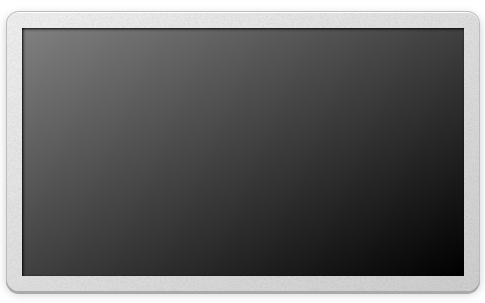
I did that for you in this demo.
You don’t want to have white in the middle or it will show when rounding errors occur.
Can this be added to just the border and not applied to the background?https://jsfiddle.net/hL5q764f/
  background: linear-gradient(to bottom right, gray, black), url("https://i.imgur.com/pwdit9N.png"), linear-gradient(to bottom right, #eee, #ccc);
  background-origin: padding-box, border-box, border-box;
  background-clip: padding-box, border-box, border-box;
  box-shadow: 0 -1px white, 0 -1px 0 1px #bbb, 0 2px 0 1px #aaa, 0 2px 10px 1px rgb(0 0 0 / 20%);
Can the CSS mask property be used here?
All I would be doing is cutting out the middle so it is see through.
https://jsfiddle.net/hL5q764f/
I posted the wrong jsfiddle, here is the one with the background around it.
https://jsfiddle.net/racsob9v/
It looks like this now.https://jsfiddle.net/racsob9v/
 border: 15px solid transparent;
  border-radius: 12px;
  background: linear-gradient(to bottom right, gray, black), url("https://i.imgur.com/pwdit9N.png"), linear-gradient(to bottom right, #eee, #ccc);
  background-origin: padding-box, border-box, border-box;
  background-clip: padding-box, border-box, border-box;
  box-shadow: 0 -1px white, 0 -1px 0 1px #bbb, 0 2px 0 1px #aaa, 0 2px 10px 1px rgb(0 0 0 / 20%);
I’m trying to do this.
If not CSS mask property,
Would you know if I would be able to use border-image?
Can the gradient and image be applied to the border, and not the background?
Can that be done?
I think you can use border-image but preparation of the image may be quite challenging. It will need to be a PNG image to include your 20% opacity.
If using border-image, each of the 8 regions can have have a gradient.
1 Like
PaulOB
August 4, 2021, 11:53am
7
asasass:
I’m trying to do this.
We are already doing that with the curtain effect?.
e.g.
1 Like
Can the middle gray / black be removed from the middle of the image?
PaulOB
August 4, 2021, 12:06pm
9
No unless you tell me why?, There is no black in my example.
What’s the difference?
What are you trying to achieve that is not shown in my demo?
That’s what I was originally trying to figure out how to do and I wasn’t able to.https://jsfiddle.net/uboec2sn/
It would also be good to know so I know how that would be done.
PaulOB
August 4, 2021, 12:49pm
11
You are talking in riddles again.
I’ve shown you how it can be done with the set up you have in the easiest way.
You can use a border-image for the gradient effect but border-images do no obey rounded corners and will stick out of the border-radius. That means you have to hide the overflow on the parent to make the round borders. However when you do that you lose the subtle box-shadow effects beacuse overflow:hidden cuts them out.
here is an example of a border-image gradient.
As you can see there is no way to have the subtle box shadow effects on it.
All in all the solution I already gave is the easiest way to do this.
1 Like
How would I be able to apply this to only the border?
url("https://i.imgur.com/pwdit9N.png")
Can it be added to the border-image?
PaulOB
August 4, 2021, 1:38pm
13
What is that image ?
It looks like a fuzzy transparent gray
You can apply it to the border but I can hardly see it.
That image is for the border.
Can they be added together?
border-image: linear-gradient(#eee, #aaa) url("https://i.imgur.com/pwdit9N.png") 1;
I think what it is called is grainy background noise.
https://jsfiddle.net/yh28L63z/
.noise {
  position: relative;
  background: blue;
}

.noise::before,
.body-noise::before {
  content: "";
  position: absolute;
  top: 0;
  bottom: 0;
  left: 0;
  right: 0;
  background-image: url(data:image/png;base64,iVBORw0KGgoAAAANSUhEUgAAADIAAAAyCAMAAAAp4XiDAAAAUVBMVEWFhYWDg4N3d3dtbW17e3t1dXWBgYGHh4d5eXlzc3OLi4ubm5uVlZWPj4+NjY19fX2JiYl/f39ra2uRkZGZmZlpaWmXl5dvb29xcXGTk5NnZ2c8TV1mAAAAG3RSTlNAQEBAQEBAQEBAQEBAQEBAQEBAQEBAQEBAQEAvEOwtAAAFVklEQVR4XpWWB67c2BUFb3g557T/hRo9/WUMZHlgr4Bg8Z4qQgQJlHI4A8SzFVrapvmTF9O7dmYRFZ60YiBhJRCgh1FYhiLAmdvX0CzTOpNE77ME0Zty/nWWzchDtiqrmQDeuv3powQ5ta2eN0FY0InkqDD73lT9c9lEzwUNqgFHs9VQce3TVClFCQrSTfOiYkVJQBmpbq2L6iZavPnAPcoU0dSw0SUTqz/GtrGuXfbyyBniKykOWQWGqwwMA7QiYAxi+IlPdqo+hYHnUt5ZPfnsHJyNiDtnpJyayNBkF6cWoYGAMY92U2hXHF/C1M8uP/ZtYdiuj26UdAdQQSXQErwSOMzt/XWRWAz5GuSBIkwG1H3FabJ2OsUOUhGC6tK4EMtJO0ttC6IBD3kM0ve0tJwMdSfjZo+EEISaeTr9P3wYrGjXqyC1krcKdhMpxEnt5JetoulscpyzhXN5FRpuPHvbeQaKxFAEB6EN+cYN6xD7RYGpXpNndMmZgM5Dcs3YSNFDHUo2LGfZuukSWyUYirJAdYbF3MfqEKmjM+I2EfhA94iG3L7uKrR+GdWD73ydlIB+6hgref1QTlmgmbM3/LeX5GI1Ux1RWpgxpLuZ2+I+IjzZ8wqE4nilvQdkUdfhzI5QDWy+kw5Wgg2pGpeEVeCCA7b85BO3F9DzxB3cdqvBzWcmzbyMiqhzuYqtHRVG2y4x+KOlnyqla8AoWWpuBoYRxzXrfKuILl6SfiWCbjxoZJUaCBj1CjH7GIaDbc9kqBY3W/Rgjda1iqQcOJu2WW+76pZC9QG7M00dffe9hNnseupFL53r8F7YHSwJWUKP2q+k7RdsxyOB11n0xtOvnW4irMMFNV4H0uqwS5ExsmP9AxbDTc9JwgneAT5vTiUSm1E7BSflSt3bfa1tv8Di3R8n3Af7MNWzs49hmauE2wP+ttrq+AsWpFG2awvsuOqbipWHgtuvuaAE+A1Z/7gC9hesnr+7wqCwG8c5yAg3AL1fm8T9AZtp/bbJGwl1pNrE7RuOX7PeMRUERVaPpEs+yqeoSmuOlokqw49pgomjLeh7icHNlG19yjs6XXOMedYm5xH2YxpV2tc0Ro2jJfxC50ApuxGob7lMsxfTbeUv07TyYxpeLucEH1gNd4IKH2LAg5TdVhlCafZvpskfncCfx8pOhJzd76bJWeYFnFciwcYfubRc12Ip/ppIhA1/mSZ/RxjFDrJC5xifFjJpY2Xl5zXdguFqYyTR1zSp1Y9p+tktDYYSNflcxI0iyO4TPBdlRcpeqjK/piF5bklq77VSEaA+z8qmJTFzIWiitbnzR794USKBUaT0NTEsVjZqLaFVqJoPN9ODG70IPbfBHKK+/q/AWR0tJzYHRULOa4MP+W/HfGadZUbfw177G7j/OGbIs8TahLyynl4X4RinF793Oz+BU0saXtUHrVBFT/DnA3ctNPoGbs4hRIjTok8i+algT1lTHi4SxFvONKNrgQFAq2/gFnWMXgwffgYMJpiKYkmW3tTg3ZQ9Jq+f8XN+A5eeUKHWvJWJ2sgJ1Sop+wwhqFVijqWaJhwtD8MNlSBeWNNWTa5Z5kPZw5+LbVT99wqTdx29lMUH4OIG/D86ruKEauBjvH5xy6um/Sfj7ei6UUVk4AIl3MyD4MSSTOFgSwsH/QJWaQ5as7ZcmgBZkzjjU1UrQ74ci1gWBCSGHtuV1H2mhSnO3Wp/3fEV5a+4wz//6qy8JxjZsmxxy5+4w9CDNJY09T072iKG0EnOS0arEYgXqYnXcYHwjTtUNAcMelOd4xpkoqiTYICWFq0JSiPfPDQdnt+4/wuqcXY47QILbgAAAABJRU5ErkJggg==);
}
<div class="noise" style="width: 300px; height:300px;">
</div>
1 Like
system
November 4, 2021, 2:27am
18
This topic was automatically closed 91 days after the last reply. New replies are no longer allowed.


