I’m stuck of what selectors i need to add/edit to align all these ‘4 col-x items’ in a line so that they are in same height and when i resize the windows, the most right image not stack on top of the form.
What I have come up with is that first off you need to declare a doctype to your document <!doctype html>
Than secondly the form is going bad on screen resize as you have noticed it is because you have “fixed” sizes for your elements inside the form.
Yes I know we don’t want the form to be so small that it becomes impossible to use so I had an idea it’s best to use the form as a popup on button click as it appears to be effecting the responsive design eventually the form will be the only thing visible on the screen without a background color.
if you wish to continue this idea and see where it leads you make the col-2 container of the form a position:relative; and z-index:999; since you can not stack static elements with z-index you have to change it to either position:absolute; or position:relative; or position:fixed; since relative positioning has no real effect of positioning your elements its the best choice the only problem is the input fields are visible but the background seems to stay behind.
Thats why I suggest creating a button than hiding the form and display it anyway you like.
Assuming you chose to remove the form I tried getting your images to have similar heights, since images can only go as far as the width attribute is without stretching it i made col-4 width:50%; tada it works!.
but wait there is a problem the image is still ever so slightly smaller than the other images even at that width. So I decided when you style nav tags just put a margin-top:-20px; just to hide that nasty piece.
when I scaled the window afterwards it appears to work perfectly! …obviously I may criticized by someone for the use of negative margins on responsive design. but for what it’s worth it’s only a small bit.
unfortunately using the form as it is may be a difficult task if you still wish to continue to have it there.(for “importance” purpose or “quick and easy” use) really i don’t think it will be a bad idea to use a form as a button.
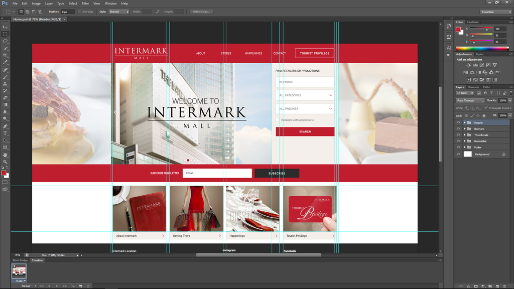
The first problem I see is that your form is in a div with a width of 16.66%, but the form “select” items have a set width of 304px. That means it will require a viewport size wider than 1825px to have any chance of fitting correctly - and that’s not taking into account any margins or padding.
Four columns like that will not work at smaller screen sizes. Have you thought about how your design should reflow at narrower widths?
Those side images are decoration and would be better as background images and then you could just use background-size:cover to fit.
The “Welcome to Intermark Mall” would also be better as browser text although it would be hard to match the font unless you had that available. Using an image for the company title won’t help search engines as much as having real text although the alt text does help. If you used text then the image behind could be a background image and would be easier to place.
Avoid trying to apply width to all the columns as that seldom works and if using flexbox you can often just size the one you need and let the other grow and shrink.
It looks as though the center portion should really be a container width a max-width which just sits over the background side images.
I’ve re-jigged your code as a starting point to show how I would roughly lay it out using the resources you have now but there are a number of questions that need answering about what happens next as to how you proceed.
Resize the page smaller to larger to see the effect (you’ll need to click ‘edit on codepen’ to see the full width version).
The welcome to Intermark looks as though its supposed to be an image slider and that could be quite awkward to fit into that column unless you can find a suitable and responsive slider off the shelf.
Yes a doctype is of course needed but as an aside when you use codepen you do not need to include any head content in the html panel. Only html that lies between the body tags should be included as codepen supplies all the doctype and body tags itself. In the codepen settings you can include your css and js files and set meta tag information which keeps that panel clean and free for just the relevant html.
The welcome to Intermark looks as though its supposed to be an image slider and that could be quite awkward to fit into that column unless you can find a suitable and responsive slider off the shelf.
Why it can be quite awkward to fit into that column if its an image slider?
Thank you for your example. Tried to read your codes and kind of getting hard to understand it all. I’ll try to play with it later to understand it more. Just learn html/css less then a month. Seems like more stuffs i need to explore. xD
Yes because your design should be controlled by its content and not by some imaginary grid.
Frameworks often use those methods because they try to cater for every eventuality but for a single design there’s no need and there are better methods.
Fixed width percentages may seem like a good idea but content seldom fits into neat little packages and as soon as you resize the screen the whole thing breaks.
Image sliders are awkward at the best of times as far as responsive design goes but I don’t know of any that will resize width and height at the same time to fit the available space.
