I had tried that here and saw it works: https://jsfiddle.net/r0Lqp2jm/2/
.ratio-keeper {
  position: relative;
  height: 0;
  padding-top: 56.25%;
  margin: auto;
  overflow: hidden;
  outline: 1px solid #333;
}
I had tried that here and saw it works: https://jsfiddle.net/r0Lqp2jm/2/
.ratio-keeper {
position: relative;
height: 0;
padding-top: 56.25%;
margin: auto;
overflow: hidden;
outline: 1px solid #333;
}
As I understand it border: 11px solid black;
Equals a 10 px border
.curtain {
  flex: 1 0 0;
  margin: auto;
  max-width: 640px;
  /*box-shadow: inset 0 -2px 0px 0px #0a0a0a;*/
  border: 11px solid black;
  border-radius: 3.2px;
  border-color: orange green orange green;
  position: relative;
}
https://jsfiddle.net/g412bwzd/

If I want to add a color behind the outline, how would I do that to fill in the space gap between the outline and border?
Would I be placing a border behind the outline somehow?
How do you work that out?
I was adding the gap space after the green.
If I put 10px there it gives me 8px.
It’s because this is being used:
  position: absolute;
  top: -2px;
  left: -2px;
  right: -2px;
  bottom: -2px;
…and in which world would that be 
11px border = 11px.
The reason you can’t see all of the border is because the radial gradient background is on top which was put there because you were getting a transparent section around the edge. You really must remember what you have done before.
You can move the red outline outwards by using outline-offset.
.ratio-keeeper{outline-offset:1px;}
12px green/orange border gives me 10px. https://jsfiddle.net/5xkpmw31/
.curtain {
  flex: 1 0 0;
  margin: auto;
  max-width: 640px;
  /*box-shadow: inset 0 -2px 0px 0px #0a0a0a;*/
  border: 12px solid black;
  border-radius: 3.2px;
  border-color: orange green orange green;
  position: relative;
}

It flows under the outline https://jsfiddle.net/b52r0z7o/
2px values.
which gives me 10px that is viewable on the screen.
You are talking in riddles now.
I’ve told you numerous times that the reason you can’t see all the border is because you have stuff on top of it.
The border size is exactly as it should be. What you can see of it is another matter as you are layering stuff over it.
You know the reasons why things are as they are so you can make your decisions accordingly.
It’s not 640 x 360 after adding outline-offset: 1px;
How is that fixed?
https://jsfiddle.net/e7gcvk2x/1/
It’s now: 642 x 362
.ratio-keeper {
  position: relative;
  height: 0;
  padding-top: 56.25%;
  margin: auto;
  overflow: hidden;
  outline: 1px solid red;
  outline-offset: 1px;
}
An outline doesn’t form part of the elements width or height. It’s just an outline which lies outside the elements dimensions. Its also been moved further away using the outline-offset because you wanted it on top of something else. It plays no part in the size of the ratio-keeper. You could move it another 20 pixels away but it won’t change the size of the ratio keeper.
We just seem to be going around in circles about some not existent pixels.
The crux of the matter is that the radial gradient gave you a 1px transparent gap that you didn’t like (and no one else in the world would notice) therefore things were moved around to cover the gap. in the end it doesn’t change the size of the ratio keeper so is not an issue. The only thing that broke the ratio keeper was you adding a border to it in the first place.
Dev tools tells me 640 x 360 also. https://jsfiddle.net/e7gcvk2x/1/
But now measure it manually.
It’s actually: 642 x 362
How would that be fixed or adjusted?

I think I found the issue: https://jsfiddle.net/a8rowb6x/
I added: background: blue;
The blue is 640 x 360.
How would I remove that gap?
.ratio-keeper {
  position: relative;
  height: 0;
  padding-top: 56.25%;
  margin: auto;
  overflow: hidden;
  outline: 1px solid red;
  outline-offset: 1px;
  background: blue;
}

I found a solution, I think. https://jsfiddle.net/hf8arokq/
640 x 360
The gap is now filled in.
I was trying to figure out a way to fill in the empty gap area and this is what I came up with, or what I stumbled upon trying different things.
Added: outline: 1px solid red;
.ratio-keeper {
  position: relative;
  height: 0;
  padding-top: 56.25%;
  margin: auto;
  overflow: hidden;
  outline: 1px solid red;
}
Added:
  border: 1px solid;
  border-color: orange green orange green;
.curtain::before {
  content: '';
  position: absolute;
  top: -2px;
  left: -2px;
  right: -2px;
  bottom: -2px;
  background: radial-gradient(circle, transparent 0% 35%, #0a0a0a 35%);
  border: 1px solid;
  border-color: orange green orange green;
}

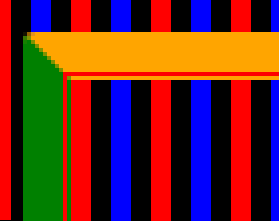
How it looked before:
For this I added display none to the iframe, so no video will be shown here. https://jsfiddle.net/jonpsr5u/2/
Does it make sense to have all of this hidden until the exit button is clicked.
And then, after the exit button is clicked, have all of this stuff appear?
.fadingOut .curtain::before {
.fadingOut .fence
.fadingOut .fence > div {
.fadingOut .fan svg
.fadingOut .cross::before,
.fadingOut .cross::after
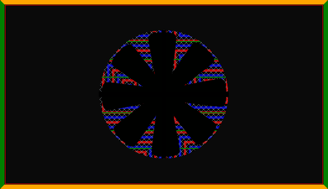
When the video is on the screen, it’s empty behind it seen here:

After the exit button is clicked, then all of this appears.

Maybe that is too much stuff all loading at 1 time and makes no logical sense to do.
You are better off having it there from the start otherwise when you click the button the screen has to be repainted with the new backgrounds.
Its probably negligible if there are no resources to load but when you are using things like gradients and filters then they take some time to paint and you may see a flash if you do it all at once rather than in the background when the page loads.
I thought about doing it this way if you think that is fine.
Only having .fadingOut placed on this one. https://jsfiddle.net/d7v1jtfx/1/
.fadingOut .isOpen {
  animation: fadingOut 1s;
  animation-delay: 11.3s;
}

@keyframes fadingOut {
  0% {
    opacity: 1;
  }

  100% {
    opacity: 0;
  }
}
The rest use a different name.
.exit:hover::before,
.exit:hover::after,
.showOnExit .exit::before,
.showOnExit .exit::after {
  background: green;
}

.showOnExit .exit {
  animation: fadeOutExit 8s forwards;
  pointer-events: none;
  opacity: 1;
}

.showOnExit .container.active .curtain .panel-left {
  animation: curtain1-close 8s ease forwards;
  transform: translateX(calc(-100% - 1px));
  animation-delay: 3.3s;
}

.showOnExit .container.active .curtain .panel-right {
  animation: curtain2-close 8s ease forwards;
  transform: translateX(calc(100% + 1px));
  animation-delay: 3.3s;
}
javascript:
 function fadeReset() {
    body.classList.remove("fadingOut");
    body.classList.remove("showOnExit");
    resetBackground("body");
    resetCurtains(".with-curtain");
    showAllButtons(".hide");
    resetButtons(".outer");
  }

  function resetPage() {
    body.classList.add("fadingOut");
    body.classList.add("showOnExit");
  }
You are adding showOnExit and fadingOut to the same element at the same time and removing them at the same time. Therefore one of them is redundant as it can all be done with the one class.
Also you add bg1 to the body and the isOpen to outer and they both get added and removed at the same time so isOpen looks redundant to me also unless you plan on having many outers.
Your timing is a bit out also as I see flash of everything just before the blue appears again.
What flash do you see, because I am not seeing it?
I think you mean you are seeing the flicker of the fan when the windows are fully closed.
I keep trying to move the numbers up a tiny bit every time I see it.
You are saying .isOpen can be removed, won’t that break the code?
Also, how do I fade out the fan, before the curtain closes fully?
Like this? https://jsfiddle.net/hafrnw5j/
.showOnExit .fan svg {
  position: absolute;
  top: 0;
  left: 0;
  bottom: 0;
  right: 0;
  width: 70%;
  height: 70%;
  margin: auto;
  animation: fan-spin 2.5s ease 0.8s forwards;
  visibility: hidden;
  opacity: 0;
  transition: visibility 0;
  transition-delay: 11.2s;
}

@keyframes fan-spin {
  0% {
    transform: rotate(0deg);
  }

  100% {
    transform: rotate(360deg);
  }
}
If I am able to add this to the fan, how do I also add it to the cross?
https://jsfiddle.net/hafrnw5j/1/
.showOnExit .fence{
  visibility: hidden;
  opacity: 0;
  transition: visibility 0;
  transition-delay: 5.2s;
}


