With the explosion of small-screen mobile computing across the world, iconography is often the most space-efficient technique to use in your UIs.
Icons are a visual representation of an object, an action or even an idea and using them, instead of a word, button, label or hyperlink, often affords you a spacier, cleaner interface.
Icons also let you simplify your messaging to the user by using ‘visual metaphors’. Common examples include:
-
 The pencil icon to edit a field;
-
 The camera icon to take a picture;
-
 The floppy disk to save your work.
Icons are simple, practical, and you probably use them on a daily basis. And they make complete sense, right? What if your users felt no connection to those icons – or worse, simply didn’t understand them at all?
Icons: Metaphors and redundant context
So, let’s think a bit about the meaning of icons you use in a typical interface. Most icons have functions that are clearly identifiable to most users. But there are a few common icons that are less clear.
In fact, it turns out that there are only a handful icons that can be defined as ‘universal’ – that have the same meaning in every context that we see them.
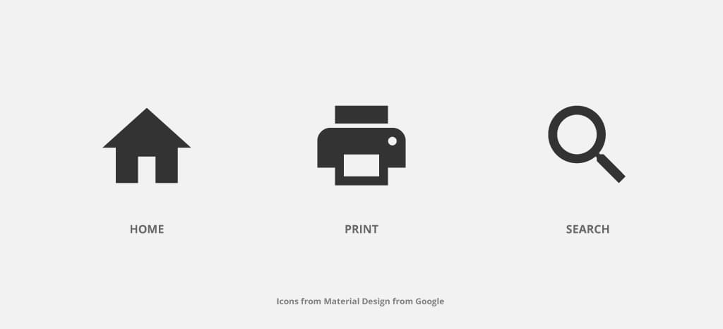
Nielsen Norman Group (https://www.nngroup.com) tested this theory and they defined that the only icons that can be considered universal are:
I can’t overstate how important this is for each and every single implementation of a user interface. When we’re designing a UI for another culture/country with a different native language (or multi-languages even) and other cultural patterns, their iconography understanding may be very different.
Let me show you some quick examples.
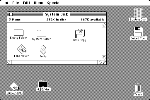
The Save Icon
The save icon metaphor was born with the early days of the Graphical User Interface (GUI) with the drawing of a floppy disk. In general, it is an icon that works well for its purpose.
But let’s try switching our perspective for a moment.

There are new emerging markets – large parts of Africa, India, China, and South America – riding a recent technological boom. While the majority of their populations have no practical access to a computer, they’re almost guaranteed to have a smartphone in their pockets. These populations have likely never seen disk-based storage of any kind before.
In fact, globally, anyone under 20 is unlikely to have used a floppy disk. Apple controversially removed the floppy drive from their G3 desktops back in 1998.
So, how can we expect these users to understand and feel connected with this visual representation of the “save” function?
Personally speaking, I’ve already faced this issue once on a professional level, in a very similar environment, where the “save” action was a crucial step for a task completion. The end-users were having more difficult than we expected since the floppy disk icon had no label associated with it.
The Favorite Icon
For gathering items and saving them to see later many user interfaces allow you to mark them as favorites.

This is most often represented by one of three symbols – a star, a heart or a bookmark icon. The bookmark concept dates back to the earliest versions of the Netscape Navigator browser.
Microsoft Internet Explorer instead called their bookmarking systems ‘Favorites’, and used a ‘starred folder’ icon.
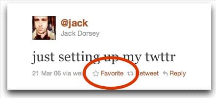
Twitter employed the five-pointed star for favoriting tweets for 10 years, until last year, when they switched to the heart icon.
All of these icons naturally compete with each other. The star icon is often applied to rating systems and feature items, the heart icon for wishlists and sharing your feelings about something and the bookmark icon for labeling contexts.
The best thing to do is to define a clear strategy to avoid confusing your user. If you use a star icon for ratings and for favorites, user-test it first users aren’t seeing them as the same thing.
The Hamburger Icon
The Hamburger Icon was originally designed to represent a list for the Xerox “Star” interface. More recently, it is commonly used to represent a menu navigation.
It’s an icon that is considered almost universal, but, because it isn’t used always for the same purpose and visual representation is so subjective, that it isn’t straightaway clear for the user what is the finality. In some interfaces, it is common to see very similar icons, if not the same, for completely different actions. Let’s see some examples.
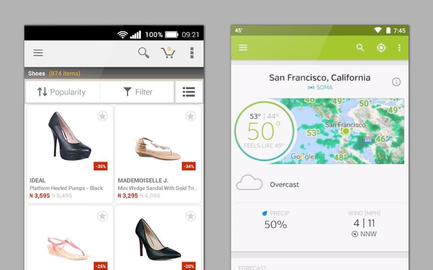
In the first example, the E-commerce app, you can see a hamburger icon on the top bar, and on the other side another really similar icon. If you’re thinking that the hamburger icon is the context button for opening the menu, you’d be wrong. Rather, the hamburger icon is used for filtering product categories.

The second example – the Weather Forecast app – the same icon displays a list of your favorite places. The other opens a small dialog with sharing, rating and settings menus.
Confusing, isn’t it?
You could argue that the hamburger icon has become the ‘junk drawer’ of modern mobile UIs. The place to hide things that don’t have a proper place.
So… using icons, labels or both?
For a good experience and UI interaction without any kind of doubt, confusion or frustration, when you use an icon give it, in some way, a label. It is really important, especially for icons that want to achieve the completion of a task.
In small screens such smartphones and smartwatches, you can search for the OS guidelines that help you achieve the best solution and give you the cheat-sheet of what the user is accustomed to.
If you’re designing an App for iPhone/iPad, take a look at iOS Human Interface Guidelines, although if you’re designing an Android App, please check the Material Design by Google. These guidelines have different approaches when it comes to using labels or not, but in the end, it’s your user research that really matters.
The secret ingredients are to understand your personas deeply, doing UI user testing and A/B testing. Only this way you can give your users a really good experience.
Less Aesthetics, More Design
A nice icon family can make an interface richer and more elegant, but, “keep it simple”. Don’t look at your icons as an opportunity to put all your illustration skills to the test. After all, it is supposed to be a symbol to be recognized.
A good UI design, in general, isn’t the one that has the most artistic innovation or the most fantastic animations or even the most trending features.
The interface success is based on:
- Clarity to inspire confidence in your user and leads to further use.
- Keep it simple. Don’t try to make your UI an inspiring piece of art. Your user just wants your interface to be useful and easy to interact.
- Testing the icons for recognizability.
- Use the 5-second rule for icons. If it takes you longer than 5 seconds to think of the image, it probably isn’t the best way to communicate that idea/action.
- Give control to your users.
- Build consistency for a better experience and branding awareness.
- And most importantly, don’t forget that you are designing an interface that’s not for yourself, but for your amazing users.
 Catarina Borges
Catarina Borges is a full-time UI/ UX designer with experience in web design, mobile applications, and branding. She has worked for clients from Africa, Europe, and North America.