Device orientation is yet another cool feature of HTML5. Device orientation allows a device to detect its physical orientation with respect to gravity. If you’ve ever rotated a smart phone or tablet, and the screen has rotated in response, then you’ve seen device orientation in action. Orientation is measured using three angles – alpha, beta, and gamma – that describe the device’s current position. We can use these angles in HTML5 enabled web apps.
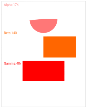
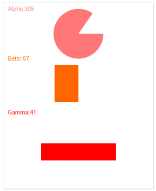
In this article, we are going to write a simple web app that utilizes device orientation. This app is going to include circular and rectangle shapes whose sizes change according to the values of alpha, beta, and gamma. The following two screenshots illustrate the behavior of our example app depending on orientation. Don’t worry if you don’t understand what the angles mean, as you’ll learn along the way.
Browser Compatibility
Before using the device orientation API, you need to make sure your browser supports it. You can easily check Can I Use.com to determine if your browser supports this API. However, your users are unlikely to do this, so you need to build something into your code. The following code can be used to dynamically detect support for the device orientation API.if (window.DeviceOrientationEvent) {
// Our browser supports DeviceOrientation
} else {
console.log("Sorry, your browser doesn't support Device Orientation");
}Getting Started
Let’s begin by creating a skeleton HTML file that will hold our application. Notice the use of acanvas element, which will hold our shapes. The script element detects whether or not the user’s browser supports device orientation. If it does, then we add a deviceorientation event listener – more on this in a below.
<!DOCTYPE html>
<html>
  <body>
    <canvas id="myCanvas" width="360" height="450" style="border:1px solid #d3d3d3;">
    </canvas>
    <script>
      if (window.DeviceOrientationEvent) {
        window.addEventListener("deviceorientation", deviceOrientationListener);
      } else {
        alert("Sorry, your browser doesn't support Device Orientation");
      }
    </script>
  </body>
</html>
The deviceorientation Event
The deviceorientation event, which our code is listening for, is fired when the device orientation changes. When this event is fired, our event handler, deviceOrientationListener() is invoked. A DeviceOrientationEvent object is the only argument passed to our handler. The previously mentioned alpha, beta, and gamma angles are defined as properties of the DeviceOrientationEvent. Before moving on, it’s time to learn more about these mysterious angles.
The Alpha, Beta, and Gamma Angles
Before explaining what each of the angles represents, we need to define the space in which they exist. The following image, courtesy of Mozilla, shows the 3D coordinate system used on mobile devices.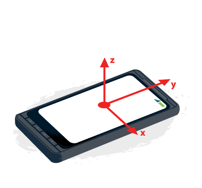
Alpha
The alpha angle represents rotation around the z-axis. Therefore, any rotation along the z-axis causes the alpha angle to change. The alpha angle can range between 0 and 360 degrees. Alpha is 0 when the top of the device is pointed directly to Earth’s North Pole. The following image shows alpha rotation.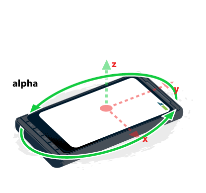
Beta
Rotation around the x-axis cause the beta angle to change. The range of beta is between -180 and 180 degrees. Beta is zero when the device is parallel to Earth’s surface. An example of this would be lying on top of a table. An illustration of the beta angle is shown below.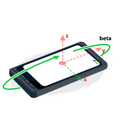
Gamma
The gamma angle is associated with the y-axis. This angle ranges from -90 to 90 degrees, and is zero when the device is parallel to the Earth’s surface. The gamma value changes when the device is rotated as shown in the following figure.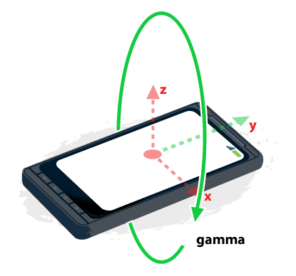
The deviceorientation Event Handler
The next step is to implement the handler for the deviceorientation event. This function is shown in the following code sample. This code begins by clearing the entire canvas. Next, a circle and rectangles are drawn according to the values of alpha, beta, and gamma. The details of how the canvas element works is beyond the scope of this article, but the reader is encouraged to check out this SitePoint article.
function deviceOrientationListener(event) {
  var c = document.getElementById("myCanvas");
  var ctx = c.getContext("2d");

  ctx.clearRect(0, 0, c.width, c.height);
  ctx.fillStyle = "#FF7777";
  ctx.font = "14px Verdana";
  ctx.fillText("Alpha: " + Math.Round(event.alpha), 10, 20);
  ctx.beginPath();
  ctx.moveTo(180, 75);
  ctx.lineTo(210, 75);
  ctx.arc(180, 75, 60, 0, event.alpha * Math.PI / 180);
  ctx.fill();

  ctx.fillStyle = "#FF6600";
  ctx.fillText("Beta: " + Math.round(event.beta), 10, 140);
  ctx.beginPath();
  ctx.fillRect(180, 150, event.beta, 90);

  ctx.fillStyle = "#FF0000";
  ctx.fillText("Gamma: " + Math.round(event.gamma), 10, 270);
  ctx.beginPath();
  ctx.fillRect(90, 340, 180, event.gamma);
}
Putting It All Together
The finished product is shown below. This page has no external dependencies, so just open it up in the device orientation friendly browser of your choice, and enjoy!<!DOCTYPE html>
<html>
<body>
<canvas id="myCanvas" width="360" height="450" style="border:1px solid #d3d3d3;">
</canvas>
<script>
function deviceOrientationListener(event) {
var c = document.getElementById("myCanvas");
var ctx = c.getContext("2d");
ctx.clearRect(0, 0, c.width, c.height);
ctx.fillStyle = "#FF7777";
ctx.font = "14px Verdana";
ctx.fillText("Alpha: " + Math.Round(event.alpha), 10, 20);
ctx.beginPath();
ctx.moveTo(180, 75);
ctx.lineTo(210, 75);
ctx.arc(180, 75, 60, 0, event.alpha * Math.PI / 180);
ctx.fill();
ctx.fillStyle = "#FF6600";
ctx.fillText("Beta: " + Math.round(event.beta), 10, 140);
ctx.beginPath();
ctx.fillRect(180, 150, event.beta, 90);
ctx.fillStyle = "#FF0000";
ctx.fillText("Gamma: " + Math.round(event.gamma), 10, 270);
ctx.beginPath();
ctx.fillRect(90, 340, 180, event.gamma);
}
if (window.DeviceOrientationEvent) {
window.addEventListener("deviceorientation", deviceOrientationListener);
} else {
alert("Sorry, your browser doesn't support Device Orientation");
}
</script>
</body>
</html>Conclusion
This article has introduced the device orientation API. This API is simple and fairly well supported in modern browsers. By harnessing the power of device orientation, your web pages can be made more responsive and powerful. In addition to the demo on this page, I encourage you to look over this article’s references, listed below.References
Article Demo https://www.w3.org/TR/orientation-event/ https://developer.mozilla.org/en-US/docs/WebAPI/Detecting_device_orientationFrequently Asked Questions (FAQs) on Using Device Orientation in HTML5
What is the significance of device orientation in HTML5?
Device orientation in HTML5 is a crucial feature that allows web applications to access and use the physical orientation data of a device. This feature is particularly useful in creating more interactive and responsive web applications. For instance, it can be used in games where the orientation of the device controls the game character, or in applications where the screen orientation changes based on how the device is held. It enhances user experience by making web applications more intuitive and engaging.
How does the device orientation API work?
The Device Orientation API provides access to the physical orientation of the device through the ‘deviceorientation’ event. This event is fired every time the orientation of the device changes. It provides three pieces of data – alpha, beta, and gamma, which represent the rotation along the different axes. By listening to this event and using these values, developers can determine the exact orientation of the device at any given moment.
What are alpha, beta, and gamma in device orientation?
Alpha, beta, and gamma are the three angles that define the orientation of the device in 3D space. Alpha represents the rotation around the z-axis, beta around the x-axis, and gamma around the y-axis. These values are in degrees and can range from 0 to 360 for alpha, and -180 to 180 for beta and gamma.
How can I detect device orientation in my web application?
To detect device orientation, you need to add an event listener for the ‘deviceorientation’ event to the window object. This event is fired every time the device’s orientation changes. The event object passed to the event handler contains the alpha, beta, and gamma values which represent the device’s orientation.
Can I use device orientation in all browsers?
While the Device Orientation API is widely supported, not all browsers provide full support for it. For instance, Safari requires explicit user permission to access device orientation data. Therefore, it’s important to always check for the availability of the API before using it and provide fallbacks for browsers that do not support it.
How can I handle browser compatibility issues with the Device Orientation API?
To handle browser compatibility issues, you can use feature detection to check if the ‘deviceorientation’ event is supported. If it’s not, you can provide a fallback or a different functionality for those browsers. Additionally, you can use libraries like Modernizr which help in detecting the availability of HTML5 features.
What are some practical applications of device orientation?
Device orientation can be used in a variety of applications. In gaming, it can be used to control game characters or elements. In mapping applications, it can be used to adjust the view based on the orientation of the device. It can also be used in augmented reality applications to align virtual objects with the real world.
How can I test the device orientation feature during development?
Many modern browsers provide tools to simulate device orientation events. For instance, Chrome DevTools has a Sensors tab that allows you to simulate different orientations and motion events. This can be very useful during development and testing.
Can I use device orientation in mobile web applications?
Yes, the Device Orientation API is particularly useful in mobile web applications. It allows you to create more interactive and engaging experiences by responding to the physical orientation of the device. However, remember that not all mobile browsers may fully support this API.
How can I ensure the privacy of users when using device orientation?
When using features like device orientation that access sensitive data, it’s important to respect user privacy. Always inform users if you’re collecting orientation data and provide clear options to opt-out. Also, use the data responsibly and only for the purpose it was collected.
 Ahmet Mermerkaya