Whenever we start any new design project, we’ll usually sit down with the client and discuss all the relevant project details with the client. If you’re lucky, your client will have a relatively clear idea of what they want to achieve and perhaps even the functions and features they want for the site.
However clients often put less thought in considering colors and palettes. Perhaps they’ll suggest ‘I love this color – can you use it?‘ or ‘Can we use the same color scheme as my favorite site? I know it’s not related, but the colors look amazing!‘.
Now, I’m not suggesting there is anything wrong with these answers; you can definitely use your favorite color for a causal site or a hobby site.
But when you are talking about specific business goals, it probably pays to take a more scientific approach to the color scheme you associate with your brand.
You need to explain the importance of ‘Color Psychology’ and how it can ultimately influence your bottom line.
What is Color Psychology?
Colors are all around us and they affect us in many ways. They can trigger certain emotions and moods. Research explains how colors can affect your customer or visitor behavior towards a brand. In simple terms, we can influence the way people respond to our design.
Let’s look at some popular colors and the impact they tend to create:
Blue
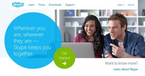
to evoke a sense of trust, calmness
and energy
Inspires: Trust, Responsibility, Security and Friendliness. Used By: Facebook, PayPal, Skype, Ford
Green
Inspires: Nature, Money, Balance, Energy, and Health. Used By: Starbucks, Animal Planet, John Deere
Orange
Inspires: Joy, Excitement, Aggression and Action. Used by: Fanta, Nickelodeon, Soundcloud
Brown
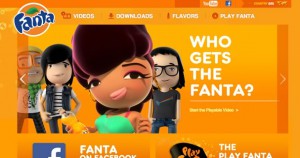
joyful feel with their use of orange.
Inspires: Comfort, Organic, Friendliness, and Dependable. Used By: Hershey’s, Organickidz, UPS
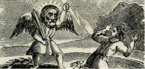
Black
Inspires: Power, Class, Elegance, Grief and Prestige. Used by: Johnnie Walker, Chanel, Nike
Pink
Inspires: Femininity, Love, Gentleness and Romance. Used by: Victoria’s secret, Barbie, SUPRÉ
Purple
Inspires: Creativity, Dignity, Authority and Wisdom. Used By: Yahoo, Hallmark, Cadbury
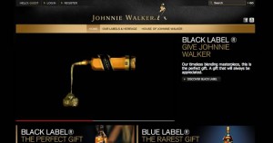
a sense of prestige and power
by using black
Red
Inspires: Passion, Anger, Danger, Energy and Attention Used by: CocaCola, Canon, Levi’s, Virgin
Now we can get a sense for how the emotions we evoke using colors could help to increase the conversion rate of our design.
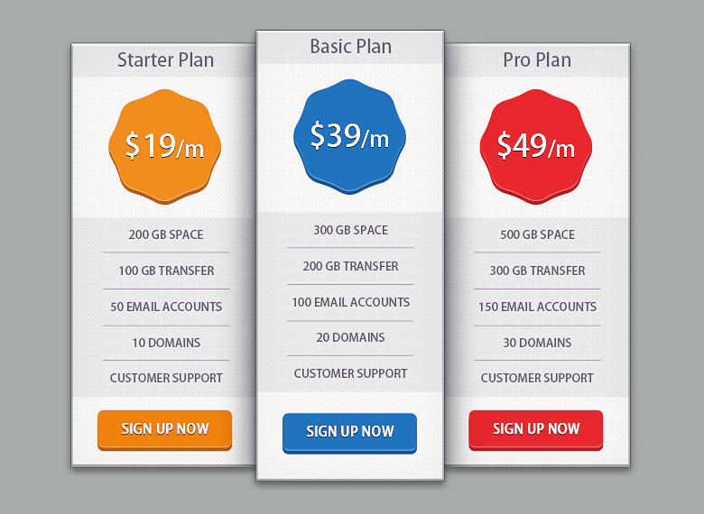
Let’s play with color psychology and create a converting ‘Price Table’ using specific colors to grab the customer’s attention. We will use three main colors for our price table:
- Blue
- Orange
- Red
Well-established marketing know-how tells us that when presented with a 3-tiered offer (for instance, Bronze, Silver and Gold options), the majority of users will select the middle-tier option.
Presumably people don’t like thinking of themselves as either overly cheap or extravagant, so the middle tier appears the wise option.
In fact, it’s common for marketers to create deliberately less-attractive ‘bronze’ and ‘gold’ options with the express purpose of making their mid-tier ‘silver’ offering seem comparatively great value.
In our case, we are going to use blue to make our middle option appear to be the safe, sensible and responsible choice.
Of course, there are no absolute right and wrongs with these color choices, and you don’t even have to use different color in each panel. But in our case, we want all our plans to stand-out somewhat equally, while making our default options feel like the safe and prudent choice.
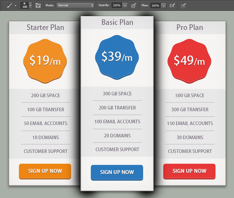
Here’s what we will be creating:
So let’s get started.
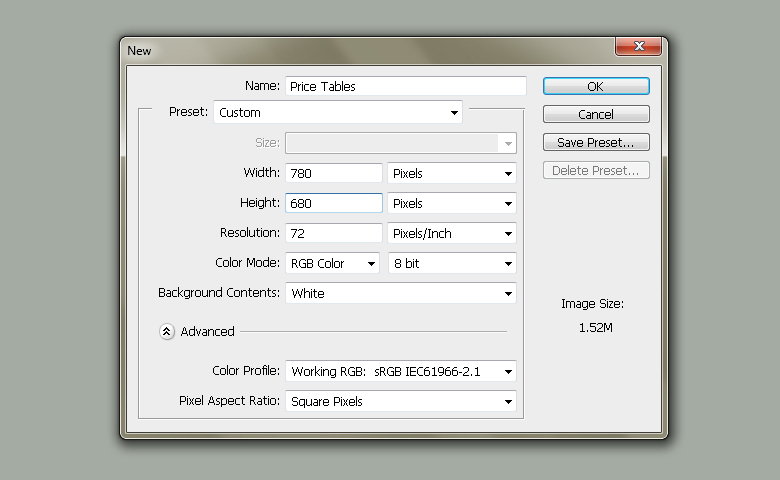
Step 1:
Create a new document in Photoshop with 780px width and 680px height.
Step 2:
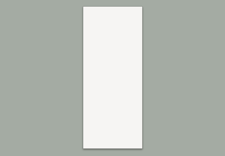
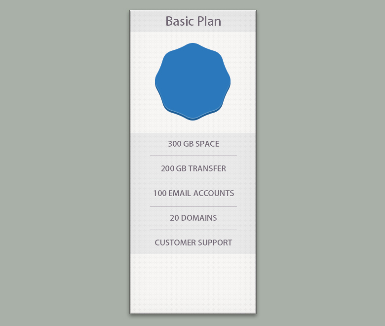
Firstly, we’ll draw the base of our price table. So, pick #f6f4f3 fill color and select the Rectangle Tool (“U”) and click the canvas to view the rectangle window. Enter 256px for width and 614px for height and hit “OK” to draw a rectangle as shown below.
Label it as “Base”.

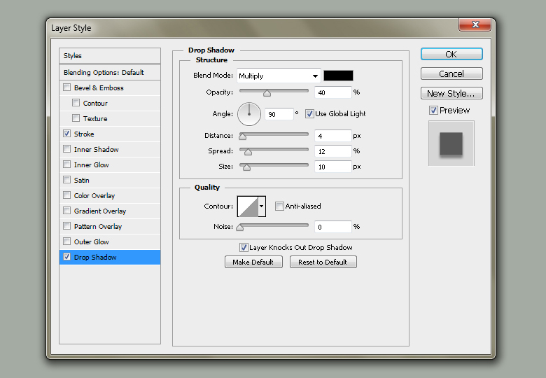
Step 3:
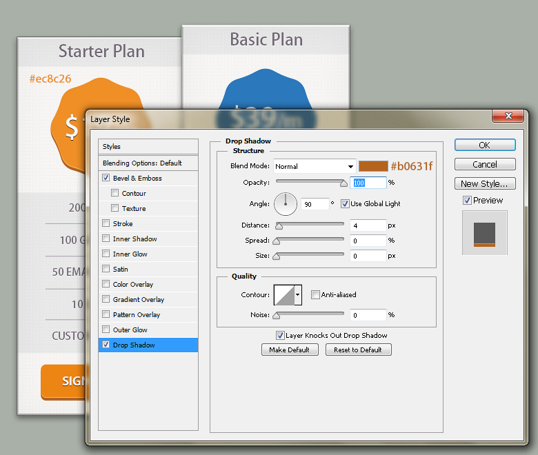
Double-click the Base rectangle to view the Layer Style window. Apply given settings for Stroke and Drop Shadow.

Step 4:
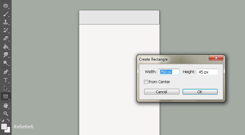
Pick #e6e6e6 fill color and select the Rectangle Tool (“U”) to draw a rectangle along the top border of base of 256px width and 45px height.
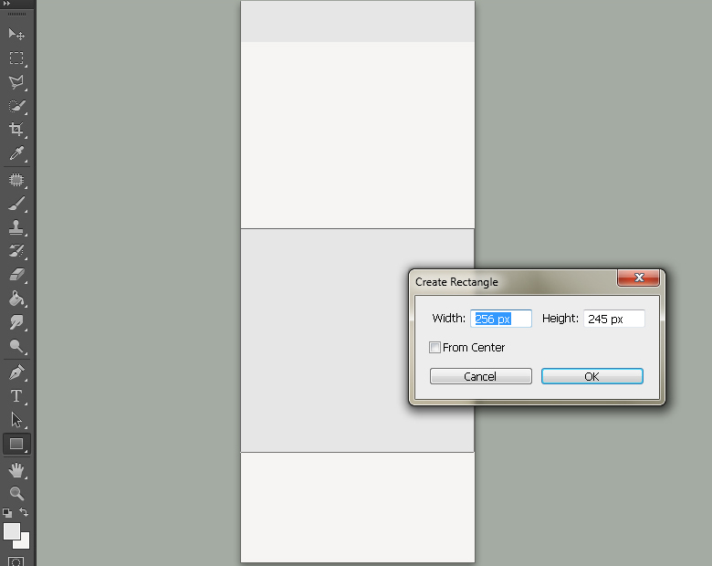
Draw another rectangle with the same fill color of 256px width and 245px height as shown here.
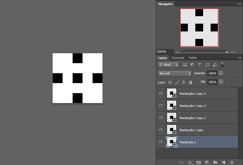
Step 5:
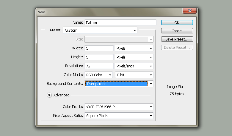
Next, I’ll show you how to make a simple pattern in Photoshop. Create a new document with 5px width and 5px height. Make sure to choose “Transparent” background. To view the canvas properly drag the navigator slider towards right at 3200%.
Now pick the Rectangle Tool and draw a 1x1px rectangle, position it in the center of canvas. Make 4 copies of it and arrange them as shown below. Once you are done, go to Edit> Define Pattern and label your pattern.
That’s it.
Step 6:
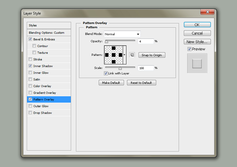
Come back to your document, click the Base rectangle and make its copy by going to Layer> Duplicate Layer. Place the copy above the rest of the rectangles.
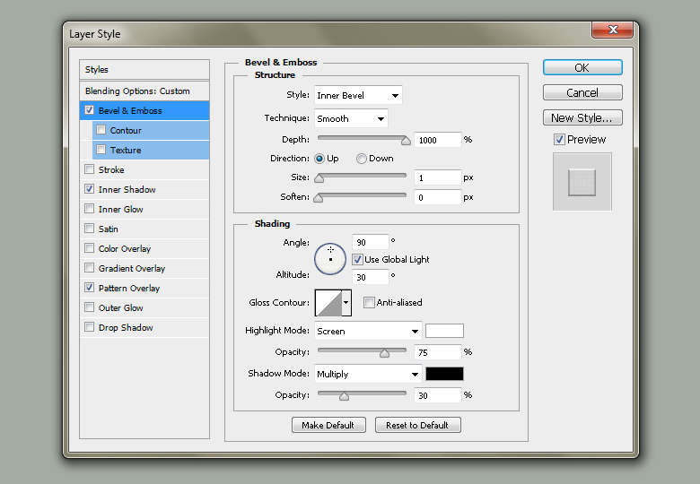
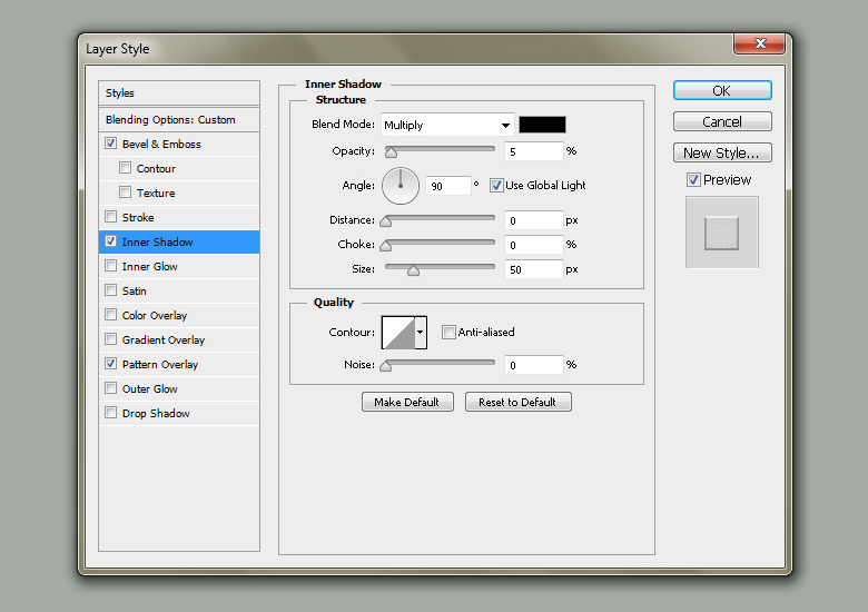
Make its fill 0% and apply given Layer Style settings on it.

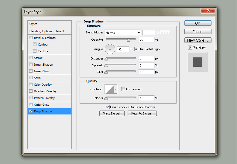
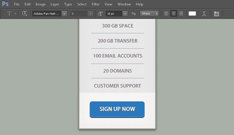
Step 7:
Next, we’ll add the title text. Pick #736a76 fill color and select the Horizontal Type Tool (T) to type the title. I’ve used ‘Adobe Fan Heiti Std’ font here which is included in CS6.
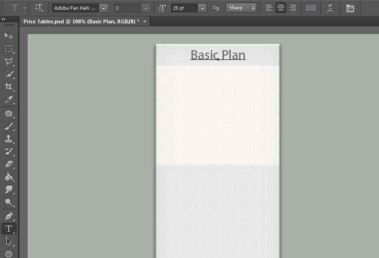
Step 8:
Double-click the text layer and apply given settings for Drop Shadow.

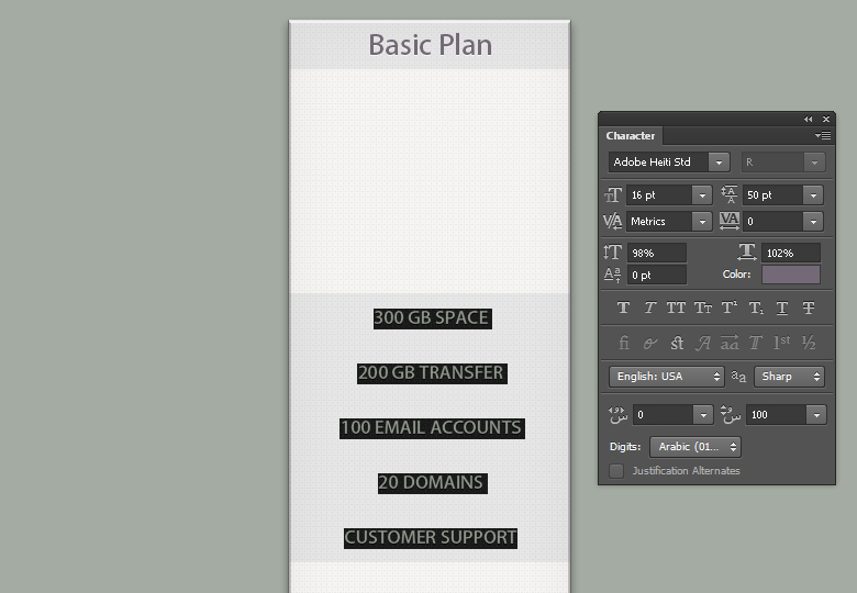
Step 9:
Now add the details, apply given settings in the character panel of Type Tool. Make sure to set the leading at 50pt.
Right-click the title text and choose ‘Copy Layer Style‘ option. Now right-click the details text layer and select ‘Paste Layer Style‘ to apply the same settings for Drop Shadow.
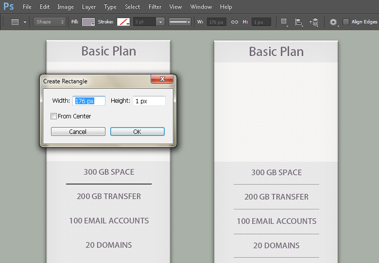
Step 10:
Next, we’ll add separators. Pick #9c949f fill color and draw a thin rectangle of 176px width and 1px height. Make few copies of it and position them between the text.
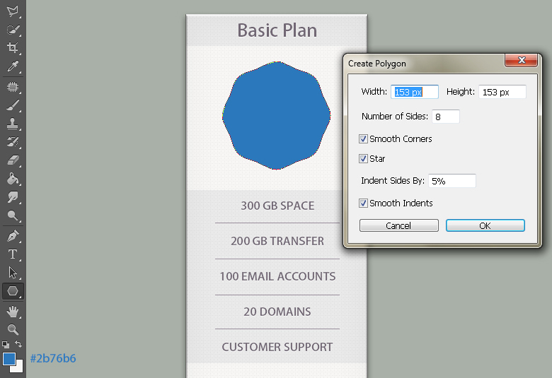
Step 11:
Pick #2b76b6 fill color and select the Polygon Tool. Hit the canvas to view the polygon window and apply given settings here to draw a polygon shown below.
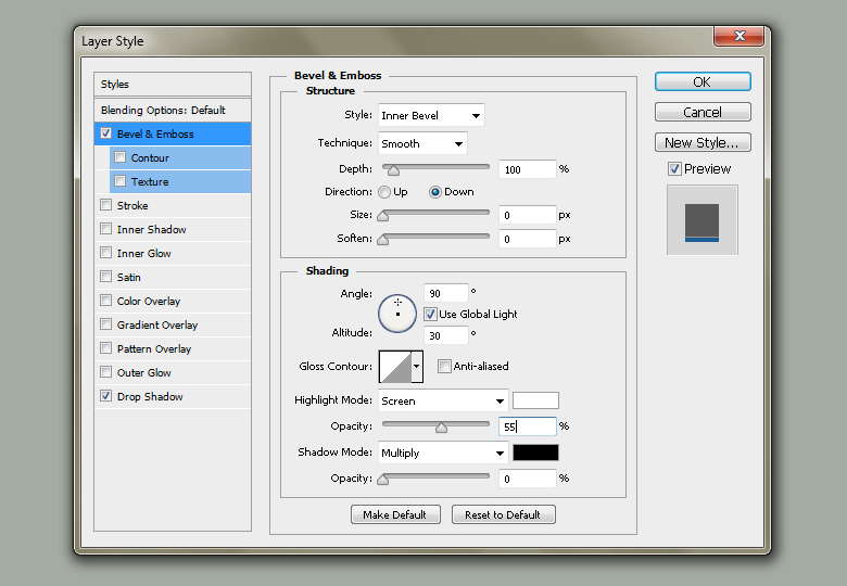
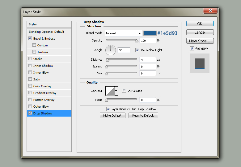
Step 12:
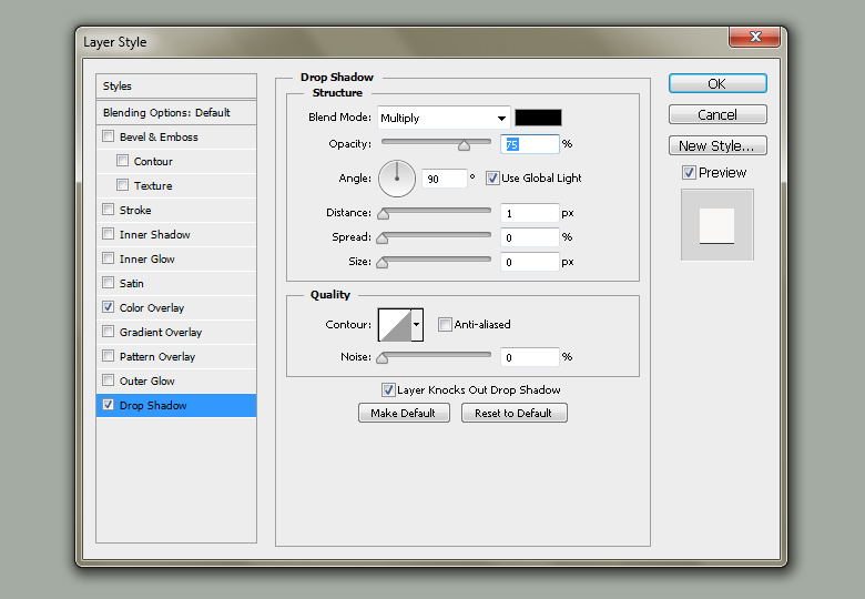
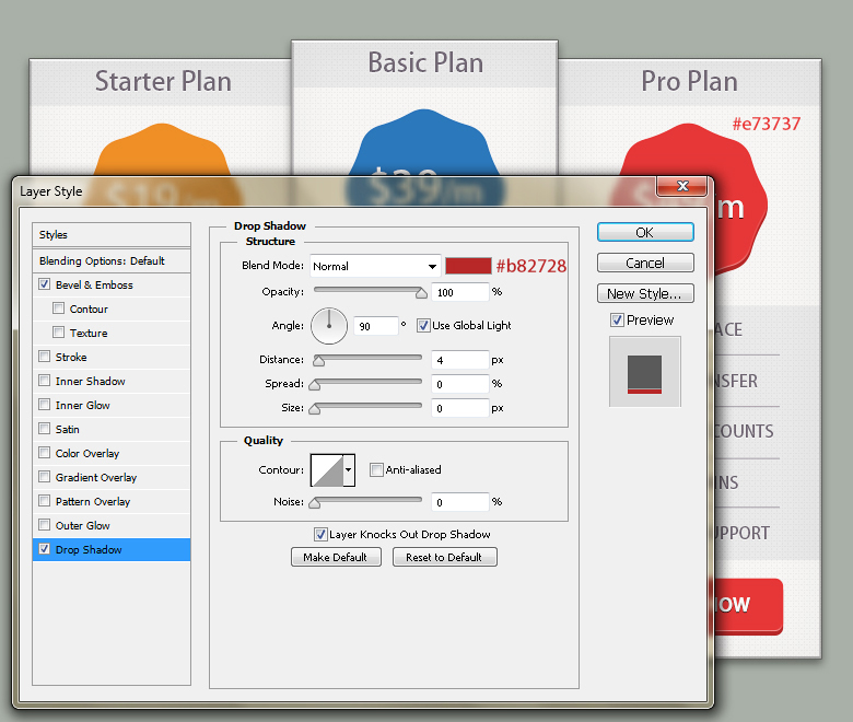
Double-click the Polygon layer and apply given settings for Drop Shadow and Bevel & Emboss.
Step 13:
Next, we’ll add the price over the polygon. Pick #f9f7f6 fill color and type the text using the same font. I wrote $39 with 41pt font size and /m with 30pt.
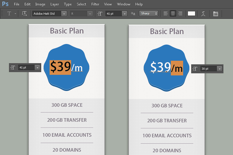
Double-click the text and apply given settings for Drop Shadow.
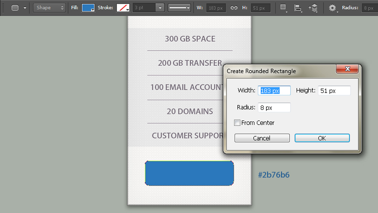
Step 14:
We’ll make the signup button now. Pick same color as used for the polygon (#2b76b6). Now select the Rounded Rectangle Tool to draw a rectangle with 183px width, 51px height and 8px radius.
Step 15:
Now right-click the polygon and choose ‘Copy Layer Style’ option. Now right-click the button layer and choose ‘Paste Layer Style’ to apply same layer style settings on it. After that, pick the Horizontal Type Tool to type ‘Sign Up Now‘ with 18pt font size and apply same drop shadow settings on it as applied in step 13.
Step 16:
Our main price table is ready. To make the side tables duplicate the entire group, place it below the original and drag it towards left. Press Ctrl+ T to activate the Free Transform Tool and decrease the height of Base and its copy up to 94%.
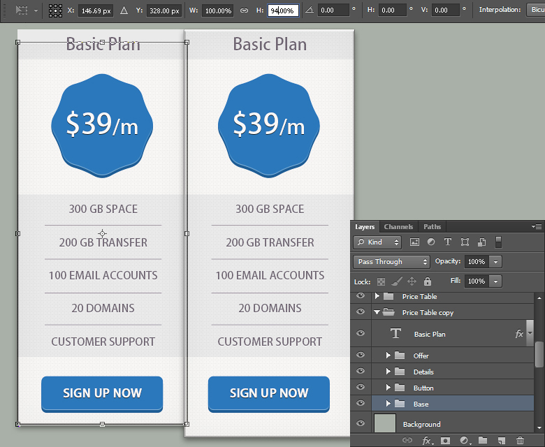
Now adjust rest of the elements to fit in the new base height and edit the text. Also give orange shade to the polygon and button.
Step 17:
Duplicate the modified price table and drag it towards right. Edit the text and change the polygon and button color to red.
Step 18:
To create shadow, create a new layer just below the original price table. Now pick the black fill color and select the Soft Round Brush Tool with 100px size and apply it as shown below.
Step 19:
Select the top portion of shadow using Rectangular Marquee Tool and go to Edit> Clear. After that, select the bottom part and get rid of it similarly.

Step 20:
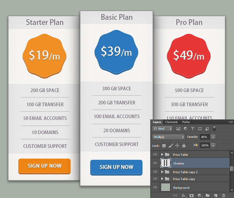
Change shadow layer blending mode to ‘Multiply’ with 40% opacity.
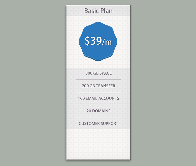
Final result:
And there you have it!
In any price table you should have set some goals and call-to-actions. In our price table we’ve presented all the options attractively, but have also used both size and color to give more focus to our Basic Plan, and to make it more prominent.
You can see that with careful use of color psychology in your project, you can create both a more memorable experience for your visitors aa well as a more effective result for your client.
Frequently Asked Questions on Using Color Psychology in Price Tables
How does color psychology influence the effectiveness of a price table?
Color psychology plays a significant role in influencing the effectiveness of a price table. Different colors evoke different emotions and reactions in people. For instance, red is often associated with urgency and can prompt immediate action, making it an effective color for highlighting discounts or special offers. On the other hand, blue is often associated with trust and reliability, making it a good choice for long-term subscriptions or high-value products. Understanding these associations can help you design a price table that effectively guides your customers towards making a purchase.
What are some best practices for using color in price tables?
When using color in price tables, it’s important to maintain a balance. Too many colors can be overwhelming and confusing, while too few can make the table look dull and uninteresting. Use contrasting colors to highlight important information and make it stand out. Also, consider the color associations in your target market, as these can vary between different cultures and regions.
How can I test the effectiveness of my color choices in my price table?
You can test the effectiveness of your color choices through A/B testing. This involves creating two versions of your price table with different color schemes and showing them to different segments of your audience. You can then compare the performance of the two versions to see which one is more effective.
Can I use color psychology to influence the perceived value of my products?
Yes, color psychology can be used to influence the perceived value of your products. For example, using premium colors like black or gold can make your product seem more luxurious and high-value. However, it’s important to ensure that the color scheme matches the overall branding and positioning of your product.
How can I use color to highlight the most important information in my price table?
You can use color to highlight the most important information in your price table by using contrasting colors. For example, if your table is mostly blue, you could use a bright yellow or red to highlight the price or the ‘buy now’ button. This will draw the viewer’s attention to that information and make it more likely that they will take action.
How does color psychology apply to different types of products?
The application of color psychology can vary depending on the type of product. For example, eco-friendly products often use green to signify their connection to the environment, while luxury products may use black or gold to signify elegance and exclusivity. It’s important to consider the product and the target audience when choosing colors.
How can I use color to differentiate between different options in my price table?
You can use color to differentiate between different options in your price table by assigning a different color to each option. This can help users easily distinguish between the options and make a choice more quickly. However, it’s important to ensure that the colors are not too similar, as this can cause confusion.
How can I ensure that my color choices are accessible to all users?
To ensure that your color choices are accessible to all users, it’s important to consider color contrast and color blindness. Use high-contrast colors to ensure that text is easily readable against the background, and avoid color combinations that are difficult for color-blind users to distinguish.
Can I use color psychology to influence the order in which users view information in my price table?
Yes, you can use color psychology to influence the order in which users view information in your price table. Users are naturally drawn to bright, contrasting colors, so you can use these to guide their gaze towards the most important information. However, it’s important to use this technique sparingly to avoid overwhelming the user.
How can I use color to create a sense of urgency in my price table?
You can use color to create a sense of urgency in your price table by using warm, bright colors like red or orange. These colors are often associated with urgency and can prompt users to take action. However, it’s important to use these colors sparingly and in conjunction with clear, compelling copy to avoid creating a sense of pressure or desperation.
 Anum Khan
Anum is Web and Graphic designer. Addicted to Photoshop and crazy for pixel perfection. She is also an active blogger, sharing her passions, skills and creative details on her blog Websoulz. She loves to connect with the community, sharing the latest design gossips and rolling her eyes on boring trends.