
In this quick tip excerpted from Unleashing the Power of CSS, Stephanie shows how container queries enable us to ship resilient components containing built-in layout and style variants.
It might seem quite bold to say, but container queries allow us to apply the “build once, deploy everywhere” methodology. As a design systems engineer, it really appeals to me to be able to ship design system components with built-in layout and style variants.
To demonstrate this idea, the image below shows a subscription form. Container queries have been applied, and the component is shown in a full-width area within the narrower space of the sidebar and at the medium width within the content area.
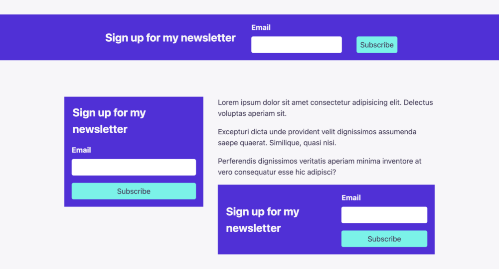
Grid is an excellent companion for composing these variants. Using grid template areas, we’re able to rearrange the form sections without the need for extra markup. In this subscription form component, I’ve identified three grid areas: legend, field, and submit. The overlays added in the following video show how the layout changes across the variants.
In the code for the subscription form, the <form> element has a class subscription-form and is set as the container. A nested <div> with a class of form-content is what our container queries will then modify:
.subscription-form {
  container-type: inline-size;
}
At the narrowest default width, the form is a simple grid stack with a gap applied:
.form__content {
  display: grid;
  gap: 1rem;
}
The first container query for the mid-sized layout is doing the heavy lifting of creating the grid template and assigning all of the elements to the grid areas:
@container (min-width: 375px) {
  .form__content {
    grid-template-areas:
            "legend field"
            "legend submit";
    align-items: center;
    column-gap: 2rem;
  }

  legend {
    grid-area: legend;
  }

  .form-group {
    grid-area: field;
  }

  button {
    grid-area: submit;
  }
}
The second, final container query then only has to adjust the grid-template-areas definition to horizontally line up the areas. Only one additional tweak is needed, which is to realign the Subscribe button to the end position, which visually aligns it to the email input:
@container (min-width: 700px) {
  .form__content {
    grid-template-areas:
            "legend field submit";
  }

  button {
    align-self: end;
  }
}
The following video clip shows the subscription form layout adjusting as the width is reduced.
The following CodePen demo provides a live example of this form form layout (with “Resize me!” handles).
See the Pen Container Queries for Subscription Form by SitePoint (@SitePoint) on CodePen.
As you can see, container queries offer us the capability to build components that can be reused anywhere.
This article is excerpted from Unleashing the Power of CSS: Advanced Techniques for Responsive User Interfaces, available on SitePoint Premium.
Frequently Asked Questions (FAQs) about CSS Components
What are CSS components and why are they important in web development?
CSS components are reusable parts of a website’s design, such as buttons, forms, or navigation bars, that are styled using Cascading Style Sheets (CSS). They are crucial in web development because they promote consistency, improve efficiency, and make maintenance easier. By using CSS components, developers can ensure a uniform look and feel across the website, reduce the amount of code they need to write, and simplify the process of updating or modifying the design.
How can I make my CSS components more resilient?
To make your CSS components more resilient, you should aim for modularity, encapsulation, and simplicity. Modularity involves breaking down your design into small, independent components that can be reused throughout your website. Encapsulation means ensuring that each component’s styles do not leak into other parts of the website. Simplicity involves avoiding unnecessary complexity in your CSS code, which can make it harder to understand, maintain, and debug.
What is the role of HTML in creating CSS components?
HTML (HyperText Markup Language) is used to structure the content of a web page, while CSS is used to style this content. When creating CSS components, you start by writing the HTML markup for the component, such as a button or a form. This markup defines the structure and content of the component. You then use CSS to style this markup, defining the appearance of the component, such as its color, size, and position.
Can I use CSS components in a responsive design?
Yes, CSS components can be used in a responsive design. In fact, they are particularly useful in this context because they can be designed to adapt to different screen sizes and orientations. This can be achieved by using media queries in your CSS code, which allow you to apply different styles depending on the characteristics of the device that is displaying the web page.
How can I test the resilience of my CSS components?
You can test the resilience of your CSS components by checking how they behave under different conditions. For example, you can resize your browser window to see how the components adapt to different screen sizes. You can also try viewing your website on different devices and browsers to see if the components display correctly. Additionally, you can use tools like CSS Lint to check your CSS code for errors or potential problems.
What are some common mistakes to avoid when creating CSS components?
Some common mistakes to avoid when creating CSS components include not planning for reusability, not encapsulating component styles, and overcomplicating your CSS code. Not planning for reusability can lead to duplicate code and inconsistencies in your design. Not encapsulating component styles can cause styles to leak into other parts of your website, leading to unexpected results. Overcomplicating your CSS code can make it harder to understand, maintain, and debug.
Can I use CSS frameworks to create components?
Yes, CSS frameworks like Bootstrap, Foundation, and Bulma provide pre-designed components that you can use in your website. These components are styled using CSS and can be customized to fit your design. Using a CSS framework can save you time and ensure a consistent look and feel across your website. However, it’s important to understand the underlying CSS code so you can modify the components as needed.
How can I optimize the performance of my CSS components?
You can optimize the performance of your CSS components by minimizing the amount of CSS code you use, using shorthand properties where possible, and avoiding expensive CSS selectors. Minimizing your CSS code can reduce the size of your stylesheets, leading to faster load times. Using shorthand properties can make your code more concise and easier to read. Avoiding expensive CSS selectors can improve rendering performance, as some selectors require more processing power than others.
What is the difference between a CSS component and a CSS module?
A CSS component is a reusable part of a website’s design that is styled using CSS. A CSS module, on the other hand, is a way of organizing and encapsulating your CSS code to avoid conflicts with other styles on the page. CSS modules can be used to style CSS components, ensuring that the component’s styles do not leak into other parts of the website.
How can I learn more about creating resilient CSS components?
There are many resources available online to learn more about creating resilient CSS components. Websites like SitePoint, CSS-Tricks, and Smashing Magazine offer tutorials, articles, and guides on the topic. You can also find courses on platforms like Coursera, Udemy, and Codecademy. Additionally, you can practice creating your own CSS components and experiment with different techniques to improve their resilience.
 Stephanie Eckles
Stephanie Eckles is the author of in-depth tutorials on ModernCSS.dev, and the creator of StyleStage.dev, SmolCSS.dev, and 11ty.Rocks. Steph has well over a decade of webdev experience that she enjoys sharing as an author, egghead and workshop instructor, podcast host, Twitch streamer, and conference speaker. She's an advocate for accessibility, scalable CSS, and the Jamstack. Offline, she's mom to two girls and a cowboy corgi and enjoys baking.