

In my last post, Pure CSS3 Speech Bubbles Without Images, we saw how the :before and :after pseudo-elements could be used to create different effects. In this post we’ll use similar techniques to create a variety of ribbons.
 Ribbon effects are in vogue. Most designers use positioned images, but we’ll create them without using border effects and a single
 h2 tag:
<h2>My Heading</h2>
Let’s give this a little style and make it overlap the containing element:
/* containing element */
#page
{
	width: 500px;
	padding: 50px;
	margin: 0 auto;
	background-color: #fff;
	border: 1px solid #333;
}

h2
{
	position: relative;
	width: 50%;
	font-size: 1.5em;
	font-weight: bold;
	padding: 6px 20px 6px 70px;
	margin: 30px 10px 10px -70px;
	color: #555;
	background-color: #999;
	text-shadow: 0px 1px 2px #bbb;
	-webkit-box-shadow: 0px 2px 4px #888;
	-moz-box-shadow: 0px 2px 4px #888;
	box-shadow: 0px 2px 4px #888;
}
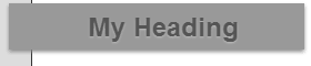 In this example, our #page has 50px of padding and a 1px border. The heading has a left margin of -71px so it overlaps the edge by 20px. Note we’re also using
 position: relative so the other ribbon elements can be positioned as necessary.
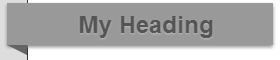
 Now we need to create the folded part of the ribbon which goes ‘behind’ the page. As we saw in the last post, we can use border effects to create any type of triangular shape on an :after pseudo-element with zero width and height:
h2:after
{
	content: ' ';
	position: absolute;
	width: 0;
	height: 0;
	left: 0px;
	top: 100%;
	border-width: 5px 10px;
	border-style: solid;
	border-color: #666 #666 transparent transparent;
}
 It’s looking great and that might be all you need. But client’s love over-designed pages so let’s take it a little further. First, we could apply a flag shape to the right-hand edge by overlaying a white triangle applied to the :before pseudo-element:
h2:before
{
	content: ' ';
	position: absolute;
	width: 0;
	height: 0;
	right: -2px;
	top: 0px;
	border-color: transparent #fff transparent transparent;
}
 That’s nice, but what about a folded-back ribbon effect on the left-hand edge? No problem:
h2:before
{
	content: ' ';
	position: absolute;
	width: 30px;
	height: 0;
	left: -30px;
	top: 12px;
	border-width: 20px 10px;
	border-style: solid;
	border-color: #999 #999 #999 transparent;
}
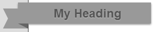 The border color of the pseudo-elements much match the background color of the h2 since it actually appears above the title. Altering the z-index doesn’t work on pseudo-elements if the parent is positioned.
Please see the demonstration page for an example which shows all three ribbon styles. It works as expected in IE8, IE9, Firefox, Chrome, Safari and Opera. IE6 and IE7 degrade gracefully and show the main overlapping title. All the CSS code is contained in the HTML source.
Who needs Photoshop?!
And if you enjoyed reading this post, you’ll love Learnable; the place to learn fresh skills and techniques from the masters. Members get instant access to all of SitePoint’s ebooks and interactive online courses, like HTML5 & CSS3 For the Real World.
Comments on this article are closed. Have a question about CSS3? Why not ask it on our forums?
Frequently Asked Questions (FAQs) about Pure CSS3 Ribbons
How can I create a ribbon corner using pure CSS3?
Creating a ribbon corner using pure CSS3 involves using the ::before and ::after pseudo-elements. These pseudo-elements allow you to insert content onto a page without it needing to be in the HTML. You can style these elements to create the illusion of a ribbon corner. For example, you can use the border property to create a triangular shape, and then position it appropriately to create the ribbon effect.
Can I add text to my CSS3 ribbon?
Yes, you can add text to your CSS3 ribbon. This can be done by adding a text element inside your ribbon element in your HTML. You can then style this text using CSS to position it correctly on the ribbon, and to apply any desired styling such as font size, color, and so on.
How can I make my CSS3 ribbon responsive?
Making your CSS3 ribbon responsive involves using relative units such as percentages or ems instead of absolute units like pixels. This allows the ribbon to scale based on the size of the viewport or the base font size. You can also use media queries to apply different styles at different viewport sizes, allowing you to adjust the size and position of the ribbon as needed.
Can I animate my CSS3 ribbon?
Yes, you can animate your CSS3 ribbon using CSS animations or transitions. For example, you could use a transition to smoothly change the color of the ribbon when the user hovers over it. Alternatively, you could use an animation to make the ribbon move or change shape over time.
How can I add a shadow to my CSS3 ribbon?
You can add a shadow to your CSS3 ribbon using the box-shadow property. This property allows you to specify the horizontal and vertical offset of the shadow, the blur radius, the spread radius, and the color of the shadow. For example, you could use the following CSS to add a gray shadow to your ribbon:.ribbon {
box-shadow: 2px 2px 5px 0px rgba(0,0,0,0.3);}
How can I create a ribbon banner using pure CSS3?
Creating a ribbon banner using pure CSS3 involves creating a long, thin ribbon and then adding text or other content to it. You can use the ::before and ::after pseudo-elements to create the ends of the banner, and then use the text-align property to center the text on the banner.
Can I use gradients in my CSS3 ribbon?
Yes, you can use gradients in your CSS3 ribbon. This can be done using the linear-gradient or radial-gradient functions in CSS. These functions allow you to specify multiple colors and the direction of the gradient, allowing you to create a variety of gradient effects.
How can I create a double ribbon using pure CSS3?
Creating a double ribbon using pure CSS3 involves creating two ribbon elements and positioning them so that they overlap. You can use the z-index property to control which ribbon appears on top. You can then style each ribbon separately, allowing you to create a variety of double ribbon effects.
Can I use CSS3 ribbons in a navigation bar?
Yes, you can use CSS3 ribbons in a navigation bar. This can be done by creating a ribbon for each navigation item, and then using CSS to position them appropriately. You can also use CSS to change the appearance of the ribbons when the user hovers over them or clicks on them, providing visual feedback to the user.
How can I create a ribbon with a pattern using pure CSS3?
Creating a ribbon with a pattern using pure CSS3 can be done using the background-image property. This property allows you to specify an image to be used as the background of an element. You can use a repeating pattern image to create the effect of a patterned ribbon. You can also use the background-size and background-position properties to control the size and position of the pattern.

