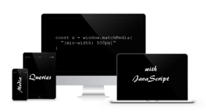
Media Queries in CSS
In the following example, cssbasic.css is served to all devices. But, if it’s a screen with a horizontal width of 500 pixels or greater, csswide.css is also sent:<link rel="stylesheet" media="all" href="cssbasic.css" />
<link rel="stylesheet" media="(min-width: 500px)" href="csswide.css" />- Most browsers support
window.innerWidthandwindow.innerHeight. (IE before version 10 in quirks mode requireddocument.body.clientWidthanddocument.body.clientHeight.) window.onresize- All the main browsers support
document.documentElement.clientWidthanddocument.documentElement.clientHeightbut it’s inconsistent. Either the window or document dimensions will be returned depending on the browser and mode.
How to Write Media Queries with JavaScript Code
Fortunately, it’s possible to respond to CSS3 media query state changes within JavaScript. The key API iswindow.matchMedia. This is passed a media query string identical to those used in CSS media queries:
const mq = window.matchMedia( "(min-width: 500px)" );matches property returns true or false depending on the query result. For example:
if (mq.matches) {
// window width is at least 500px
} else {
// window width is less than 500px
}// media query event handler
if (matchMedia) {
const mq = window.matchMedia("(min-width: 500px)");
mq.addListener(WidthChange);
WidthChange(mq);
}
// media query change
function WidthChange(mq) {
if (mq.matches) {
// window width is at least 500px
} else {
// window width is less than 500px
}
}WidthChange() would never be called if the user did not change their browser dimensions.
At the time of writing, matchMedia has excellent browser support across the board, so there’s no reason why you can’t use it in production.
Check how the text dynamically changes in the demo below from more than 500 pixels to less than 500 pixels as you resize your browser window. Alternatively, download the sample code:
See the Pen CSS Media Queries with JavaScript by SitePoint (@SitePoint) on CodePen.
Frequently Asked Questions (FAQs) about JavaScript Media Queries
What is the purpose of using JavaScript Media Queries?
JavaScript Media Queries are used to apply different behaviors or styles to a website or application based on the user’s device characteristics, such as screen size, resolution, or orientation. This is particularly useful for creating responsive designs that adapt to different screen sizes, ensuring a consistent user experience across various devices. For instance, you might want to display a navigation menu as a dropdown on smaller screens, but as a horizontal bar on larger screens. JavaScript Media Queries allow you to implement such dynamic changes in your design.
How do I use JavaScript to detect a change in screen size?
JavaScript provides the window.matchMedia() method, which can be used to detect changes in screen size. This method returns a MediaQueryList object that can be used to determine if a particular media query matches the current device. You can also add a listener to this object to respond to changes in the device’s match status. Here’s a basic example:var mql = window.matchMedia("(max-width: 600px)");mql.addListener(function(e) {
if(e.matches) {
/* the viewport is 600 pixels wide or less */
} else {
/* the viewport is more than 600 pixels wide */
}});
Can I use JavaScript Media Queries in all browsers?
JavaScript Media Queries are widely supported in all modern browsers, including Chrome, Firefox, Safari, Edge, and Internet Explorer 9 and above. However, it’s always a good idea to check the current browser compatibility on a site like Can I Use before implementing any new web feature.
How do I combine multiple media queries in JavaScript?
You can combine multiple media queries in JavaScript using the and operator, similar to how you would in CSS. For example, if you wanted to check if the screen is less than 600px wide and in portrait orientation, you could write:var mql = window.matchMedia("(max-width: 600px) and (orientation: portrait)");
Can I use JavaScript Media Queries to detect device type?
While you can use JavaScript Media Queries to detect certain device characteristics like screen size and orientation, they are not designed to detect specific device types or models. For instance, you can’t use a media query to determine if the user is on an iPhone or an Android device. However, you can make educated guesses based on the information available, such as assuming a device is a phone if the screen width is less than 500px.
How do I use JavaScript Media Queries to apply different styles?
JavaScript Media Queries are typically used in conjunction with the DOM API to dynamically apply different styles based on the current media query. For example, you might add or remove a class from an element, or directly modify an element’s style properties. Here’s a basic example:var mql = window.matchMedia("(max-width: 600px)");mql.addListener(function(e) {
var nav = document.getElementById("nav");
if(e.matches) {
nav.classList.add("dropdown");
} else {
nav.classList.remove("dropdown");
}});
Can I use JavaScript Media Queries to load different content?
Yes, you can use JavaScript Media Queries to conditionally load different content based on the current media query. For example, you might load a smaller image on smaller screens to save bandwidth. However, keep in mind that all JavaScript, including media queries, is executed client-side, so this won’t prevent the larger image from being downloaded in the first place.
How do I test my JavaScript Media Queries?
You can test your JavaScript Media Queries by resizing your browser window to simulate different screen sizes. Most modern browsers also provide developer tools that allow you to simulate different devices and screen sizes. Additionally, you can use automated testing tools that can simulate a variety of devices and screen sizes.
Can I use JavaScript Media Queries in conjunction with CSS Media Queries?
Yes, JavaScript Media Queries can be used in conjunction with CSS Media Queries. In fact, they often are. While CSS Media Queries are great for applying different styles based on device characteristics, JavaScript Media Queries allow you to apply more complex behaviors and manipulations that can’t be achieved with CSS alone.
Are there any libraries or frameworks that can simplify working with JavaScript Media Queries?
Yes, there are several libraries and frameworks that provide abstractions for working with JavaScript Media Queries, such as Enquire.js and matchMedia.js. These can simplify the process of writing and managing your media queries, especially if you’re dealing with a large number of them. However, keep in mind that adding a library or framework also adds to your project’s complexity and load time, so it’s important to weigh the benefits against the costs.
 Craig Buckler
Craig is a freelance UK web consultant who built his first page for IE2.0 in 1995. Since that time he's been advocating standards, accessibility, and best-practice HTML5 techniques. He's created enterprise specifications, websites and online applications for companies and organisations including the UK Parliament, the European Parliament, the Department of Energy & Climate Change, Microsoft, and more. He's written more than 1,000 articles for SitePoint and you can find him @craigbuckler.