When we hear the phrase ‘menu design’, most of us think of user interfaces, but there are many wonderful lessons in design and information architecture that we can learn from the long and competitive history of restaurant menu design. Let’s have a looks at a few of my favorite examples.
Eleven Madison Park in New York City is a world-class restaurant in every sense of the term. They have clocked in as one of the top five in the world, in fact, and a meal here will set you back a couple hundred bucks—without wine.
But let’s say you saved your pennies and managed to land a reservation. The menu you received would have looked like this:
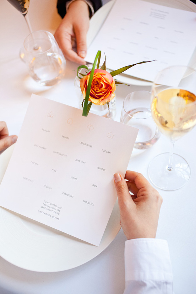
Eleven Madison Park by Juliette Cezzar (via Art of the Menu)
Amazing. Designed by Juliette Cezzar, it is absolutely free of clutter, containing literally just the essential information—the main component of every dish, arranged in a 4 x 4 grid. As such, it demonstrates one of the key principles of visual hierarchy: put extra space around the important things, so they are easier to see.
Unfortunately, as a practical model for menu design, it is pretty much useless. Eleven Madison Park’s situation is extremely particular. Here, the restaurant’s reputation is so awesome, customers can order on faith, without even seeing descriptions of the dishes.
By contrast, most menus are required to provide a lot more information, including categories (starter, main course, dessert), descriptions, and prices, at the very least.
Here’s how a typically loaded menu might look:
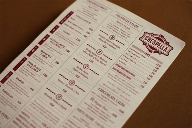
Crespella by Tag Collective (via Art of the Menu)
We would say that this design, by Tag Collective, is perfectly solid, but less than inspiring. It is orderly and effort was clearly made to add variety and charm. But there is also a lot of information here, and the visual hierarchy is too weak. The result is that at first glance, the menu looks dense and overwhelming. It is missing the ingredient in which Eleven Madison Park’s menu luxuriates: space.
The point of this contrast is to demonstrate the key importance of visual hierarchies in menu design, where designers often must cram quite a lot of information into not so big a space. If you’re not familiar with the concept of visual hierarchy, this post will take you through the basics.
The basic idea is that there are several principles for making certain graphic information more visible—higher in the hierarchy—than other information. Bigger rather than smaller, above rather than below, to the left rather than to the right (assuming a culture that reads left-to-right), color rather than grayscale, bold rather than slim: these are all ways of assigning visual primacy.
In this post we will revisit visual hierarchy, specifically with menu design in mind. We’ve broken it down into five categories:
- Spacing
- Alignment
- Borders
- Font
- Color
We think the menu designs included below are exemplary of these principles, finding good middle grounds between the two approaches shown above.
Spacing
The Eleven Madison Park design and the Crespella design are both examples of the importance of good spacing: the former has plenty, the latter has somewhat too little.
We think the design below strikes a good balance, allowing important text to breathe so it is easily legible and stands out as important.
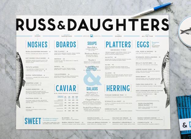
Russ & Daughters by Kelli Anderson
Alignment
Alignment is a simple hierarchy principle: if text is in a line, it probably belongs together as a group. You can use this instead of, or more likely in addition to, other grouping cues like uniform typeface, size and boldness.
Note that slight disalignment can also achieve a useful effect. This is clear in the second example below, for Ellie’s table, where staggering the menu items gives the information more life and personality.
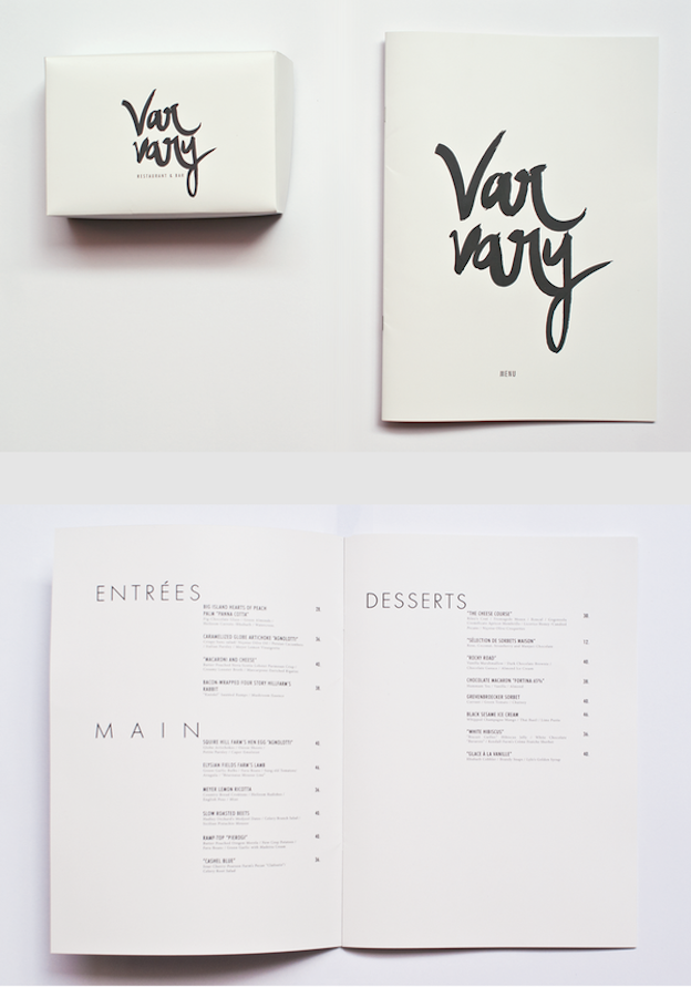
Varvary by Shierly DC (via Behance)
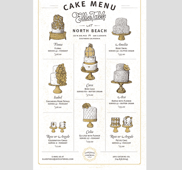
Ellie’s Table by Brian Rau (via dribbble)
Borders
If your menu is starting to get crowded, one tried-and-true option is always to simply separate disparate information using lines or borders. This is also a simple way of bringing some extra attention to things that are otherwise low in the hierarchy, whether because they are positioned at the margins or rendered in small print to save room.
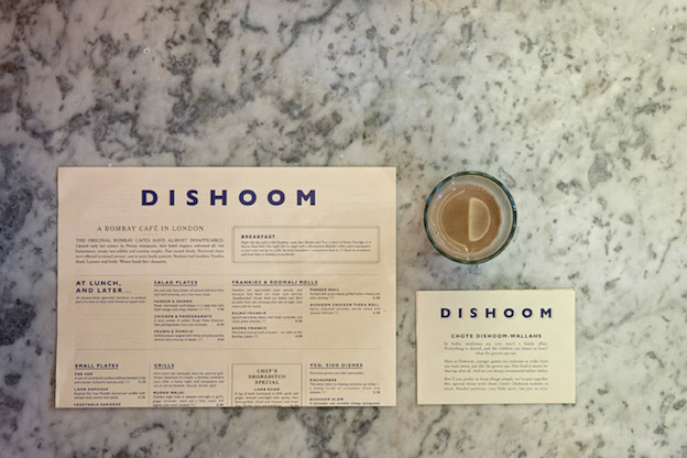
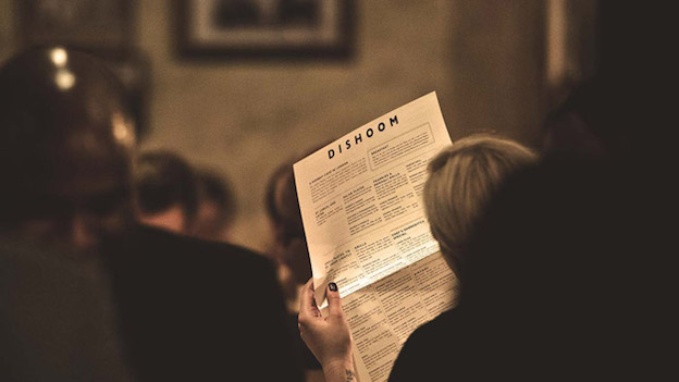
Dishoom by & Smith Design (via Art of the Menu)

Cellar Maker by Gamut
Font
Font in fact entails various aspects: size, weight (boldness), italics, and typeface. Greater size or weight obviously raises information in the visual hierarchy, and sometimes the design of the typeface itself carries a more pronounced or reticent personality.
Pairing typefaces and varying the above attributes results in a more intangible quality that designers often call “texture.”
Bacon by Sanctuary Print Shop (Designspiration)
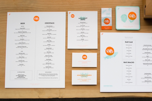
Riffle by Hovercraft Studio
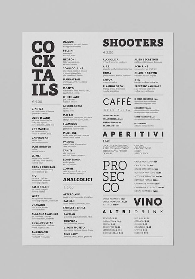
Malo’ Cocktail Cafè by Giuseppe Fierro (via Behance)
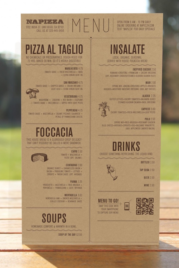
Napizza by Miller
Color
Needless to say, juxtaposing color against black and white is a surefire way to make the colorful item stand out. However, it has other hierarchy-related uses as well.
Putting information of different types in different colors helps to distinguish them, and surrounding fields of information with a colored background achieves a similar effect. Never overlook the importance of good color pairing.
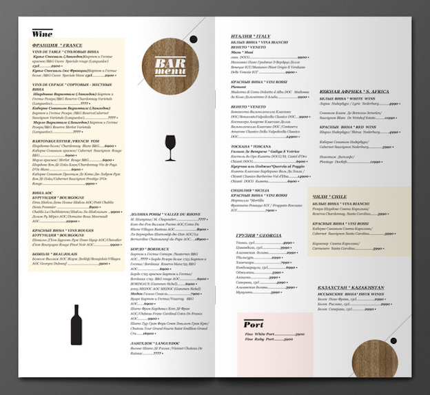
Bar Menu by Azamat Sayfullaev (via Behance)
Republished with permission from the 99designs Designer Blog
What do you think are the most important hierarchy principles when it comes to menu design? Share in the comments!
 Alex Bigman
Alex Bigman is liaison to 99designs' awesome community of graphic designers. He is a recent grad of UC Berkeley, where he studied history of art and cognitive science.