

Preprocessors like Less, Sass, Stylus, etc., extend the capabilities of CSS by including such programming language features as variables, functions, mathematical operations, etc.
Appropriate use of this technology aims to ensure maintainable stylesheet documents and an improved workflow.
This article takes a step beyond the basics of the Less preprocessor language by using some of the Bootstrap 3 Less code as both a learning and development tool.
If you’re just starting out, enjoy Speed Up Your Web Development Process with Less, a clear and concise video introduction by Sandy Ludosky.
Key Takeaways
- Leverage Bootstrap Mixins for Efficiency: Utilize the Bootstrap mixins library to streamline your CSS code, enabling the reuse of common styles and reducing code redundancy.
- Understanding Mixins: Mixins in Less are akin to functions in programming that group CSS declarations for reusability across various classes.
- Use of the @import Directive: Incorporate necessary Bootstrap .less files into your projects using the @import directive, enhancing modularity and maintainability of your code.
- Advantages of Parametric Mixins: Explore parametric mixins like `.container-fixed()` and `.make-row()` which allow customization through parameters, providing flexibility in styling elements.
- Responsive Design Simplified: Apply responsive design easily with mixins for grid layouts such as `.make-md-column()` that adapt to different screen sizes using media queries nested within mixins.
- Optimize with Namespaces and Extend: Organize your mixins using namespaces and optimize CSS output by extending shared styles across selectors, adhering to the DRY (Don’t Repeat Yourself) principle.
The Demo Page Set Up
The Less features discussed here are all implemented in this compiled CodePen page and as this zip file so that you can freely see how the page looks, check the code details for yourself and experiment with it.
The Folders Structure
Here’s what the project’s directory structure looks like.
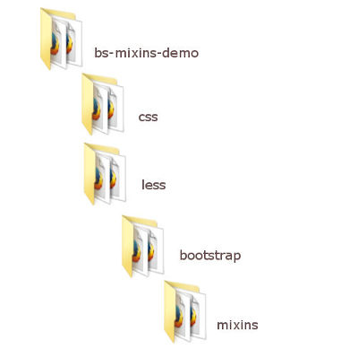
All the Bootstrap files go into the bootstrap folder. This also includes a mixins folder where we place the Bootstrap mixins.
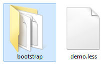
The index.html file goes straight inside the bs-mixins-demo folder.
The demo.css file will be added to the css folder, once the Less files are compiled.
The project’s Less file, demo.less, is placed inside the less folder. All the Less code I write for this demo goes here. In a real world project, I’d break its contents into separate .less files. However, given the reduced size of this demo, we can get away with just one file.
The HTML Structure
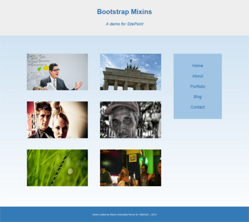
The demo page consists of a simple two-column layout with header and footer. Bootstrap components and JavaScript plugins are not used. But don’t be fooled – there’s enough in there to show the Bootstrap’s mixins goodness in action:
- adaptive layout
- nested columns
- columns offset
- different column display order on desktop and mobile view
- Bootstrap buttons
- CSS3 gradients
- CSS3 card-flipping effect on hover

Below is what the outline of index.html looks like.
<!-- HEADER -->

<header role="banner">

  <div class="container">

    <h1><a href="#">Site Title</a></h1>

    <p>Site Tagline</p>

  </div>

</header>
<!-- PAGE CONTENT -->

<div class="container">

  <div class="page-content">
    <!-- NAVIGATION -->

    <aside class="sidebar" role="complementary">

      <nav role="navigation">
      </nav>

    </aside>
    <!-- MAIN CONTENT -->

    <main class="main-content" role="main">
      <!-- NESTED COLUMNS GRID -->

      <article class="card">

      <!-- Column 1 -->

      </article>
      <article class="card">

      <!-- Column 2 -->

      </article>
      ...
    </main>

  </div>

</div>
<!-- FOOTER -->

<footer role="contentinfo">

  <div class="container">
  </div>

</footer>
Here’s an added bonus of using the Less source code: a clean HTML document without any typical Bootstrap grid classes.
The Bootstrap Files
The Bootstrap files we need for this demo are available on the Bootstrap website. Make sure, you grab the Less source files.
The files listed below need to be copied over from the Less folder of the downloaded source code into the demo’s bootstrap folder:
- mixins.less
- normalize.less
- scaffolding.less
- variables.less
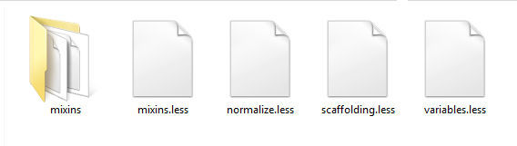
Also, the entire content of the mixins directory of the Bootstrap source code needs to be copied over into the demo’s mixins folder.
The Less @import Directive
To make the Bootstrap .less files available to our demo, Less offers the @import directive. In this demo, we import our copy of the Bootstrap files into the demo.less file like so:
@import (reference) "bootstrap/variables.less";

@import (reference) "bootstrap/mixins.less";

@import "bootstrap/normalize.less";

@import "bootstrap/scaffolding.less";
Less has six keywords that can be used with the @import directive: reference, inline, less, css, once, and multiple.
The reference keyword is a great feature: now we have everything contained in bootstrap/variables.less and bootstrap/mixins.less at our fingertips. However, only what we actually use for our project will be compiled into the resulting CSS document.
The Compiler
You can compile Less code both server side and client side.
Client side compilation is as quick as adding demo.less and less.js (downloadable from the LssCss.org website) in the head section of your HTML document.
<link href="less/demo.less" rel="stylesheet/less">

<script src="less/less.js"></script>
Client side compiling is great to get started with Less and experimenting with it. However, for a production site, the best option is server side precompiling with node.js or a third party tool.
This demo uses Prepros, a precompiler for Windows, Mac, and Linux available both as a free and a paid download. You’re free to use your favorite tool, it won’t affect the end result.
For an in-depth guide on how to use Prepros to precompile your Less code, Multilingual Preprocessing with Prepros by Ivaylo Gerchev will tell you all you need to know.
What are Less Mixins?
Mixins in Less offer a way to package all the properties of a class so that we can reuse them as a property inside another class.
From the LessCss website:
Mixins are a way of including (“mixing in”) a bunch of properties from one rule-set into another rule-set.
Here’s an example.
If we choose to build a web layout using floats, we will need a technique to clear those floats.
Below is the Clearfix Hack by Nicolas Gallagher, also used by the Bootstrap framework, turned into a Less mixin.
.clearfix() {

  &:before,

  &:after {

    content: " ";

    display: table;

  }

  &:after {

    clear: both;

  }

}
The advantage of having it packaged into a mixin is that we can now add it wherever we need to clear floats with just one line of code. For example, here’s how to add it to a container element that encompasses a number of floated elements:
.container {

  property1: value1;

  property2: value2;

  .clearfix();

}
When compiled into CSS, this code outputs the following:
.container:before,

.container:after {

  display: table;

  content: " ";

}

.container:after {

  clear:both;

}

.container {

  property1: value1;

  property2: value2;

}
The level of complexity of a mixin varies in relation to what you intend to achieve with it. It’s time to see what it’s possible to achieve using the Bootstrap mixins as a library for our project.
Taking Advantage of the Bootstrap Mixins
If you’re ready to move from the basics and embark on your journey to mixins ninjahood, using an excellent mixins library not only helps you write awesome CSS code, but is also a great way to learn from the best.
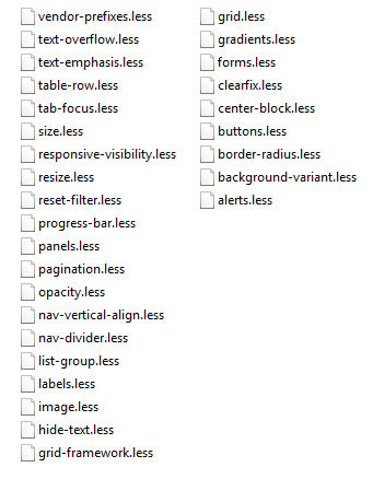
Let’s open the mixins folder and explore the way Bootstrap builds its Less code.
Layout Mixins
The mixins that I personally find most useful are those that help me build the page layout.
You can find these in grid.less.
The .container-fixed() Mixin
This mixin is designed to generate the CSS for centering the content of a web page. Here it is:
.container-fixed(@gutter: @grid-gutter-width) {

  margin-right: auto;

  margin-left: auto;

  padding-left:  (@gutter / 2);

  padding-right: (@gutter / 2);

  &:extend(.clearfix all);

}
Let’s take a closer look into the .container-fixed() mixin.
This is a parametric mixin, that is, a mixin that takes one or more arguments. Writing mixins like this gives us quite a bit of flexibility. We can use the same ruleset but customize it differently by changing the value we assign to the arguments.
This particular Bootstrap mixin uses arguments with default values. The argument @gutter has a default value of @grid-gutter-width, that you can find in the variables.less file. This means that, if no value for this argument is passed when using the mixin, the code will fall back on the default value.
One more interesting bit to notice about the .container-fixed() mixin is its use of &:extend(.clearfix all).
This piece of code does the following:
- it includes a
.clearfixclass built with the.clearfix()mixin. This class has the functionality of clearing floated child elements; - it extends that functionality to the elements and classes styled using the
.container-fixed()mixin. It does this with the Less:extend()pseudo-class; - by adding the
allkeyword at the end, it ensures that the compiler extends the clearfix functionality to all selectors nested inside the extended class.
Since the release of version 3.1.0 of the Bootstrap framework, &:extend(.clearfix all) has replaced the use of the .clearfix() mixin inside the .container-fixed() mixin (you can define a mixin inside another mixin). Let’s examine why we can consider this move as an improvement in the quality of the Bootstrap CSS code.
Applying the .clearfix() mixin to any element or class that contains floated children ends up repeating the same clearfix hack over and over in the CSS document.
What the Less :extend() pseudo-class does is to produce a CSS declaration that groups together all the elements and classes that share the same CSS rules.
For instance, if you were to apply the .clearfix() mixin to .container, .row, and .footer, your compiled CSS would repeat the same clearfix hack for each of the three classes.
However, using the Less :extend() pseudo-class instead, as Bootstrap now does, will output this CSS code:
.container:before,

.container:after,

.row:before,

.row:after,

.footer:before,

.footer:after {

  display: table;

  content: " ";

}

.container:after,

.row:after,

.footer:after {

  clear:both;

}
The gain of using the :extend() pseudo-class is a compliance with the DRY principle. In particular, it avoids repeating the same CSS code by merging together elements and class selectors that share the same bunch of properties.
To use the Bootstrap .container-fixed() mixin in your code, add .container-fixed() to a class or a HTML element. In this article’s demo, I use it for the .container class, just like Bootstrap does:
.container {

  .container-fixed();

}
Here’s what the CSS output of the .container class looks like:
.container {

  margin-right: auto;

  margin-left: auto;

  padding-left: 15px;

  padding-right: 15px;

}
The .make-row() Mixin
In the Bootstrap grid system, columns live inside a wrapper element. The .make-row() mixin generates the styles for this element. Here’s what it looks like:
.make-row(@gutter: @grid-gutter-width) {

  margin-left:  (@gutter / -2);

  margin-right: (@gutter / -2);

  &:extend(.clearfix all);

}
This mixin calculates a left and right margin for the row. Also, since the .make-row() mixin is designed to style wrappers for floated columns, it’s extended with the .clearfix class for floats clearing.
In this article’s demo, I use it on the .page-content class, like this:
.page-content {

  .make-row();

}
The CSS output is:
.page-content {

  margin-left: -15px;

  margin-right: -15px;

}
The Columns Mixins
The Bootstrap grid system uses four column sizes for responsive layouts: the extra-small, the small, the medium, and the large size.
Each column size is generated by a corresponding mixin. Because these mixins have a similar pattern, let’s just examine the mixin for the medium column.
.make-md-column(@columns; @gutter: @grid-gutter-width) {

  position: relative;

  min-height: 1px;

  padding-left:  (@gutter / 2);

  padding-right: (@gutter / 2);
  @media (min-width: @screen-md-min) {

    float: left;

    width: percentage((@columns / @grid-columns));

  }

}
This is another parametric mixin. The @gutter argument has a default value, but the value for the @columns argument will have to be provided when using the mixin. If you don’t assign a value to the @columns argument, Less will throw an error.
A great feature Less offers is nesting. You can nest selectors in a way that reflects the parent-children relationship in your HTML document, without having to write the parent’s selector every time you reference a child element’s selector.
For instance, what in regular CSS looks like this:
article {

  background: blue;

}

article p {

  color: gray;

}
… using Less nesting, looks like this:
article {

  background: blue;

  p {

    color: gray;

  }

}
The Bootstrap .make-md-column() mixin shows us how to take advantage of this nifty Less feature inside a mixin. The LessCss website says:
Directives such as
mediaorkeyframecan be nested in the same way as selectors. Directive is placed on top and relative order against other elements inside the same ruleset remains unchanged. This is called bubbling.
The media query inside the .make-md-column() mixin dictates the column’s behavior when the screen’s width corresponds to the value of the @screen-md-min variable (Bootstrap gives a default value of 992px to this variable. You can find this out in variables.less). When the screen’s width hits the assigned value, the column’s width will be equal to the percentage value of your design’s number of columns divided by the total number of columns (Bootstrap’s default value for the total number of columns is twelve).
The demo uses the .make-md-column() mixin for the sidebar, the main content column, and the six nested columns inside the main content.
.sidebar {

  .make-md-column(4);

}

.main-content {

  .make-md-column(12);

}

.card {

  .make-md-column(5);

}
The CSS output for the .sidebar is:
.sidebar {

  position: relative;

  min-height: 1px;

  padding-left: 15px;

  padding-right: 15px;

}

@media (min-width: 992px) {

  .sidebar {

    float: left;

    width: 33.33333333%;

  }

}
The Button Mixin
The mixin Bootstrap uses to build the styles for the button element is a great example of how convenient it is to use Less for CSS development.
The .button-variant() mixin is located in the buttons.less file inside the mixins folder. It outputs default button styles, as well as styles for common button states. This means that you add this mixin to a button element’s selector and never worry about writing other rules for all those button states. What a time saver!
Here’s the mixin’s code:
.button-variant(@color; @background; @border) {

  color: @color;

  background-color: @background;

  border-color: @border;
  &:hover,

  &:focus,

  &.focus,

  &:active,

  &.active,

  .open > .dropdown-toggle& {

    color: @color;

    background-color: darken(@background, 10%);

    border-color: darken(@border, 12%);

  }

  &:active,

  &.active,

  .open > .dropdown-toggle& {

    background-image: none;

  }

  &.disabled,

  &[disabled],

  fieldset[disabled] & {

    &,

    &:hover,

    &:focus,

    &.focus,

    &:active,

    &.active {

      background-color: @background;

      border-color: @border;

    }

  }
  .badge {

    color: @background;

    background-color: @color;

  }

}
This parametric mixin needs three values from you and spits out a major chunk of CSS code that covers all buttons’ states.
There are some selectors that are part of the Bootstrap framework in there, like .badge or .dropdown-toggle. But nothing prevents you from copying over this mixin into demo.less (or into your project’s specific mixins library folder) and customizing it to fit your own needs. If you didn’t want any extraneous Bootstrap selectors, you could rewrite the .button-variant() mixin like so:
.demo-button-variant(@color; @background; @border) {

  color: @color;

  background-color: @background;

  border-color: @border;
  &:hover,

  &:focus,

  &.focus,

  &:active,

  &.active {

    color: @color;

    background-color: darken(@background, 10%);

    border-color: darken(@border, 12%);

  }

  &:active,

  &.active {

    background-image: none;

  }

  &.disabled,

  &[disabled],

  fieldset[disabled] & {

    &,

    &:hover,

    &:focus,

    &.focus,

    &:active,

    &.active {

      background-color: @background;

      border-color: @border;

    }

  }

}
This is how I use the .demo-button-variant() mixin in the demo page:
.action-btn {

 .demo-button-variant(@gray; lighten(@brand-info, 20%); darken(@brand-info, 10%));

}
The CSS output is:
.action-btn {

  color: #555555;

  background-color: #b0e1ef;

  border-color: #31b0d5;

}

.action-btn:hover,

.action-btn:focus,

.action-btn.focus,

.action-btn:active,

.action-btn.active {

  color: #555555;

  background-color: #85d0e7;

  border-color: #2289a7;

}

.action-btn:active,

.action-btn.active {

  background-image: none;

}

.action-btn.disabled,

.action-btn[disabled],

fieldset[disabled] .action-btn,

.action-btn.disabled:hover,

.action-btn[disabled]:hover,

fieldset[disabled] .action-btn:hover,

.action-btn.disabled:focus,

.action-btn[disabled]:focus,

fieldset[disabled] .action-btn:focus,

.action-btn.disabled.focus,

.action-btn[disabled].focus,

fieldset[disabled] .action-btn.focus,

.action-btn.disabled:active,

.action-btn[disabled]:active,

fieldset[disabled] .action-btn:active,

.action-btn.disabled.active,

.action-btn[disabled].active,

fieldset[disabled] .action-btn.active {

  background-color: #b0e1ef;

  border-color: #31b0d5;

}
What about all those ampersand symbols (&)? The ampersand selector refers to the parent selector inside a nested selector.
The most common use is with pseudo-classes, like in the example below. Instead of repeating .action-btn like in vanilla CSS, slamming an ampersand does the job and saves precious time.
.action-btn {

  color: gray;

  &:hover {

    text-decoration: none;

  }

}
This compiles into the following CSS:
.action-btn {

  color: gray;

}

.action-btn:hover {

  text-decoration: none;

}
You can also use the ampersand selector inside mixins, like in the Bootstrap .button-variant() mixin. When the ampersand is placed at the end of the selector list, it allows you to reverse the order of nesting. To use a small chunk of the .button-variant() mixin as example:
.button-variant(@color; @background; @border) {

...

  &:active,

  &.active,

  .open > .dropdown-toggle& {

    background-image: none;

  }

...

}
When the mixin above is used on the .action-btn selector, it outputs the following CSS
.action-btn:active,

.action-btn.active,

.open > .dropdown-toggle.action-btn {

  background-image: none;

}
Gradients Mixins
In gradients.less inside the mixins folder, you’ll find a bunch of mixins encapsulated within a namespace. This is a great technique for grouping mixins for organizational purposes and making your code more portable.
Here’s the general structure of the Bootstrap gradient mixin to illustrate this point (the complete source code is available with the demo’s files).
#gradient {
  .horizontal(@start-color: #555; @end-color: #333; @start-percent: 0%; @end-percent: 100%) {

    //mixin's code goes here

  }
  .vertical(@start-color: #555; @end-color: #333; @start-percent: 0%; @end-percent: 100%) {

    //mixin's code goes here

  }
  .directional(@start-color: #555; @end-color: #333; @deg: 45deg) {

    //mixin's code goes here

  }
  ...
}
As you can see, namespaces are defined in the same way as CSS ID selectors.
In the example above, the code that goes inside each grouping is not different from what you would write in your CSS code for a gradient, only using the mixin’s arguments instead of fixed values.
In the demo for this article, I use the vertical gradient mixin to style the background of the entire web page:
body {

  #gradient > .vertical(lighten(@brand-primary, 40% ); lighten(@brand-primary, 60%) );

}
The Bootstrap gradient mixin has default values as arguments, therefore you can just use empty brackets and it works. Here, I change the start and end color of the gradient using the Less pre-built lighten() and darken() color functions.
Less has a great variety of color functions. The ones used above are designed to produce a lighter or darker variant of the input color. Really handy when you need a quick way of generating a palette of different shades of the same basic color value.
Conclusion
In this post I’ve highlighted some features of the Less preprocessor language by getting close and personal with the Bootstrap mixins and using a good number of them in a small project.
Exploring and using Bootstrap as a rich mixins library means translating all the theory on the Less preprocessor language we gain from books, courses, and tutorials, into a real-world context. It’s a great way of making the transition from handling the basics of Less to becoming a Pro.
If you have any queries about what’s been discussed here or other aspects of the live demo that haven’t been covered in the post, keep sending them my way. I look forward to your feedback!
Frequently Asked Questions on Bootstrap Mixins Library
What are Bootstrap Mixins and why are they important?
Bootstrap Mixins are a powerful feature of the LESS preprocessor used in Bootstrap. They allow you to create reusable styles, avoid code repetition, and keep your stylesheets more organized. Mixins are essentially a group of CSS declarations that can be reused throughout the website, making your code more efficient and easier to maintain. They are important because they help in creating consistent, scalable, and maintainable code in your Bootstrap projects.
How do I use Bootstrap Mixins in my project?
To use Bootstrap Mixins in your project, you first need to import the Mixins library into your LESS file using the @import directive. Once imported, you can use any Mixin by simply including it in your LESS rule-set. For example, to use the .border-radius() Mixin, you would write .border-radius(5px); in your LESS file. This would output the corresponding CSS for a border radius of 5px.
Can I create my own Mixins in Bootstrap?
Yes, you can create your own Mixins in Bootstrap. To create a Mixin, you simply define a class and include the properties you want. Then, you can include this class in your other LESS rule-sets just like you would with a Bootstrap Mixin. This allows you to create reusable styles that are specific to your project.
What are some common Bootstrap Mixins that I should know about?
Some common Bootstrap Mixins include .border-radius() for setting the border radius, .box-shadow() for adding a box shadow, and .transition() for applying a CSS transition. These Mixins are used frequently in Bootstrap projects and can greatly simplify your LESS code.
How do I override the default styles in Bootstrap using Mixins?
To override the default styles in Bootstrap, you can create your own Mixins with the same name as the Bootstrap Mixin you want to override. Then, when you include this Mixin in your LESS rule-set, your styles will be used instead of the default Bootstrap styles.
Can I use Mixins with other CSS preprocessors like SASS?
Yes, you can use Mixins with other CSS preprocessors like SASS. The concept of Mixins is not unique to LESS or Bootstrap. However, the syntax and usage may vary slightly depending on the preprocessor.
What are the benefits of using Mixins in my Bootstrap project?
Using Mixins in your Bootstrap project can provide several benefits. They can help you write more efficient and maintainable code, reduce repetition, and create consistent styles across your website. They also allow you to override default Bootstrap styles and create your own reusable styles.
Are there any limitations or drawbacks to using Mixins?
One potential drawback to using Mixins is that they can lead to bloated CSS if not used carefully. Because Mixins output all of their content each time they are included, they can potentially generate a lot of redundant CSS. However, this can be mitigated by using Mixins judiciously and leveraging other LESS features like variables and nesting.
Can I use Mixins in a regular CSS file?
No, Mixins are a feature of CSS preprocessors like LESS and SASS and cannot be used in a regular CSS file. However, once your LESS file is compiled, the resulting CSS will include the styles from the Mixins.
Where can I find more information about Bootstrap Mixins?
The official Bootstrap documentation is a great resource for learning more about Mixins. It includes a comprehensive list of all the Mixins available in Bootstrap, along with examples of how to use them. You can also find many tutorials and articles online that provide in-depth explanations and examples of using Mixins in Bootstrap.

