If you’re new to CSS layouts, you’d be forgiven for thinking that using CSS floats in imaginative ways is the height of skill. If you have consumed as many CSS layout tutorials as you can find, you might suppose that mastering floats is a rite of passage. You’ll be dazzled by the ingenuity, astounded by the complexity, and you’ll gain a sense of achievement when you finally understand how floats work.
Don’t be fooled. You’re being brainwashed.
The Danger Signs
I spotted this rule in a CSS reset file:
address, blockquote, center, dir, div, fieldset, pre,
dd, dt, frameset,li, h1, h2, h3, h4, h5, h6, dl,
ol, ul, form, table {
  float: left;
}
This is a sign that the CSS author is a follower of the one true layout; a believer in the magic of floats. Followers believe they’ve found the only layout technique they’ll ever need. Enshrined into CSS frameworks everywhere, using one of these is equivalent to deciding that you’ll never need to learn another CSS layout technique.
The truth is using floats for layout was the best kludge anyone could come up with six years ago with the limited CSS support available at the time. Here we are in 2011, browser CSS capabilities are leaping ahead and the floating crowd are still coding CSS like it’s 2005. Floated layouts are strangling CSS innovation.
CSS layouts that rely on floated elements are overly complex, brittle, demand tortuous thinking, create a raft of odd problems that require nonsensical rules, are unfriendly to beginners, and—in most situations—are simply not required.
The Ironic Clearfix
The bugbear of floated layouts is the need to clear floats. When you have a stack of floated elements they are taken out of the document flow, and their container element collapses. If you want that container to properly surround its floating children (I call them floaters) you’ll need to clear those floats.
The methods for doing this are varied and depend upon the specific layout requirements. If you have a group of floaters within a containing element, and you need that element to extend to full height, then float the container too. The most popular technique, however, is to apply a clearfix: add an element that will refuse to yield to the floaters.
The original clearfix was to add a block element after all the floaters with the rule clear: both; like so:
<div></div>.clearfix { clear: both; }The need to add structural markup for no real semantic purpose was annoying enough to inspire people to seek another solution.
This is the height of clear fix technology:
.clearfix:before, .clearfix:after { content: "020"; display: block; height: 0; overflow: hidden; }

.clearfix:after { clear: both; }

.clearfix { zoom: 1; }
You simply add the class clearfix to your container element and let the magic happen. It’s so progressive, it’s even included in the HTML5 Boilerplate project.
I find it more than a little ironic that the only browsers that support this method—that support the :before and :after pseudo elements and generated content—support almost all of the CSS2.1 spec (plus some of the CSS3 spec) and so have no need for kludges like floated layouts anyway. We’re talking about IE8-and-above-level browsers here.
The Real Problem
We’ve had a decade where the only choices for layout have been inline or block display, and floated or absolute positioning. Creating a layout is really the combination of many small, simple layout tasks. These tasks have often been made needlessly complex by using floats to position elements. The ingenuity required to solve this introduced complexity has become a benchmark for CSS prowess.
Why not stop using floats and remove the complexity instead?
Here’s a collection of CSS properties and values that have been avoided in the past due to boring compatibility issues, but are now widely enough supported that we can begin to use them in our CSS layouts. There are no floats in any of these examples and I hope by exploring the possibilities I might convince you to stop and think before automatically reaching for your toolkit of float-based kludges.
Display: inline-block;
Inline-block is a value for the display property that lets you consistently apply properties like margins, padding, width, height, and vertical-align while remaining an inline element. It’s incredibly useful in any situation where you want to align block elements horizontally in rows.
A mainstay of blogs everywhere is the use of an unordered list for the navigation menu. Turning that list horizontal would normally require you to float all the menu items left or right, then deal with the height of the containing element, and any clearing problems. All of these problems are nullified by applying display: inline-block; to all the li elements. If you want to make the anchor elements fill up the space, apply display: block; to them.
Here’s some example HTML for a simple menu:
<div class="nav">
  <ul>
    <li><a href="home">Home</a></li>
    <li><a href="about">About</a></li>
    <li><a href="news">Latest News</a></li>
    <li><a href="meals">Kitten Meals</a></li>
    <li><a href="pelts">kitten Pelts</a></li>
    <li><a href="dioramas">kitten Dioramas</a></li>
    <li><a href="search">Search</a></li>
  </ul>
</div>
Next we apply equally simple CSS:
.nav > ul > li {
     display: inline-block;
}
.nav > ul > li a:link, .nav > ul > li a:visited {
    display: block;
}
After some cosmetic styles are added we have a horizontal menu:
You may have spotted the fact that the list marker is no longer visible. That’s because list items have a display value of list-item by default; changing the display value has also removed the list marker.
The inline-block elements will also respond to the vertical-align property. So if you have elements of differing dimensions you can create different effects like so:
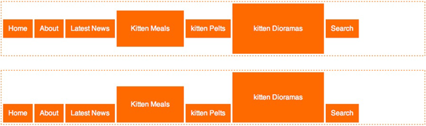
The top menu uses vertical-align: middle; and the bottom menu uses vertical-align: bottom;.
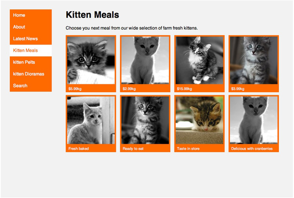
Here’s another example that uses inline-block to create a 2D grid of elements. What I like about using inline-block in this way is that the elements wrap so nicely for different browser widths. Once again the HTML and CSS are simple:
<ul>
  <li class="product"><img src="..."><p>$5.99kg</p></li>
  <li class="product"><img src="..."><p>$2.99kg</p></li>
  <li class="product"><img src="..."><p>$15.99kg</p></li>
  <li class="product"><img src="..."><p>$3.99kg</p></li>
  <li class="product"><img src="..."><p>Fresh baked</p></li>
  <li class="product"><img src="..."><p>Ready to eat</p></li>
  <li class="product"><img src="..."><p>Taste in store</p></li>
  <li class="product"><img src="..."><p>Delicious with cranberries</p></li>
</ul>
li.product {
display: inline-block;
...
}With the addition of some cosmetic styles and appropriate widths the effect is complete:

If you use media queries you can make sure that the containing element width is set to an optimal value to avoid any orphans on the last row. It’s just like laying tiles. Check out the example in the code archive if you’d like to see this in action.
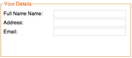
Inline-block is also helpful with form presentation. It’s a great way to apply a consistent width to your labels without using structural markup:
<fieldset>
  <legend>Your Details</legend>
  <label for="name">Full Name:</label><input type="text" value="" />
  <label for="address">Address:</label><input type="text" name="address" value="" />
  <label for="email">Email:</label><input type="text" name="email" value="" />
</fieldset>
Apply display: inline-block; to the label and input elements, apply an appropriate width to the fieldset element:
label {
  display: inline-block;
  width: 10em;
}

input[type="text"] {
  display: inline-block;
  width: 20em;
}

fieldset {
  width: 30em;
}
The result is a nicely formatted form:
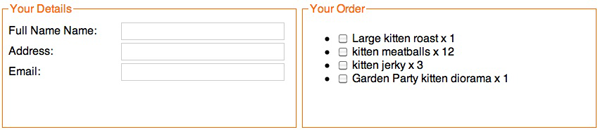
If you apply display: inline-block; to multiple fieldset elements you can align them horizontally, like so:
Box-sizing: border-box
Box-sizing is actually a CSS3 property, but is supported by all browsers except IE6 and 7. By applying a box-sizing value of border-box to a block element, the browser will include the padding and border widths into the total width of the element; shrinking the content space in the process. This is exactly how IE5 used to work. The problem with the now-standard way of calculating element width—the sum of the element width, padding, border width, and margin—is that you can’t specify a width of 100% and then apply padding or borders because that would increase the element width past 100%. Box-sizing: border-box; is the answer.
You can happily apply a width of 100% to an element (or the widths of two or more adjacent elements that total 100%) and also add padding and borders without worrying that the elements will grow past 100%. Very handy for fluid layouts.
An important note: depending on the browser version you may need to use the vendor-specific prefixes -moz-box-sizing for Gecko-based browsers, and -webkit-box-sizing for webkit-based browsers. Firefox 3.6 and Chrome 10 appear to support the property without the vendor prefix but Safari 5 still needs it.
Min-height
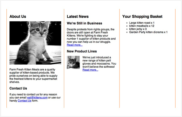
Here’s a common layout situation: two columns; one for the main content and one for complementary content. The HTML might look like this:
<div class="wrapper">
  <div class="content">
    ... main content here
  </div>
  <div class="nav">
    ... navigation menu and complementary content here
  </div>
</div>
We then apply the following CSS to arrange the columns.
.wrapper {
  padding: 2em;
  max-width:  980px;
  margin: 0 auto;
  position: relative;
  min-height: 40em;
}
.nav {
  position: absolute;
  width: 150px;
  top: 2em;
  background-color: #FF6A00;
}
.content {
  margin-left: 200px;
}
The content column is full width, but we add extra margin on the left hand side to accommodate the menu. The menu is then positioned using absolute or fixed positioning. In the past the main drawback of this method was when the complementary column was longer than the main column.
Because the complementary column is positioned absolutely it’s out of the document flow and the container element will collapse to the height of the shorter content column. In these times of widespread compatibility for the min-height property, we can easily avoid this problem and apply a min-height value on the containing element; enough to make sure it surround the complementary column.
Here’s the result:
If you want the column on the other side, no need to adjust the markup, just adjust the CSS values.
.nav {
  position: absolute;
  width: 150px;
  top: 2em;
  right: 2em;
  background-color: #FF6A00;
}
.content {
  margin-right: 200px;
}
Other CSS properties that are useful for layout, but have traditionally been avoided include position: fixed;, max-width, min-width, and max-height. You should take another look at these properties as well because browser support is extensive these days.
For example, if you choose fixed positioning for the complementary column, it’ll stay fixed to the viewport, while the rest of the page scrolls. You can see this effect on simplebits.com.
Display: table
With the arrival of IE8 all browsers support table-related value for the display property. This allows us to apply the layout behavior of tables, rows and cells to any HTML elements. For alignment into columns or rows, these display values are the quick and easy solution.
There’s often quick resistance to anything table-related mentioned in the same breath as CSS layouts. In fact some web professionals are so outraged at the suggestion of using display: table;, you’d think we’re killing kittens.
Table-based display values are unrelated to using HTML-tables for layout. The debates have come and gone. They’re boring now. Let’s move on.
All the previous examples using display: inline-block; can also be achieved using display: table; and related values. Here’s our navigation menu again, but this time each menu item is displaying like a table cell instead of an inline-block.
The HTML is the same and the CSS only requires a couple of simple changes:
.nav > ul {
  display: table;
  border-spacing: 0.25em;
}
.nav > ul > li {
  display: table-cell;
}
You might notice that there’s no element playing the part of the table row. There’s no need: browsers makeup the missing parts of the table structure using anonymous elements. You might also notice that because we’re applying the table display behavior to the ul element, we can also apply table-related style properties like border-spacing.
Our new menu bar has one big behavior difference to its inline-block-based cousin. Because it acts like a table with a single row, those menu items no longer wrap. Instead, if the browser window becomes narrower, they’ll bunch up—each cell’s width will be reduced just like a HTML table. It’s worth keeping in mind when choosing your layout method; sometimes you may want elements to wrap, sometimes not. The choice is yours.
If we want to make a fixed, equidistant grid of elements, CSS tables come to the rescue. This is a modification to the previous grid example, except this time we’ll need to adjust the HTML. We’ll use multiple ul elements and each one will become a table row:
<div class="content">
  <ul>
    <li class="product"><img src="..."><p>$5.99kg</p></li>
    <li class="product"><img src="..."><p>$2.99kg</p></li>
    <li class="product"><img src="..."><p>$15.99kg</p></li>
    <li class="product"><img src="..."><p>$3.99kg</p></li>
  </ul>
  <ul>
    <li class="product"><img src="..."><p>Fresh baked</p></li>
    <li class="product"><img src="..."><p>Ready to eat</p></li>
    <li class="product"><img src="..."><p>Taste in store</p></li>
    <li class="product"><img src="..."><p>Delicious with cranberries</p></li>
  </ul>
</div>
Here’s the CSS:
.content {
  display: table;
  border-spacing: 1em;
}
.content > ul {
  display: table-row;
}
li.product {
  display: table-cell;
  width:  170px;
}
Here’s your perfect grid:

Of course it’s trivial to achieve our two-column layout using display: table;:
.nav {
  display: table-cell;
  width: 150px;
  padding-right: 50px;
}
.content {
  display: table-cell;
}
Equal height columns, without the need to specify a min-height value, with a minimum of fuss. Of course to adjust the position of the complementary column we’d have to change the order in the HTML source. It’s a slight downside you have to consider when choosing to use display: table;.
Equal height columns is particularly useful when you want to include vertical borders between columns. Using display: table; has an added bonus in this situation: the border-collapse property. Take, for example, a typical three column footer you might find on a WordPress-powered site:
<ul>
  <li class="widget-container">
    ...footer column content
  </li>
  <li class="widget-container">
    ...footer column content
  </li>
  <li class="widget-container">
    ...footer column content
  </li>
</ul>
Here’s the end result; equal height columns with a single pixel vertical border on the columns.
Once again the CSS is simple:
.footer {
  display: table;
  border-collapse: collapse;
  width: 100%;
}
.footer > li {
  display: table-cell;
  width: 33.3%;
  padding: 1em;
  border-left: 1px solid #FF6A00;
  border-right: 1px solid #FF6A00;
}
One small caveat: the border-collapse property has to be set on the element to which you’ve added the display: table; property.
Finally, here’s a trick CSS tables can perform effortlessly, that other techniques struggle with: vertical alignment. Here’s what we want to achieve; perfect centering of a block element:
We’ll need an element to be the table and one to be the single cell. For this example we’ll co-opt the html and body elements in order to center a div element. The rest is easy:
html {
  width: 100%;
  height:  100%;
  display: table;
}
body {
  display: table-cell;
  vertical-align: middle;
}
body > div {
  width: 300px;
  margin: 0 auto;
}
Aren’t Floats Good for Something?
Defenders of the floated layout are quick to point out the strengths of their technique. Here are the often cited benefits:
Source Order Independence
As I mentioned above, dependence upon HTML source order for the columns when using display: table; is a common criticism. But I question the implication that floated layouts are indeed independent of source order, the belief that they are the only way to achieve source order independence, and the notion that source order independence is even important.
First let’s clarify something: pure CSS layouts are pure fiction. All current CSS layout methods rely on the document flow to some extent. CSS lacks a way to describe a layout that is completely independent of the order of the markup, although it may gain one in the near future.
Claims of source order independence usually only mean that you can reorder columns. With a simple CSS change left becomes right and right becomes left. Headers, footers and the content within columns are usually still in display order. But, how often is this column-switching ability put to real use? This ability is only possible in specific circumstances and the markup and CSS have to be constructed with this ability in mind. If this ability is actually required for a specific reason, it may be worth all the trouble. If you only use it to prove that it can be done, then is all the added complexity and brittleness worth a slight decrease in source order dependence?
The only real way to position elements without regard to source order is to use the position values fixed or absolute. The min-height layout demo above is an example. Also, if you use display: inline-block; to horizontally align block elements, you can use a combination of positive and negative margin values to reorder the elements visually without changing the source order.
If you remain unconvinced that the source order issue is a red herring, consider that, as this 465 Berea St article points out, the Web Content Accessibility Guidelines clearly recommend that HTML source order should match the display order. Consider also that the rise of HTML5 makes the source order issue a moot point. HTML5 provides explicitly semantic elements. The order in which you place them in the source will make no difference to the indexing of your content. The article element will contain the article content, the header element will contain the header content, and the aside element will contain the complementary content.
Browser Compatibility
IE 6 and 7 compatibility are frequently used as a yoke to reign in unbridled enthusiasm for new layout techniques. If you’re still clinging to the idea that one stylesheet should work everywhere, on all browsers, the concept of responsive design should destroy that notion for good. With so many web-enabled devices you need to customize the experience for these devices anyway.
With the release of IE9 it’s time to put these old clunkers out to pasture. Treat IE6 and 7 like the least capable mobile devices and use conditional comments to provide a minimal experience. If you’re using the advanced clearfix rule I mentioned at the beginning of this article, but lack an alternative stylesheet for IE6 and 7, you’re already ignoring the browser compatibility issue.
There’ll Always be Floats
Of course floats are useful in some situations. There will always be a need to float an element so that other page content flows around it. There’s just no need to always press them into the service of a complicated layout.
Is That It?
You might be thinking “Is that it? It seems very simple and obvious.” I agree! That’s the whole point. The floating crowd would have you believe that the only way to build advanced CSS layouts is through complicated stacks of floated elements. That’s not true any more. We now have a stack of easy-to-use properties available. Combine some or all of the above methods into a single layout and you’ll be able to do whatever you want without floats.
I watch my kids play Little Big Planet 2, and see them create their own worlds from scratch. I want them to see the web in the same way: like a playground. When layouts are simple to create, making tools that generate CSS layouts will be easy too. People will no longer need to code by hand.
Browsers have come leaps and bounds since the bad old days. Spurred on by the adoption of Ajax and now HTML5 and CSS3, browser makers are working harder than ever. We have to keep this momentum going, use the new technology as much as possible. These experiences give people a reason to upgrade their browsers, browser-makers a reason to keep developing, and tool-makers a reason to create better, easier-to-use tools. We have to explore the boundaries, develop new techniques, and boot those old, cherished layout recipes out the door. They’re holding us back.
The Future
CSS3 layout is set to provide far more exciting layout controls. But, we’ll have to wait a few more years before these standards have widespread support. To me it feels as if a large segment of the web industry is standing still, waiting around until CSS3 layout standards are fully supported. Why wait? Much easier layout methods are available right now.
All the source code for the examples in this article is available on GitHub.
No kittens were actually harmed in the making of this article.
 Andrew Tetlaw
iOS Developer, sometimes web developer and Technical Editor.