The word “gestalt” gets thrown around a lot in design. Taken from the German word for “form” or “shape,” it often refers to the overall look of something that is greater than the sum of its parts. In psychology, gestalt refers to the basic principles that allow us to visually perceive order.
These principles are fundamental building blocks for creating visual meaning – and often seen in logo design. To better explain how to utilize gestalt principles in your work, we’ve put together a designer-oriented crash course. Enjoy!
Figure-ground
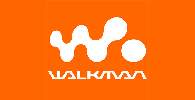
Logo: Sony Walkman (via Wikipedia)
When we look at the Sony Walkman logo (above), we don’t simply see a single plain containing orange and white pixels – even though that’s actually what it is. Rather, most of us perceive an illusory depth as well: we see a figure (a “W” and dot) and a ground that appears to be behind it.
That’s thanks to the figure-ground gestalt principle, which says that when a smaller shape is surrounded by a larger uniform area, we perceive the smaller object to be in front and have the border. With effort you can reverse the effect. Try imagining that the orange area is a sheet of paper with “W”- and dot-shaped holes cut out of it. You can do it, but it doesn’t feel natural.
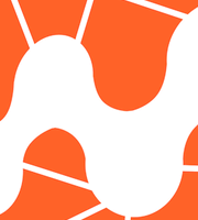
Notice how the figure-ground distinction breaks down when the surrounding field is no longer uniform. The version below looks more like a mosaic, laid out in a single flat plane, rather than a figure in front of a background.
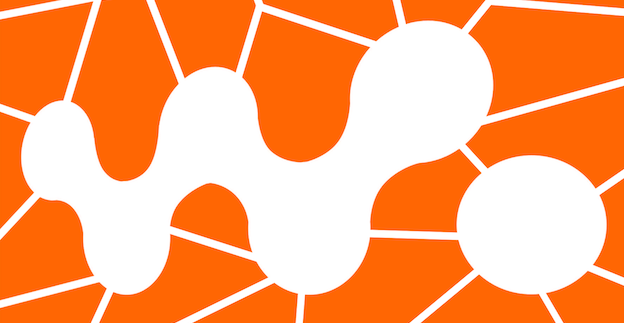
The perception of illusory depth disappears when the background is non-uniform
Proximity
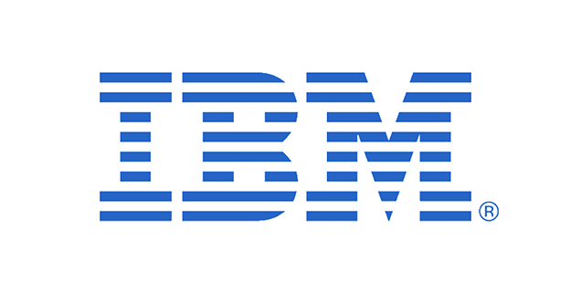
Logo: IBM (via Wikipedia)
When we look at the IBM logo, most of us see three letters composed of short horizontal lines stacked on top of each other. We don’t see 8 long horizontal lines that have gaps in them. Why is this? Partly, it’s because we recognize the letters “I,” “B” and “M”, but not entirely. The below version is in Hebrew, and we bet you’ll be able to see distinct letters even if you don’t know the Hebrew alphabet:
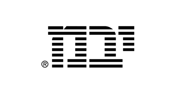
Logo: Hebrew version for IBM (via Logodesignlove)
The reason in fact has to do with the very simple gestalt principle of proximity. If there is a series of objects (such as lines), we tend to perceive objects that are close together as a group. The short segments of the “I” are all closer together than the short and long segments of the top horizontal bar, which has greater gaps between the “B” and “M” and the crevice in the “M.” As a result, we perceive the “I” as a unit and not the top horizontal bar.
Similarity
Just as we tend to group together objects that are close to one another, we also tend to group together objects that are similar—whether in color, shade, orientation or shape.
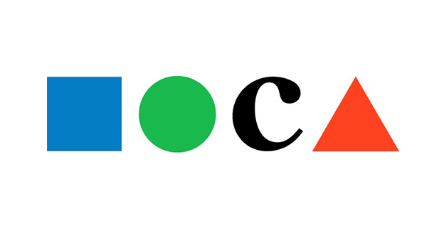
Logo: Museum of Contemporary Art
The logo for Los Angeles’ Museum of Contemporary Art (MOCA) is an interesting example of this. The “C” is a proper letter, but in place of the “M,” “O” and “A” there are three corresponding shapes: a square, circle and triangle.
Chances are that when you look at this logo, your inclination is to group the three colored shapes together – even though they aren’t all next to each other – and to view the black “C” as an outlier. It’d be a strain to perceive the square and the circle as a pair and the “C” and the triangle as another pair, even though this would be a more logical sequence. That’s the similarity gestalt principle at work.
Continuance
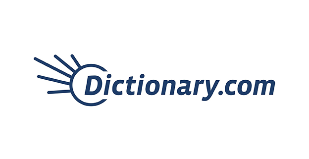
Logo: Dictionary.com
The continuance principle holds that if line or curve segments are in alignment, we tend to perceive them as part of a continuous whole. That’s why, when describing the Dictionary.com logo, nearly everyone would say it’s a partial circle with five branches sticking out. We see the circular form as one continuous part, because if you broke it up into segments, all of them would align. The branches are separate because they do not align with it; they hit it at right angles.
But the mark could be described in other ways. Someone who’s suffered a brain injury and doesn’t conform to the normal continuance principles might say something like “it’s a checkmark whose right line curves downward, connected to a partial “C” shape with 4 lines sticking out of it—like the below:
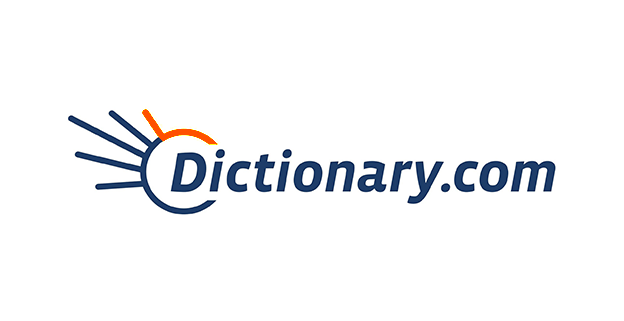
Without the continuance principle, you’d be more likely to perceive different segmentation in the Dictionary.com logo
Closure
The human mind doesn’t like loose ends. When we see a figure that appears to be partially enclosed, our tendency is to “complete” it, even if that means supplying imaginary visual information. This is known as the closure principle.
Many logos are famous for their utilization of the closure principle, which allows them to present a figure using minimal visual information. The World Wildlife Fund is one example. In their logo, we sense the curve at the top of the panda’s head, even though there’s no actual line there:

Logo: World Wildlife Fund
Perhaps the most famous example is the “hidden” arrow in the FedEx logo. It requires zero lines of its own, instead slyly borrowing the borders of the “E” and the “x”:
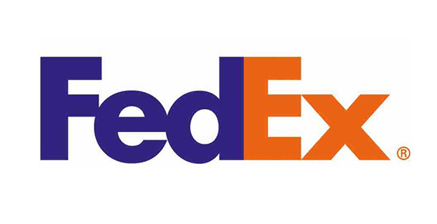
Logo: FedEx
Have you noticed gestalt principles at work in any other logo designs? Share in the comments!
This article was originally published at 99designs Designer Blog. Reproduced with permission.
Frequently Asked Questions (FAQs) about Gestalt Principles in Design
What are the key Gestalt principles in design?
The key Gestalt principles in design include similarity, proximity, closure, figure-ground, continuity, and common fate. These principles are based on the psychological theory that the human brain tends to perceive visual elements in a way that makes the most sense, seeking simplicity and order in complex forms. Understanding these principles can help designers create more effective and visually appealing designs.
How can I apply Gestalt principles in my design work?
Applying Gestalt principles in design work involves understanding how users perceive visual relationships. For instance, using the principle of similarity, you can group related elements together by making them look similar. The principle of proximity suggests that elements that are close together are perceived as more related than those that are further apart. By understanding and applying these principles, you can guide the viewer’s eye and create more effective visual hierarchies in your designs.
What is the significance of the figure-ground principle in Gestalt psychology?
The figure-ground principle is a fundamental aspect of visual perception in Gestalt psychology. It refers to the tendency of the visual system to simplify a scene into the main object that we are looking at (the figure) and everything else that forms the background (the ground). This principle is crucial in design as it helps determine where the viewer’s attention will be focused.
How does the principle of closure work in Gestalt design?
The principle of closure in Gestalt design refers to the human eye’s tendency to see closed shapes even when a shape isn’t completely enclosed. If there’s enough of the shape for the eye to recognize what it’s supposed to be, the brain will fill in the missing information. This principle can be used in design to create intriguing, engaging visuals that encourage the viewer to interact with the design.
Can you explain the principle of continuity in Gestalt design?
The principle of continuity suggests that the human eye will follow the smoothest path when viewing lines, paths, or patterns, and will perceive them as a single, unified form. This principle can be used in design to guide the viewer’s eye in a specific direction or to create a sense of movement.
What is the principle of common fate in Gestalt design?
The principle of common fate states that objects moving in the same direction or at the same speed are perceived as a group or pattern. This principle can be used in design to create a sense of unity and cohesion, particularly in animations or interactive designs.
How do Gestalt principles improve user experience?
Gestalt principles can significantly improve user experience by making designs more intuitive and easier to understand. By understanding how users perceive and interpret visual information, designers can create interfaces that guide users naturally to the information or action they need.
What is the relationship between Gestalt principles and psychology?
Gestalt principles are based on Gestalt psychology, a theory of mind and brain that proposes that the operational principle of the brain is holistic, parallel, and analog, with self-organizing tendencies. These principles are used in design to understand and predict how viewers will perceive or interpret visual elements.
How do Gestalt principles influence logo design?
Gestalt principles play a significant role in logo design. They can help designers create logos that are visually appealing, memorable, and effectively communicate the brand’s message. For instance, the principle of simplicity can guide designers to create a logo that is simple yet powerful, while the principle of closure can be used to create a logo that engages the viewer’s imagination.
Can you provide examples of Gestalt principles in everyday design?
Gestalt principles are everywhere in everyday design. For instance, in web design, the principle of proximity is often used to group related items together, such as navigation links. The principle of similarity is used in typography to create visual consistency. In logo design, the principle of closure is often used to create logos that are simple yet engaging.
 Alex Bigman
Alex Bigman is liaison to 99designs' awesome community of graphic designers. He is a recent grad of UC Berkeley, where he studied history of art and cognitive science.