We love design, UX, and everything that enables technology to help make our life easier. We want to inspire and encourage future designers to continue to improve the user experience across all the devices and applications that we use. We hope these examples will inspire and help others through describing these ‘challenging’ moments when you think I wish it would just do x instead of y …
When Windows 8 Removed the Start Button
As a company, Apple is often considered to be an innovative, design-led company but in many ways they’re quite conservative – particularly when it comes to their OS. A user of OS X from ten years ago would likely still find their way around their latest version. Changes tend to small and incremental.
On the other hand, more recently Microsoft have been making changes to their core UX – often at the expense of the user. Anyone using a Windows PC has, from the beginning, used the desktop and Start menu as the hub from which to navigate tasks and the file system.
With Windows 8, Microsoft designed an OS that would be both click and touch friendly; but the experience was generally unsatisfactory in both contexts. By removing the Start menu and the default Desktop screen, they pulled the rug from under users who, over years of use, were ingrained in opening applications and files in a particular way.
This all had to be relearned and caused enormous frustration for even the most loyal Windows fan. Thankfully the Start button was re-introduced in 8.1 but not before many had downgraded to Windows 7.
It’s a good example of the perils of developing a novel new design at the expense of users and possibly ignoring user testing.
ATMs: Do they really need to return the card just because they don’t have the amount I asked for?

If you can’t give the amount requested it’s ok. Just ask me for a new amount. You don’t need to send me back to the start or cancel the transaction and give me my card back.
For such a widely-used, mature UI, ATMs have an incredibly inconsistent user experience, switching between keypads, side mounted screen buttons and touch-screen controls often within the same interaction. It’s hard to know precisely why. Is it that corporate competition is beating out standards and UI consistency? Or are financial institutions just slow-moving on UX?
You Know My Name – Why Not Use It?

Companies that reply with ‘Dear Subscriber‘. I recently had a problem with a Wired magazine subscription. I was involved in some email tennis with a nice enough guy who managed to get things sorted for me. But every email came back as ‘Dear Subscriber’ on the back of my last email.
As soon as I get my confirmed account details I’m cancelling my subscription.
Mobile Popup Ads That Fill the Screen (With No Easy to Find ‘X’)
Companies that don’t realise they are talking to mobile consumers and insist on having pop up adverts that take up the full screen on a phone and you can’t find the minimise ‘x’. I’m not sure if it’s a technical failing or a business decision, but it’s a great way to make users feel both helpless and stupid.

USB: Remind Me Which Way is the Right Way Up (Again)?
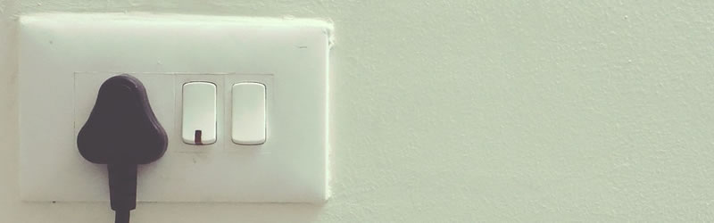
How many times have you tried to insert a USB key upside down? I do it about 50% of the time.
On the surface, this seems like a tiny quibble until you consider how many tens of millions of USB devices get used every day. Tally up the collective seconds wasted with each ‘plug fail’ and it becomes a more serious consideration.
Of course, there are well-established solutions to this type of problem. For more than a hundred years power outlets have an obvious socket orientation that makes it difficult to get wrong. Even better: design a plug that doesn’t matter which way it’s plugged (i.e. lightning cables).
Forgetful Forms

Accidentally hitting the back button or otherwise navigating away from a long web form before submitting it, and have to enter everything again. This can easily be avoided with localStorage in JavaScript.
This one is a killer and has driven us all mad at some point!
Browser Password Overrides
Usually, password management is a good thing, until you run into a web form that asks for only one field – and your browser tries to save it as a password without a username. Be sure that your idea of ‘help’ isn’t actually hurting your users.
Project Scope Creep and Improper Requirements
A large insurance website not long ago spent 20 months developing a new website based around the priciples of ‘mobile first’, spending in excess of €180k (over $200k). When the site was finally launched, the dimensions for desktop/laptop were constrained by mobile/tablet dimensions so desktop screens were not utilised effectively.
Even worse, the first release of the site was not even mobile ready! Less than 12 months later, a brand new website was rolled out.
Technology Faux Pas
A major international hotel chain website was designed and developed using the latest HTML5 technologies rolled out in early days of HTML5. It looked wonderful on the glossy hotel screens, but when viewed in smaller mobile devices, the menus, and panels stacked on top of each other obscuring the content and functionality.
Worse, in older browsers, a window appeared inside the site frame instructing the user to install the Google Chrome Frame extension to view the site.
Foot in Mouth Layout Issues
When Google rolled out their “Page Layout” update to their algorithms back in 2012, a tech news site reported on it. The actual content of their news article was two pages down on the keyboard, below the ads and large images … and they actually still practice this … the report specifies that this practice will start being penalised by the algorithm.
Why Does Facebook Want Access To My Microphone and Camera?
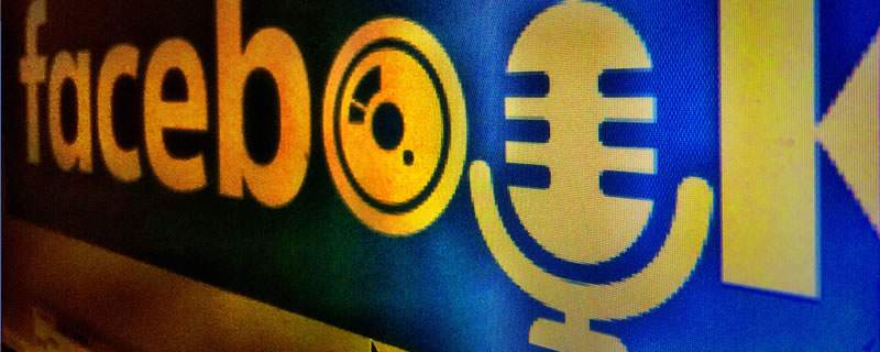
I still don’t know why Facebook wanted access to the microphone and camera on my machine so that I could add a French flag overlay in response to the Paris attacks. I had to really look to find out how to turn them off once I had added the flag to my cover image.
The “Not-so-digital Home”
I know of a company who had invested a lot of money in the ‘digital home’. One of the managers of the programme agreed to have his home ‘upgraded’ to digital. One evening he got home to a house in complete darkness. After trying unsuccessfully to remedy the problem via the UI, he resorted to calling in one of the techies. After spending another hour troubleshooting, the techie was still no closer to finding the issue.

Eventually, he discovered that the light bulb had blown. The project was mothballed the next morning.
Be careful you’re not inventing more problems than you are solving.
Conclusion
The great thing about all of those things that can potentially drive us mad is that they are all ultimately changeable. UX designers are people too, and will generally realise pretty quickly if they have designed something that drives themselves mad, let alone the rest of the world.
Remember the days when you couldn’t copy text from a PDF document? Thankfully we are now in an age where bumps in the road can usually be identified and fixed fairly quickly. We hope this article inspires everyone, ourselves included, to keep honing better and better user experiences for all of us.
 Simon Cocking & the Digital Skills Academy Team
Simon is Senior Editor at Irish Tech News and has been based in Ireland for over 20 years. He has founded three companies, two Coops, and introduced one national sport to the country. Recently listed #23 in 100 most influential people in FinTech.