In this article, we’re going to see CSS Grid in action by creating a responsive multi-column website layout.
CSS Grid is a new, hot trend in web development these days. Forget about table layouts and floats: a new way to design websites is already here! This technology introduces two-dimensional grids which define multiple areas of layout with a handful of CSS rules.
Grid can make third-party frameworks such as 960gs or Bootstrap grid redundant, as you may easily do everything yourself! This feature is supported by all major browsers, though Internet Explorer implements an older version of the specification.
If you’re new to Grid layout, check out our beginner’s guide to CSS Grid.
What We’re Going to Build
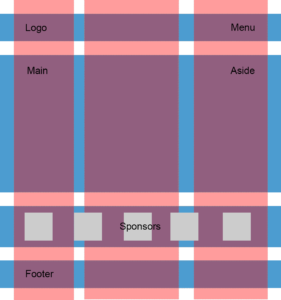
So, we were asked to create a typical website layout with a header, main content area, sidebar to the right, a list of sponsors, and a footer:
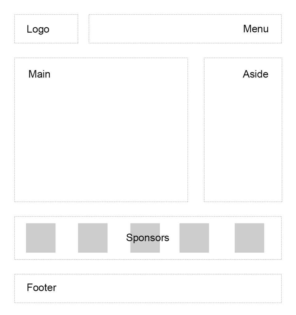
Another developer has already tried to solve this task and came up with a solution that involves floats, display: table, and some clearfix hacks. We’re going to refer to this existing layout as “initial”:
See the Pen SP: Multi-Column Layout With Floats by SitePoint (@SitePoint) on CodePen.
Until recently, floats were considered to be the best option to create such layouts. Prior to that, we had to utilize HTML tables, but they had a number of downsides. Specifically, such table layout is very rigid, requiring lots of tags (table, tr, td, th etc), and semantically these tags are used to present table data, not to design layouts.
But CSS continues to evolve, and now we have CSS Grid. Conceptually, it’s similar to an old table layout but can use semantic HTML elements with a more flexible layout.
Planning the Grid
First things first: we need to define a basic HTML structure for our document. Before that, let’s briefly talk about how the initial example works. It has the following main blocks:
.containeris the global wrapper that has small margins to the left and to the right..main-headeris the header that contains the.logo(occupying 20% of the space, floating to the left) and the.main-menu(occupying 79% of the space, floating to the right). The header is also assigned a hacky fix to clear the floats..content-area-wrapperwraps the main.content-area(occupying 66.6% of the space minus1remreserved for margin, floating to the left) and the.sidebar(occupying 33.3% of the space, floating to the right). The wrapper itself is also assigned with a clearfix..sponsors-wrappercontains the logos of the sponsors. Inside, there’s a.sponsorssection with thedisplayproperty set totable. Each sponsor, in turn, is displayed as a table cell..footeris our footer and spans to 100% of the space.
Our new layout will be very similar to the initial one, but with one exception: we won’t add the .main-header and .content-area-wrapper wrappers because the clearfixes won’t be required anymore. Here is the new version of the HTML:
<div class="container">
<header class="logo">
<h1><a href="#">DemoSite</a></h1>
</header>
<nav class="main-menu">
<ul>
<li class="main-menu__item"><a href="#">Our clients</a></li>
<li class="main-menu__item"><a href="#">Products</a></li>
<li class="main-menu__item"><a href="#">Contact</a></li>
</ul>
</nav>
<main class="content-area">
<h2>Welcome!</h2>
<p>
Content
</p>
</main>
<aside class="sidebar">
<h3>Additional stuff</h3>
<ul>
<li>Items</li>
<li>Are</li>
<li>Listed</li>
<li>Here</li>
<li>Wow!</li>
</ul>
</aside>
<section class="sponsors-wrapper">
<h2>Our sponsors</h2>
<section class="sponsors">
<figure class="sponsor">
<img src="https://via.placeholder.com/150x150">
</figure>
<figure class="sponsor">
<img src="https://via.placeholder.com/200x150">
</figure>
<figure class="sponsor">
<img src="https://via.placeholder.com/100x200">
</figure>
<figure class="sponsor">
<img src="https://via.placeholder.com/100x100">
</figure>
<figure class="sponsor">
<img src="https://via.placeholder.com/200x200">
</figure>
</section>
</section>
<footer class="footer">
<p>
© 2018 DemoSite. White&Sons LLC. All rights (perhaps) reserved.
</p>
</footer>
</div>
Note that you may utilize the body as the global .container; that’s just a matter of preference in this case. All in all, we have six main areas:
- Logo
- Menu
- Main content
- Sidebar
- Sponsors
- Footer
Usually it’s recommended that you implement a mobile-first approach. That is, you start from the mobile layout and then add styles for larger screens. This isn’t necessary in this case, since we’re adapting an initial layout that already falls back to a linearized view on small-screen devices. Therefore, let’s start by focusing on the grid’s implementation, and after that talk about responsiveness and fallback rules. So, return to our scheme and see how the grid columns can be arranged:
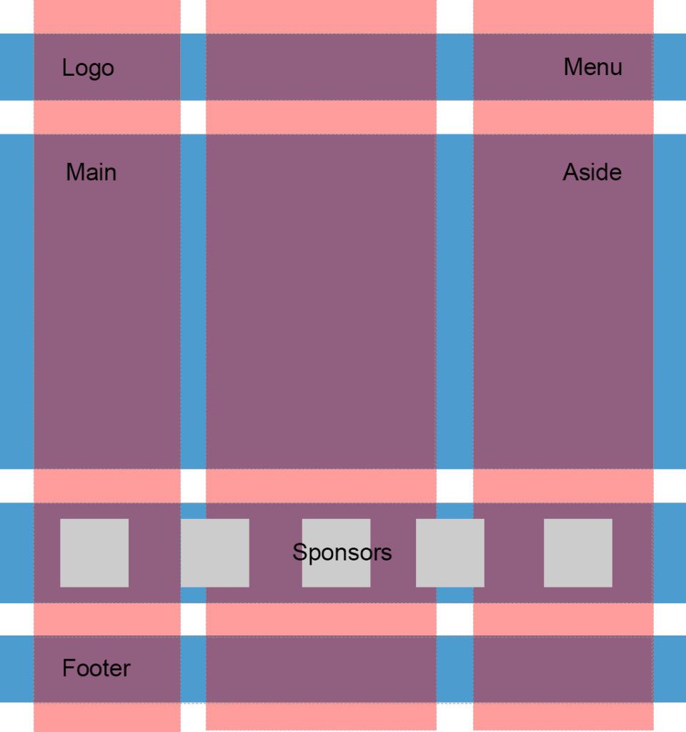
So, I propose having three columns (highlighted in red) and four rows (highlighted in blue). Some areas, like the logo, are going to occupy only one column, whereas others, like main content, are going to span multiple columns. Later we can easily modify the layout, move the areas around, or add new ones.
Following the scheme, give each area a unique name. These will be used in the layout defined below:
.logo {
  grid-area: logo;
}

.main-menu {
  grid-area: menu;
}

.content-area {
  grid-area: content;
}

.sidebar {
  grid-area: sidebar;
}

.sponsors-wrapper {
  grid-area: sponsors;
}

.footer {
  grid-area: footer;
}
Now set the display property to grid, define three columns and add small margins to the left and right of the main container:
.container {
  display: grid;
  margin: 0 2rem;
  grid-template-columns: 2fr 6fr 4fr;
}
display: grid defines a grid container and sets a special formatting context for its children. fr is a special unit that means “fraction of the free space of the grid container”. 2 + 6 + 4 gives us 12, and 6 / 12 = 0.5. It means that the middle column is going to occupy 50% of the free space.
I would also like to add some spacing between the rows and columns:
.container {
  // ...
  grid-gap: 2rem 1rem;
}
Having done this, we can work with individual areas. But before wrapping up this section, let’s quickly add some common styles:
* {
  box-sizing: border-box;
}

html {
  font-size: 16px;
  font-family: Georgia, serif;
}

body {
  background-color: #fbfbfb;
}

h1, h2, h3 {
  margin-top: 0;
}

header h1 {
  margin: 0;
}

main p {
  margin-bottom: 0;
}
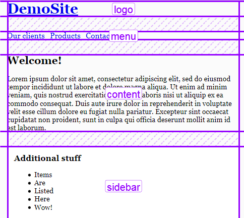
Good! Now we can proceed to the first target, which is going to be the header.
Designing the Header
Our header occupies the first row that should have a specific height set to 3rem. In the initial layout this is solved by assigning the height property for the header wrapper:
.main-header {
  height: 3rem;
}
Also note that the logo and the menu are vertically aligned to the middle, which is achieved using the line-height trick:
.logo {
  // ...
  height: 100%;
  line-height: 3rem;
}
With CSS Grid, however, things are going to be simpler: we won’t require any CSS hacks.
Start by defining the first row:
.container {
  // ...
  grid-template-rows: 3rem;
}
Our logo should occupy only one column, whereas the menu should span two columns. We can express our intent with the help of the grid-template-areas property, which references the grid-area names assigned above:
.container {
  // ...
  grid-template-areas:
    "logo menu menu";
}
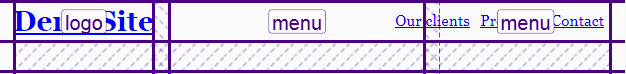
What’s going on here? Well, by saying logo only once, we’re making sure that it occupies only one — the left-most column. menu menu means that the menu occupies two columns: the middle and the right-most one. See how straightforward this rule is!
Now align the logo on the Y axis:
.logo {
  grid-area: logo;
  align-self: center;
}
The menu should be centered vertically and pulled to the right:
.main-menu {
  grid-area: menu;
  align-self: center;
  justify-self: end;
}
Our menu is built with the ul and li tags, so let’s also style them a bit by removing markers, nullifying margins/paddings, and setting the menu to a flex container:
.main-menu ul {
  margin: 0;
  padding: 0;
  display: flex;
}

.main-menu__item {
  list-style-type: none;
  padding: 0;
  font-size: 1.1rem;
  margin-right: 0.5rem;
}

.main-menu .main-menu__item:last-of-type {
  margin-right: 0;
}
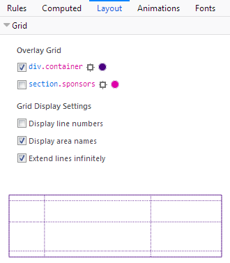
That’s pretty much it. To observe the result, I’m going to use Firefox with a handy CSS Grid highlighter tool enabled. (There are similar tools for other browsers available: for instance, Gridman for Chrome.) To gain access to this tool, press F12 and select the .container element, which should have a grid label:
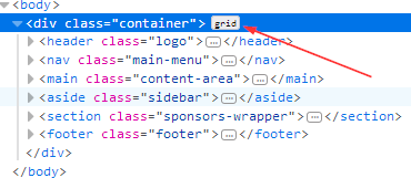
After that, proceed to the CSS rules tab, and find the display: grid property. By pressing on the small icon next to the grid value, you can enable or disable the highlighter:
Here is the result:
The highlighter displays all your rows and columns, as well as the margins between them and the areas’ names. You can customize the output inside the Layout section, which also lists all the grids on the page:
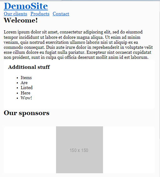
So, we’ve dealt with the header, so let’s proceed to the main content area and the sidebar.
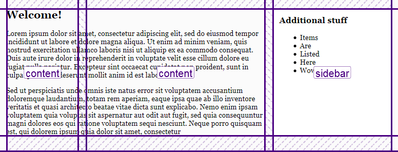
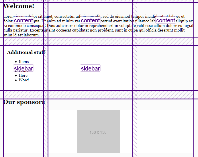
Main Content and Sidebar
Our main content area should span two columns, whereas the sidebar should occupy only one. As for the row, I’d like its height to be set automatically. We can update the .container grid accordingly:
.container {
  //  ...
  grid-template-rows: 3rem auto;
  grid-template-areas:
          "logo menu menu"
          "content content sidebar";
}
I’d like to add some padding for the sidebar to give it some more visual space:
.sidebar {
  grid-area: sidebar;
  padding: 1rem;
}
Here’s the result, as viewed in Firefox’s Grid tool:
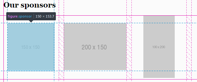
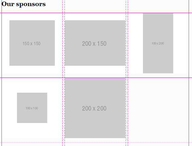
Sponsors
The sponsors section should contain five items with equal widths and heights. Each item, in turn, will have one image.
In the initial layout, this block is styled with display: table, but we won’t rely on it. Actually, the sponsors section may be a great candidate for applying CSS grid as well!
First of all, tweak the grid-template-areas to include the sponsors area:
.container {
  // ...
  grid-template-areas:
          "logo menu menu"
          "content content sidebar"
          "sponsors sponsors sponsors"
}
Now turn the .sponsors section into a grid as well:
.sponsors {
  display: grid;
}
As long as we need five items with equal widths, the repeat() function can be utilized to define the columns:
.sponsors {
  display: grid;
  grid-template-columns: repeat(5, 1fr);
}
As for the row, its height should be set automatically. The gap between the columns should be equal to 1rem:
.sponsors {
  display: grid;
  grid-template-columns: repeat(5, 1fr);
  grid-template-rows: auto;
  grid-column-gap: 1rem;
}
Style each item:
.sponsor {
  margin-left: 0;
  margin-right: 0;
  background-color: #fff;
  border-radius: 0.625rem;
}
Here’s the intermediate result:
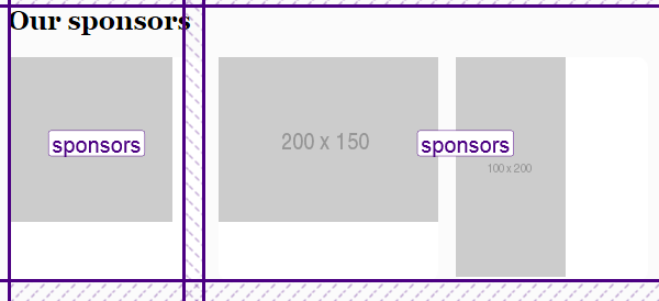
This example illustrates that you can nest grids without any problems. Another solution might be using Flexbox, but in this case the sponsors may wrap if there’s not enough width for them.
Now I would like to center the images both vertically and horizontally. We might try doing the following:
.sponsor {
  place-self: center;
}
place-self aligns the element on the X and Y axes. It’s a shorthand property to align-self and justify-self.
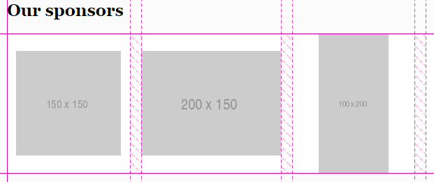
The images will indeed be aligned, but unfortunately the white background is gone. This is because each .sponsor now has width and height equal to the image’s dimensions:
It means that we need a different approach here, and one of the possible solutions is to employ Flexbox:
.sponsor {
  // ...
  display: inline-flex;
  align-items: center;
  justify-content: center;
}
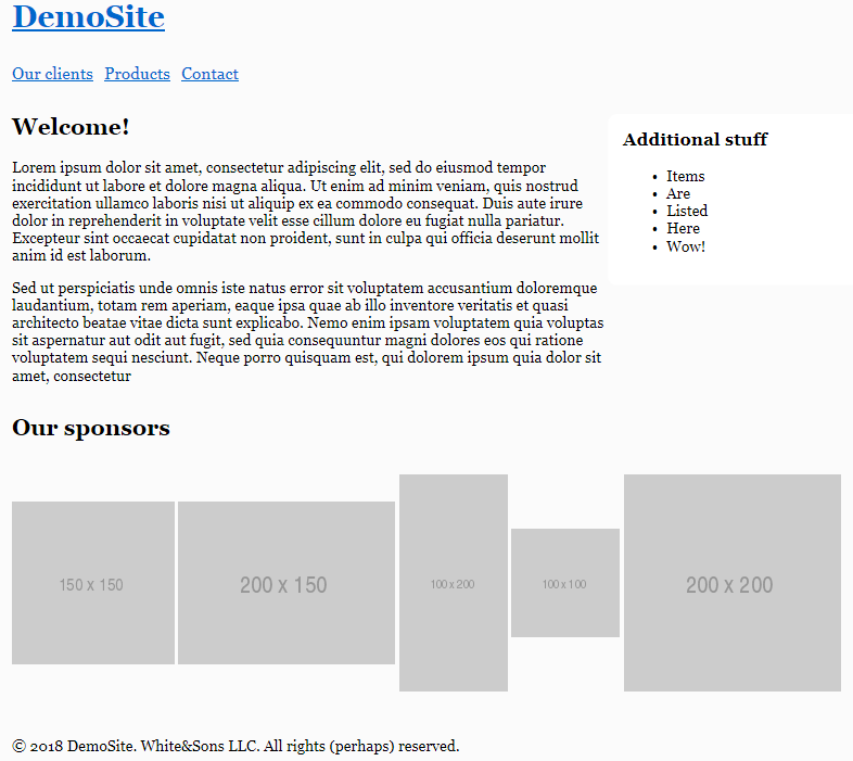
Now everything is displayed properly, and now we know that Grid plays nicely with Flexbox:
Footer
Our last section is the footer, and it’s actually the simplest section. All we have to do is span it to all three columns:
.container {
  // ...
  grid-template-areas:
          "logo menu menu"
          "content content sidebar"
          "sponsors sponsors sponsors"
          "footer footer footer";
}
Basically, the layout is finished! However, we’re not done yet: the site also has to be responsive. So, let’s take care of this task in the next section.
Making the Layout Responsive
Having CSS Grid in place, it’s actually very easy to introduce responsiveness, because we can quickly reposition the areas.
Large Screens
Let’s start with large screens (in this article I’ll be sticking to the same breakpoints as defined in Bootstrap 4). I’d like to decrease the horizontal margin of the main container and the gap between individual sponsors:
@media all and (max-width: 992px) {
  .container {
    margin: 0 1rem;
  }

  .sponsors {
    grid-column-gap: 0.5rem;
  }
}
Medium Screens
On the medium screens, I’d like the main content area and the sidebar to occupy all three columns:
@media all and (max-width: 768px) {
  .container {
    grid-template-areas:
            "logo menu menu"
            "content content content"
            "sidebar sidebar sidebar"
            "sponsors sponsors sponsors"
            "footer footer footer";
  }
}
Let’s also decrease font size and stack the sponsors so they’re displayed one beneath another. The gap between the columns should be zero (because actually there will be only one column). Instead, I’ll set a gap between the rows:
@media all and (max-width: 768px) {
  // ...
  html {
    font-size: 14px;
  }

  .sponsors {
    grid-template-columns: 1fr;
    grid-column-gap: 0;
    grid-row-gap: 1rem;
  }
}
This is how the layout looks on medium screens now:
Small Screens
On small screens, we’re going to display each area on a separate row, which means that there will be only one column now:
@media all and (max-width: 540px) {
  .container {
    grid-template-columns: 1fr;
    grid-template-rows: auto;
    grid-template-areas:
            "logo"
            "menu"
            "content"
            "sidebar"
            "sponsors"
            "footer";
  }
}
The menu should not be pulled to the right in this case, and we also don’t need the gap between the columns:
@media all and (max-width: 540px) {
  .container {
    // ...
    grid-gap: 2rem 0;
  }

  .main-menu {
    justify-self: start;
  }
}
The job is done:
Note that you may even rearrange the grid items easily for various screens. Suppose we’d like to put the menu at the bottom on small screens (so that the visitors don’t have to scroll up after they’ve finished reading material on the page). To do that, simply tweak the grid-template-areas:
@media all and (max-width: 540px) {
  .container {
    // ...
    grid-template-areas:
            "logo"
            "content"
            "sidebar"
            "sponsors"
            "footer"
            "menu";
  }
}
Doing Without Media Queries
It’s worth mentioning that we can make the sponsors block responsive without any media queries at all. This is possible with the help of auto-fit property and minmax function. To see them in action, tweak the styles for the .sponsors like this:
.sponsors {
  // ...
  grid-template-columns: repeat(auto-fill, minmax(200px, 1fr));
}
The repeat function, as you already know, repeats the columns as many times as necessary.
auto-fill means “fill the row with as many columns as possible”. If there’s not enough space for the column, it will be placed to the next line.
minmax allows us to specify the minimum and maximum value for the columns’ widths. In this case, each column should span 1 fraction of free space, but no less than 200 pixels.
All this means that on smaller screens the columns may be shrunk down to at most 200px each. If there’s still not enough space, one or multiple columns will be moved to a separate line. Here’s the result of applying the above CSS rules:
Fallbacks
Unfortunately, CSS Grid is not yet fully supported by all browsers, and you may guess which one is still implementing an older version of the specification. Yeah, it’s Internet Explorer 10 and 11. If you open the demo in those browsers, you’ll see that the grid doesn’t work at all, and the areas are simply stacked:
Of course, this isn’t the end of the world, as the site is still usable, but let’s add at least some fallback rules. The good news is that if the element is floated and also has grid assigned, the grid takes precedence. Also, the display, vertical-align, and some other properties also have no effect on grid items, so let’s take advantage of that fact.
The stacked menu looks nice as is, but the sidebar should probably be placed next to the main content, not below it. We can achieve this by using display: inline-block:
.content-area {
  display: inline-block;
  vertical-align: top;
}

.sidebar {
  display: inline-block;
  vertical-align: top;
}
In all browsers that support grid, these properties will have no effect, but in IE they’ll be applied as expected. One more property we need to tweak is the width:
.content-area {
  width: 69%;
  display: inline-block;
  vertical-align: top;
}

.sidebar {
  width: 30%;
  display: inline-block;
  vertical-align: top;
}
But having added these styles, our grid layout will now look much worse, because the width property isn’t ignored by grid items. This can be fixed with the help of the @supports CSS query. IE doesn’t understand these queries, but it doesn’t need to: we’ll use it to fix the grid!
@supports (display: grid) {
  .content-area, .sidebar  {
    width: auto;
  }
}
Now let’s take care of the sponsor items and add some top margin for each block:
.sponsor {
  vertical-align: middle;
}

.main-menu, .content-area, .sidebar, .sponsors-wrapper, .footer  {
  margin-top: 2rem;
}
We don’t need any top margin when the grid is supported, so nullify it inside the @supports query:
@supports (display: grid) {
  // ...
  .main-menu, .content-area, .sidebar, .sponsors-wrapper, .footer, .sponsor {
    margin-top: 0;
  }
}
Lastly, let’s add some responsiveness for IE. We’ll simply stretch the main content, sidebar, and each sponsor to full width on smaller screens:
@media all and (max-width: 760px) {
  .content-area, .sidebar {
    display: block;
    width: 100%;
  }

  .sponsor {
    width: 100%;
    margin-top: 1rem;
  }
}
Don’t forget to fix the sponsor’s width for the browsers that support grid:
@supports (display: grid) {
  // ..

  .sponsor {
    width: auto;
  }
}
Here’s how the layout looks in Internet Explorer now:
You can view the final result on CodePen:
See the Pen SP: Multi-Column Layout With Grid by SitePoint (@SitePoint) on CodePen.
Conclusion
In this article, we’ve seen CSS Grid in action and utilized it to redesign an existing float-based layout. Comparing these two solutions, we can see that the HTML and CSS code of the “grid” solution is smaller (not counting the fallbacks, of course), simpler, and more expressive. With the help of the grid-template-areas property, it’s easy to understand how individual areas are laid out, and we can quickly reposition them or adjust their sizes. On top of that, we don’t need to rely on various hacky tricks like clearfix.
So, as you see, CSS Grid is a great alternative to floats, and it’s very much production-ready. You may need to provide some fallback rules for Internet Explorer (that implements an older version of the specification), but as you’ve seen, they’re not very complex, and in general the site is still usable even without any backwards compatibility at all.
Have you already tried creating websites with CSS Grid? What are your impressions? Share your thoughts in the comments!
Frequently Asked Questions about CSS Grid Retrofit
What is the significance of CSS Grid Retrofit in web design?
CSS Grid Retrofit is a powerful tool in web design that allows developers to create complex layouts with ease. It is a two-dimensional system, meaning it can handle both columns and rows, unlike flexbox which is largely a one-dimensional system. This makes it a versatile tool for creating responsive designs that adapt to different screen sizes and resolutions. It also simplifies the process of aligning and distributing space among items in a container, even when their size is unknown or dynamic.
How does CSS Grid Retrofit compare to other grid systems?
CSS Grid Retrofit stands out from other grid systems due to its flexibility and ease of use. Unlike other systems that require extensive coding and calculations, CSS Grid Retrofit allows developers to create complex layouts with minimal code. It also offers more control over the placement and alignment of elements, making it a preferred choice for many developers.
Can I use CSS Grid Retrofit for mobile responsive design?
Yes, CSS Grid Retrofit is an excellent tool for creating mobile responsive designs. It allows developers to define different grid layouts for different screen sizes using media queries. This means you can create a complex layout for a desktop view, and a simpler, more streamlined layout for mobile view, all within the same CSS document.
What are the browser compatibility issues with CSS Grid Retrofit?
CSS Grid Retrofit is compatible with most modern browsers, including Chrome, Firefox, Safari, and Edge. However, it may not work as expected in older browsers or versions. It’s always a good practice to test your design in multiple browsers to ensure it works as intended.
How can I start using CSS Grid Retrofit in my projects?
To start using CSS Grid Retrofit, you need to define a container element as a grid with display: grid. Then, you can define the column and row sizes with grid-template-columns and grid-template-rows, and place its child elements into the grid with grid-column and grid-row.
Can I combine CSS Grid Retrofit with other layout methods?
Yes, CSS Grid Retrofit can be combined with other layout methods like Flexbox for more complex designs. This can be particularly useful when you want to create a layout that is partially flexible and partially fixed.
What are the best practices for using CSS Grid Retrofit?
Some best practices for using CSS Grid Retrofit include using named grid areas for easier layout management, using the fr unit for flexible grid tracks, and using Grid Inspector in your browser’s developer tools to visualize and debug your grid layouts.
How does CSS Grid Retrofit handle overlapping elements?
CSS Grid Retrofit allows elements to overlap, which can be a powerful tool for creating unique layouts. You can control the stacking order of overlapping elements with the z-index property.
Can I use CSS Grid Retrofit for vertical layouts?
Yes, CSS Grid Retrofit is a two-dimensional system, meaning it can handle both columns and rows. This makes it a versatile tool for creating both horizontal and vertical layouts.
What are some common challenges when working with CSS Grid Retrofit?
Some common challenges when working with CSS Grid Retrofit include dealing with browser compatibility issues, handling overlapping elements, and managing complex layouts with many grid areas. However, with practice and a good understanding of the grid properties, these challenges can be overcome.
 Ilya Bodrov-Krukowski
Ilya Bodrov is personal IT teacher, a senior engineer working at Campaigner LLC, author and teaching assistant at Sitepoint and lecturer at Moscow Aviations Institute. His primary programming languages are Ruby (with Rails) and JavaScript. He enjoys coding, teaching people and learning new things. Ilya also has some Cisco and Microsoft certificates and was working as a tutor in an educational center for a couple of years. In his free time he tweets, writes posts for his website, participates in OpenSource projects, goes in for sports and plays music.