In this article, we’ll look at five ways to horizontally and vertically center a div using CSS Grid. Of course, these centering techniques can be used on any kind of element. We’ve also covered how to center elements horizontally and vertically using Flexbox and positioning with transforms.
Setting Up
Let’s first create a container with a simple box element inside it that we’ll use to demonstrate these centering methods. Here’s the HTML:
<article>
  <div></div>
</article>
Here’s our starting CSS:
article {
  width: 100%;
  min-height: 100vh;
  background: black;
  display: grid;
}

div {
  width: 200px;
  background: yellow;
  height: 100px;
}

In all our examples, we’ll be using the display: grid property. This establishes the <article> element as a grid container and generates a block-level grid for that container. We’ve made the grid container wide (width: 100%) and tall (min-height: 100vw) so that there’s plenty of room for our div to move around in. (Here’s our demo template on CodePen if you want to experiment with it.)
Now, let’s look at the various ways to center our div.
1. Center a Div with CSS Grid and place-self
The place-self property provides an easy way to center a grid item horizontally and vertically. It’s used to center a grid item in the center of its grid cell (assuming that the grid cell is wider and taller than the grid item, which it is in our example).
Centering our div is as simple as this:
article {
  display: grid;
}

div {
  place-self: center;
}
See the Pen
Centering Using Grid and place-self by SitePoint (@SitePoint)
on CodePen.
The place-self property is a shorthand for the justify-self (horizontal) and align-self (vertical) properties. You can experiment with them in this CodePen demo.
Using place-self is particularly useful for centering individual items within a grid, as it leaves the other grid items free to be positioned differently. But it’s not the only way to center an element with Grid, so let’s now look at some other methods.
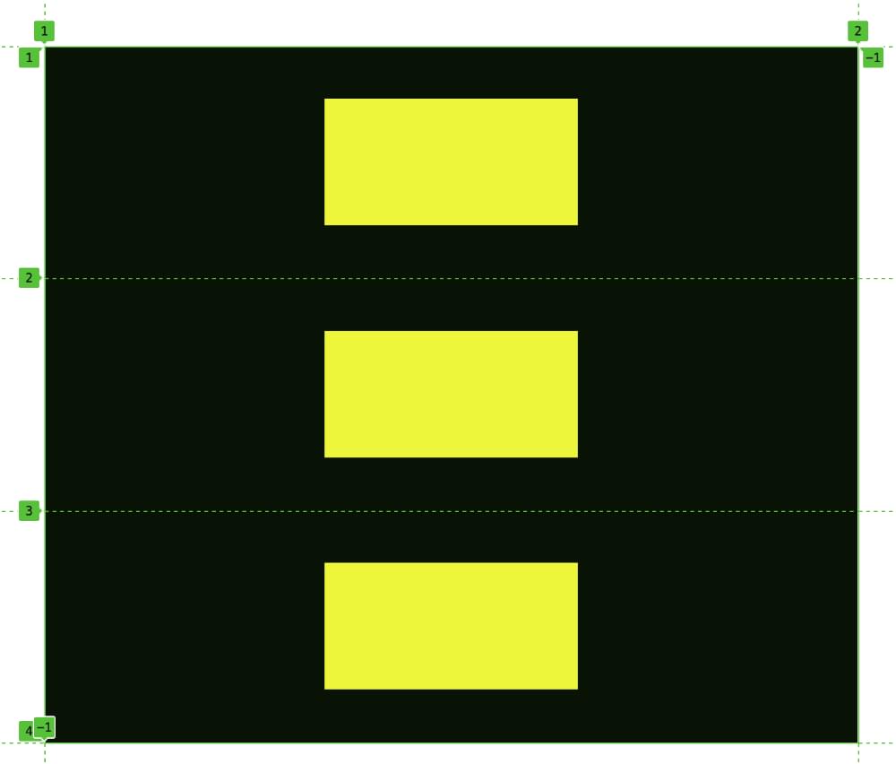
2. Center a Div with CSS Grid and place-items
Let’s now look at what’s involved with using Grid with place-items to center our div.
The place-items property is shorthand for justify-items (horizontal) and align-items (vertical). These properties are applied to the grid container rather than each grid item, and are useful when we want all grid items to have the same placement. (You can experiment with them in this CodePen demo.)
Let’s return to our test CSS and add the following code to the parent container:
article {
  display: grid;
  place-items: center;
}
See the Pen
Center an Element with CSS Grid and place-items by SitePoint (@SitePoint)
on CodePen.
As an experiment, we could add more div elements to the CodePen demo above to see what happens. Each of the divs will be centered horizontally and vertically within its grid cell, as shown in the image below (via the browser’s grid inspector).
3. Center a Div with place-content
The place-content property is shorthand for justify-content (horizontal) and align-content (vertical). While place-self and place-items govern how a grid item is placed within its designated grid cell, place-content specifies how the entire content of a grid container should be aligned (that is, all grid items considered as one group). In our demo, there’s only one grid item (our single, yellow div), so we can also use place-content to center it in its container.
Let’s update our test CSS and add the following code to the parent container:
article {
  display: grid;
  place-content: center;
}
Once again, as shown below, our div is centered in its container.
See the Pen
Center an Element with CSS Grid and place-content by SitePoint (@SitePoint)
on CodePen.
A few things to note here. Firstly, in all our examples so far we’ve used the value of center (for obvious reasons). But each of the properties we’ve explored so far has various other values for placing items. There are quite a few values for place-content (as you can read on on MDN), and two others can also be used for centering our div: space-around and space-evenly. Try swapping out center for these values in the Pen above.
Also, in our simple example of a div being centered in a container, we can even mix and match properties we’ve seen above. We could use justify-content and align-items to center our div, as seen in this demo.
4. Center a Div with CSS Grid and Auto Margins
As always, we’ll target the parent container with display: grid. We’ll also assign the div an automatic margin using margin: auto. This makes the browser automatically calculate the available space surrounding the div and divide it vertically and horizontally within its grid cell, placing the div in the middle:
article {
  display: grid;
}

div {
  margin: auto;
}
See the Pen
Center an Element with CSS Grid and Auto Margins by SitePoint (@SitePoint)
on CodePen.
Using margins to align items is a very simple and powerful trick. Check out this YouTube video to find out lots of other cool things we can do with CSS margins.
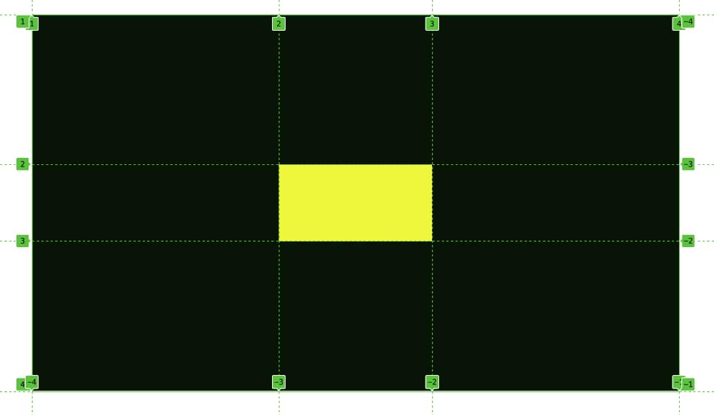
5. Centering a Div with Grid Areas
The final method we’ll cover digs further into the powers of Grid layout, as we’ll look at two ways to center our div inside a grid with multiple rows and columns.
Here’s our essential CSS:
article {
  display: grid;
  grid-template-columns: 1fr 200px 1fr;
  grid-template-rows: 1fr 100px 1fr;
}

div {
  background: yellow;
  grid-column: 2;
  grid-row: 2;
}
Now we’re explicitly laying out a grid, with an area in the middle to house our div. We don’t even have to set dimensions on our div now, as the grid tracks will handle that. We specify a grid cell in the middle of the grid that’s 200px wide and 100px tall, and then we tell our div to start at the second grid line and the second row line. (By default, it will only span to the next grid line in each direction.) Our div is, once again, placed nicely in the center of its container, as shown below.
See the Pen
Center a Div with CSS Grid by SitePoint (@SitePoint)
on CodePen.
The image below shows the div sitting within its grid tracks.
Grid layout offers various different ways to achieve this result. Let’s end by doing the same thing as above, but this time using a named area for our div:
article {
  display: grid;
  grid-template-columns: 1fr 200px 1fr;
  grid-template-rows: 1fr 100px 1fr;
  grid-template-areas: ".  .  ."
                       ". box ."
                       ".  .  .";
}

div {
  background: yellow;
  grid-area: box;
}
Here, we’re setting a grid-area named box and then describing where it should sit on the grid, specifying which grid cells are empty with a simple dot (.).
Below is a live CodePen demo.
See the Pen
Center a Div with CSS Grid by SitePoint (@SitePoint)
on CodePen.
The advantage of this layout method is that it can easily incorporate lots of other elements placed wherever and however we desire. That’s the power of Grid layout.
Conclusion
Each of these methods lets us center a div horizontally and vertically within a container. The place-self and margin: auto options are nice in that they’re applied directly to the element being centered rather than its container. But all of the methods covered in this article are efficient and do the job very nicely. There are all sorts of scenarios in which we might want to center an element, so it’s important to have a range of tools for achieving that goal.
In the demo examples, we’ve just used an empty div, but of course we can add content to the div and the centering will still work. And, once again, these centering techniques work on elements other than divs.
FAQs on How to Center a Div Using CSS Grid
What is the CSS Grid Layout and why is it important?
The CSS Grid Layout is a two-dimensional layout system that has features targeted at web design. It is part of the CSS standard developed by the World Wide Web Consortium (W3C). The CSS Grid Layout allows you to design web pages with a layout in rows and columns, similar to a grid. This makes it easier to design complex web pages. It is important because it provides a more efficient way to design web page layout, reducing the use of hacks and helping to create a more flexible and responsive web design.
How can I center an element using CSS Grid?
To center an element using CSS Grid, you need to apply the CSS properties to the parent container and the child element. For the parent container, you need to set the display property to grid. Then, for the child element, you need to set the margin property to auto. This will center the child element both horizontally and vertically within the parent container.
What are the different ways to align items in CSS Grid?
There are several ways to align items in CSS Grid. The most common ones are using the justify-items, align-items, justify-content, and align-content properties. The justify-items property aligns items along the row axis, while the align-items property aligns items along the column axis. The justify-content and align-content properties align the grid itself along the row and column axis, respectively.
How can I use the justify-self and align-self properties in CSS Grid?
The justify-self and align-self properties in CSS Grid are used to align an item within its cell. The justify-self property aligns an item along the row axis, while the align-self property aligns an item along the column axis. You can set these properties to start, end, center, or stretch.
What is the difference between CSS Grid and Flexbox?
CSS Grid and Flexbox are both layout models in CSS. The main difference between them is that CSS Grid is a two-dimensional system, meaning it can handle both columns and rows, while Flexbox is a one-dimensional system, meaning it can handle either columns or rows, but not both at the same time. This makes CSS Grid more suitable for larger scale layouts, while Flexbox is more suitable for smaller scale layouts.
How can I create a responsive layout with CSS Grid?
To create a responsive layout with CSS Grid, you can use the fr unit, which represents a fraction of the available space in the grid container. You can also use media queries to change the grid layout based on the viewport size.
Can I use CSS Grid with other CSS layout models?
Yes, you can use CSS Grid with other CSS layout models, such as Flexbox or Box Model. This allows you to create complex layouts that are not possible with a single layout model.
How can I create a grid with equal-width columns in CSS Grid?
To create a grid with equal-width columns in CSS Grid, you can use the repeat function in the grid-template-columns property. For example, grid-template-columns: repeat(3, 1fr) will create a grid with three equal-width columns.
What is the box alignment in CSS Grid?
Box alignment in CSS Grid refers to how items are aligned within their grid areas. This can be controlled with the justify-items, align-items, justify-self, and align-self properties.
How can I create a gap between grid items in CSS Grid?
To create a gap between grid items in CSS Grid, you can use the grid-gap property. This property is a shorthand for grid-row-gap and grid-column-gap, which set the size of the gap between rows and columns, respectively.
 Fimber Elemuwa
Fimber is a freelance frontend developer, Unity dev and technical writer who writes about the best programming practices, and likes making hard concepts easier. He's currently studying Microbiology at the University of Port Harcourt.
 Ralph Mason
Ralph is a production manager at SitePoint and a freelance copyeditor, web designer and teacher at Page Affairs.