Quick! You have a big presentation in less than 24 hours that includes a handful of data tables and spreadsheets. It’s good data but it’s not much to look at. You want to present something more dynamic than straight images, but coding a solution from scratch isn’t an option for you.
Luckily for you, there are some online solutions that can yield both attractive and dynamic results with no coding involved.
Today, I will be giving you the rundown on five possible solutions that will help you construct more than just a simple bar graph.
Let’s get started!
Plot.ly
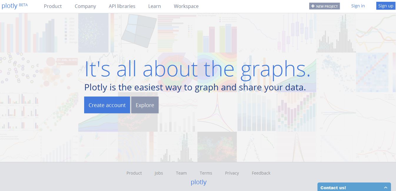
First Impression: Plotly is user-friendly, that’s the first thing I noticed. After creating an account I was able to navigate the site easily in literally five seconds. In the right hand corner next to your account name you can create your first project.
Here you can choose whether you want to build a plot or grid. From there you are guided through importing your data. If you just want to test-drive Plotly, you can check out 12 pre-built data examples. These examples alone give you an idea on what Plotly can do for you, and honestly, it’s impressive stuff.
Creating your graph is just a matter of loading in your information and customizing the traces, layout, axes, notes and legend. The charts and graph types at your disposable are very professional-looking so it is a perfect solution for those business and analytical presentations.
It doesn’t mean that those who are presenting more casual information can’t use it however. There is something for everyone with Plotly even if it’s still in BETA mode.
Features:
- Plotly is free
- You can create up to 50 private files
- You can collaborate on graphs without relying on e-mail
- Interactive charts and variety of data visualizations to choose from
- Charts can be exported to multiple formats including EPS, SVG and PDF
- No installation required
Note: Plotly is still relatively new but they report on their most recent updates via the Plotly Blog as well as showing-off what you can do with the program. If you’re just getting started and want to see what Plotly is all about then check out their Learn page.
Hohli: Online Charts Builder
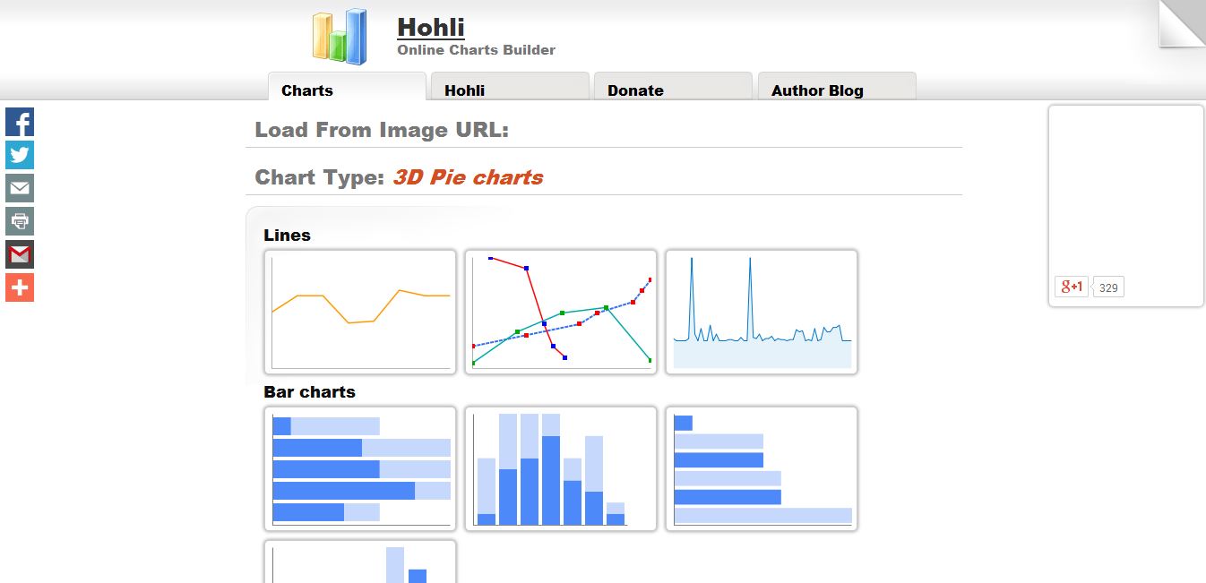
From the get-go your graph type options are clear. Altogether there are six major graph types, while three of those graph types come with variations.
Constructing a new graph is a fairly simple, linear process. This is a nice approach because you’re never overwhelmed with a myriad of options as you begin composing your data.
There is also the ability to customize your chart size and orientation, so if you need a vertical graph instead of a horizontal, you’re in luck. Not to mention there is a preview window off to the right of your screen that allows you to see what you’re making which makes correcting errors a breeze.
Features:
- Hohli: Online Charts Builder is completely free
- No signing up required
- Customizing your charts is as easy as a few clicks, color choices and inputting your data
- You can change your chart type without starting over
- The ability to load from Google Charts
ChartBlocks
Like Plot.ly, ChartBlocks guides you through your first creation. Here you are given three choices: copy/paste or manually input your data, use data that you have already imported into ChartBlocks (only applicable if you have created a chart previously) or upload a spreadsheet from your computer.
From there the process flows smoothly. There are only five chart types to choose from if you are using a free account and, unfortunately, apart from a few templates that offer color variations, there is a limit to your ability to customize your chart type.
Apart from that downside, you have access to a bevy of customizable options to allow your chart to visually match your presentation.
Features:
- ChartBlocks is a freemium model – 5 chart types
- Three methods of adding data are available to you
- Customizable assets for your charts help them stand out
- Download your charts to multiple formats including PS, SVG and PNG
- Your charts can be shared via social networks and even embedded into your sites and presentations
Online Chart Tool
All in all, there are ten chart types to choose from, each with their own unique look. Like the other chart builders ‘OCT’ follows a pleasingly linear workflow when it comes to the data design process. However each graph type comes with a different set of choices and variables.
For example, if you choose an Area Chart you’ll need to decide on the type and style options, while picking the Meter Chart only requires you to determine your style. From this point, you can add your data either manually or by uploading a CSV file.
As if you weren’t given enough customizable options with choosing your chart’s style assets, you can also decide how your labels and fonts will appear on the finished product. When you think you’re ready, you can preview your chart, finish tweaking whatever you like, and then share or download it.
Features:
- Online Chart Tool is a free online program
- No registering is required, but you can create an account
- A variety of charts and customizing options are available for you
- There are 17 types of fonts for you to choose from when it’s time to create your labels
- You can save your chart data online whether to share it or come back to it later
- There are four downloadable options for you to choose from including PDF and CSV
- The site offers six language options which it makes it a bit more accessible to non English speakers
RAW
First Impression: RAW is unlike any other free online graph program I have ever seen. If you like the professionalism and variety of graphs that Plotly provides, then you are likely going to like the charts that RAW offers.
Instead of the standard bar/pie graph selections, you get a choice of 16 charts to choose from. Not to mention there is the ability to design your own chart if you so choose.
RAW is very easy to use, and there is not even any need for a ‘next’ button to click on when you want to proceed. You don’t even need to register with the service to use it.
On the downside, RAW doesn’t currently offer the ability to upload a spreadsheet — but you can fairly easily copy and paste your data in. From there, you get to pick your chart type. A lot of them you may not have heard of many of the chart type, but luckily a summary appears on the left explain each type.
You can “map out your layout” or, in other words, plan where your information will go. This is done in a loose, drag-n-drop style that is quite different to the other apps I played with. Moving and arranging your data results in real-time changes of your graph, so you can methodically test what works best.
Once you’re done with this mapping stage, you are literally done, as there is no customization option when it comes to color and type.
Features:
- RAW is free for anyone to use
- There is no registration required
- Easy chart creation
- Drag and drop mapping tool that allows you to change your information around without accidentally deleting your data
- 16 professional charts to choose from
- Three downloadable options along with a generated embed code
- Your data remains safe thanks to no server-side operations
Note: RAW can be freely downloaded and modified as it is an open and customizable project. For more information check out their FAQ or get Forked on GitHub.
Bottom Line
All of the programs mentioned are great tools for anyone looking to construct and display charts without coding. From engaging, colorful charts to more clean and professional designs there is something for everyone to choose from.
If you’re looking to WOW with your presentation I definitely recommend Plotly and RAW. For free programs these two yield some impressive results. Having said that, each of Hohli, ChartBlocks and Online Chart Tool offer unique features and are perfect contenders for anyone looking to visualize data.
Frequently Asked Questions (FAQs) about Creating Great Online Charts
What are the key elements to consider when creating an online chart?
When creating an online chart, it’s crucial to consider the type of data you’re presenting, the audience, and the message you want to convey. The chart type should be appropriate for the data. For instance, bar charts are ideal for comparing quantities, while pie charts are best for showing proportions. The chart should be easy to understand, with clear labels, a legend if necessary, and a title that succinctly describes what the chart represents. The color scheme should be visually appealing and should differentiate the data points or categories effectively.
How can I make my online chart interactive?
Interactive charts engage the audience and allow them to explore the data at their own pace. You can make your chart interactive by using online tools like Chartle or Visual Paradigm. These tools offer features like tooltips, zooming, panning, and drill-down, which allow users to interact with the chart. You can also add interactive elements like buttons or sliders that allow users to change the chart’s parameters.
Can I customize the design of my online chart?
Yes, most online chart creation tools offer a range of customization options. You can usually change the colors, fonts, and sizes of the chart elements. Some tools, like Canva, also offer a variety of templates that you can use as a starting point for your design. Remember, the design should enhance the readability and comprehension of the chart, not detract from it.
How can I share my online chart?
Once you’ve created your chart, you can usually share it by embedding it on a webpage, sharing a link, or exporting it as an image or PDF. Some tools, like Visme, also offer options for sharing the chart on social media or via email.
Can I use online charts for real-time data?
Yes, some online chart tools support real-time data. This means the chart will automatically update as new data comes in. This is particularly useful for displaying dynamic data, like stock prices or weather data. LiveGap Charts is one tool that offers this feature.
Are there any free online chart tools?
Yes, many online chart tools offer free versions. These may have limitations on the number of charts you can create or the features you can use. Some free tools include Chartle, Canva, and Visual Paradigm.
Can I use online charts in a presentation?
Absolutely. Online charts can be a powerful tool in presentations, helping to visualize complex data and make your points more memorable. You can usually export your chart as an image or PDF and insert it into your presentation software.
How can I ensure my online chart is accessible?
To make your chart accessible, ensure it has clear labels and a legend if necessary. Use contrasting colors to differentiate data points or categories. Also, provide a text description of the chart for those who use screen readers.
Can I create an online chart without coding skills?
Yes, many online chart tools are designed for non-technical users. They offer intuitive interfaces and drag-and-drop functionality, so you can create a chart without writing a single line of code.
How can I use online charts for data analysis?
Online charts can help you spot trends, patterns, and outliers in your data. Some tools offer advanced features like trend lines, regression lines, and statistical analysis. Remember to interpret your charts in the context of your data and your research question.
 Gabrielle Gosha
Gabrielle is a creative type who specializes in graphic design, animation and photography.