
The following is a short extract from our book, Researching UX: Analytics, written by Luke Hay. It’s the ultimate guide to using analytics for improved user experience. SitePoint Premium members get access with their membership, or you can buy a copy in stores worldwide.
When you first start analyzing data, it’s easy to make mistakes, particularly if you’re new to analytics. Don’t let that put you off, though! This section lists some of the main pitfalls, and how they’re best avoided—to ensure your analysis paints a true picture of user behavior.
Confusing Visits and Views
Different analytics tools will use different terminology to describe the same thing. For rookie analysts, this can cause confusion, and can mean that the wrong data is reported. Even within the same tool, terminology can be confusing. One of the most common mistakes people make is to confuse visits and views.
A visit (now known as a session in Google Analytics) generally describes a group of interactions one user takes within a given time frame on your website. A view (or “pageview” in some tools) describes a view of a page on your site that is tracked by the analytics tracking code.
These are two entirely different things, but visits and views are sometimes used interchangeably when people talk about their analytics. As you can imagine, this can cause problems for analysts, as reports will become inaccurate. Make sure you understand the terminology, so that you know what you’re reporting on. (See the Google Analytics glossary at the end of this book if you’re unsure.)
Obsessing over Visits and Views
When it comes to analyzing your data, you need to make sure you’re analyzing the most important areas. A very common mistake people make is to focus purely on visits and views. Because you’re a UXer, I know I don’t need to convince you that there’s more to a website than just a lot of people visiting it! You may still find yourself under pressure, though, to increase page views or even visits. Leave this side of things to marketers, and focus your efforts on the numbers that relate to user experience.
Getting Drawn into the Numbers
Quantitative data is all about numbers. If your account is set up correctly, the numbers don’t lie! Despite this, you need to make sure you don’t forget what the numbers actually represent: real users.
As stated previously, the numbers will tell you what happened, not why, and this is why it’s important not to forget to ask why. You’ll need to look beyond the numbers and consider their context. Make sure you don’t fall into the trap of just reporting what has happened: be sure to consider the bigger picture and think about what the numbers mean for the user experience of your website.
This is where you’ll need to bring in the qualitative methods we touched on previously. You can often use analytics to find a problem, and user research methods to solve it.
Thinking Low Numbers Are Always Bad
One side effect of getting drawn into the numbers is that you automatically consider low numbers, or a drop in numbers, to be bad. While a drop in purchases is likely to be a bad thing, a reduction in the time users spend on particular pages, for example, could be good or bad.
If you’ve redesigned the home page on a website and the time people are spending on it drops, this could be due to the improved efficiency of your design. It may be that people are able to navigate more quickly to areas of interest to them. Once again, context is key here. Work out what any drops actually mean for the website as a whole, rather than assuming they’re always going to be negative.
Confusing Correlation with Causation
Just because something happens to your analytics at the same time as you make a change to the website doesn’t mean the two are connected. If you notice changes to your analytics after making a change, you need to be sure it’s not a coincidence and that the two are connected.
You’re likely to have to delve a little deeper into your reports to prove that the rise in conversion rate was due to your great new design. This is covered in more detail in Chapter 6, but it’s something you should be aware of before you take credit (or blame!) for any sizable shifts in your reporting data.
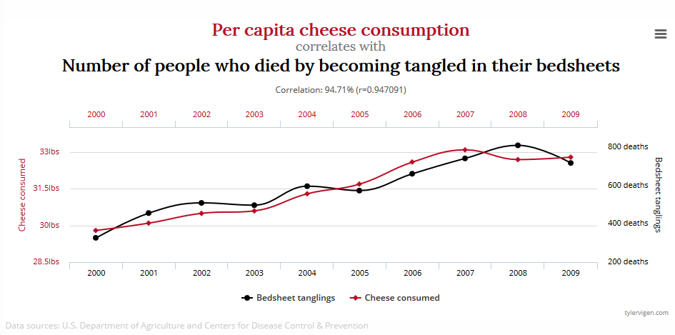
The graph below, taken from tylervigen.com, shows a correlation of close to 95% for cheese consumption and number of people who died by becoming tangled in their bed sheets:
There’s also a strong correlation between ice cream sales and drownings at sea, as both go up in the summer. Only an analyst severely lacking common sense would say that ice cream causes drowning, though!
The correlation versus causation issue is probably the most prolific mistake I see people make when analyzing data. When it comes to website analytics, one example of this might be where data shows that people who use site search covert 50% more than those who don’t. This could convince UXers to encourage more people to use the site search. However, the more likely correlation is that people who use the site search are a more engaged audience than the average users, and also have a better idea of what they’re looking for—meaning that they naturally have higher conversion rates.
Combining quant and qual (and sometimes your own common sense) will help ensure you don’t fall into the trap of confusing correlation and causation. Split testing is also a great way to determine true causation, and will help to protect against drawing incorrect conclusions from your data. We’ll cover split testing more in Chapter 6.
Grouping All Visits Together
As UXers, we know that different people use websites in different ways. We also know that the same person is likely to use a website differently when using different devices, or even using the same website at different times of the day. We need to include these considerations of user behavior in our quantitative analysis.
If a website has a conversion rate of 5%, this tells us one story. If we break that figure down, though, and see that the conversion rate is 10% for desktop users and only 1% for mobile users, that tells a different story, and gives a good indication of where we should focus our UX efforts!
Segmenting users is key to understanding how a website is performing. We’ll cover segmentation in more detail later in Chapter 3.
Analyzing Too Broadly
With a wealth of data available, knowing where to start analyzing it all can be difficult. When starting a new project, you might want to have a quick, top-level assessment of the available data. But useful insight comes from digging deeper.
Looking at “headline” figures may give an overall indication of a website’s current performance, but it’s unlikely to give the information we need to improve the UX. Where possible, it’s best to approach your analytics with a goal in mind. This will help focus your efforts, and should help you avoid feeling overwhelmed by the sheer amount of data available. The chapters of this book relate to current UX goals, and are designed to help you approach data analysis in the right way.
The number of visits (or “sessions”) a website receives is often a figure that people focus in on. This metric tells us little about a website’s performance, though, as the purpose of most websites is to do more than just act as a destination for users. It’s far more important to know how users are engaging with individual pages, and how many of those pages are converting. I’d much rather have a website with 1,000 visitors a month and a conversion rate of 10% than a website with 5,000 visitors a month and a conversion rate of 1%, wouldn’t you?
Focusing on Numbers Rather than Trends
It can be tempting to look at numbers and make a judgement about whether they’re “good” or “bad”. One question I often get asked during my training sessions is “What’s a good average visit duration?” There isn’t a simple answer to this question. It will depend on your website and what you’re trying to achieve. What’s seen as good for one website might be seen as terrible for another.
It’s important to look at whether your key metrics are increasing or decreasing over time. You might also want to set targets to give yourself something to aim for. Just looking at recent figures in isolation tells you very little. In short, don’t worry so much about the numbers; worry more about whether they’re going up or down, and how that relates to the UX goals you’ve set.
Remember, though: it’s all about context. Big increases or drops in metrics, or particularly high or low metrics, need to be considered in relation to what’s happening elsewhere on the website or app. For example, if product-page views dropped by 2% over three months, you may not think much of it, but if all other pages had an increase in views of 30% over the same period, suddenly this 2% drop looks like something worth investigating.
Including Bot or Spam Traffic
Certain types of traffic can skew your analytics data if you’re not careful. You only want to record visits from real users, and not artificial “bot” traffic.
Search engines use bots to crawl websites and index the web so they can return relevant search results to users. Bots used by all the major search engines don’t show up in most analytics tools, and you wouldn’t want to block these bots from crawling your website. You do, however, want to block bots that artificially inflate your analytics numbers.
The amount of bots that execute JavaScript is steadily increasing. Bots now frequently view more than just one page on your website, and some of them even convert on your analytics goals. As bots become smarter, you also need to become smarter, to ensure this traffic doesn’t cloud your judgement when you make important business decisions based on the data in your analytics platform.
The Fresh Egg blog provides a useful guide on how to spot, and block, spam traffic from your analytics tool in its article “How to Deal With Bot Traffic in Your Google Analytics”.
Not Customizing Your Setup
Standard reports in some analytics tools can be really detailed and will provide you with a lot of useful information. But, as mentioned earlier, the standard reporting setup will only get you so far. Each website works differently, so don’t take a one-size-fits-all approach to your analytics. Instead, customize your setup to make sure you get the data you need.
Not Generating Actionable Takeaways
You can get a lot of information from your analytics package, and you can present this as important-looking reports and really impress people. What’s more important, however, is coming away from your analysis with actionable next steps based on the data.
Spotting trends and uncovering potential problems is only doing half the job! If you notice that tablet users are viewing considerably fewer pages than their desktop counterparts, what does this mean? What are you proposing to do about it? While you won’t get an answer about how to fix a problem from your analytics, you should be able to propose your next step. Perhaps the fact that tablet users are seemingly less engaged than desktop users will lead you to do some usability testing on tablets? Or maybe you think you should do additional user research to find out the context in which your tablet users are visiting your website? Whatever you decide, it’s important that you do decide to do something. Analyzing the numbers is just the start; make sure you follow that up with action!
Your analytics data can also help you prioritize those next steps, as it can help quantify the volume of lost visitors, or sales, or something else, caused by each issue you’ve spotted.
Frequently Asked Questions (FAQs) on Common Analytics Pitfalls
What are some common mistakes made when interpreting analytics data?
One of the most common mistakes made when interpreting analytics data is not understanding the context of the data. This can lead to incorrect conclusions and misguided decisions. For instance, a sudden spike in website traffic may not necessarily mean an increase in engagement or conversions. It could be due to a bot attack or a temporary surge in interest due to a viral post. Therefore, it’s crucial to understand the context and the source of your data before drawing conclusions.
How can I avoid the pitfall of data overload?
Data overload can be overwhelming and can lead to analysis paralysis. To avoid this, it’s important to focus on key performance indicators (KPIs) that align with your business goals. Instead of trying to analyze every piece of data, prioritize what’s most relevant to your objectives. Use data visualization tools to simplify complex data sets and make them easier to understand.
What is the pitfall of over-reliance on historical data?
While historical data is important for understanding trends and patterns, over-reliance on it can be a pitfall. The business environment is dynamic and constantly changing. Therefore, what worked in the past may not necessarily work in the future. It’s important to combine historical data with real-time data and predictive analytics for a more comprehensive analysis.
How can I avoid the pitfall of not considering data quality?
Data quality is crucial for accurate analysis. Ensure your data is clean, accurate, and reliable. Implement data validation checks and data cleaning processes. Also, be cautious of any outliers or anomalies in your data as they can skew your analysis.
What is the pitfall of not aligning data with business goals?
Not aligning data with business goals can lead to irrelevant analysis. Your data analysis should be guided by your business objectives. Identify the key metrics that directly impact your business goals and focus your analysis on these.
How can I avoid the pitfall of not using the right analytics tools?
Using the right analytics tools is crucial for effective data analysis. Understand your business needs and choose a tool that can meet these needs. The right tool should be able to collect, analyze, and visualize data in a way that’s useful for your business.
What is the pitfall of not integrating data sources?
Not integrating data sources can lead to a fragmented view of your business. It’s important to integrate all your data sources for a holistic view. This can help you uncover insights that you may miss when analyzing data sources in isolation.
How can I avoid the pitfall of not having a data-driven culture?
To avoid this pitfall, foster a data-driven culture within your organization. Encourage employees to use data in their decision-making processes. Provide training and resources to help them understand and use data effectively.
What is the pitfall of not updating data regularly?
Not updating data regularly can lead to outdated analysis. Ensure your data is updated regularly for accurate and timely analysis. Use automated data collection and updating tools to streamline this process.
How can I avoid the pitfall of not considering data privacy and security?
Data privacy and security should be a top priority. Ensure your data collection and storage practices comply with relevant laws and regulations. Implement robust security measures to protect your data from breaches and unauthorized access.
 Luke Hay
Luke Hay is a UK-based UX Consultant who’s been working with websites since the 1990s. He prides himself on taking a user-centric, analytical approach to design, development and optimization of websites and apps. Luke currently splits his time between working as the Senior User Researcher at digital transformation agency Clearleft, and as a freelance UX and analytics consultant and trainer. Always involved in his local digital community, Luke has helped organize and curate events for UX Brighton, and is one of the organizers of UX Camp Brighton.