Dear Floppy Disk,
I’m not sure if you’ve noticed, but some people want you gone. Some still love you and the others, well you haven’t caused a problem yet so you’re still welcomed to stop by every now and again.
To be honest I don’t know what’s going to happen to you a few years from now. I don’t think anyone does, but if this is one of the last few times we get to talk, I just want to say thank you for saving me time and time again.
Always Grateful,
A. User

The above letter may sound a little dramatic but for a number of few years now the floppy disk icon has come under fire for being used to encapsulate the idea of ‘saving a file’.
It has been a discussion point for so many years that we are addressing it once more with the hopes that our readers might provide some insight and even suggestions to this issue.
While I’m not campaigning to save the floppy disk, I’m certainly not grabbing the nearest pitchfork and torch to march on it either.
The Floppy Disk Assumption
The core assumption seems to be that those who are born in the 21st century have no tangible experience with floppy disks, and therefore won’t be able to interpret any meaning from an icon employing them.
While this does make some sense — we know iTunes moved away from using the CD icon for similar reasons — I’m not so quick to assume that those born after the 90’s aren’t smart enough to realize that the floppy disk means ‘save file’.
The Iconography of the Floppy
The icon itself is usually a simple blue 3.5 floppy design. For the majority of people who see the icon they readily know that it’s the symbol to “save” or “save as”.
Whether you like it or not, it’s useful to remember that the floppy disk icon is iconic, and icons — regardless of logic — can often persist for a long time after their initial meaning has receded.
But let’s be clear on something: I’m not suggesting that because the floppy disk is iconic that it can’t be changed. Things change. That’s inevitable but before you go around changing things we have to look at things on larger scale than just the generation issue.

Currently there doesn’t seem to be any self-evident solution to the floppy disk dilemma. Some have tried novel solutions but, so far, none appear to have been significantly clearer in meaning.
Let’s Play Devil’s Advocate
By now you’re probably asking yourself: “What’s the use of an icon if it needs to be explained?”. Surely the purpose of an icon is to encode the meaning into the graphic?
The answer is, yes, ideally that’s a goal, but this isn’t always possible.
Question: What does this mean?
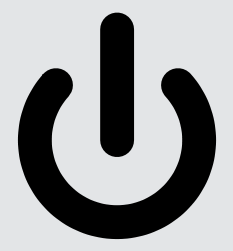
If you’re reading this article on a laptop, computer monitor or phone you may barely need to move your eyes to see this icon. Xboxes. DVRs. It’s ubiquitous in technology.
We all understand exactly what it means, but how?
It’s hard to draw its meaning entirely from the symbology: a circle broken at its top by a line. In fact, you could argue that a completed circle *should* mean ‘on’ — as in, completing the circuit — and that a broken circle should mean ‘off’ — or breaking the circuit.
But it doesn’t. We all know it that it means ‘on’, because it’s a symbol we’ve all learned and collectively agreed upon its meaning.
Perhaps it works the same with those born after the 90s when it comes to the floppy disk.
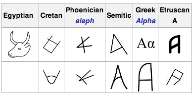
Let’s dive a little deeper and talk about the alphabet.
Every modern-day letter started in a different form to the shape we’re accustomed to. The letter ‘A’ is a perfect example here.
History tells us that the first letter of the Phoenician alphabet was ‘aleph’. Aleph is one of the earliest known ancestors to our letter ‘A’, and is believed to be based on a Phoenician pictogram of an ox head.
Presumably there was a time when knowledge of ‘phoenician oxen’ was helpful in interpreting aleph, but that hasn’t made ‘A’ any less useful today.
Will the Floppy Disk Icon Outlive the Concept of ‘Save File’?
Perhaps there’s an argument to be made that the era of the ‘Save file’ icon is closing. You won’t find a floppy disk icon in your Gmail UI, because Google has done away with the idea of manual saving of files.
In the age of Git, source control, and automatic backups, you could argue that the the idea of manually saving discrete, standalone files is ebbing away.
Maybe your grandkids will ask you “Did you really have to save your own files in the olden days, gramps?”
The Challenge #1
So is it time to say goodbye the floppy disk icon?
It’s time for you the reader to step up to this design challenge. We are interested in how you would graphically tackle this issue. Show us your best design or even a couple that could work as a substitute for the floppy drive icon.
Your design could be a rehash/simplification of the floppy disk or something completely new altogether. Surprise us. We’re interested in seeing what you’re going to do.
Also let us know whether you love, hate or are indifferent with the floppy disk staying current.
Frequently Asked Questions (FAQs) about the Save Icon Redesign Challenge
Why is the save icon usually represented by a floppy disk?
The save icon is typically represented by a floppy disk because it was the primary medium for data storage when graphical user interfaces were first developed. It became a universally recognized symbol for saving data. Despite the obsolescence of floppy disks, the icon has remained due to its widespread recognition and understanding.
What are the challenges in redesigning the save icon?
Redesigning the save icon presents several challenges. The new design must be universally recognizable, simple, and intuitive. It should also consider cultural differences and accessibility. Moreover, it must overcome the ingrained association of the floppy disk image with the save function.
What are some proposed alternatives to the floppy disk save icon?
Some proposed alternatives include a downward arrow pointing into a tray, a hard drive, or a cloud symbol. However, these alternatives also have their limitations. For instance, the cloud symbol is often associated with online storage rather than saving to a local drive.
Why is it important to consider cultural differences when redesigning the save icon?
Cultural differences can influence how symbols are interpreted. For example, while a downward arrow might signify downloading or saving in some cultures, it could mean discarding or deleting in others. Therefore, it’s crucial to consider these differences to ensure the new icon is universally understood.
How does accessibility factor into the redesign of the save icon?
Accessibility is a crucial factor in icon redesign. The new icon should be easily distinguishable and understandable for people with visual impairments or cognitive disabilities. This might involve considering color contrast, size, and simplicity of design.
Why hasn’t the save icon been updated despite the obsolescence of floppy disks?
The save icon hasn’t been updated mainly due to its widespread recognition. Changing such a universally understood symbol could lead to confusion and usability issues. However, as technology evolves and newer generations become less familiar with floppy disks, the need for an update becomes more apparent.
What is the significance of simplicity in icon design?
Simplicity is key in icon design as it ensures the icon is easily recognizable and understandable. A complex design might confuse users or take longer to interpret, disrupting the user experience.
How can user testing help in the redesign of the save icon?
User testing can provide valuable insights into how the new design is perceived and understood by different user groups. It can help identify potential issues and improvements, ensuring the final design is intuitive and user-friendly.
What are some considerations when transitioning from the old save icon to a new design?
When transitioning to a new design, it’s important to consider user education and gradual implementation. Users need to be informed about the change and its significance. A sudden change without proper communication could lead to confusion and mistakes.
How can the new save icon design maintain the legacy of the floppy disk symbol?
The new design can maintain the legacy of the floppy disk symbol by incorporating elements that signify saving or storage. This could be a downward arrow, a box, or a tray. The key is to balance familiarity with innovation to create a design that is both fresh and recognizable.
 Gabrielle Gosha
Gabrielle is a creative type who specializes in graphic design, animation and photography.