The poster for “The Dark Knight” has a more sinister tone with the red type appearing like blood.
 Red is certainly popular in logo design, undoubtedly because of it’s ability to attract attention. Here’s a number of logos you may be familiar with, resplendent in red.


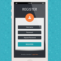
 When using red in web design, some designers choose to go really bold and use red as the main color. This takes guts as it can be quite overwhelming and stop people in their tracks. Here’s a few “in your face” red designs.
Too Much Tweet
When using red in web design, some designers choose to go really bold and use red as the main color. This takes guts as it can be quite overwhelming and stop people in their tracks. Here’s a few “in your face” red designs.
Too Much Tweet
 Jon Wallace
 Godmother
 Youth Against Sudoko
 Tuesday
 Other web designs use just a hint or touch of red to lift the overall color scheme are:
Pama Liqueur
Other web designs use just a hint or touch of red to lift the overall color scheme are:
Pama Liqueur
 Upload Pie
 http://www.glazbenaskolakrizevci.hr/
 Levilive
 Red Associations: Love, Cupid, Anger, Hell, Devil, Emotion, Stop, High Energy, Passion, Blood, Danger.
What does red mean to you? Do you use red much in your design work? What do you think of the designs featured here?
Red Associations: Love, Cupid, Anger, Hell, Devil, Emotion, Stop, High Energy, Passion, Blood, Danger.
What does red mean to you? Do you use red much in your design work? What do you think of the designs featured here?
Frequently Asked Questions about the Color Red
What emotions does the color red evoke?
The color red is often associated with intense emotions such as love, passion, and anger. It can also symbolize power, danger, or excitement. The color red can evoke a physical response, increasing heart rate or raising blood pressure. It’s a color that demands attention and can be used to highlight important elements.
How does the color red influence design?
Red is a powerful tool in design, often used to draw attention, evoke emotions, or make a bold statement. It can be used to highlight important elements, create a sense of urgency, or stimulate appetite. However, it’s important to use red sparingly as it can be overwhelming if overused.
What does a red color scheme say about a brand?
A red color scheme can convey a brand’s passion, energy, and determination. It can also suggest that the brand is bold, dynamic, and confident. Brands that use red are often seen as powerful and exciting.
How does the color red affect purchasing decisions?
Red can stimulate a sense of urgency and excitement, making it a popular choice for sales and clearance signs. It can also stimulate appetite, making it a popular choice for food and beverage brands. However, it’s important to note that the impact of color on purchasing decisions can vary depending on cultural and personal associations.
What are some cultural associations with the color red?
Cultural associations with the color red can vary widely. In Western cultures, red is often associated with love, passion, and danger. In Eastern cultures, red is often associated with luck, prosperity, and celebration. It’s important to consider these cultural associations when using red in design.
How can I use the color red effectively in my designs?
To use red effectively in your designs, consider its emotional and physical impact. Use it to draw attention to important elements, evoke emotions, or make a bold statement. However, be careful not to overuse red as it can be overwhelming.
What are some popular shades of red and their meanings?
Popular shades of red include crimson, scarlet, and burgundy. Crimson is often associated with love and passion, scarlet with courage and excitement, and burgundy with sophistication and wealth.
How does the color red interact with other colors?
Red is a dominant color that can overpower other colors if not balanced properly. It can create high contrast when paired with cool colors like blue or green, or create a warm, energetic palette when paired with other warm colors like orange and yellow.
What are some common misconceptions about the color red?
Some common misconceptions about the color red include the belief that it always signifies danger or that it’s an aggressive color. While red can symbolize these things, it can also symbolize love, passion, and excitement.
How can I incorporate the color red into my personal style?
Incorporating red into your personal style can make a bold statement. Consider adding red accessories for a pop of color, or wearing red clothing to stand out in a crowd. However, remember that red is a powerful color, so it’s best used sparingly.
 Jennifer Farley
Jennifer Farley is a designer, illustrator and design instructor based in Ireland. She writes about design and illustration on her blog at Laughing Lion Design.