How to Create a CSS Typewriter Effect for Your Website


Key Takeaways
- The CSS typewriter effect involves gradually revealing text, making your website’s content dynamic and engaging, and can be used in landing pages, personal websites, and code demonstrations.
- The typewriter effect can be created by changing the width of a text element from 0 to 100% using the CSS steps() function, and by animating a cursor that ‘types out’ the text.
- Adjustments can be made to the typing effect to cater to longer or shorter pieces of text by increasing or decreasing the steps and duration of the typing animation.
- The typewriter effect can be combined with a blinking cursor animation to further enhance the effect, and the cursor can be customized by adjusting its border-right property, color, frequency of blinking, and more.
In this article, you’ll learn how to make your website’s text dynamic and more engaging using typewriter effects in pure CSS.
The typewriter effect involves text being revealed gradually, as if it’s being typed before your eyes.
Adding typewriter effects to chunks of your text can help engage your website’s visitors and keep them interested in reading further. The typewriter effect can be used for many purposes, such as making engaging landing pages, call-to-action elements, personal websites, and code demonstrations
The Typewriter Effect Is Easy to Create
The typewriter effect is easy to make, and all you’ll need in order to make sense of this tutorial is a basic knowledge of CSS and CSS animations.
Here’s the way the typewriter effect is going to work:
- The typewriter animation is going to reveal our text element by changing its width from 0 to 100%, step by step, using the CSS
steps()function. - A blink animation is going to animate the cursor that “types out” the text.
Creating the Web Page for Our Typing Effect
Let’s first create the web page for our typewriter demo. It will include a <div> container for our typewriter text with a class of typed-out:
<!doctype html>
<html>
  <head>
    <title>Typewriter effect</title>
    <style>
      body{
        background: navajowhite;
        background-size: cover;
        font-family: 'Trebuchet MS', sans-serif;
      }
  </style>
  </head>
  <body>
    <div class="container">
      <div class="typed-out">Web Developer</div>
    </div>
  </body>
</html>
Styling the Container for the Typewriter Text
Now that we have the layout of the web page, let’s style the <div> with the “typed-out” class:
.typed-out {
  overflow: hidden;
  border-right: .15em solid orange;
  font-size: 1.6rem;
  width: 0;
}
Note that, in order for the typewriter effect to work, we’ve added the following:
"overflow: hidden;"and a"width: 0;", to make sure the text content isn’t revealed until the typing effect has started."border-right: .15em solid orange;", to create the typewriter cursor.
Before making the typing effect, in order to stop the cursor at the last letter of the typed-out element once it has been fully typed out, the way a typewriter (or really a word processor) would, we’ll create a container for the typed-out element and add display: inline-block;:
.container {
  display: inline-block;
}
Making the Reveal-text Animation
The typewriter animation is going to create the effect of the text inside the typed-out element being typed out, letter by letter. We’ll use the @keyframes CSS animation rule:
@keyframes typing {
  from { width: 0 }
  to { width: 100% }
}
As you can see, all this animation does is change an element’s width from 0 to 100%.
Now, we’ll include this animation in our typed-out class and set its animation direction to forwards to make sure the text element won’t go back to width: 0 after the animation has finished:
.typed-out{
    overflow: hidden;
    border-right: .15em solid orange;
    white-space: nowrap;
    font-size: 1.6rem;
    width: 0;
    animation: typing 1s forwards;
}
Our text element will simply be revealed in one smooth step, from left to right:
See the Pen
Smooth step by SitePoint (@SitePoint)
on CodePen.
Adding Steps to Achieve a Typewriter Effect
So far, our text is revealed, but in a smooth way that doesn’t reveal the text letter by letter. This is a start, but obviously it’s not what a typewriter effect looks like.
To make this animation reveal our text element letter by letter, or in steps, the way a typewriter would, we need to split the typing animation included by the typed-out class into steps in order for it to look like it’s being typed out. This is where the steps() CSS function comes in:
.typed-out{
  overflow: hidden;
  border-right: .15em solid orange;
  white-space: nowrap;
  font-size: 1.6rem;
  width: 0;
  animation:
    typing 1s steps(20, end) forwards;
}
As you can see, we’ve split the typing animation into 20 steps using the CSS steps() function. This is what we see now:
See the Pen
Multiple steps by SitePoint (@SitePoint)
on CodePen.
Here’s our full code so far:
<html>
<head>
<title>Typewriter effect</title>
</head>
<style>
body{
background: navajowhite;
background-size: cover;
font-family: 'Trebuchet MS', sans-serif;
}
.container{
display: inline-block;
}
.typed-out{
overflow: hidden;
border-right: .15em solid orange;
white-space: nowrap;
animation:
typing 1s steps(20, end) forwards;
font-size: 1.6rem;
width: 0;
}
@keyframes typing {
from { width: 0 }
to { width: 100% }
}
</style>
<body>
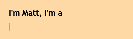
<h1>I'm Matt, I'm a</h1>
<div class="container">
<div class="typed-out">Web Developer</div>
</div>
</body>
</html>
Adjusting steps for a longer typing effect
To adjust for longer pieces of text, you’ll need to increase the steps and duration of the typing animation:
See the Pen
Long typewriter effect by SitePoint (@SitePoint)
on CodePen.
Adjusting steps for a shorter typing effect
And to adjust for shorter pieces of text, you’ll need to decrease the steps and duration of the typing animation:
See the Pen
Short typewriter effect by SitePoint (@SitePoint)
on CodePen.
Making and Styling the Blinking Cursor Animation
Obviously the original mechanical typewriters didn’t have a blinking cursor, but it’s become tradition to add one to imitate the more modern computer/word-processor blinking cursor effect. The blinking cursor animation helps to make the typed out text stand out even more from static text elements.
To add a blinking cursor animation to our typewriter animation, we’ll first create the blink animation:
@keyframes blink {
  from { border-color: transparent }
  to { border-color: orange; }
}
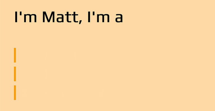
Inside our web page, this animation will change the border color of the typed-out element’s border — which is used as a cursor for the typewriter effect — from transparent to orange.
We’ll include this animation in the typed-out class’s rules and set its animation direction property to infinite to make the cursor disappear and reappear every .8s forever:
.typed-out{
    overflow: hidden;
    border-right: .15em solid orange;
    white-space: nowrap;
    font-size: 1.6rem;
    width: 0;
    animation:
      typing 1s steps(20, end) forwards,
      blink .8s infinite;
}
See the Pen
Blinking cursor by SitePoint (@SitePoint)
on CodePen.
Adjusting code for the blink typing effect
We can make the cursor thinner or thicker by adjusting its border-right: .15em solid orange; property, or you can make the cursor a different color, give it a border-radius, adjust the frequency of the its blinking effect, and more.
See the Pen
Styled blinking cursor by SitePoint (@SitePoint)
on CodePen.
You can experiment with these properties inside the CodePen demo and see what else you can come up with!
Combining the Elements of Typewriter Text Animations
Now that you know how to make the typewriter effect in CSS, it’s time for me to demonstrate some practical and relevant use cases of this typing effect.
Portfolio typing effect
Here’s an example of a personal portfolio. Typewriter effects can make your web-resume/personal website stand out, and make it more engaging.
You can play around with this portfolio demo on CodePen.
API typing effect
Here’s an example of an API landing page.
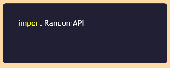
You can play around with this API demo on CodePen.
It’s likely that, at some point in your development journey, you’ve come across an API provider landing page and seen a code block like that, demonstrating the implementation of their API. I personally find this a really practical and relevant implementation of the typewriter effect, and find that it looks more attractive and inviting than a static chunk of code.
Product landing page typing effect
Here’s an example of a SaaS/product landing page.
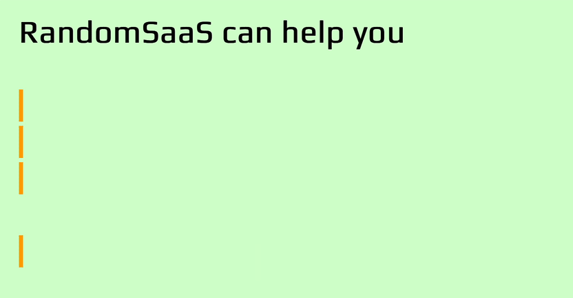
You can play around with this SaaS product page demo on CodePen.
I’ve found that typewriter effects inside SaaS or product landing pages are more inviting and engaging to visitors looking to use their products or services. Having spent a lot of time developing web services and web apps, I can say from experience that typing effects create extra interest in your landing pages. Typed-out text like “Get started today” gives extra punch to call-to-action text.
Conclusion
We’ve seen in this article how easy it is to use CSS to create animated “typewriter” text. This typing effect definitely can add interest and delight to your web pages.
Perhaps it’s worth ending with a mild word of warning, though. This technique is best used on small portions of non-critical text, just to create a bit of extra delight. But be careful not to rely on it too heavily, as using CSS animation like this has some limitations. Make sure to test your typewriter text on a range of devices and viewport sizes, as results may vary across platforms. Also spare a thought for end users who rely on assistive technologies, and ideally run some usability tests to make sure you’re not making life difficult for your users. Because you can do something with pure CSS doesn’t necessarily mean you should do it. If the typewriter effect is important to you and you want to use it for more critical content, perhaps at least look into JavaScript solutions as well.
Anyhow, I hope you’ve enjoyed this article, and that it’s got you thinking about other cool things you can do with CSS animation to add touches of interest and delight to your web pages.
FAQs About Creating CSS Typewriter Effect
Let’s end by answering some of the most frequently asked questions about how to create a typewriter effect in CSS.
What is the typewriter effect?
The “typewriter effect” is an animation technique that makes a string of text appear on screen letter by letter, as if it’s being typed out in real time by a typewriter. This effect is often created with the help of JavaScript, but can also be achieved with CSS alone, as demonstrated in this article.
What is a typewriter animation?
A typewriter works by printing text one letter at a time. A typewriter animation is one that imitates the typing of a typewriter, by presenting word of text one letter at a time. It’s a popular animation effect on many web pages.
How can I animate text typing in CSS?
Modern CSS offers various tools for creating animations, including animation, @keyframes, steps(). These tools are used to gradually reveal text that is a first hidden through the overflow property.
How can I make a customizable typewriter animation with CSS?
Creating a customizable typewriter animation with CSS involves using keyframes and CSS properties to control the appearance and behavior of the text as it types
onto the screen. You can make it customizable by exposing some of the animation parameters as CSS variables (custom properties) so that you can easily change them in your stylesheet. For example::root {
--typewriter-text: "Your text here"; /* Text to type */
--typewriter-duration: 4s; /* Duration of typing animation */}.typewriter {
animation: typewriter var(--typewriter-duration) steps(20) infinite;}@keyframes typewriter {
from {
width: 0;
}
to {
width: 100%;
}}
In this CSS code, we define custom properties (--typewriter-text and --typewriter-duration) to make the animation customizable. You can change the default values by modifying these properties.
How do you stop the cursor at the last letter of the typed-out element once it has been fully typed out?
To stop the cursor at the last letter of a typed-out element in a CSS typewriter animation, you can use CSS animations and the animation-fill-mode property:.typewriter p {
animation: typewriter 4s steps(40) forwards;
/* Adjust the duration and steps as needed */
}
In the above CSS, the typewriter animation gradually increases the width of the <p> element inside the .typewriter container, effectively typing out the text. The animation-fill-mode property is set to forwards to make sure the animation holds the final state (fully typed) after completion. With this setup, the cursor will blink at the last letter of the typed-out element once it has been fully typed out.
What are some examples of websites that use typewriter effects effectively?
Typewriter animations are often used on sites such as portfolio websites, especially of designers and developers, where they’re used to highlight key skills and to add a creative touch to the page, thus drawing the attention of readers. Typewriter effects are also sometimes used on blogging websites and landing pages, and for product presentations.
I'm a full-stack developer with 3 years of experience with PHP, Python, Javascript and CSS. I love blogging about web development, application development and machine learning.