8 Cool jQuery Animation Effects Tutorials

Back in the day, if you saw something that was animated on a website it was automatically assumed to be Flash. But not anymore, with jQuery you may become interested in creating animated effects, so here are some jQuery Animation Effect tutorials to get you on your way. Have fun!
Related Posts:
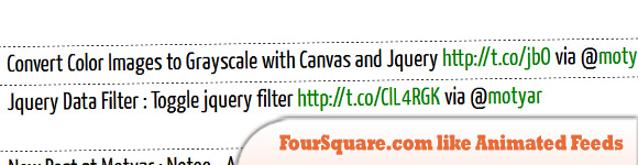
1. FourSquare.com like Animated Feeds Display with Jquery
In this tutorial you will learn a simple way to create same RSS scrolling ticker using jQuery.
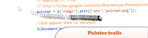
2. Pointer Trails with jQuery
Learn how to create a pointer trail on your web-page with the help of jQuery.
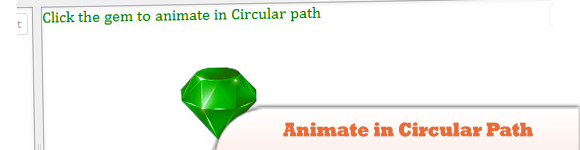
3. jQuery Animate in Circular Path
Learn how to animate an element in circular path or over a circle using jQuery.
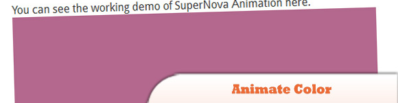
4. Animate Color using jQuery
Animate a change in background Color using jQuery.
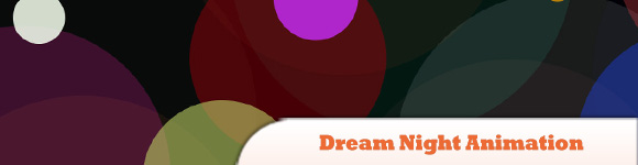
5. Dream Night Animation with jQuery
The DreamNight is a screen saver in my friend’s cellphone, I tried to implement it on web with help of jQuery and CSS.
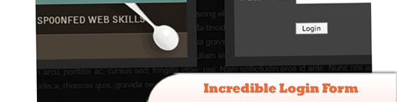
6. Incredible Login Form with jQuery
In this tutorial, we’ll create a sliding panel, that slides in to reveal more content, using JQuery to animate the height of the panel.
7. Load In and Animate Content with jQuery
In this tutorial we will be taking your average everyday website and enhancing it with jQuery. We will be adding ajax functionality so that the content loads into the relevant container instead of the user having to navigate to another page.

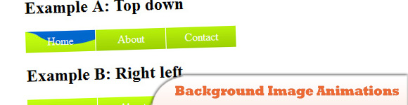
8. Using jQuery for Background Image Animations
jQuery is a great library for this type of task but out of the box, it can’t animate background position properly because of the need to animate two values instead of just one.
Frequently Asked Questions about jQuery Animation Effects
What are the basic requirements for implementing jQuery animation effects?
To implement jQuery animation effects, you need a basic understanding of HTML, CSS, and JavaScript. jQuery is a JavaScript library, so knowledge of JavaScript is essential. You also need to include the jQuery library in your project. You can either download it from the jQuery website or include it directly from a Content Delivery Network (CDN). Once you’ve included jQuery, you can start using its methods to create animations.
How can I speed up or slow down a jQuery animation?
jQuery provides two parameters for controlling the speed of an animation: ‘slow’ and ‘fast’. These are predefined speeds, but you can also specify a custom duration in milliseconds. For example, to make an animation last 2 seconds, you would write: $(selector).animate({params}, 2000);.
Can I chain multiple animations together?
Yes, jQuery allows you to chain multiple animations together. This means you can execute several animations on the same element one after the other. To do this, simply call another animation method at the end of the first one. For example: $(selector).fadeIn().slideUp();.
How can I stop a running animation?
jQuery provides the .stop() method to stop a running animation. This method stops the currently running animation on the selected element. For example, to stop an animation on a paragraph, you would write: $("p").stop();.
Can I animate CSS properties with jQuery?
Yes, jQuery allows you to animate almost any CSS property. The .animate() method is used for this purpose. You simply pass the CSS properties you want to animate and their target values as an object to this method. For example, to animate the width of an element, you would write: $(selector).animate({width: "200px"});.
How can I create a custom animation?
To create a custom animation, you can use the .animate() method. This method allows you to animate any numeric CSS property. You simply pass the properties you want to animate and their target values as an object to this method. You can also specify the duration of the animation and a callback function to be executed after the animation completes.
What are easing functions in jQuery animations?
Easing functions specify the speed at which an animation progresses at different points within the animation. jQuery provides two easing functions: ‘swing’ and ‘linear’. ‘Swing’ is the default easing function and it progresses slowly at the beginning and end, and faster in the middle. ‘Linear’ progresses at a constant speed throughout the animation.
Can I use jQuery to animate elements on scroll?
Yes, jQuery provides several methods to animate elements on scroll, such as .scrollTop() and .scrollLeft(). These methods return or set the vertical and horizontal scroll position of an element. You can use these methods in combination with the .animate() method to create scroll animations.
How can I animate the display and visibility of elements?
jQuery provides several methods to animate the display and visibility of elements, such as .fadeIn(), .fadeOut(), .slideDown(), .slideUp(), and .toggle(). These methods animate the opacity or height of the elements, creating a fade or slide effect.
Can I use jQuery animations with responsive design?
Yes, jQuery animations work well with responsive design. You can use the .resize() method to trigger animations when the browser window is resized. You can also use media queries in your CSS to adjust the animations for different screen sizes.
Sam Deering has 15+ years of programming and website development experience. He was a website consultant at Console, ABC News, Flight Centre, Sapient Nitro, and the QLD Government and runs a tech blog with over 1 million views per month. Currently, Sam is the Founder of Crypto News, Australia.