As web designers, we’re used to designing for the particular constraints and capabilities of web browsers, and there’s a ton of great advice out there to help. HTML emails are a different story, though — they’ve often been the black sheep of the web design world, and have either been ignored or actively repelled.
Despite that, HTML email usage continues to grow, and it has continually proven to be an effective tool for businesses to communicate with customers. Studies over recent years have shown that, on average, email marketing provides as much as $50 in revenue for every dollar spent.
Let’s be clear here: we’re not talking about spam! We’re talking about email that people have explicitly requested, like the BBC news headlines or your hotel booking confirmation. If you don’t have permission to email people, don’t email them, no matter how nice your design is. We’re also not saying that every email should be HTML.
Whether we like it or not, HTML email is here to stay, and since someone needs to design it, that person should be a web professional. However, an email is not a web page. When you design a web site, you know that the visitors probably have some idea of what to expect. They may have clicked on a search result, or a link from another site, so they have a context in which to understand your pages. When they arrive, you have the whole browser window in which to display your message.
Email is different. An email inbox is a very noisy place, with tons of messages, folders, calendars, and other distractions. Your subscribers may only ever read the subject line, or perhaps see your email through a tiny preview pane, so you need to design it accordingly and make the best use of the screen space and time the reader gives you.
So, what makes a good, modern HTML email design?
Key Elements of HTML Email
There are a few key elements that every commercial email should use; they’ll form the core of your design:
Permission Reminder
When you make a business call, you don’t start with ‘Buy our fantastic new widget today!’ — at least, you shouldn’t. Instead, you usually start by introducing yourself and reminding the recipient about your past meeting or contact.
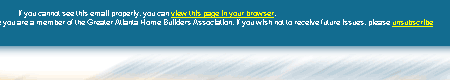
Your emails should start the same way, with a clear, specific reminder of how subscribers got onto your list. This gives them some context for your message, and reduces the likelihood that recipients will mark your messages as spam.
Well-formatted Copy
The single biggest advantage of using HTML in email is the ability to format your copy. You can use real headings, adjust line height, highlight important content, and make copy scannable in ways you can’t easily do with plain text.
This is really where you should spend most of your time designing emails — making the message easier to read, and easier to act on.
Prominent Unsubscribe Link
Every commercial email should provide a quick and reliable way for people to get off the list. Both designers and clients sometimes try to hide this link away, hoping to keep subscribers on their lists. But if someone wants off, you must let them do it easily, or you’ll just end up with spam complaints. Automatic unsubscribe mechanisms are far better than the type that require manual processing or the filling in of tedious forms.
Plain Text Version (and Web Version)
A plain text version of every commercial email you send should be available for people who can’t, or choose not to, view the HTML version. Sending email in multipart text+html format makes this simple. Additionally, consider linking to a web page to give recipients the full HTML experience if that makes sense for your audience and content.
Legally Required Details
Some countries have legal requirements in place that mandate certain elements in commercial emails. The best-known example is the CAN-SPAM laws, which require, among other things, that a physical street address is included in every commercial email.
Visual Connection to the Brand
As a design context, email is a different from the web, but it should facilitate an extension of the web site’s branding into email in the same way that web sites can extend a print brand. This helps subscribers make the connection in their minds between the email and the company sending it, and again, it can reduce spam complaints.
Once you’ve pulled together the core of your email, it’s time to get creative in laying out and styling your content.
Email Layout and Design
Just like creating a web page, designing an email is all about knowing your topic and your audience. Without going right back to page layout and design basics, email has a few defining characteristics that should guide your design.
An Email is Not a Web Page
Some designers will often say this as if it means that HTML email should not exist. Well, that boat has sailed, but it is definitely true that an email is a different context than a web page, and needs to be treated differently.
Prioritising Content
An email message has a lot to compete with for attention. There are all the other messages in the inbox, there are the spam messages, there is often a mix of personal and work-related messages, and then there are all of those draft messages that are in the process of being written. And to think that reading email is only a small part of most people’s jobs!
You need to get to the point quickly. Start with the most valuable information — don’t hide it away. Your reader should be able to glance at the top of the email and know immediately if it’s worth reading. Consider starting with a table of contents or a short summary that will entice them to read the full email.
Full Articles vs Extracts
One decision you may need to make is the choice between a standalone email, which offers complete information, and a format that uses “teasers” that link to the web site. Your choice will depend on your goals for the email. If you want to drive traffic to the site, skilfully written teasers can work well. If your newsletter is more about building your reputation as a provider of information, having the full content in the email might make more sense.
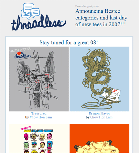
The Threadless newsletter features a simple teaser image for each shirt
Neither format is intrinsically better, but one may suit your style and goals more than the other. But no matter what format you choose, every email should contain a clear call to action.
Call to Action
Given the amount of work that goes into getting your readers to actually open and read email, it’s surprising how many designers don’t have a clear call to action in their campaigns. You should have a good idea of what you want the reader to do with the information you’re sending them.
The action may be to contact you, or to visit your web site for more information. It might be to purchase something or answer a survey. Whatever it is, make sure your design makes that task simple and obvious.
A big button or link in the right spot can avoid that “dead-end” experience for your readers. Give them somewhere to go, and you should see much better results from your campaigns.
Design Your Plain Text Too
Every HTML email you send should be accompanied by a plain text alternative for people who can’t or prefer not to view the HTML. You should spend some design time on your plain text, because you never know which customer is seeing it.
The core rules for plain text emails are:
1. Keep your line lengths short.
2. Email software has a habit of breaking up lines of text in inconvenient places. For example, your carefully written sentence could end up like this:
Email software has a nasty habit of breaking up lines of
text in inconvenient
places. Your carefully written sentence can
end up like this.
The solution is to keep lines short, and add hard returns to the end of each line. A line length of 65 characters offers the greatest protection from jagged formatting problems. When you’re editing and formatting a text newsletter, set your editing software to a width of 65 characters with automatic hard returns.
3. Use the shortest URLs you can.
As well as keeping your lines within 65 characters, you need to keep your URLs short. A broken line of text just looks ugly, but a broken URL doesn’t work at all. Some CMSs use very long parameters, so you might consider using redirects on your own server, or a service like http://www.tinyurl.com/ to get shorter versions of your URLs.
Also make sure you use full URLs (including the http:// component), and that you insert a space on either side of the URL to help email clients find them and make them clickable, as many do.
4. Create headings and sections.
A big block of text is hard to read, especially when it’s in plain text format with no colours or different font sizes to help people scan through. You can use lines of repeated characters — underscores (_______) or asterisks (********), for example — to emphasise your headings and break up your email into sections.
You don’t have full typographic control in plain text, but you can at least make sure the text is well structured and clear. Check out some example plain text emails for ideas.
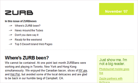
Examples of Excellent Email Design
The following guidelines are important, but they don’t mean you can’t be imaginative and creative in the ways you apply them to your emails. Here are just a few great examples of email design targeted to specific audiences with specific content.

Coding Like it’s 1999
Once you have your design and layout planned, it’s time to actually build the HTML, and this is the point at which we start slipping back in time. There are some key technical constraints and techniques you need to have in your toolkit to implement your fantastic design.
CSS Support in Email Clients
The typical email client is quite similar to a web browser from 1999, with limited or inconsistent support for modern HTML and CSS. The best place to start is with the Campaign Monitor Guide to CSS Support in Email, which gives you an overview and helpful chart that shows what is and is not supported in the major email clients. You may find SitePoint’s article on Writing HTML Email useful as well.
These resources will give you a solid base for the structure of your email, and you can build up from there.
The Preview Pane: a Trailer for Your Email
Before your subscribers actually see your email, they may get just a glimpse of it in their preview panes. Typically, this will be a window of no more than a couple of hundred pixels in height, but your subscribers may use the information that’s visible in that space to decide whether they will open your email or ignore it.
Great emails make use of this space to answer the questions: ‘Who is this from?’ and ‘What is the email about?’ That may mean having a consistent header image that is recognizable, or having a heading that grabs their attention. Particularly useful are emails that list a table of contents high up on the page. That way, you’re not forcing your reader to decide without any information.
Of course, preview panes vary in their size and location, so all you can do is to prioritise your content and start with the key information, as we discussed earlier.
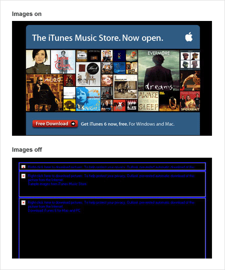
Image Blocking
By default, many email clients will not download images referenced in HTML emails. Instead, they’ll show a placeholder, sometimes with a message or information bar that explains how to turn images on. For an overview of the situation, see Mark Wyner’s Image Blocking in Email Clients: Current Conditions and Best Practices.
Your email needs to be immediately readable and useful, even without any images showing. That means having real text content on the page, headings, and links that will load right away. Your text has to give the reader a compelling reason to bother turning on those images at all. All-image emails can result in a very poor experience for many of your readers, like the Apple email announcement below.
You may also want to have a sentence at the top of your email asking people to add your “from” address to their whitelists or address books, as for many email clients this step will bypass image blocking and help keep your newsletter out of the junk folder.
The Things that Shall Not Be
While some email design involves modifying elements or working around issues, some parts of web design are best kept out of email altogether — things like audio files, Flash files, and JavaScript.
Email client developers rightly haven’t spent time supporting these types of content, both for security reasons and to protect the email reader’s experience. An email inbox is not the place to show a movie or play a song. Your readers won’t expect it, and probably wouldn’t like it.
Support for Flash in email, for example, is very low. Instead of trying to put every part of your web site into email, use the email as a gateway to your site. Link a static screenshot to your video on the web site, or use a song icon to link to your online player.
Restraint is very important, because an email that causes a security warning, or that unexpectedly animates, for example, is going to be quickly deleted.
Testing, Testing
Unlike web browsers, where you can reasonably cover the major browsers on your own desktop, email testing can be very time-consuming. There are at least 12 email clients with major market share, and depending on your audience, you may need to test in all of them.
There are tools out there to help you with the process — for example, Campaign Monitor’s design and spam testing tool and Litmus. They can save you a lot of time by showing you screenshots of your email in all the big clients.
Of course, you can do it yourself, too, by setting up all the different clients and having a test list of email addresses. Remember: it’s always better to find the problems before you send out your client’s campaigns.
Better Standards Support for Email Clients?
By now you’re probably already sick of having to deal with so many email clients with different levels of support for basic HTML and CSS. You’re not alone!
Late last year, the team at Freshview was part of the launch of the Email Standards Project, which is trying to do something about the situation. The idea is to start working with email client developers to get some consistent, modern HTML and CSS rendering that we can all rely on.
On the Project’s web site, there’s a series of email client reports as well as a blog that covers our progress to date. Recently, Yahoo! promised to make a fix, and IBM has been in discussions with the group.
If you’d like to know more, or find out how to help, visit email-standards.org.
Getting Better All the Time
There’s one more question you need to answer before you actually send your email: What will be a good result? You can spend as long as you like crafting your code and design, but you need to be able to tell whether your time was well spent. Before you send, make sure you have defined some measurable goals for your email campaign.
Some typical aspects to measure and set targets for are:
- A certain percentage of people actually opening your email. Be aware though that measuring opens is not an exact science.
- People clicking through to your most important links. What is the single most important action you want your readers to take? That is the most important aspect to track.
- Email responses. Perhaps you just want to increase the number of people contacting you. That’s a simple measurement to take.
- Sales or inquiries. If you have the right tools in place, you can track people coming to your site from your emails, and monitor them all the way through a checkout process.
These kinds of measurements are best done over a series of campaigns. At first, you won’t have any benchmark numbers to judge against. There are plenty of broad statistics and metrics out there, but every audience is different. Far more important is to define your own measurements, and track how your campaigns compare against them over time. Are you getting closer to your targets?
How Can I Improve My Results?
As with web design, there’s an endless number of ways you could tweak your email design and copy to get better results. If you’re regularly emailing a list, you have the opportunity to try small, controlled changes. You can test them with your entire subscriber base, or select a small segment and send them a variation from your main list.
Pick one area to work on at a time, so you can control the number of variables, and have a better idea of what’s actually making a difference. Some good places to start are:
Subject Lines
In a busy, active email inbox, that short little subject line may be the only chance you get to convince someone to open your email and consider reading it. Try to make your subject lines recognisable and valuable by ensuring that they give an accurate indication of the email’s content. Check out resources like The Art of the Subject Line for more ideas, and experiment with some different subjects to see what impact they have.
Time and Day of Sending
Sometimes, the same email can be more effective on a Tuesday afternoon than it was on a Thursday morning. You’ll find lots of conflicting evidence in this area, so the only way to know what will work for your audience and topic is to try a few different times. Think about when you personally spend the most time reading email — is it first thing in the morning? Or after lunch, before you start on a new project?
Headlines and Link Copy
Just like the subject line, headlines are the elements people use to judge whether your email’s worth reading. Your copy could be fantastically useful, but skipped over because the headline wasn’t convincing. Resources like Brian Clark’s How to Write Headlines That Work are a great starting point.
Content Positioning and Prioritisation
Don’t be afraid to try moving different sections of your newsletter around, or even dropping under-performing content completely. Watching your statistics should give you an idea of what your audience is most interested in, so use that knowledge to structure the email — just as you would for a web site. Email design can be a microcosm of information architecture, and one you can be quite flexible with.
HTML Email Can Be Done Right!
It takes a little bit of effort, and it can be frustrating, but with some knowledge and practice, you can create HTML emails that people will find easier to read, attractive and useful. Make sure you always send plain text too, but don’t leave the HTML up to the marketers!
 Mathew Patterson
Mathew Patterson looks after Campaign Monitor's customers and recently wrote "Create Stunning HTML Email" for Sitepoint. He's also involved in the Email Standards Project and can be found at http://mathewpatterson.com