With major sites like Wired News and ESPN migrating to CSS layout, the “new wave” of Web design is truly here. But even in the most modern browsers, CSS has its limitations.
Understanding them can save you a lot of frustration and wasted time.
For better or worse, the vogue of Web design has evolved to favour a layout similar in style to a newspaper. Common design elements include:
- a header and footer that each spans the page horizontally
- content constrained by page width
- vertical scrolling is acceptable, within reason
- navigation and secondary content in vertical columns next to the main content
That last one is the real kicker. The sad reality is that the current CSS specificaton (CSS2) was not designed with multiple columns of content in mind. As a result, just as Web designers have always had to abuse HTML tables to achieve complex page layout, they must now abuse CSS positioning to achieve those same ends.
This is a controversial position to take, I’ll admit. Right now, all signs point to CSS as the ideal way to perform page layout for the Web. Unfortunately, the CSS2 spec (finalized in 1998) predates many of the complexities of present day Web design, the strong fashion of multi-column design chief among them.

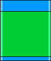
Shown here is the classic three column design with header and footer, the most basic expression of current Web layout fashion. This is of course dead easy to accomplish with HTML tables, but you’re better than that!
To achieve this in CSS, we begin with a natural three-block page. Blocks, incidentally, are simply <div> tags in the HTML code. By “natural” I mean that we don’t do anything special to the blocks to get them into this layout — the browser will naturally stack the three blocks vertically, each occupying the width of the browser window.
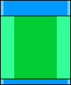
Next, we make room for the left and right columns by adding margins to the content area. This is the distilled CSS code:
#content {

  margin-left: 100px;

  margin-right: 100px;

}
Finally, we add the left and right columns as absolute-positioned blocks:
#left, #right {

  position: absolute;

  top: 100px; /* height of the header */

  width: 100px;

}


#left {

  left: 0;

}


#right {

  right: 0;

}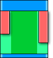
Not far from the desired effect, right? There are just two problems with this result:
- The left and right columns do their own thing in the height department. CSS provides no way to match the heights of the columns without setting a fixed height for all three — rarely a feasible option!
- Since the absolute-positioned left and right columns float above the rest of the page, the position of the footer is still determined solely by the height of the content area. This causes problems when the content column is shorter than the other columns.
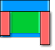
If you’re dealing with solid background colors in all the columns, the former may not be a problem for you. The latter, however, is the biggest headache faced by new practitioners of CSS layout. This problem is a direct result of the lack of multi-column support in CSS2. As designers, we shouldn’t have to resort to absolute positioning to create a multi-column layout, but CSS2 doesn’t have anything better to offer.
For now, the best solution is to use JavaScript to equalize the column heights after the browser performs the initial layout.
JavaScript to the Rescue!
We’ll assume you have a page with three columns. The center column uses natural (i.e. static) positioning and includes margins that leave room for the left and right columns, which use absolute positioning.
The id attributes of the column <div> tags are left, content, and right.
Instead of dealing with the differences between browsers, we’ll leave it to the professionals and use the excellent X script from Cross-Browser.com. Simply download x.js from that site and load it in the <head> tag of your page as follows:
<script src="x.js" type="text/javascript">

</script>
Now, because the footer may well be covered by the left and right columns when the browser lays them out, we’ll want to keep the footer invisible until we’ve adjusted the column heights.
Make sure the footer <div> has id="footer" set and add this style rule to the <head> tag of your document:
<style type="text/css">

#footer {

  visibility: hidden;

}

</style>
Now, when the browser has finished loading the page (and whenever the browser window is resized), we want to find out which of the columns is the tallest and resize them all to that height. Then we can display the footer.
Because this process may happen repeatedly as the user resizes the browser window, we need to wrap the content of each column in an additional <div>. The structure of the document becomes:
<div id="left">

  <div id="leftcontent"><!--left--></div>

</div>

<div id="content">

  <div id="contentcontent"><!--content--></div>

</div>

<div id="right">

  <div id="rightcontent"><!--right--></div>

</div>
It is these “inner” <div> we will check for the natural height of each column before setting the height of the “outer” <div>.
Here’s the JavaScript function that adjusts the layout using the X library’s xHeight and xShow functions:
<script type="text/javascript">

function adjustLayout()

{

  // Get natural heights

  var cHeight = xHeight("contentcontent");

  var lHeight = xHeight("leftcontent");

  var rHeight = xHeight("rightcontent");


  // Find the maximum height

  var maxHeight =

    Math.max(cHeight, Math.max(lHeight, rHeight));


  // Assign maximum height to all columns

  xHeight("content", maxHeight);

  xHeight("left", maxHeight);

  xHeight("right", maxHeight);


  // Show the footer

  xShow("footer");

}
All that’s left is to make this function run when the page is loaded or resized. This is done with xAddEventListener:
window.onload = function()

{

  xAddEventListener(window, "resize",

    adjustLayout, false);

  adjustLayout();

}

</script>
And that does it! See it in action for yourself!
The Future
But how about the future? The working draft of CSS3 includes multi-column layout module, but it is designed for flowing text across columns of equal width, not for newspaper-style layouts with varying columns widths.
The best bet for pure CSS multi-column layouts that I see on the horizon is the display-model and display-role properties in the CSS3 box model. In a particularly ironic twist, these properties would let you set the column blocks to behave as table cells for the purposes of layout. Design techniques would come full circle while still preserving the content/style division of CSS layout.
Frequently Asked Questions about the Limits of CSS Layout
What are the main limitations of CSS layout?
CSS layout has several limitations. Firstly, it can be challenging to achieve complex layouts due to the lack of a proper layout system. Secondly, CSS layout is not fully compatible with all browsers, which means that some styles may not render correctly on certain browsers. Thirdly, CSS layout can become quite complex and difficult to manage as the size of a project increases. Lastly, CSS layout does not provide a way to create dynamic content, which can limit its usefulness in certain scenarios.
How does browser compatibility affect CSS layout?
Browser compatibility is a significant limitation of CSS layout. Not all browsers interpret CSS rules in the same way, which can lead to inconsistencies in how a webpage is displayed. This means that developers often have to write additional code to ensure that their designs look the same across different browsers, which can be time-consuming and complex.
Why is it difficult to achieve complex layouts with CSS?
CSS was originally designed for simple document styling, not complex layouts. As a result, it lacks a proper layout system, making it challenging to create complex layouts. Developers often have to resort to hacks and workarounds to achieve the desired layout, which can lead to messy and hard-to-maintain code.
How does the complexity of CSS layout increase with the size of a project?
As the size of a project increases, the CSS codebase can become quite large and complex. This can make it difficult to manage and maintain the CSS code. Additionally, it can be challenging to keep track of all the different styles and their interactions, leading to potential conflicts and inconsistencies in the design.
Can CSS layout create dynamic content?
No, CSS layout cannot create dynamic content. CSS is a styling language, not a programming language, so it does not have the ability to create dynamic content. This can limit its usefulness in certain scenarios, such as when you want to create interactive web applications.
What are some alternatives to CSS layout?
There are several alternatives to CSS layout, including JavaScript-based layout systems like Flexbox and Grid. These systems provide more control over the layout and can handle complex layouts more easily. Additionally, they are more compatible with modern browsers, reducing the need for browser-specific code.
How can I overcome the limitations of CSS layout?
There are several strategies to overcome the limitations of CSS layout. One approach is to use a CSS preprocessor like Sass or Less, which can simplify the CSS code and make it easier to manage. Another approach is to use a JavaScript-based layout system like Flexbox or Grid, which provides more control over the layout.
Are there any tools that can help with CSS layout?
Yes, there are several tools that can help with CSS layout. For example, CSS frameworks like Bootstrap provide pre-defined classes that can simplify the process of creating a layout. Additionally, CSS preprocessors like Sass or Less can help manage and maintain the CSS code.
Can CSS layout handle responsive design?
Yes, CSS layout can handle responsive design, but it can be challenging. CSS media queries can be used to apply different styles for different screen sizes, but this can lead to complex and hard-to-maintain code. Using a CSS framework or a JavaScript-based layout system can simplify the process of creating a responsive design.
What are the future prospects of CSS layout?
The future prospects of CSS layout are promising. The CSS Working Group is actively working on new features and improvements to make CSS layout more powerful and easier to use. Additionally, browser support for CSS layout is improving, which will reduce the need for browser-specific code.
Kevin Yank is an accomplished web developer, speaker, trainer and author of Build Your Own Database Driven Website Using PHP & MySQL and Co-Author of Simply JavaScript and Everything You Know About CSS is Wrong! Kevin loves to share his wealth of knowledge and it didn't stop at books, he's also the course instructor to 3 online courses in web development. Currently Kevin is the Director of Front End Engineering at Culture Amp.