Every day this week, we’ll be publishing an article that’s been hand picked by our editor, as part of CSS Theme Week.
One of the most commonly used arguments regarding CSS that I hear from designers who don’t like web standards is, “CSS designs are so boring. They’re too boxy.” I can’t help but find this statement to be a bit silly. To me, that’s like saying buildings built with wood are boxy. An architect can create a boring-looking building. But, using the same tools, an architect can create a stunning work of art. It all depends on creativity and experimentation.
It’s true that CSS is heavily reliant upon a grid — everything flows on x and y axes (and can be positioned as such, much like designs built in Photoshop). However, this doesn’t mean that your design has to be boring. If you understand how the grid works, you can fracture or abstract that grid to make your layout more dynamic and interesting. In achieving this goal (while supporting flexibility and maintainability), CSS designs have so much more to offer than table-based layouts.
Before you begin, be sure to download the files that I used to produce these examples, so you can follow along.
Grids and Wireframes
“You have to know the rules before you can break them.”
I heard this common saying throughout my design and art classes when I was studying. If you’ve taken any classes in typography or layout, you know that the grid is one of the most important essentials in design. However, if you aren’t familiar with this concept, here’s a very brief overview:
- A grid provides organization. A grid can act as your page layout’s “blue plan.” Well-planned grids can be aesthetically pleasing, as well as providing organization to your content.
- A grid can define more information. A well-organized layout can help provide consistency from page to page, and define what type of information is being provided at various points (for example: a sidebar can be used to provide secondary information; copyright and legal information, etc. might be placed in the page footer, and so on).
- A grid can unify a series. Having a planned guide for the placement of logos, headlines, images, and/or text in any medium (business cards, advertisements, web site layouts, etc.) can help “tie” everything together. Therefore, a grid can be a very important element of a brand.
For web design, wireframes are used to plan a site’s grid. Wireframes are a basic visual guide used to suggest the layout and placement of fundamental design elements within the interface.
Wireframes are a great way to design your site’s layout without actually worrying about the artistic details. They allow you to focus purely on the placement of your content (navigation, body copy, headlines, etc.). This technique is practiced in print design as well, but for this article, we’re going to focus on the Web.
Wireframes also provide a guide for your site’s markup and style sheet. For example, if your site has a multi-column layout (a content area, and one or two sidebars), you can use markup (usually a <div> tag, though this can vary depending on the content) to define those areas, styling them into columns, rows, or whatever is determined by your wireframe. You can take the same approach to style your header, or masthead, and footer.
Knowing the “setup” on the front end will give you more insight into how the site should be structured (which is a good thing to have in the back of your mind when you do start applying artistic detail).
Now, normally, in the typical design workflows with which I’ve been involved, the design is finalized after the wireframe is created. The content is then created before any coding begins. However, for the purposes of this article, the content is being created on a whim, so the code will come into play early on, just for learning purposes. Once this process comes more naturally, a “regular” workflow can be established. But for now, let’s just explore the power of CSS. (Wow, that last bit sounded dramatic!)
Starting our Design
Here’s an example of a grid that you may typically see on a web site:
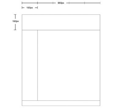
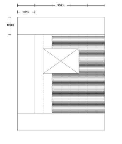
I decided to take advantage of the width of 960px: I divided by five, which gave me 192px. I used this as my grid unit — columns will be this width, and all other design elements will be proportional to it. The header is 192px tall as well.
The markup and style for this layout could be pretty straightforward; it would probably look something like this HTML (to which I’ve added dummy copy):
<!DOCTYPE html PUBLIC "-//W3C//DTD XHTML 1.0 Strict//EN" "https://www.w3.org/TR/xhtml1/DTD/xhtml1-strict.dtd">
<html xmlns="https://www.w3.org/1999/xhtml" lang="en" xml:lang="en">
<head>
<title>Example Layout</title>
<meta http-equiv="content-type" content="text/html; charset=utf-8" />
<link type="text/css" rel="stylesheet" href="style.css"/>
</head>
<body>
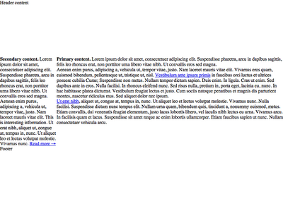
<div id="page">
<div id="header">
<p>Header content</p>
</div>
<div id="content-primary">
<p><strong>Primary content.</strong> Lorem ipsum dolor sit amet, consectetuer adipiscing elit. Suspendisse pharetra, arcu in dapibus sagittis, felis leo rhoncus erat, non porttitor urna libero vitae nibh. Ut convallis eros sed magna.</p>
<p>Aenean enim purus, adipiscing a, vehicula ut, tempor vitae, justo. Nam laoreet mauris vitae elit. Vivamus eros quam, euismod bibendum, pellentesque ut, tristique ut, nisl. <a href="#">Vestibulum ante ipsum primis</a> in faucibus orci luctus et ultrices posuere cubilia Curae; Suspendisse non metus. Nullam tempor dictum sapien. Duis enim. In ligula. Cras ut enim. Sed dapibus ante in eros. Nulla facilisi. In rhoncus eleifend nunc. Sed risus nulla, pretium in, porta eget, lacinia eu, nunc. In hac habitasse platea dictumst. Vestibulum feugiat lectus et justo. Cum sociis natoque penatibus et magnis dis parturient montes, nascetur ridiculus mus. Sed aliquet dolor nec ipsum.</p>
<p><a href="#">Ut erat nibh</a>, aliquet ut, congue at, tempus in, nunc. Ut aliquet leo et lectus volutpat molestie. Vivamus nunc. Nulla facilisi. Suspendisse dictum nunc tempus elit. Nullam urna quam, bibendum quis, tincidunt a, nonummy euismod, metus. Etiam convallis, dui venenatis feugiat elementum, justo lacus lobortis libero, vel iaculis nibh lectus eu urna. Vivamus arcu. In facilisis quam et lacus. Suspendisse sit amet neque ac enim lobortis ullamcorper. Etiam faucibus sapien ut nunc. Nullam consectetuer vehicula arcu.</p>
</div>
<div id="content-secondary">
<p><strong>Secondary content.</strong> Lorem ipsum dolor sit amet, consectetuer adipiscing elit. Suspendisse pharetra, arcu in dapibus sagittis, felis leo rhoncus erat, non porttitor urna libero vitae nibh. Ut convallis eros sed magna. Aenean enim purus, adipiscing a, vehicula ut, tempor vitae, justo. Nam laoreet mauris vitae elit. This is interesting information. Ut erat nibh, aliquet ut, congue at, tempus in, nunc. Ut aliquet leo et lectus volutpat molestie. Vivamus nunc. <a href="#">Read more →</a> </p>
</div>
<div id="footer">
<p>Footer</p>
</div>
</div>
</body>
</html>Here’s the CSS:
* {

  margin: 0;

  padding: 0;

}

body {

  text-align: center;

}

#page {

  margin: 0 auto;

  width: 960px;

  text-align: left;

}

#header {

  height: 192px;

}

#content-primary {

  float: right;

  width: 768px;

}

#content-secondary {

  float: right;

  width: 180px;

}

#footer {

  clear: right;

}

.clear {

  clear: both;

}
The margins and padding on all elements are reset using an asterisk (*). This sets the styles to be applied to everything. Read more on this technique, as documented by Andrew Krespanis.
This example uses the standard method of centering the design: I’ve set text-align: center for the body, margin: 0 auto, a width (in this case, 960px), and text-align: left for the containing div (which I’ve called “page”).
Next, the content divs (content-primary and content-secondary) float to the right. content-primary appears first in the markup, so this is the direction needed to align the columns properly next to each other. Finally, the columns are cleared in the footer.
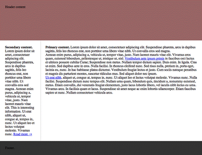
So far, this is what we have:
Adding the Backgrounds
Let’s turn on some backgrounds so we can see the boundaries a little more clearly. Note that, for this example, I’m using the faux-column technique to create the columns. This technique basically takes a background image and repeats it vertically to create the first two column colors (and avoid uneven heights):

The CSS that makes this happen can be found in the #page selector:
#page {

  margin: 0 auto;

  width: 960px;

  background: url(page.gif) repeat-y;

  text-align: left;

}
Now that we have the basic structure, we’ll add some margins and padding to the columns to create some whitespace.
The width of our page — 960px — divides evenly by 12, so we’ll use this value as the basis for our margins and padding (and later we’ll use it for font size). To provide a little more breathing room, let’s double it and use 24px for our margins. Whitespace is important. We’ll then subtract 48px from each column to accommodate our new margins. Here’s the CSS:
* {

  margin: 0;

  padding: 0;

}

body {

  background: #eee;

  text-align: center;

}

#page {

  margin: 0 auto;

  width: 960px;

  background: #fff url(page.gif) repeat-y;

  text-align: left;

}

#header {

  height: 192px;

  background: #966;

}

#header p {

  padding: 24px;

}

#content-primary {

  float: right;

  margin: 24px;

  width: 720px;

}

#content-secondary {

  float: right;

  margin: 24px;

  width: 144px;

}

#footer {

  clear: right;

  background: #333;

}

#footer p {

  padding: 24px;

}

.clear {

  clear: both;

}
So far, this is what we have.
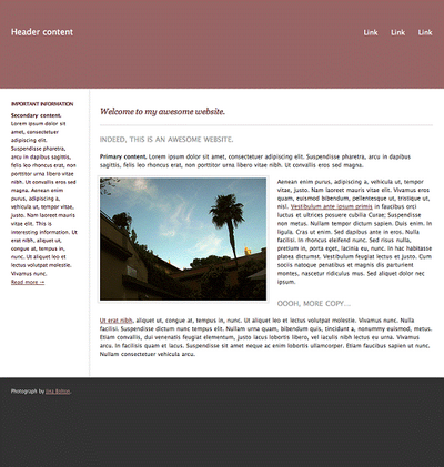
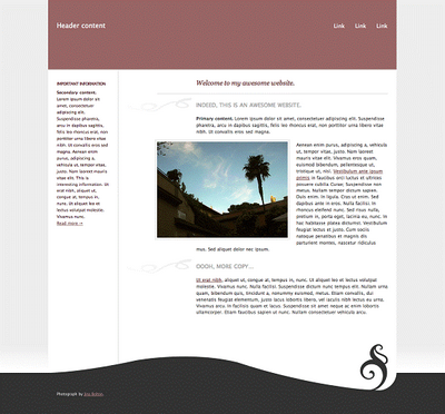
As you can see, we essentially have our wireframe in place — with added colors and content. Now we can move beyond the wireframe and get a little more experimental with the design.
Dropping in Content
Let’s go ahead and add some images, a menu, headings, and so on, so that we really have more to work with. This isn’t an advanced tutorial, though, so we’ll keep things fairly simple. Here’s the HTML:
<div id="page">
<div id="header">
<p>Header content</p>
<ul>
<li><a href="#">Link</a></li>
<li><a href="#">Link</a></li>
<li><a href="#">Link</a></li>
</ul>
</div>
<div id="content-primary">
<h1>Welcome to my awesome website.</h1>
<h2>Indeed, this is an awesome website.</h2>
<p><strong>Primary content.</strong> Lorem ipsum dolor sit amet, consectetuer adipiscing elit. Suspendisse pharetra, arcu in dapibus sagittis, felis leo rhoncus erat, non porttitor urna libero vitae nibh. Ut convallis eros sed magna.</p>
<img src="photo.jpg" alt="" />
<p>Aenean enim purus, adipiscing a, vehicula ut, tempor vitae, justo. Nam laoreet mauris vitae elit. Vivamus eros quam, euismod bibendum, pellentesque ut, tristique ut, nisl. <a href="#">Vestibulum ante ipsum primis</a> in faucibus orci luctus et ultrices posuere cubilia Curae; Suspendisse non metus. Nullam tempor dictum sapien. Duis enim. In ligula. Cras ut enim. Sed dapibus ante in eros. Nulla facilisi. In rhoncus eleifend nunc. Sed risus nulla, pretium in, porta eget, lacinia eu, nunc. In hac habitasse platea dictumst. Vestibulum feugiat lectus et justo. Cum sociis natoque penatibus et magnis dis parturient montes, nascetur ridiculus mus. Sed aliquet dolor nec ipsum.</p>
<h2>Oooh, more copy…</h2>
<p><a href="#">Ut erat nibh</a>, aliquet ut, congue at, tempus in, nunc. Ut aliquet leo et lectus volutpat molestie. Vivamus nunc. Nulla facilisi. Suspendisse dictum nunc tempus elit. Nullam urna quam, bibendum quis, tincidunt a, nonummy euismod, metus. Etiam convallis, dui venenatis feugiat elementum, justo lacus lobortis libero, vel iaculis nibh lectus eu urna. Vivamus arcu. In facilisis quam et lacus. Suspendisse sit amet neque ac enim lobortis ullamcorper. Etiam faucibus sapien ut nunc. Nullam consectetuer vehicula arcu.</p>
</div>
<div id="content-secondary">
<h3>Important Information</h3>
<p><strong>Secondary content.</strong> Lorem ipsum dolor sit amet, consectetuer adipiscing elit. Suspendisse pharetra, arcu in dapibus sagittis, felis leo rhoncus erat, non porttitor urna libero vitae nibh. Ut convallis eros sed magna. Aenean enim purus, adipiscing a, vehicula ut, tempor vitae, justo. Nam laoreet mauris vitae elit. This is interesting information. Ut erat nibh, aliquet ut, congue at, tempus in, nunc. Ut aliquet leo et lectus volutpat molestie. Vivamus nunc. <a href="#">Read more →</a> </p>
</div>
<div id="footer">
<p>Photograph by <a href="http:/jinabolton.com">Jina Bolton</a>.</p>
</div>
</div>Here, a menu (or navigation system) has been added. We’ve also added some headlines and a photograph. Now, I have to admit, the default typographical settings and colors are driving me a little mad, so let’s go ahead and add some aesthetic styling to make things look a little nicer. Take a look at this CSS:
* {
margin: 0;
padding: 0;
}
body {
background: #eee;
font: 12px/18px "Lucida Grande", Verdana, sans-serif;
text-align: center;
color: #333;
}
a:link, a:visited {
color: #633;
}
a:hover {
color: #966;
}
h1 {
margin-bottom: 11px;
padding-top: 15px;
padding-bottom: 21px;
border-bottom: 1px solid #ccc;
font: normal italic 1.5em/18px Georgia, serif;
color: #633;
}
h2, h3{
font-weight: normal;
font-size: 1em;
line-height: 18px;
}
h2 {
padding-top: 10px;
padding-bottom: 20px;
font-size: 1.25em;
text-transform: uppercase;
color: #999;
}
h3 {
padding-bottom: 6px;
font-weight: bold;
text-transform: uppercase;
letter-spacing: -1px;
color: #633;
}
#page {
margin: 0 auto;
width: 960px;
background: #fff url(page.gif) repeat-y;
text-align: left;
}
#header {
height: 192px;
background: #966;
}
#header p {
float: left;
padding: 60px 24px 24px 24px;
font-size: 1.5em;
line-height: 1em;
color: #fff;
}
#header ul {
padding-top: 62px;
padding-right: 12px;
text-align: right;
list-style: none;
}
#header li {
display: inline;
margin: 0 12px;
}
#header li a {
font-size: 1.25em;
line-height: 1em;
text-decoration: none;
color: #fff;
}
#header li a:hover {
color: #300;
}
#content-primary {
float: right;
margin: 24px;
width: 720px;
}
#content-primary p {
padding-bottom: 18px;
}
#content-primary img {
float: left;
margin: -6px 18px 0 -6px;
padding: 3px;
border: 3px solid #eee;
background: #fff;
}
#content-secondary {
float: right;
margin: 24px;
width: 144px;
font-size: 11px;
color: #300;
}
#content-secondary p {
padding-bottom: 18px;
}
#footer {
clear: right;
height: 192px;
background: #333;
font-size: 10px;
line-height: 1em;
text-shadow: 1px 1px 1px #333;
color: #fff;
}
#footer a:link, #footer a:visited {
color: #c99;
}
#footer p {
padding: 24px;
}
.clear {
clear: both;
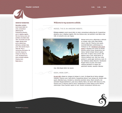
}Besides setting type styles, we’ve also adjusted the spacing to give things more breathing room. The footer was set to a height of 192px (not just for consistency — I like fat footers). I also gave the img negative margins so that the padding and borders would extend outside the boundaries, lining it up more nicely.
Let’s take a look at our progress.
Now, if all CSS designs looked like this page, I could understand a designer’s concern about CSS layouts being boring. However, as we’re about to see, it doesn’t take much to make things much more interesting.
Fracturing the Grid
My design teacher was affectionately called the “Grid Nazi.” He would measure everything and make sure all the pieces of a design matched and were lined up. However, though The Grid was very important to him, he stressed that knowing how to fracture the grid in the right way could really bring energy to a design.
So how do you fracture the grid the right way? Well, it’s important to keep in mind the fact that proportion is a beautiful thing. I like to break columns up a little by offsetting objects outside of a margin. For this example, we can use the offset image, and also apply a left-side margin to the primary content (to get some more of that whitespace we love). Take a look at this wireframe, in which the image extends beyond the boundaries of the area created by our wireframe:
This feature is easy to accomplish using a negative margin in CSS:
#content-primary {

  float: right;

  margin: 12px 24px 60px 24px;

  width: 528px;

}

#content-primary img {

  float: left;

  margin: -6px 18px 0 -114px;

  padding: 3px;

  border: 3px solid #eee;

  background: #fff;

}

#content-secondary {

  float: right;

  margin: 30px 216px 60px 24px;

  width: 144px;

  font-size: 11px;

  color: #300;

}
First, I applied a few rules that exist for aesthetic purposes only — you can decide to skip this part if you like. I decided I wanted the baselines of both the columns to line up properly. To achieve this, I adjusted the top margins of #content-primary and #content-secondary until the baselines lined up as intended. Then I set a larger margin (of 60px) on the bottoms of these both columns — I prefer the bottom spacing on the designs I create to be a little larger than expected.
Next, I reduced the width of #content-primary, as is shown in the wireframe image. Now we can give the image a negative margin of 114px, which will allow the image to extend halfway into the margin.
Since we made the #content-primary smaller, we’ll need to give #content-secondary a larger right margin so that it will sit to the left as intended. I also wanted to extend the border of the h1 out into the margin, just to balance things out a little. You can do this using negative margins, too:
h1 {

  margin-bottom: 11px;

  margin-left: -108px;

  padding: 15px 0 21px 108px;

  border-bottom: 1px solid #ccc;

  font: normal italic 1.5em/18px Georgia, serif;

  color: #633;

}
The left-side padding was set to equal the negative margin, so the text will stay in place, but the border extends out as intended.
Another nice technique you can use to break up the “boxy” look is to apply an ornamental background image that can also extend into the margin. We create this look using roughly the same approach we used above:
h2 {

  margin-left: -204px;

  padding: 10px 0 20px 204px;

  background: url(h2_ornament.gif) 3px 0 no-repeat;

  font-size: 1.25em;

  text-transform: uppercase;

  color: #999;

}
Little changes like this can be simple and subtle, yet they have the potential to really make a difference and break up straight lines.
While “fracturing the grid” definitely helps, this layout still could use something more.
Applying Abstraction
Antoni Gaudi believed that the straight line belonged to man, and the curved line belonged to God. If you want to see abstract, take a look at his work.
In this project, we’re not exactly going all-out abstract, but it’s fun to have the work of the masters in the back of your mind when you’re using abstraction. Whether it’s used along with a grid, or used on its own (in the vein of Gaudi), abstraction can add that little “something” that’s needed to make a design really interesting.
For our layout, the #header and #footer are quite simple, so let’s add some snazzy background images to these sections. Whether it’s everyone’s favorite rounded corner, a diagonal line, or a swirl, the background image is up to you … be creative with it.
Let’s start with the footer. (There’s no particular reason the footer should be first — I just felt like choosing it.) Let’s add a background image that will “decorate” the top of the footer:

The rest of the footer will be filled with the dark gray color. Here’s the relevant CSS:
#footer {

  clear: right;

  height: 192px;

  background: #333 url(footer.gif) top no-repeat;

  font-size: 10px;

  line-height: 1em;

  text-shadow: 1px 1px 1px #333;

  color: #fff;

}
The text inside the footer now should appear pushed down, so that it stays in the dark gray area:
#footer p {

  padding: 132px 24px 0 24px;

}
We can create an illusion that the footer extends outside the boundaries of the containing div (#page) by creating a background image for the body. This image will extend the gray area, so it can be a simple, horizontally repeating image:
body {

  background: #eee url(bg.gif) 0 100% repeat-x;

  font: 12px/18px "Lucida Grande", Verdana, sans-serif;

  text-align: center;

  color: #333;

}
So now we have a footer that is visually catchier:
Let’s do the same for the header. First, we’ll add a background image that breaks up the straight-line appearance of the layout:
This image will be positioned toward the bottom of the header, and we’ll use the background color to fill the rest of the space:
#header {

  height: 192px;

  background: #966 url(header.gif) bottom no-repeat;

}
Next, let’s play with the padding for the header content to make it display more nicely around the background image. The approach you take here will vary depending on the content in your header:
#header p {

  float: left;

  padding: 60px 24px 24px 126px;

  font-size: 1.5em;

  line-height: 1em;

  color: #fff;

}
We can use this method of applying an additional background image to make the header appear to extend outside of #page. To do so easily, we can wrap a div around the page, and use that when we apply the background image (since body is already using an image for the #footer). Here’s the final HTML:
<!DOCTYPE html PUBLIC "-//W3C//DTD XHTML 1.0 Strict//EN" "https://www.w3.org/TR/xhtml1/DTD/xhtml1-strict.dtd">
<html xmlns="https://www.w3.org/1999/xhtml" lang="en" xml:lang="en">
<head>
<title>Example Layout</title>
<meta http-equiv="content-type" content="text/html; charset=utf-8" />
<link type="text/css" rel="stylesheet" href="style.css"/>
</head>
<body>
<div id="wrap">
<div id="page">
<div id="header">
<p>Header content</p>
<ul>
<li><a href="#">Link</a></li>
<li><a href="#">Link</a></li>
<li><a href="#">Link</a></li>
</ul>
</div>
<div id="content-primary">
<h1>Welcome to my awesome website.</h1>
<h2>Indeed, this is an awesome website.</h2>
<p><strong>Primary content.</strong> Lorem ipsum dolor sit amet, consectetuer adipiscing elit. Suspendisse pharetra, arcu in dapibus sagittis, felis leo rhoncus erat, non porttitor urna libero vitae nibh. Ut convallis eros sed magna.</p>
<img src="photo.jpg" alt="" />
<p>Aenean enim purus, adipiscing a, vehicula ut, tempor vitae, justo. Nam laoreet mauris vitae elit. Vivamus eros quam, euismod bibendum, pellentesque ut, tristique ut, nisl. <a href="#">Vestibulum ante ipsum primis</a> in faucibus orci luctus et ultrices posuere cubilia Curae; Suspendisse non metus. Nullam tempor dictum sapien. Duis enim. In ligula. Cras ut enim. Sed dapibus ante in eros. Nulla facilisi. In rhoncus eleifend nunc. Sed risus nulla, pretium in, porta eget, lacinia eu, nunc. In hac habitasse platea dictumst. Vestibulum feugiat lectus et justo. Cum sociis natoque penatibus et magnis dis parturient montes, nascetur ridiculus mus. Sed aliquet dolor nec ipsum.</p>
<h2>Oooh, more copy…</h2>
<p><a href="#">Ut erat nibh</a>, aliquet ut, congue at, tempus in, nunc. Ut aliquet leo et lectus volutpat molestie. Vivamus nunc. Nulla facilisi. Suspendisse dictum nunc tempus elit. Nullam urna quam, bibendum quis, tincidunt a, nonummy euismod, metus. Etiam convallis, dui venenatis feugiat elementum, justo lacus lobortis libero, vel iaculis nibh lectus eu urna. Vivamus arcu. In facilisis quam et lacus. Suspendisse sit amet neque ac enim lobortis ullamcorper. Etiam faucibus sapien ut nunc. Nullam consectetuer vehicula arcu.</p>
</div>
<div id="content-secondary">
<h3>Important Information</h3>
<p><strong>Secondary content.</strong> Lorem ipsum dolor sit amet, consectetuer adipiscing elit. Suspendisse pharetra, arcu in dapibus sagittis, felis leo rhoncus erat, non porttitor urna libero vitae nibh. Ut convallis eros sed magna. Aenean enim purus, adipiscing a, vehicula ut, tempor vitae, justo. Nam laoreet mauris vitae elit. This is interesting information. Ut erat nibh, aliquet ut, congue at, tempus in, nunc. Ut aliquet leo et lectus volutpat molestie. Vivamus nunc. <a href="#">Read more →</a> </p>
</div>
<div id="footer">
<p>Photograph by <a href="http://jinabolton.com">Jina Bolton</a>.</p>
</div>
</div>
</div>
</body>
</html>Then we can add the CSS needed:
#wrap {

  background: url(wrap.gif) repeat-x;

}
And here’s the final CSS:
* {

  margin: 0;

  padding: 0;

}

body {

  background: #eee url(bg.gif) 0 100% repeat-x;

  font: 12px/18px "Lucida Grande", Verdana, sans-serif;

  text-align: center;

  color: #333;

}

a:link, a:visited {

  color: #633;

}

a:hover {

  color: #966;

}

h1 {

  margin-bottom: 11px;

  margin-left: -108px;

  padding: 15px 0 21px 108px;

  border-bottom: 1px solid #ccc;

  font: normal italic 1.5em/18px Georgia, serif;

  color: #633;

}

h2, h3{

  font-weight: normal;

  font-size: 1em;

  line-height: 18px;

}

h2 {

  margin-left: -204px;

  padding: 10px 0 20px 204px;

  background: url(h2_ornament.gif) 3px 0 no-repeat;

  font-size: 1.25em;

  text-transform: uppercase;

  color: #999;

}

h3 {

  padding-bottom: 6px;

  font-weight: bold;

  text-transform: uppercase;

  letter-spacing: -1px;

  color: #633;

}

#wrap {

  background: url(wrap.gif) repeat-x;

}

#page {

  margin: 0 auto;

  width: 960px;

  background: #fff url(page.gif) repeat-y;

  text-align: left;

}

#header {

  height: 192px;

  background: #966 url(header.gif) bottom no-repeat;

}

#header p {

  float: left;

  padding: 60px 24px 24px 126px;

  font-size: 1.5em;

  line-height: 1em;

  color: #fff;

}

#header ul {

  padding-top: 62px;

  padding-right: 12px;

  text-align: right;

  list-style: none;

}

#header li {

  display: inline;

  margin: 0 12px;

}

#header li a {

  font-size: 1.25em;

  line-height: 1em;

  text-decoration: none;

  color: #fff;

}

#header li a:hover {

  color: #300;

}

#content-primary {

  float: right;

  margin: 12px 24px 60px 24px;

  width: 528px;

}

#content-primary p {

  padding-bottom: 18px;

}

#content-primary img {

  float: left;

  margin: -6px 18px 0 -114px;

  padding: 3px;

  border: 3px solid #eee;

  background: #fff;

}

#content-secondary {

  float: right;

  margin: 30px 216px 60px 24px;

  width: 144px;

  font-size: 11px;

  color: #300;

}

#content-secondary p {

  padding-bottom: 18px;

}

#footer {

  clear: right;

  height: 192px;

  background: #333 url(footer.gif) top no-repeat;

  font-size: 10px;

  line-height: 1em;

  text-shadow: 1px 1px 1px #333;

  color: #fff;

}

#footer a:link, #footer a:visited {

  color: #c99;

}

#footer p {

  padding: 132px 24px 0 24px;

}

.clear {

  clear: both;

}
Here’s the result:
Taking it Further
A lot more can be done to “break out of the box”. You can get much more experimental with your background images, or go a little crazy with margins — both of which are explored in detail in The Art & Science of CSS, on which I was a co-author. While what we’ve discussed here was definitely a minimal approach, hopefully it will get you thinking of fun things you can try (and move beyond the thinking that CSS designs have to be boring). So have fun with it. Check out the book, as well as some of my favorite sites that use fun box-breaking techniques:
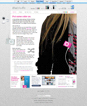
Apple iPod Shuffle: I really like the iPod shuffle and headphones that appear to be “peeking” out from behind the container.
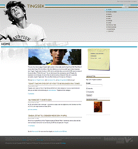
Tingsek: I’m a big fan of horizontal “bars” that fill the entire screen — I think it’s a great way to avoid a totally contained, boxy feeling. The post-it note’s angle also helps break the design up a bit, along with the background photo of Tingsek.
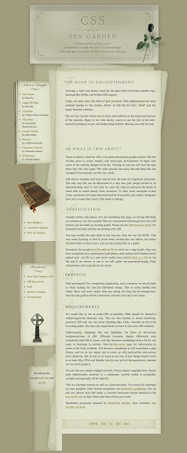
CSS Zen Garden, Entry #194: Background images really help this layout to avoid feeling boxy, even though it follows a basic grid.
Frequently Asked Questions about CSS Box Model
What is the CSS Box Model and why is it important?
The CSS Box Model is a fundamental concept in web design and development. It’s a box that wraps around every HTML element, consisting of margins, borders, padding, and the actual content. The box model is crucial because it determines how elements interact and affect each other on the page, influencing layout, spacing, and overall aesthetics. Understanding the box model is key to mastering CSS and creating visually appealing and functional web designs.
How does the CSS Box Model work?
The CSS Box Model works by treating every HTML element as a rectangular box. This box is made up of the content, padding, border, and margin. The content is the actual text or image inside the box. Padding is the space between the content and the border. The border surrounds the padding and content, and the margin is the space between the border and other elements. These layers work together to define the size and position of the elements on the page.
What is the difference between border-box and content-box in CSS?
The difference between border-box and content-box lies in how the width and height of an element are calculated. In content-box, the width and height only include the content. Padding and border are added to the outside of the box. In contrast, in border-box, the width and height include the content, padding, and border. The margin is always added outside the box in both cases.
How can I change the box-sizing property in CSS?
You can change the box-sizing property in CSS using the ‘box-sizing’ property. This property can take two values: ‘content-box’ and ‘border-box’. ‘Content-box’ is the default value and includes only the content in the element’s width and height. ‘Border-box’ includes the content, padding, and border in the element’s width and height.
How does padding affect the CSS Box Model?
Padding plays a crucial role in the CSS Box Model. It creates space between the content of an element and its border, effectively providing ‘breathing room’ for the content. This can enhance readability and visual appeal. However, it’s important to note that padding adds to the total width and height of an element, which can affect the overall layout if not accounted for.
What is the role of margins in the CSS Box Model?
Margins in the CSS Box Model define the space around an element, outside the border. They effectively create ‘breathing room’ between different elements, helping to separate them visually and enhance the overall layout. Margins do not contribute to the actual width and height of an element, but they do influence its position relative to other elements.
How can I control the border of an element in the CSS Box Model?
You can control the border of an element in the CSS Box Model using the ‘border’ property. This property allows you to define the width, style, and color of the border. You can also control each side of the border individually using the ‘border-top’, ‘border-right’, ‘border-bottom’, and ‘border-left’ properties.
How does the CSS Box Model affect the layout of a webpage?
The CSS Box Model significantly affects the layout of a webpage. It determines the size and position of elements, as well as the space between them. By manipulating the margins, borders, padding, and content of elements, you can create a wide variety of layouts. Understanding the box model is key to mastering CSS layout techniques.
Can I use the CSS Box Model to create responsive designs?
Yes, you can use the CSS Box Model to create responsive designs. By using relative units like percentages for widths, margins, and padding, you can create designs that scale and adapt to different screen sizes. The box model is a fundamental part of responsive design techniques.
What are some common issues or challenges with the CSS Box Model?
Some common issues with the CSS Box Model include understanding how widths and heights are calculated, especially when padding and borders are involved. This can lead to elements being larger than expected, which can disrupt the layout. Another common issue is dealing with the ‘margin collapse’, where the top and bottom margins of adjacent elements combine into a single margin. Understanding and mastering these aspects of the box model can take time and practice.
 Jina Bolton
Jina Bolton is an interaction designer at Crush + Lovely. Previously, Jina worked at Apple, Inc. as a visual interaction designer and front-end web developer. Jina Bolton is a visual interaction designer in Silicon Valley living in San Francisco. She is a co-author of The Art & Science Of CSS and holds a BFA in Computer Arts and Graphic Design from Memphis College of Art.