We all want to publish the websites we create as quickly as possible after we finish working on them. And let’s be honest: sometimes that comes at the expense of leaving out some important UX factors that negatively impact how users navigate the site.
The problem is, in taking a few pre-launch shortcuts, we risk permanently losing long-term users over UX mistakes we could have fixed in an hour or so. Here are a few ‘low hanging fruits’ that can have a fast UX impact.
1. Don’t make the user to do the math
Scenario: “Is this a new post?”
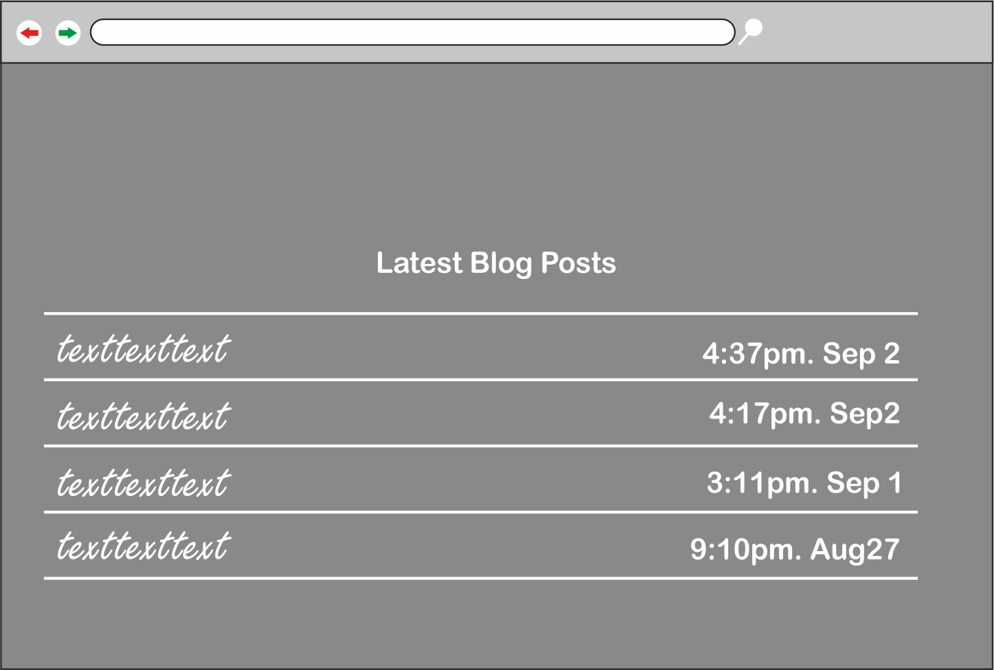
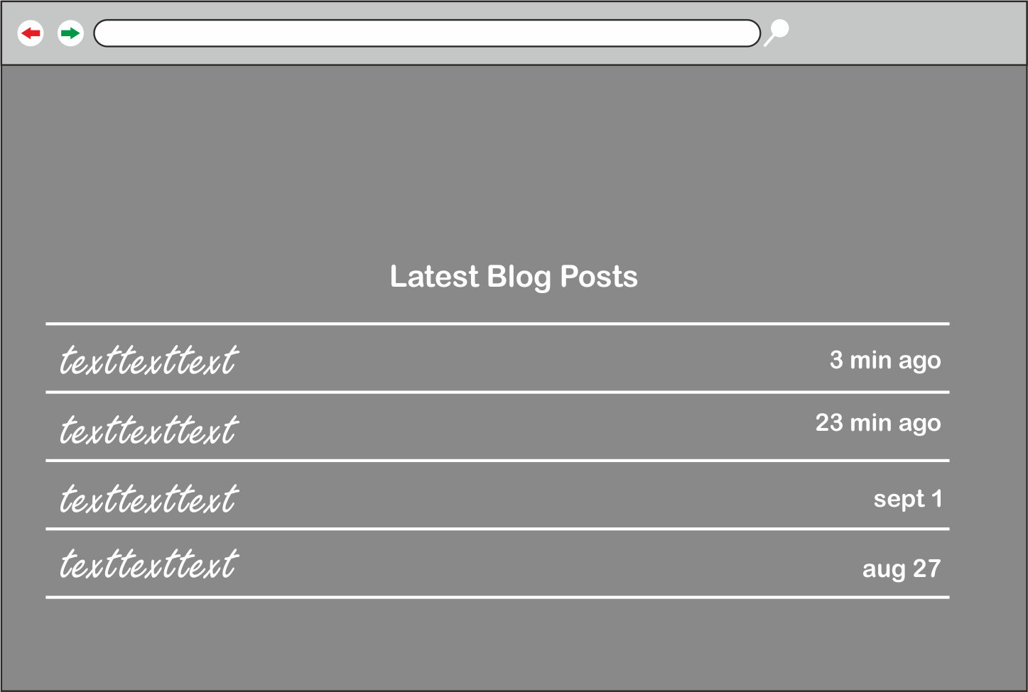
We’ve all been here: You are trying to find out whether the post you’re reading was published today, yesterday or last week, so you hunt around the page until you finally find a publish date – ’20 November’.
Ok, great – but now you’re blanking on what today’s date is!
So, now you’re off clicking on your laptop’s clock function to remind yourself what the date is. ‘Today is the 26th – ok, the post is… 3 days old‘. You spend time doing ‘time math’.
Alternative Approach
We can make this simpler with the use of ‘relative timestamps’ instead of showing the date and time a blog post was published at, we’ll use how long ago it was published, (e.g 2 days ago, last week …) these do improve your UX but you need to use them carefully, since saying 1 year ago is really not a good idea. A good rule of thumb is if it is older than a week then switch to Absolute timestamps.
2. Use natural text instead of DRY language
Scenario: Am I talking to a robot?
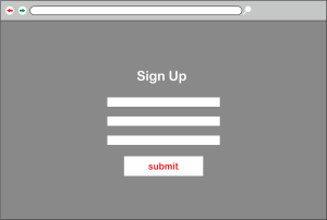
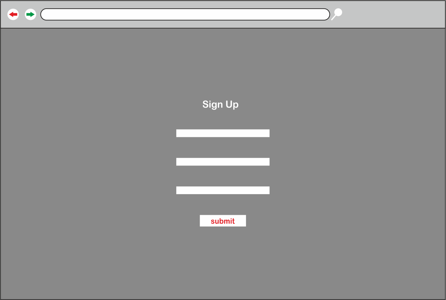
You’ve very likely come across and even subscribed to a newsletter online, how was your experience when filling out the form? I am sure it was pretty plain. As it was just Name: and E-Mail: you fill them out and agree to the terms and submit.
Wouldn’t it be better if the actual form was a bit more natural? Take a look at the following image.
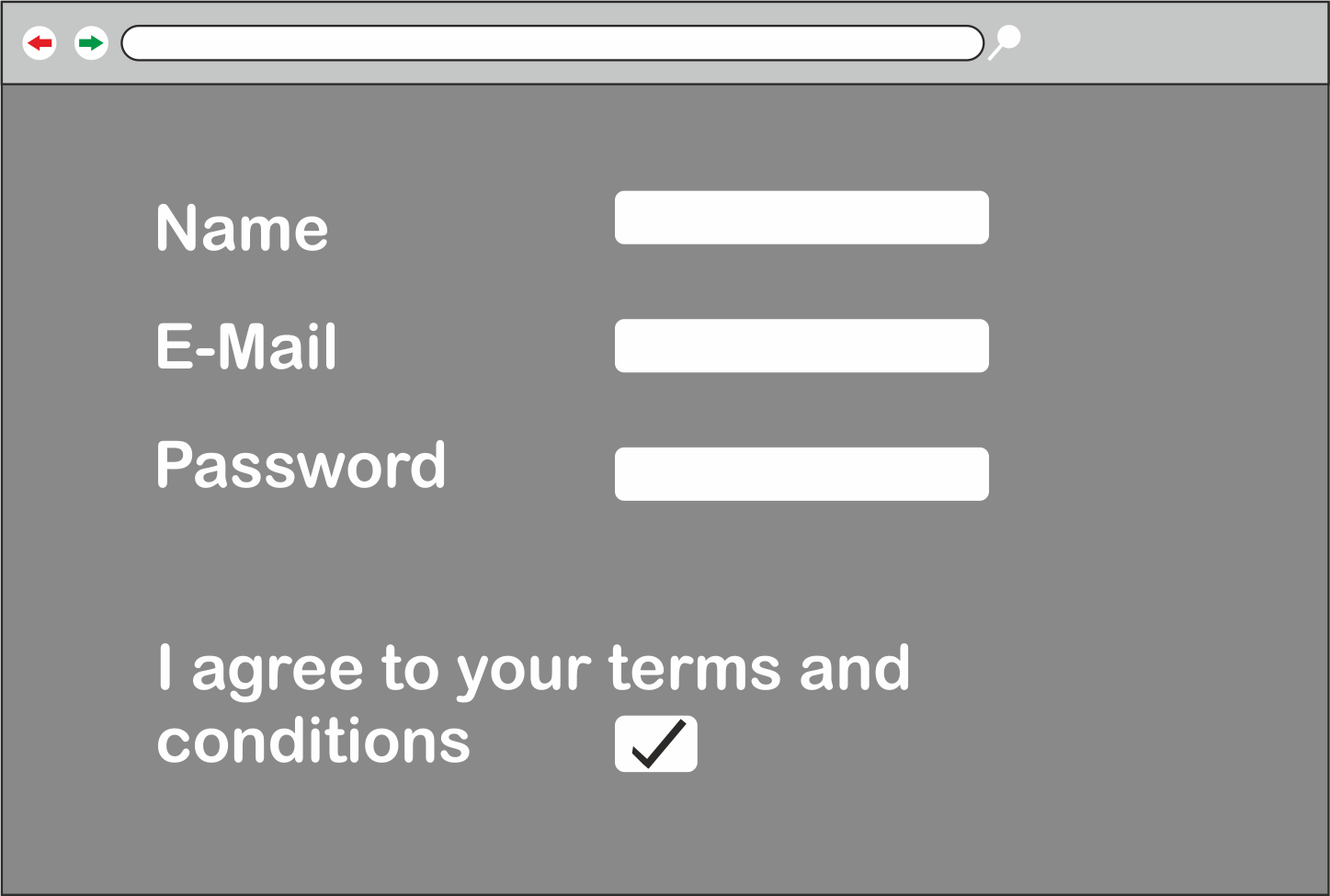
Looks functional, but rather plain and robotic, doesn’t it?
Alternative Approach
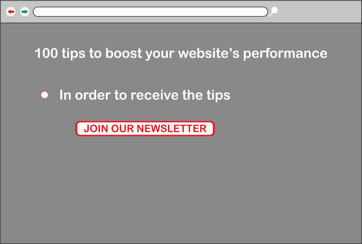
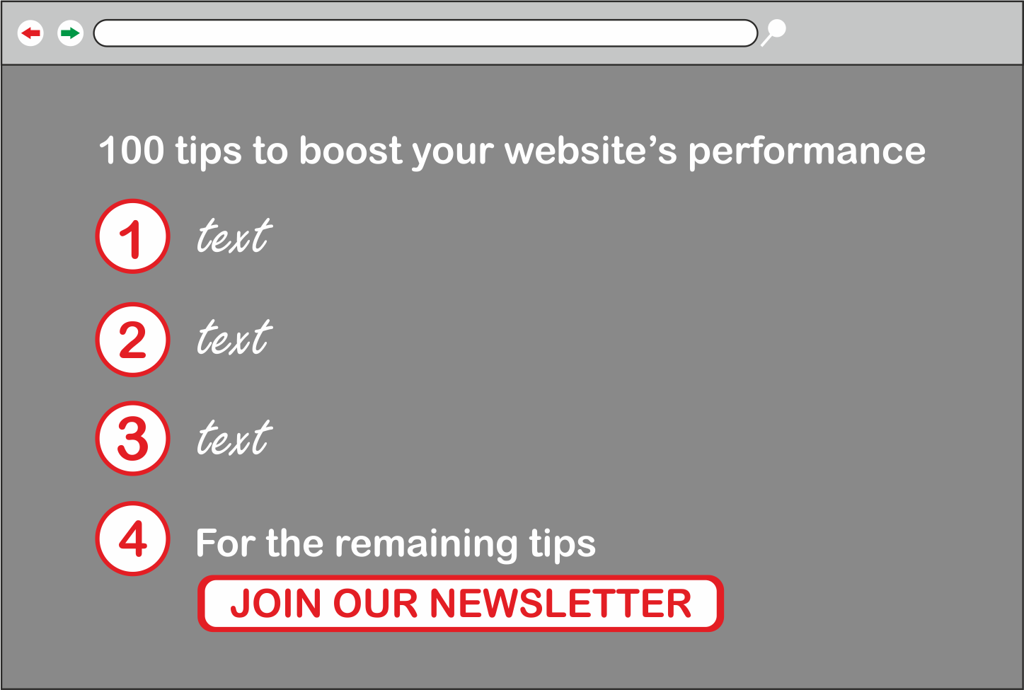
Let’s change things up and make it more conversational. Instead of using the classic form style, try incorporating your fields into the text paragraph. Looking at the next image, you can see that the form itself is easier to skim over and fill in the necessary information, without sounding too formal!

3. Ignite the curiosity of the reader
Scenario: Showing value
How many times have you come across a website offering a free eBook containing useful tips? I’m guessing more times than you can remember. Unfortunately, there is often a common issue with such sites.
Perhaps you’re interested in these tips, but when you come to the download page, you find a message saying ‘To view the tips please enter your email to download our ebook!’ It smells fishy 90% of the time, right? We’ve all been through the process of downloading a book of tips you’ve seen a thousand times before.
Alternative Approach
Curiosity is an important emotion in human beings and as a Web Developer/UX Designer, our job is to put those emotions to good use. When we are curious we tend to take the next action with little to no thinking.
Taking the chance to intrigue your readers by listing 3 to 5 tips from your eBook on the buy/download page, let’s you prove your value to your users while presenting them with a gift. Chances are, they will want to know more.
4. Talk about the benefits of your app – not the features
Scenario: The sales pitch
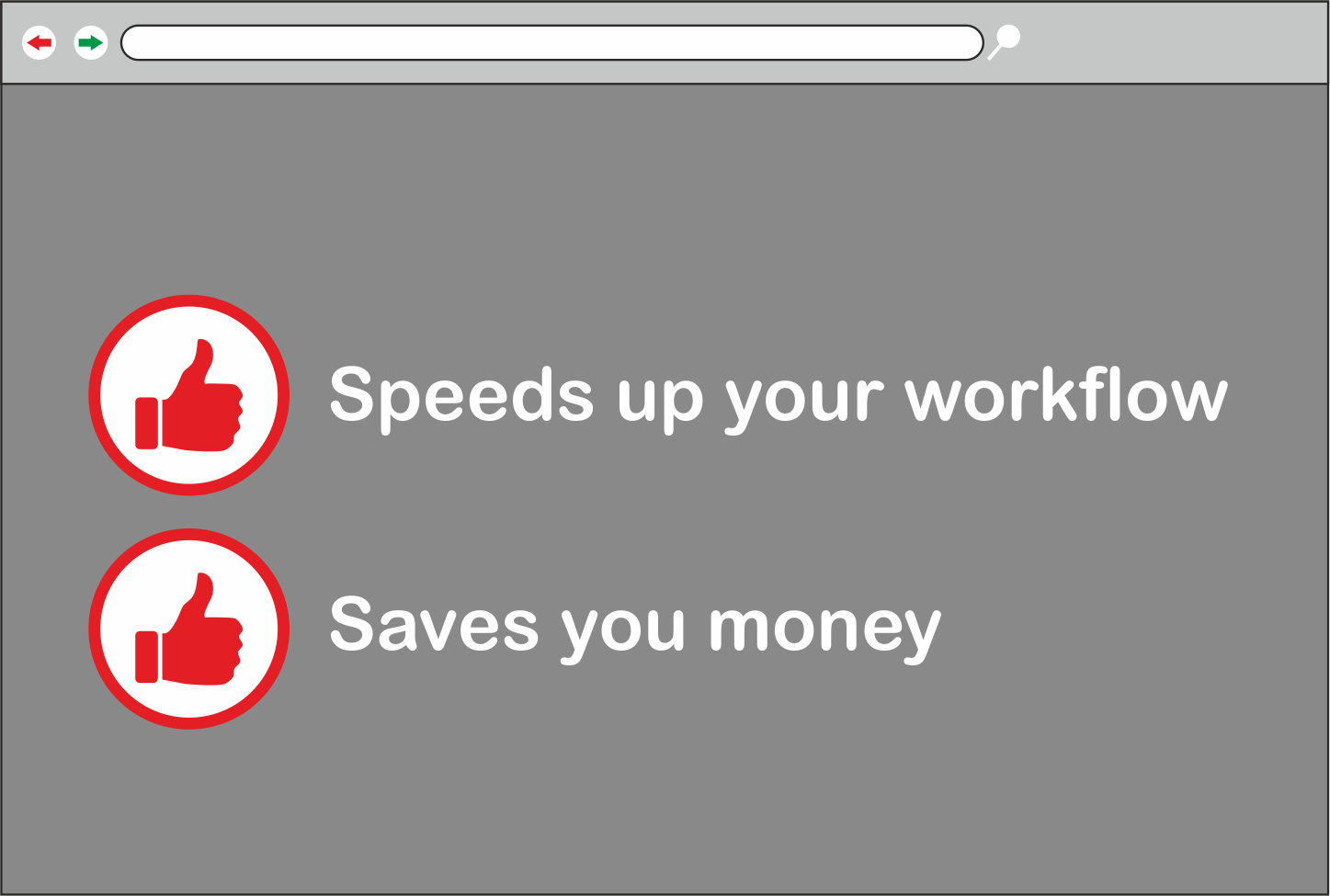
You want to know how an application/product will help you but it only displays the features of the application. For instance, ‘helps reduce your taxes‘ isn’t nearly as directly relatable as ‘saves you money‘.
Similarly, ‘Uses NodeJS‘ isn’t as useful as ‘Speeds up your workflow’. As a daily user, you probably don’t care what technologies a specific application uses – you just want to get your work done as quickly as possible.

Alternative Approach
Don’t fill your application’s description with geeky words like NodeJS, Angular, React, PHP since the majority of the users don’t have a clue on what it means, instead, focus on the benefits it offers.
5. Increase your touch/click areas size
Scenario: Navigating to a signup/login page on your phone/tablet.
After filling in your information you try to click on the ‘Submit’ button. Unfortunately, you miss the click first time as the touch target is too small. If you’re lucky, your missed click didn’t hit something else and whisk you away to another page.
If not, you now need to zoom in and click on it the second try. You lost perhaps two seconds just dealing with a dumb submit button. As a user, do you consider that a good thing? Probably not.
This is a concept that is described in ‘Fitt’s Law‘, which tells us that humans need more time to click on something the further away/smaller it is.
Alternative approach
Obviously, the solution is to increase the size of your form fields, call-to-actions, and links, and position them in easy reach. And to test those touch targets thoroughly – not just in desktops and emulators, but in real phones and tablets.

Summing Up
Often small and subtle changes can make the biggest impact when dealing with technology and especially at a large scale. And giving attention to the smallest detail will give you the results you wish.
 Saad Al-Sabbagh
Saad is a 20 year old front-end developer and a budding web designer with an eye for detail and passion for perfection, say "Hi!" to him on Facebook.