Animation is not the art of drawings that move but the art of movements that are drawn. – Norman McLaren
Everyone knows what animation is, but what about how to merge animation with web and mobile design for a better experience. While today most sites employ animation on some level, often it’s as much for the sake of artistic flourish than it is for genuinely supporting the user experience.
As with traditional design, there are concepts, principles, and the willingness to think outside of the box that will make animation work for you. If you start with these four handy tips you should be able to use animation to improve your site.
Focus on Movement, Not Code
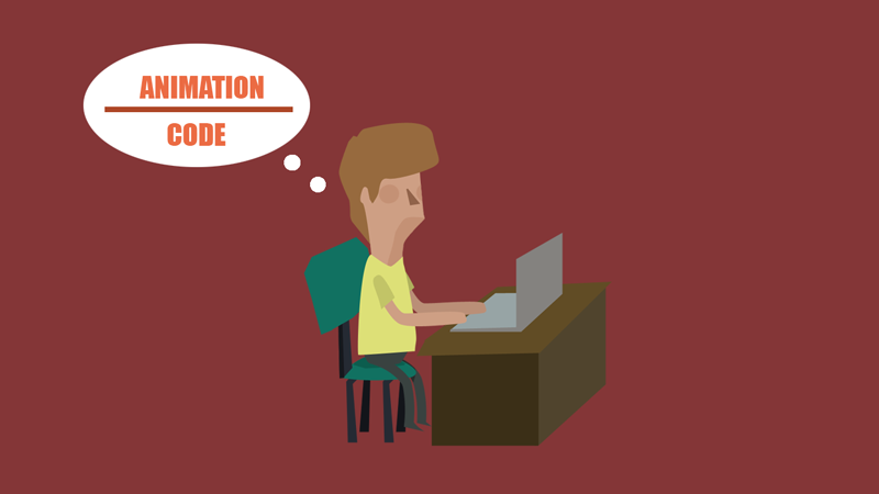
Think about movement before you even consider your code. This will allow you to put more focus into the actual animation conceptualization process. Of course, there’s a chance that not everything you design can be coded to perfection but that’s when you’ll make your artistic compromises.
Beginning with a “code focussed” mindset is more likely to undermine the personality of your animation due to worrying over possible coding constraints.
It’s a little like planning an illustration based on the colors of the pencil you have available (and don’t). It’s the wrong starting point.
This undermines your reasoning for adding animation in the first place. Try to focus more on how you want your animation to move and look. Implementation details will work themselves out later.
At the end of the day, the coding will just be ‘a means to an ends’. It’s your design process and mental execution that is going to make your animation human.
Focus on Purpose
If your animation doesn’t have a purpose, then you should question its need to be there. For instance, animated spinners that serve as loading indicators have an innate purpose yet some designers probably don’t think much beyond ‘everyone else is doing it‘ and ‘it looks pretty cool‘.
Loading animations are designed to give the user load time feedback (or, at least, some sense of progress). Other menu animations might be useful for indicating to the user where a menu goes when it is closed. These are both examples of animations that deliver practical benefits to the user.
On the flipside, unfurling navigations and spinning logos have been the poster-boy examples of a more decorative, less functional type of animation. Remember that your animation is built for the benefit of the user, not its creator. This isn’t your show-reel for Pixar.

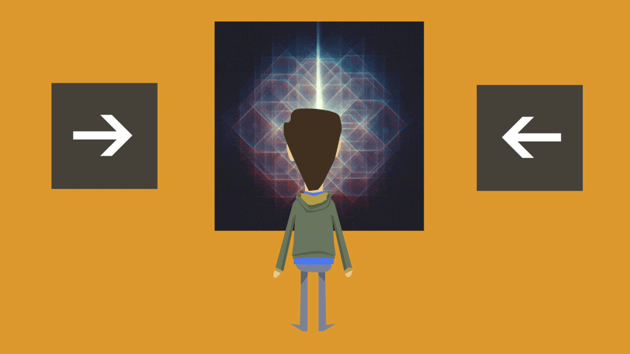
Let’s take a look at decorative, flashy animation versus something more purpose-function influenced.
-
Flashy
-
Subtle
As you see here, you can achieve virtually the same outcome without going all out on flashy, decorative animation. It gives a clean look and doesn’t leave the user asking “whoa.. what just happened?”. What’s more, busy animations feel slower the more often you use them.
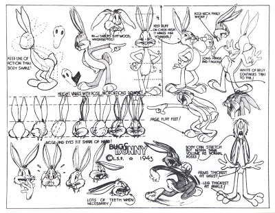
Study Movement
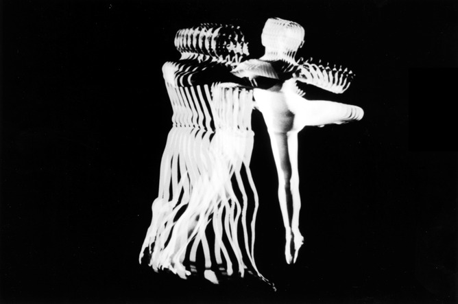
It’s difficult to animate well without having a solid understanding of movement. Effective motion animations rarely have tell-tale edges, stops or seams. The key to good animation is less about pure artistic interpretation and more about the skill of mimicking real life motion.
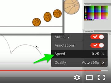
If you’re unsure about a movement, search the web for video of a real-world equivalent and study the motion at quarter speed. Lower playback speeds often reveal wonderful touches. Many people are unaware that Youtube provides variable playback speed controls via the player settings panel.
Movement is typically understood as up, down, left and right, but just because your animation moves in these directions doesn’t mean your motion will feel natural. Factors like materials, speed, acceleration, bounce and reflection should always be taken into account. It’s important to creation seamless motion to maintain the illusion and fantasy. In other words, try to keep your animation almost “invisible”.
It is easier to create ‘invisible animation’ when you understand how people view movement. It’s a good idea to study the world around you.
Study video game interfaces – particularly the titles put out in the last 3 years – and pay attention to how you, as the user, track them. If you’re not in the mood to watch gameplay then simply watch various animated films and shows. Most importantly, create real tests before you begin integrating animation into a complex project.
Try to refrain from sporadic or flashing movement. Keep it steady. Allow the viewer to enjoy and take in what they are seeing especially if the animation is crucial to digesting information. Movements the follows curves opposed to points are ideal, and soft movement over hard sharp twists and turns unless necessary.
Tell Your Story with Harmony
Synchronization is key in animation. It is easy to want to design one element after the other all for the sake of trying to generate as much animation as possible, but this isn’t the way to go. All of your animation – no matter how big or small – should be one homogeneous unit.
The best way to do this is by sitting down and creating something close to an animatic. These are animated storyboards composed of still images/drawings that have been edited and paced to match as close as possible to the final product.
Trust me when I say these are extremely helpful whether working on a website or a film. The image below is a storyboard I had put together for a music video. Needless to say, this wasn’t the final structure but it kept me on track.
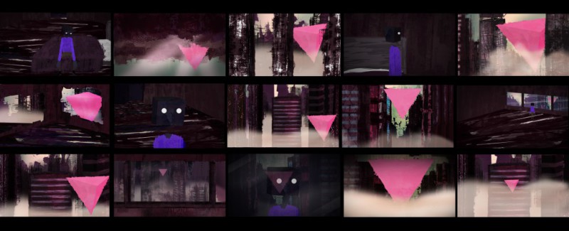
By creating rough sketches of your desired animation, you can see how everything will look which will allow you to catch inconsistencies early in the process. For example, your loading animation is a mix of spinning movement and blocked elements yet your navigation menu is a dropdown fading animation using circles. By seeing this disconnect, you can make the necessary changes or try something different altogether.
Doing small yet critical mockups and tests such as this can help fuel your overall message through harmonic motion. There are some great websites that do this perfectly. Reverend Danger and Every Last Drop use small snippets of animation to tell their story.
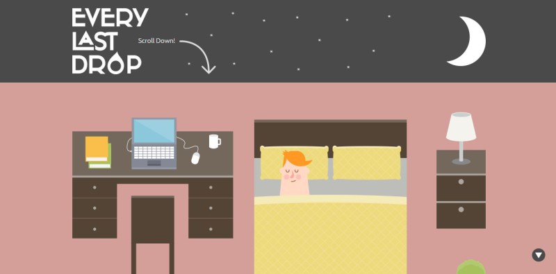
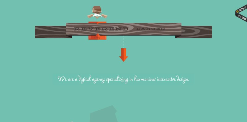
While both sites animate in very different ways, each element of their site has been crafted to not only tell their story but help move it along, literally.
Recap
Animation encompasses a vast variety of styles and approaches, but that doesn’t mean there aren’t key concepts to go by. To get the most out of your animation:
- get yourself out of the “code brain” mentality,
- keep your animations practical and useful,
- and take the time to truly understand movement and how stories are told.
Most importantly, have fun while designing.
What do you think about animation in web and mobile design? Have any favorites?
 Gabrielle Gosha
Gabrielle is a creative type who specializes in graphic design, animation and photography.